Overview
Some food brands sell a menu. Others bring a whole food culture to the table.HOSO — short for House of South — is a cloud kitchen concept built around the richness, comfort and character of Indian food. Rooted in South Indian inspiration yet open to a wider menu that includes much-loved Mughlai favourites, HOSO brings familiar flavours together under one distinctive name. The brief was to create a brand that felt unmistakably connected to food, warm in personality and strong enough to stand out across digital ordering platforms, packaging and everyday customer touchpoints. Our role was to shape that idea into a cohesive visual identity with the flexibility to grow with the kitchen.
Client: HOSO Kitchen Industry: Food & Beverage / Cloud Kitchen Scope of Work: Brand Strategy, Naming Interpretation, Logo Design, Visual Identity, Menu Design, Packaging Concepts, Brand Collateral and Digital Applications.
The Creative Challenge
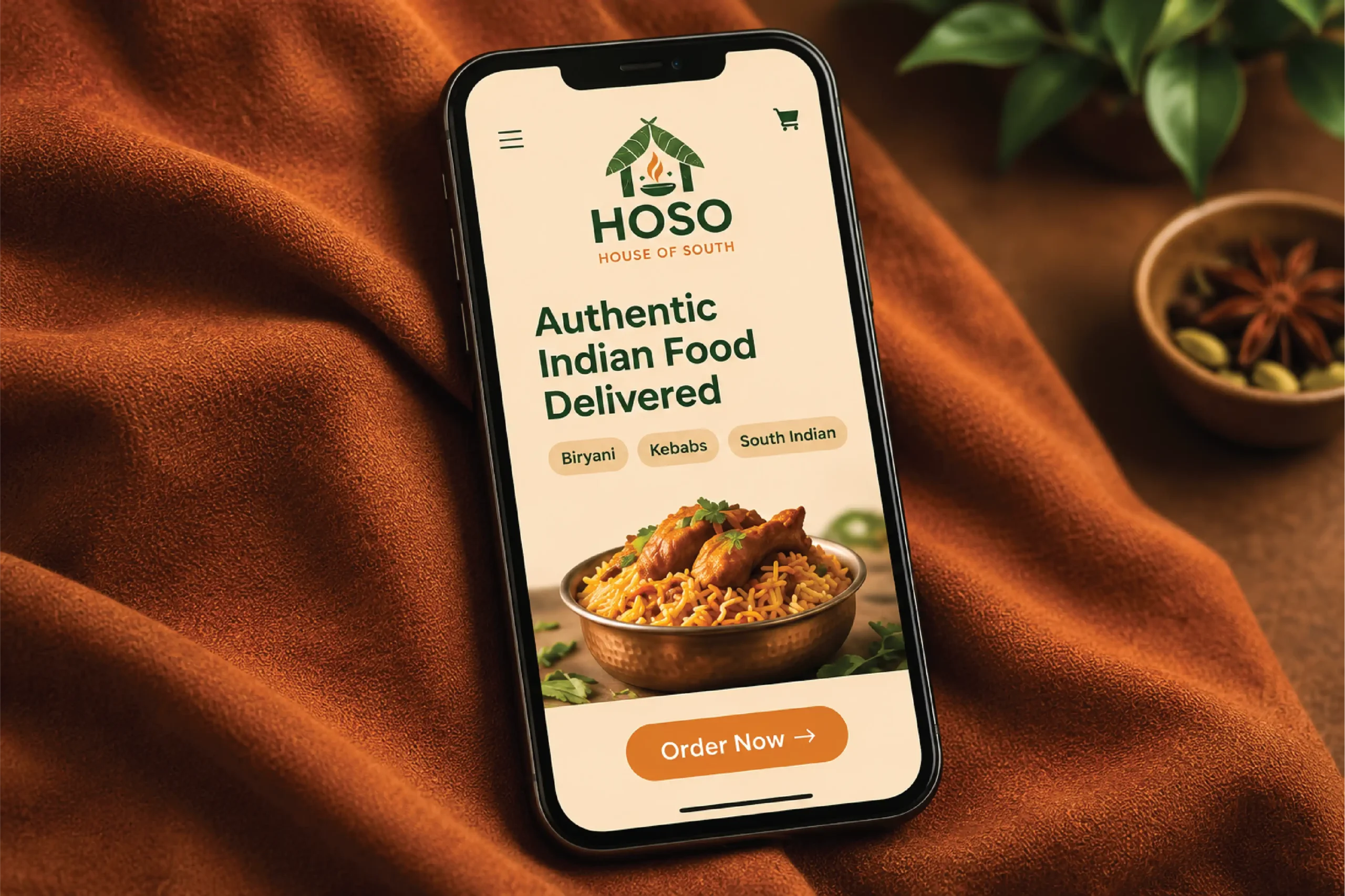
A cloud kitchen has to make its impression before the food reaches the customer. With no traditional storefront experience to do the talking, the identity needed to work hard across small screens, delivery packaging and quick customer interactions. The challenge was to build a recognisable food brand without leaning on predictable restaurant symbols or making the identity feel limited to a single cuisine. HOSO needed to express its South Indian roots while leaving room for a broader menu — including Mughlai dishes — and a varied range of food categories.The identity had to be simple, memorable and practical: clear at app-icon size, confident on packaging, and consistent wherever the brand appeared.
The Strategy
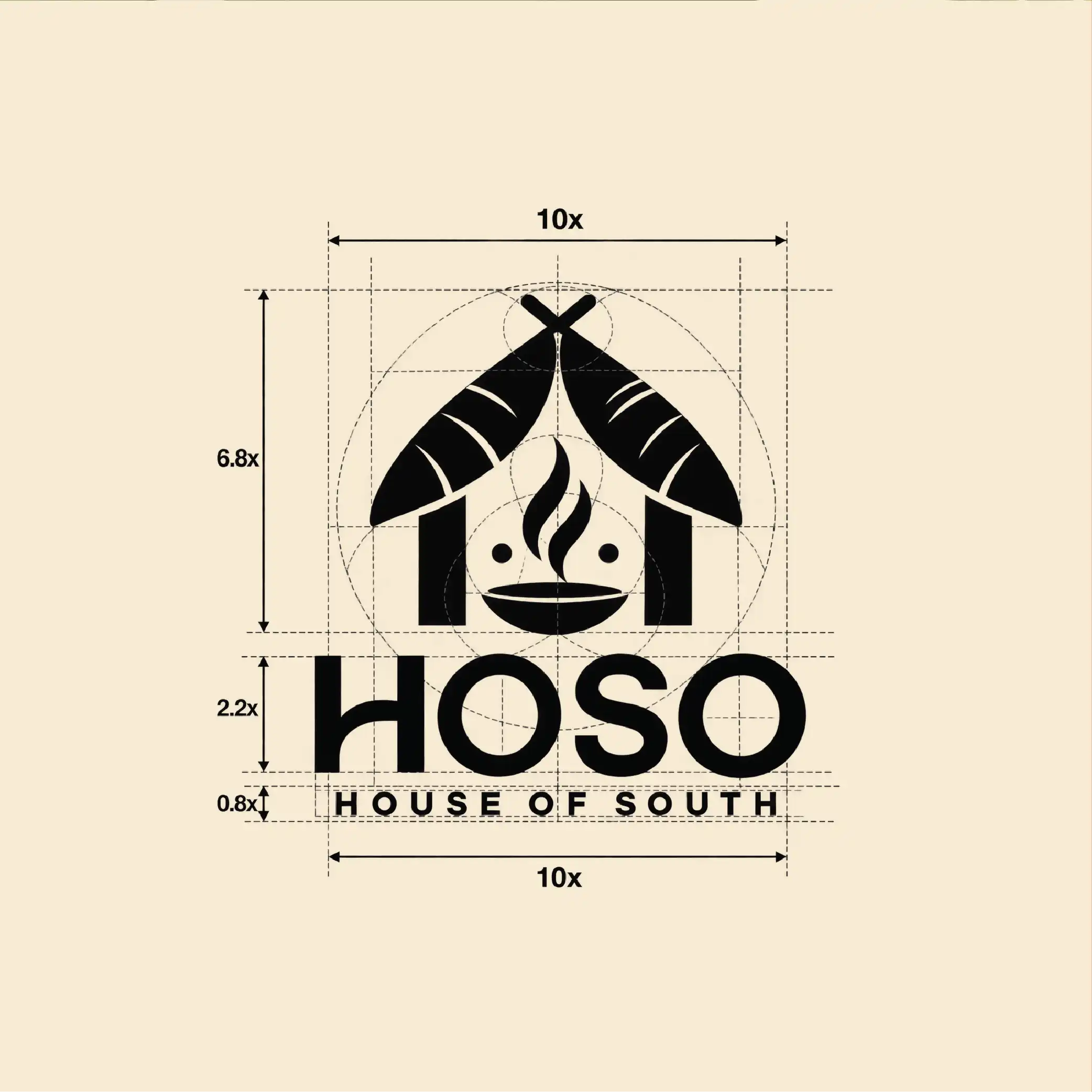
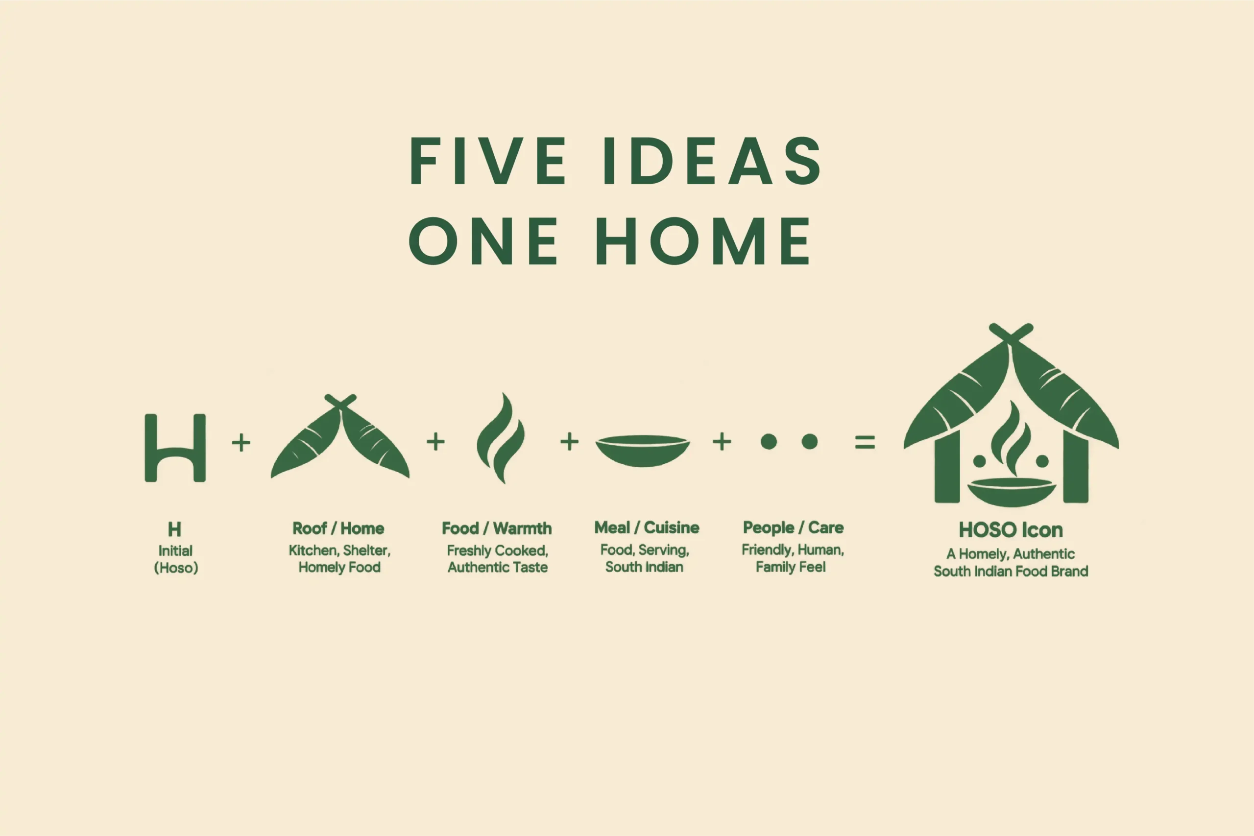
Build the identity around one simple idea: a house of food, served with warmth. We used the name HOSO as the foundation for a compact, ownable visual mark. The identity brings together cues from the cloud-kitchen format and the act of cooking, creating a symbol that feels relevant to food without tying the brand to just one dish or region. A strong, contemporary wordmark gives HOSO visibility, while the supporting visual language carries the personality across menus, packaging and digital applications. The result is designed to feel familiar and welcoming, yet distinctive enough to be remembered.
The Execution
The Concept — A Cloud Kitchen with a Clear Identity
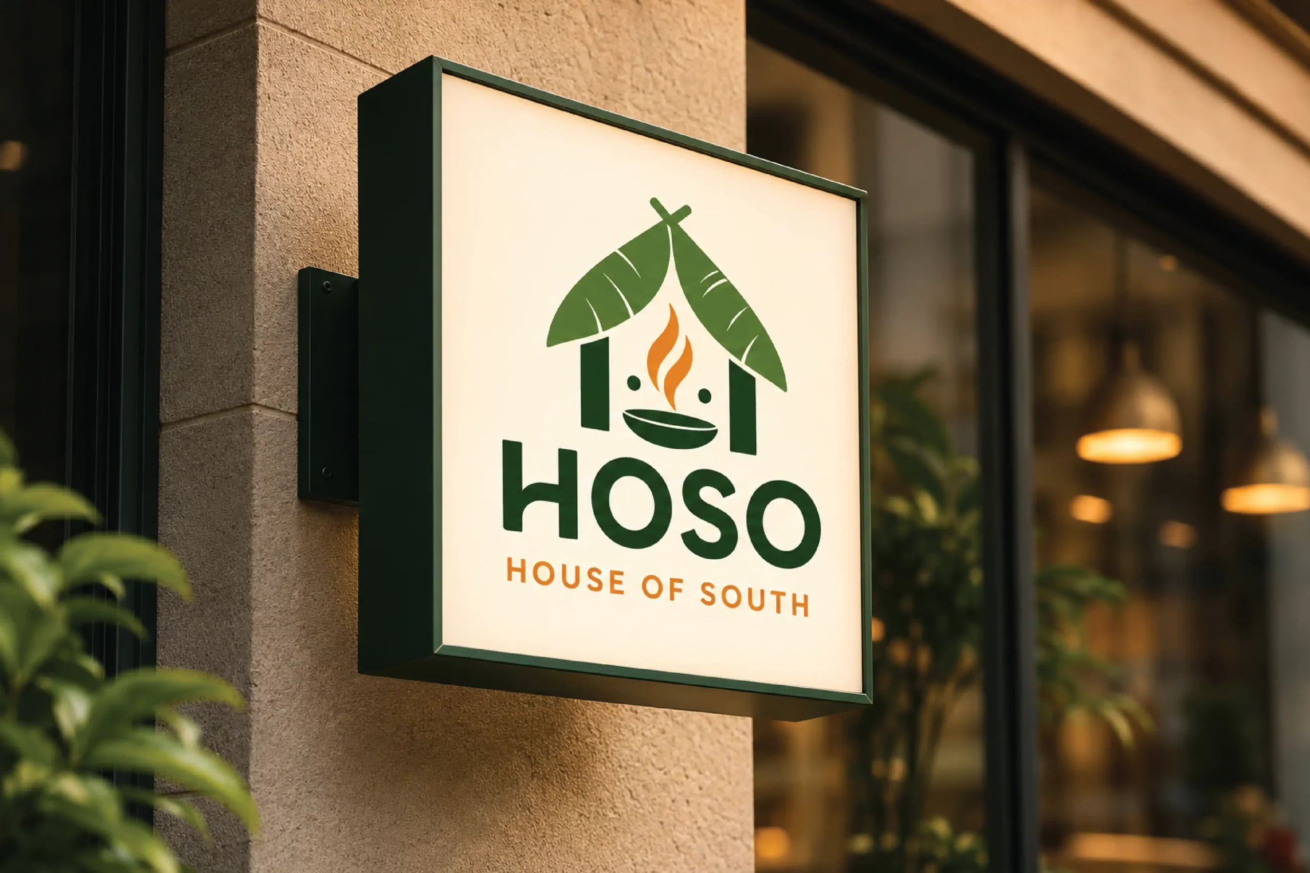
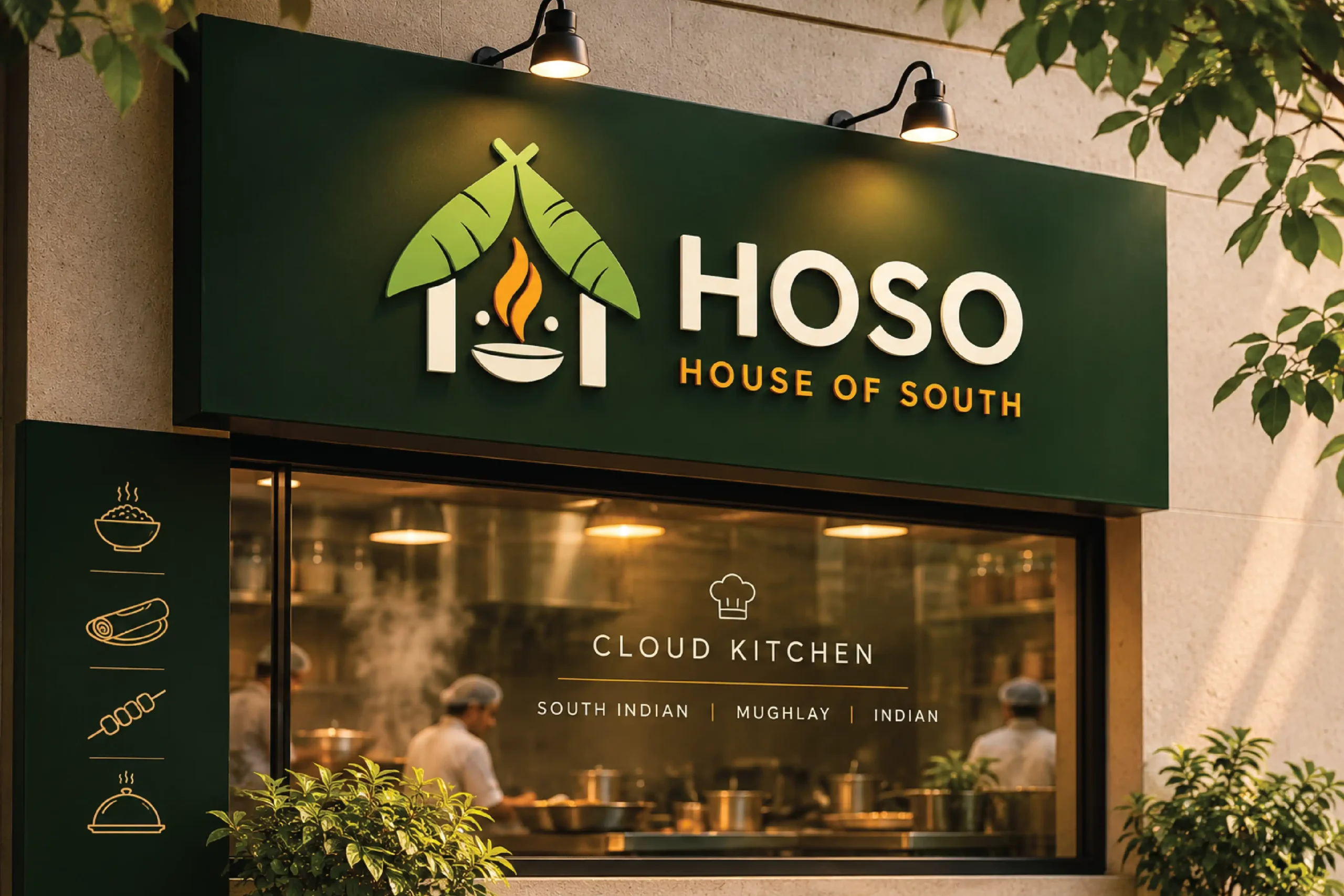
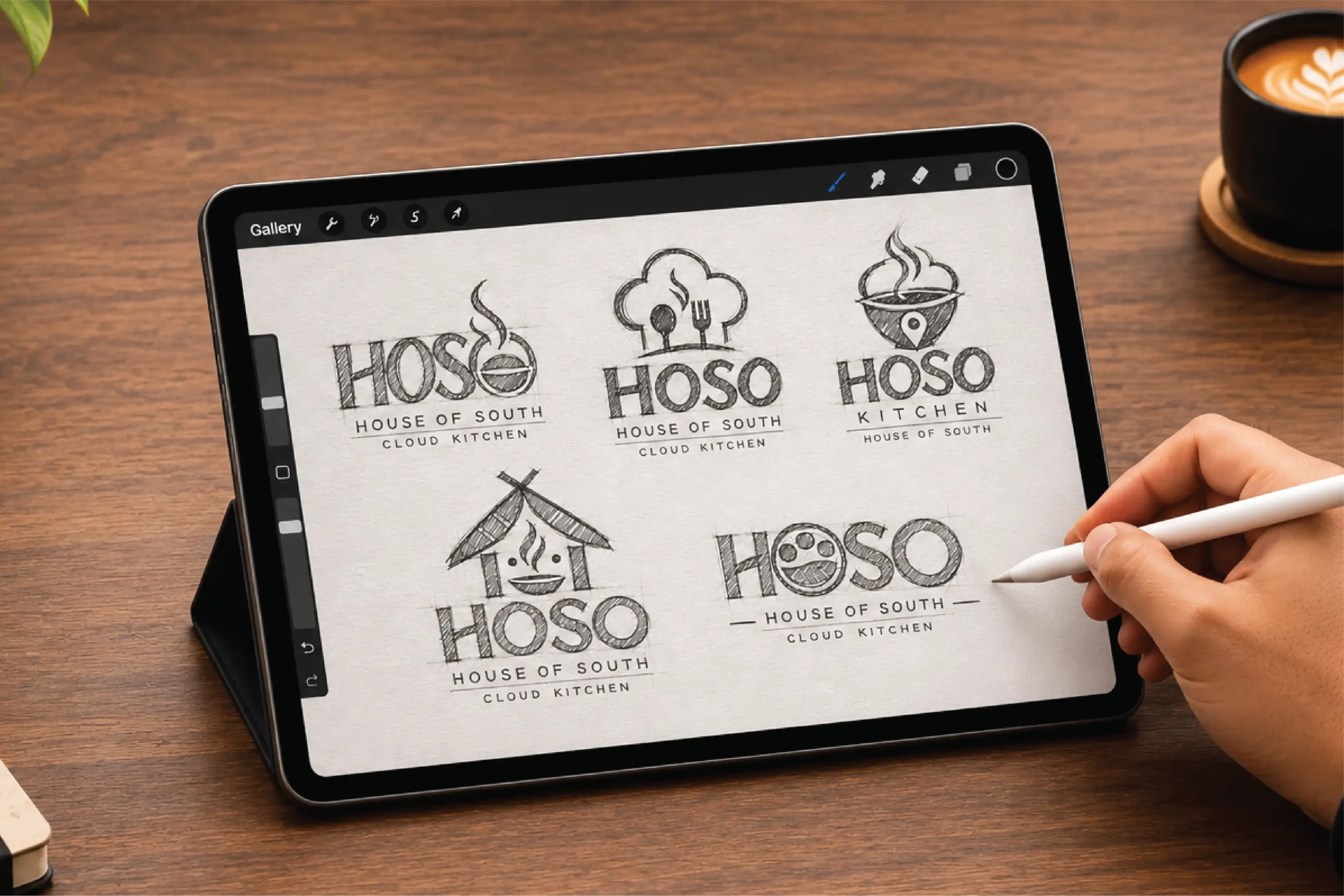
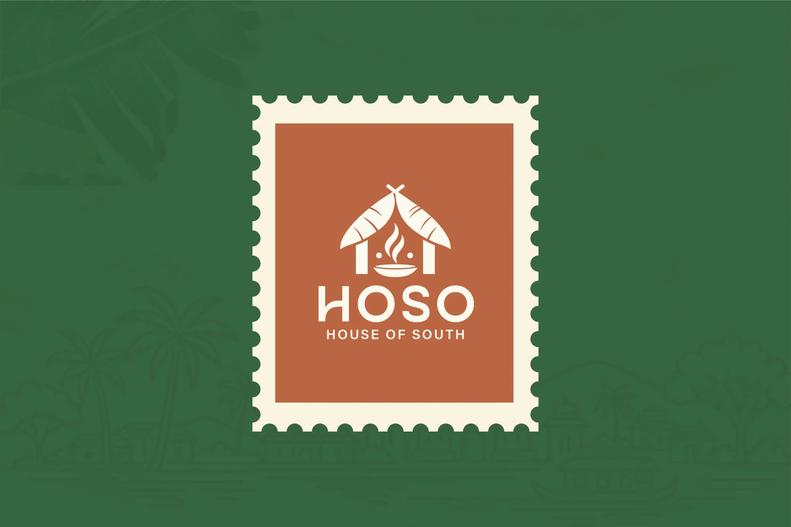
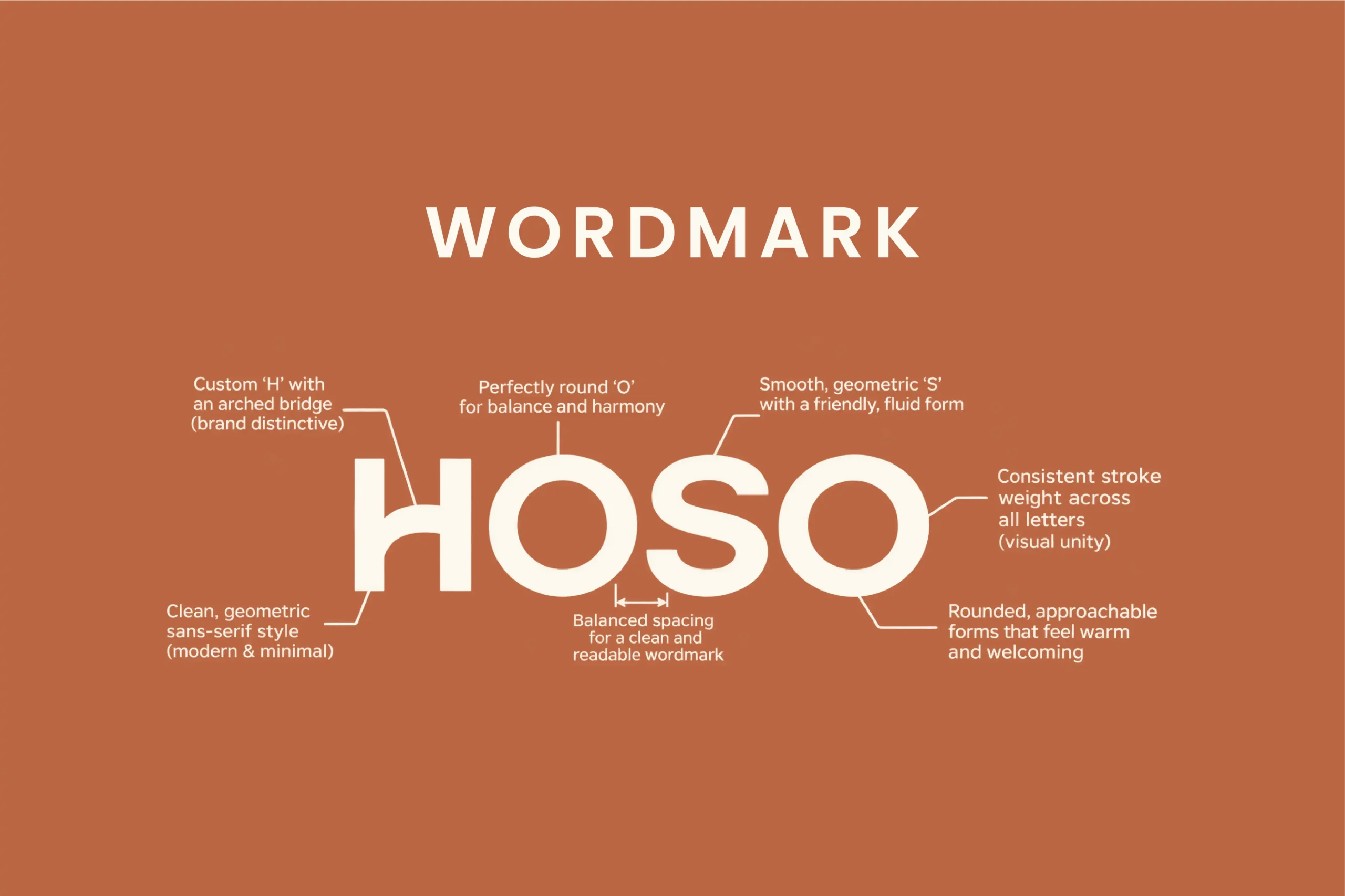
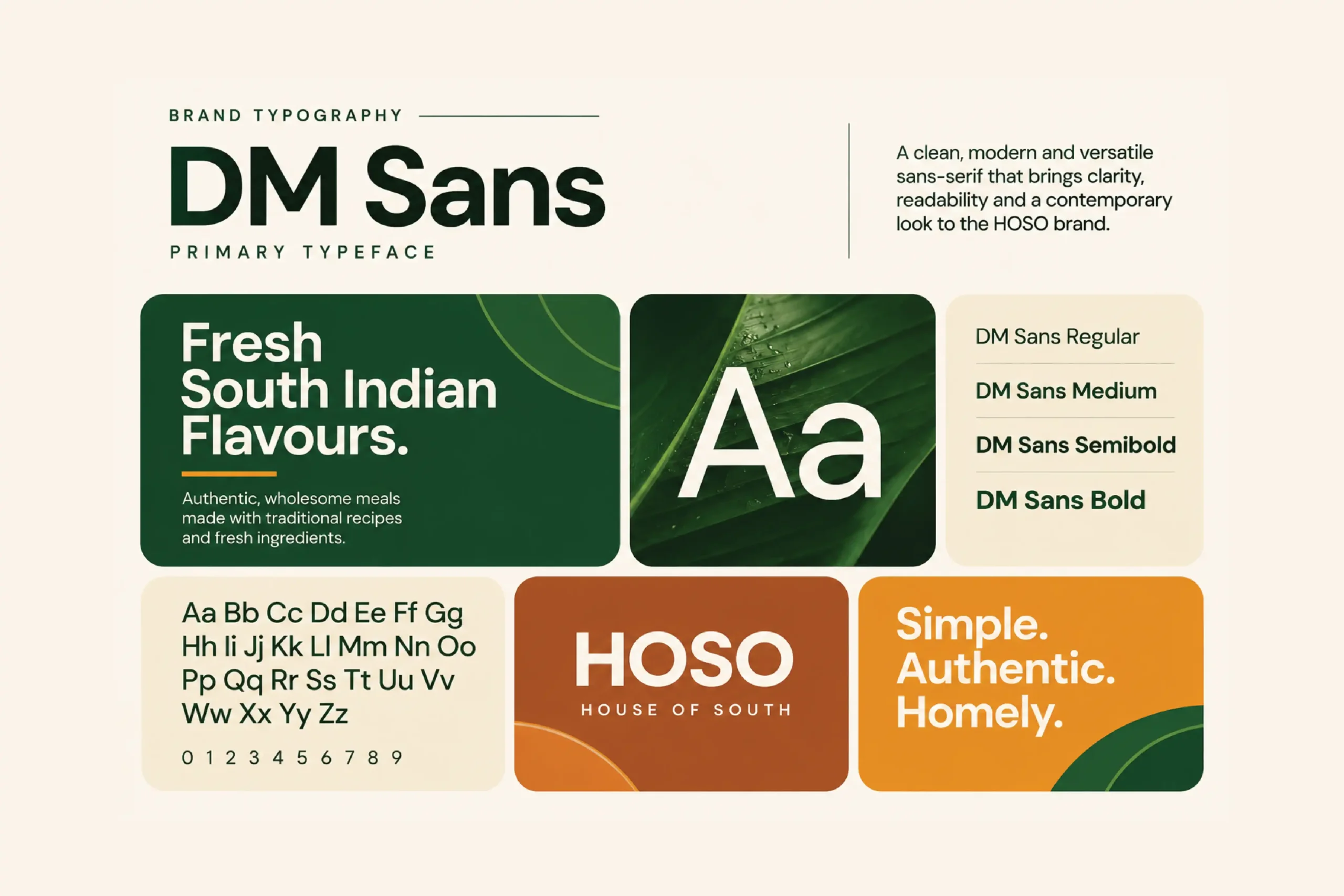
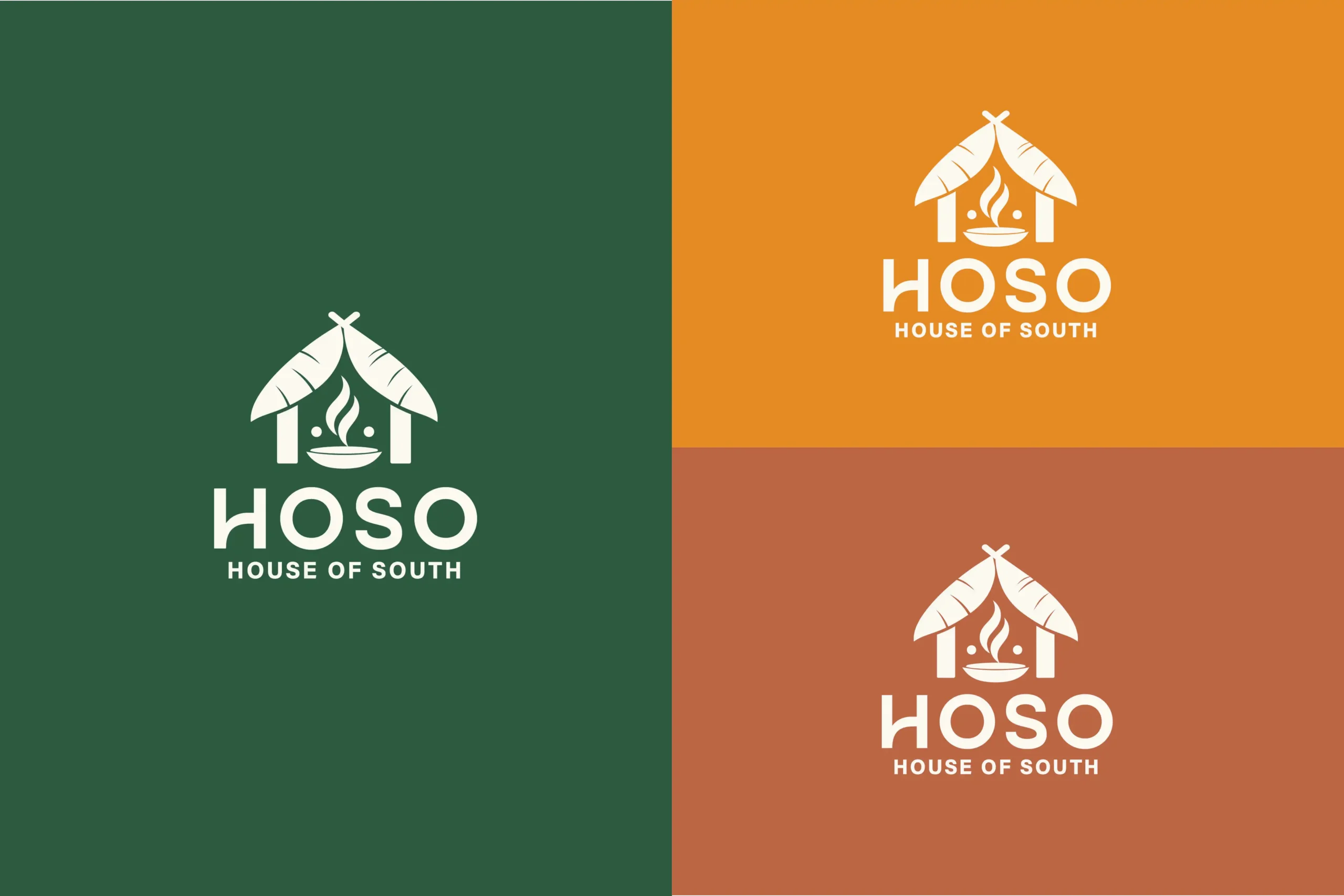
The logo exploration focused on combining the cloud-kitchen idea with a recognisable cooking element. The symbol brings these ideas together through a simple, food-led form, while the letter 'O' acts as a focal point — suggesting a plate, vessel or serving form within the HOSO name. The supporting typography was kept bold, clean and contemporary to give the name a confident presence. 'KITCHEN' sits beneath as a clear descriptor, with considered spacing that keeps the overall lock-up balanced and legible. The final direction was developed to remain effective in both full logo and standalone icon applications, making it adaptable for delivery apps, profile images, labels and packaging.
The Colour Story
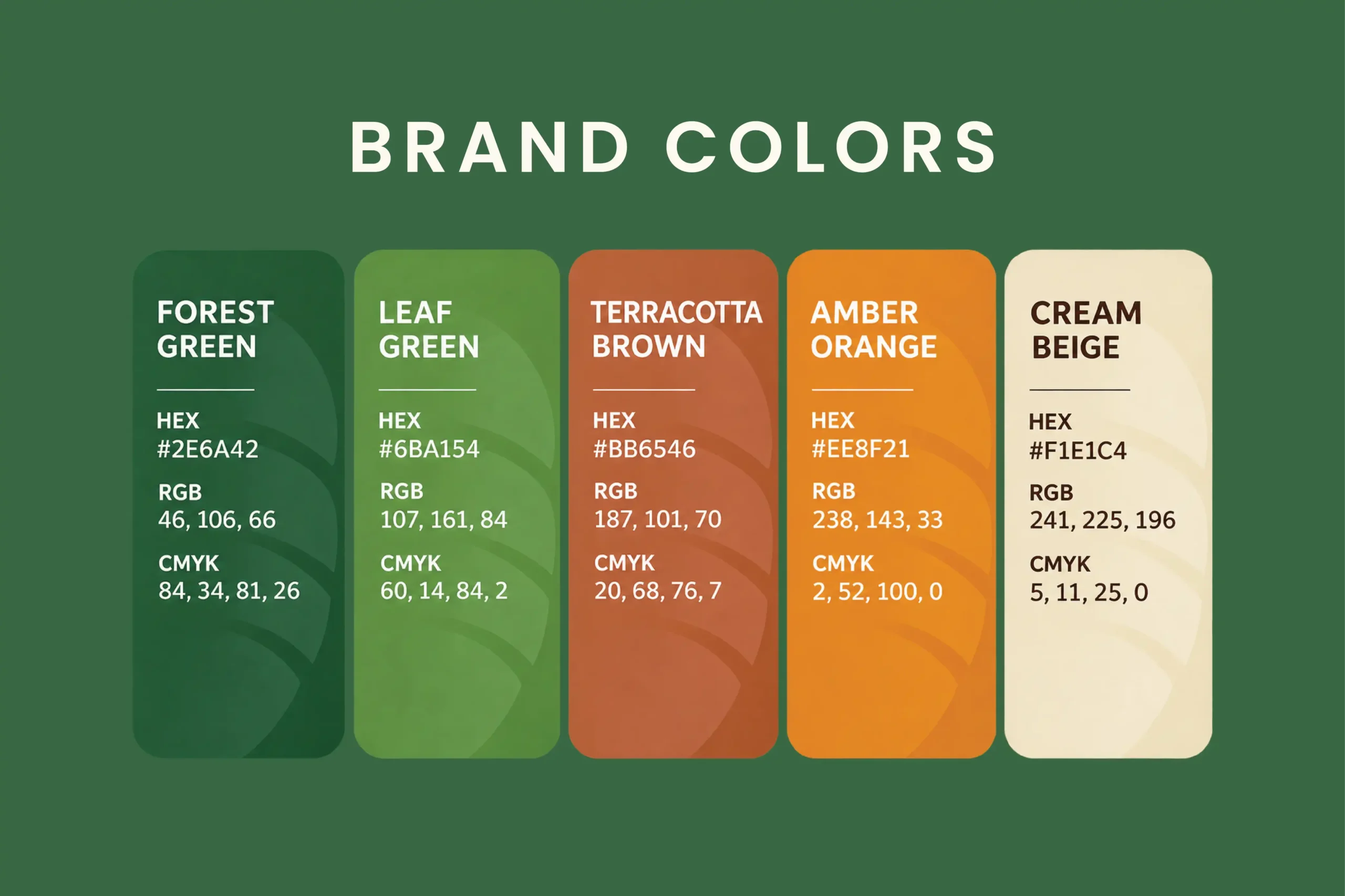
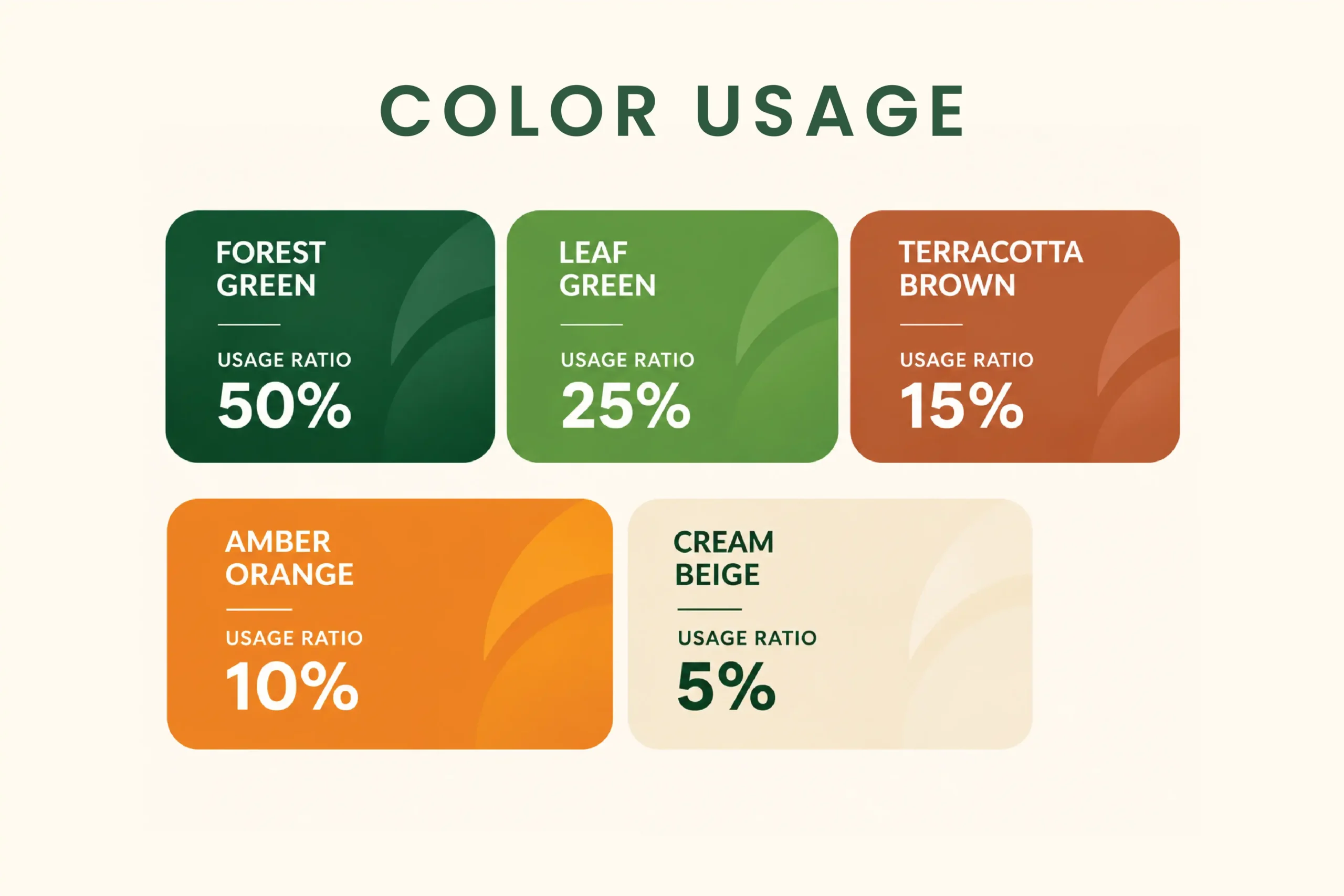
The palette balances freshness with appetite appeal, giving HOSO a recognisable presence across both food and digital environments. Deep Forest Green — #1F5214The primary colour. It brings depth, confidence and a natural association with freshness and ingredients, while giving the identity a strong visual foundation. Warm Golden Amber — #D9962BThe accent colour. It introduces warmth and energy, adding a food-friendly contrast that helps key elements stand out. Together, the colours create a balanced identity: grounded and dependable, with enough warmth to feel inviting. The palette is intentionally simple so it can be applied consistently across menus, packaging, uniforms and digital touchpoints.
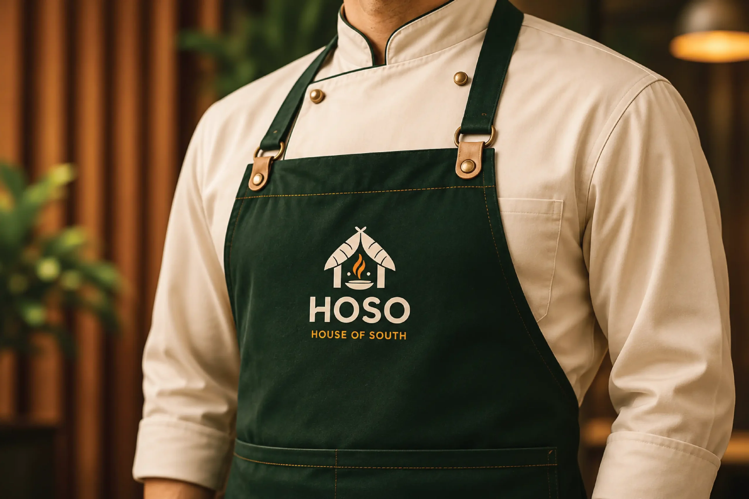
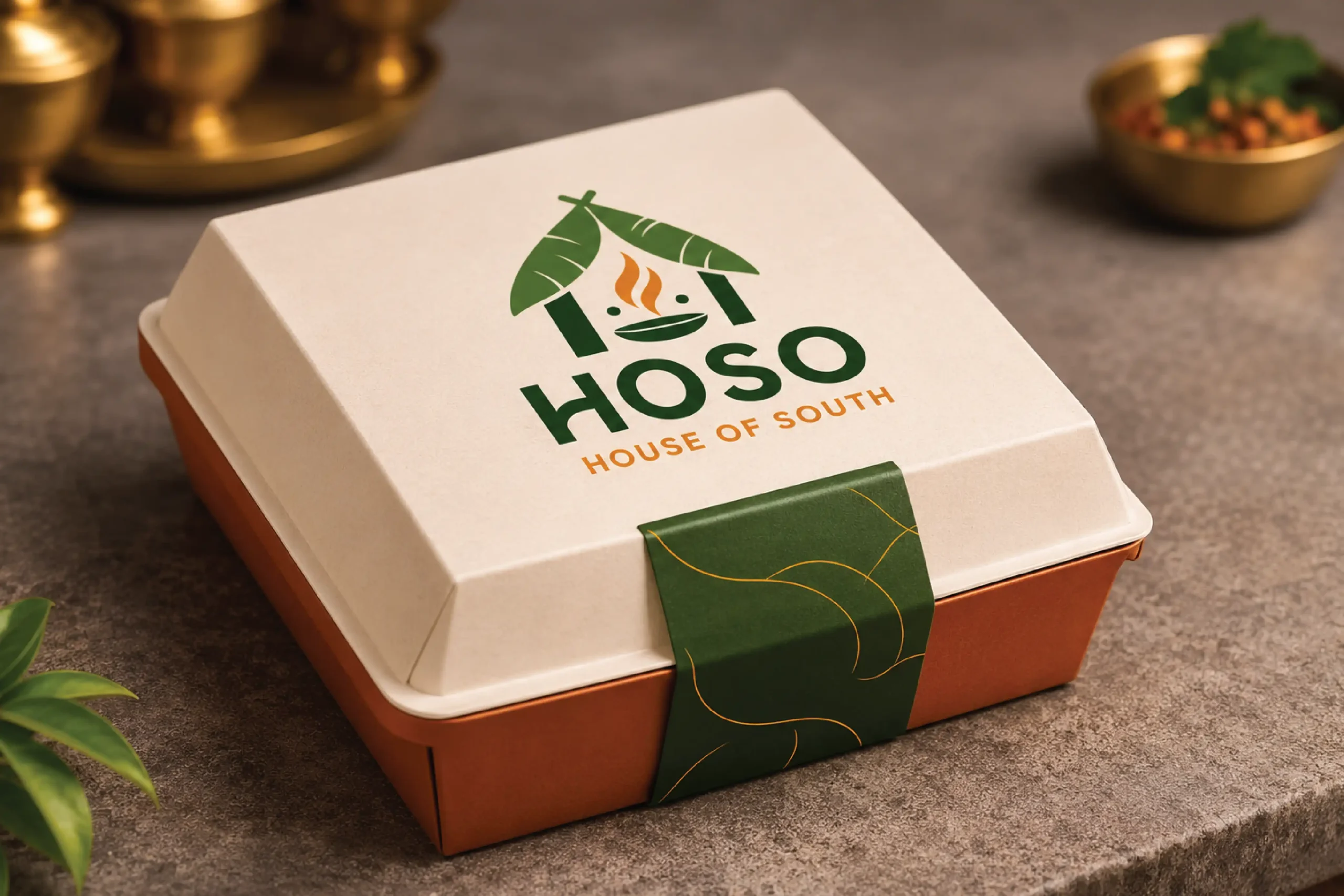
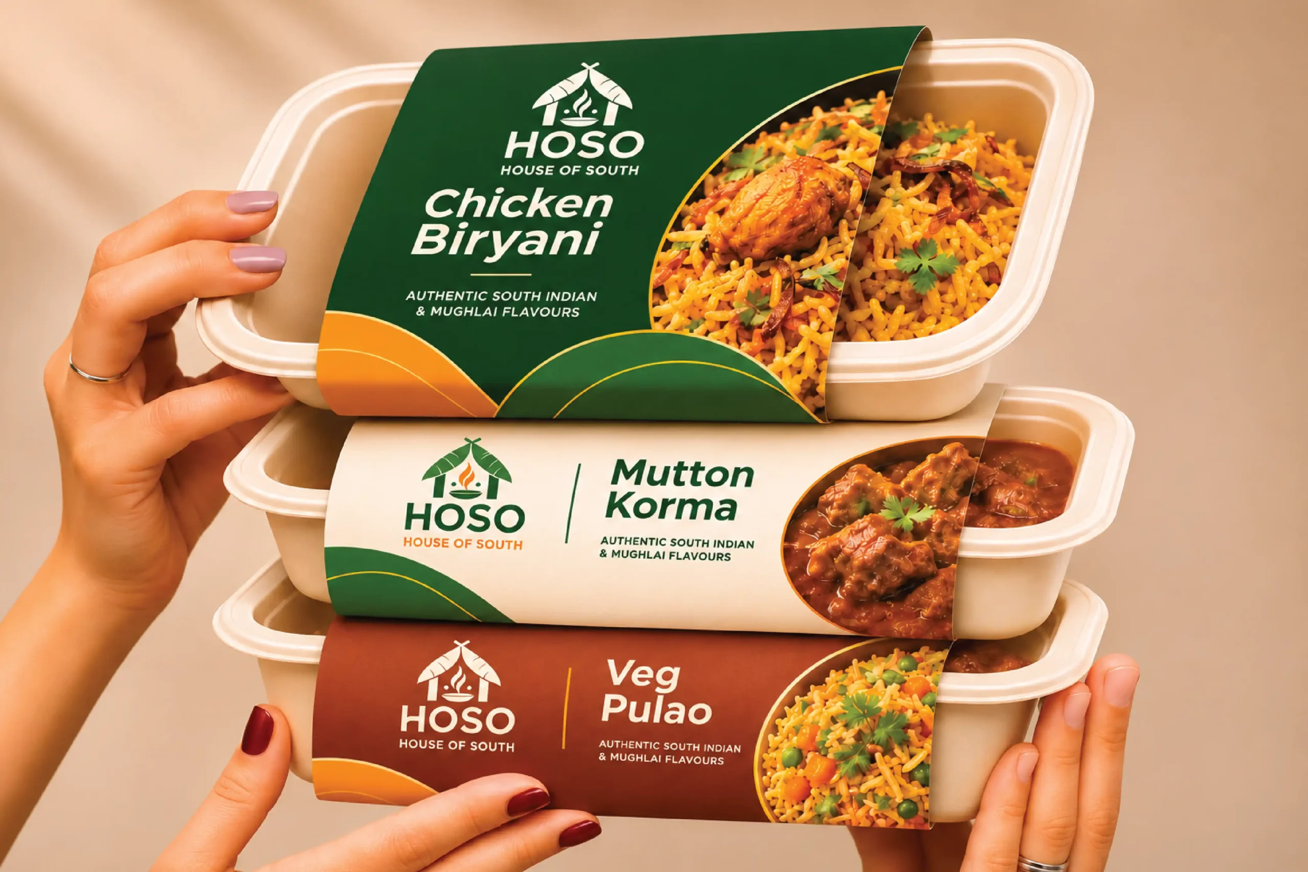
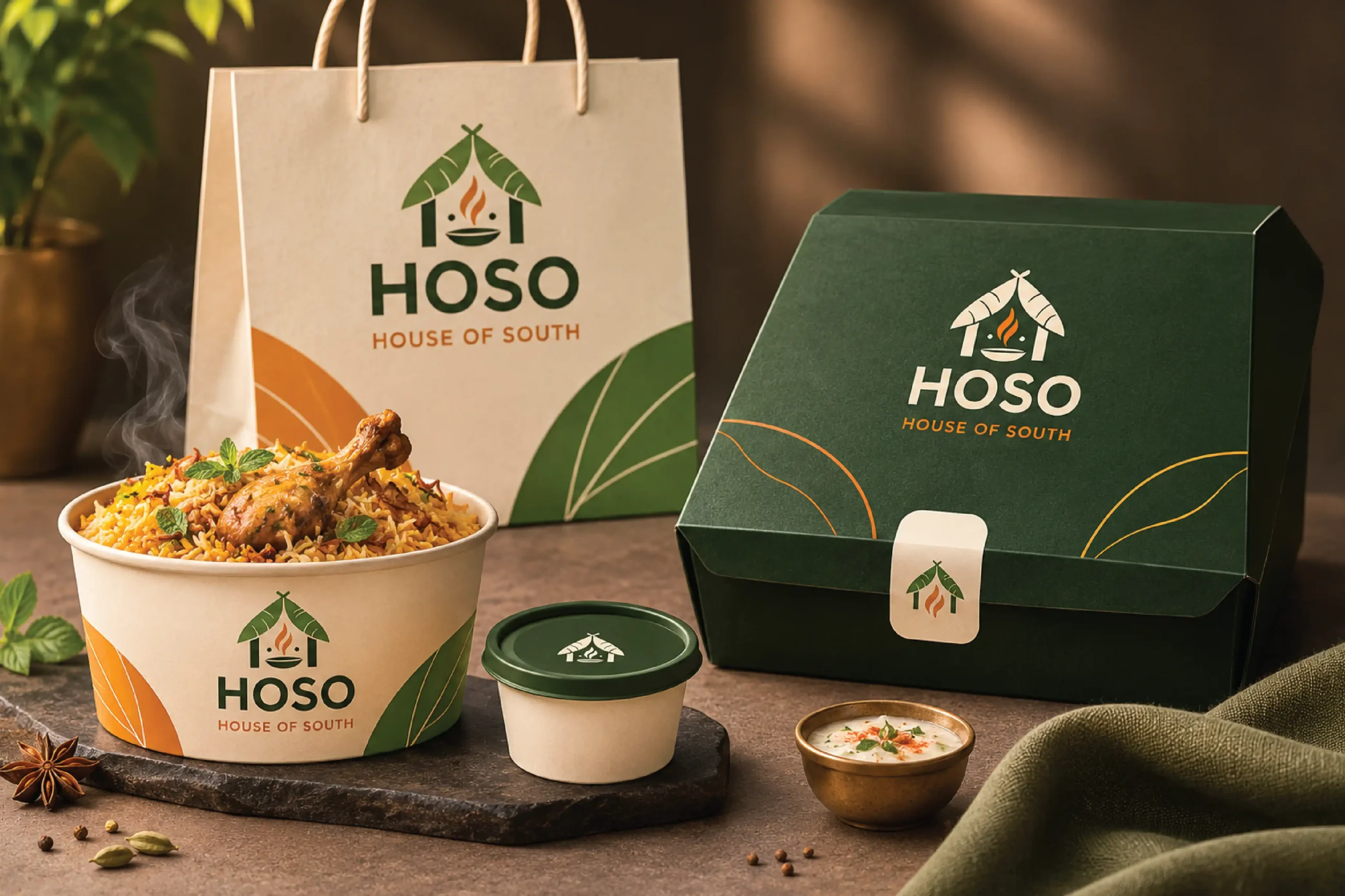
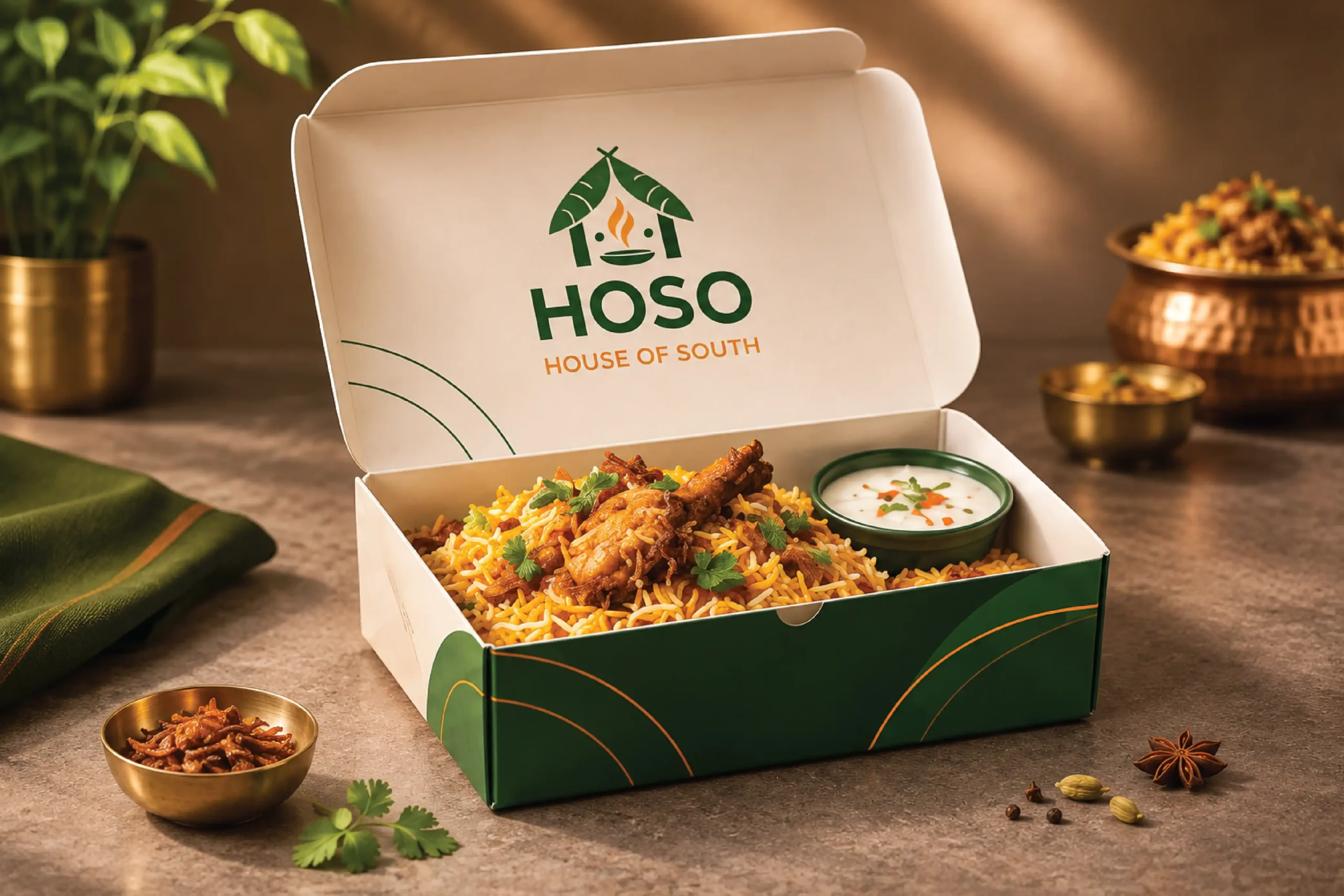
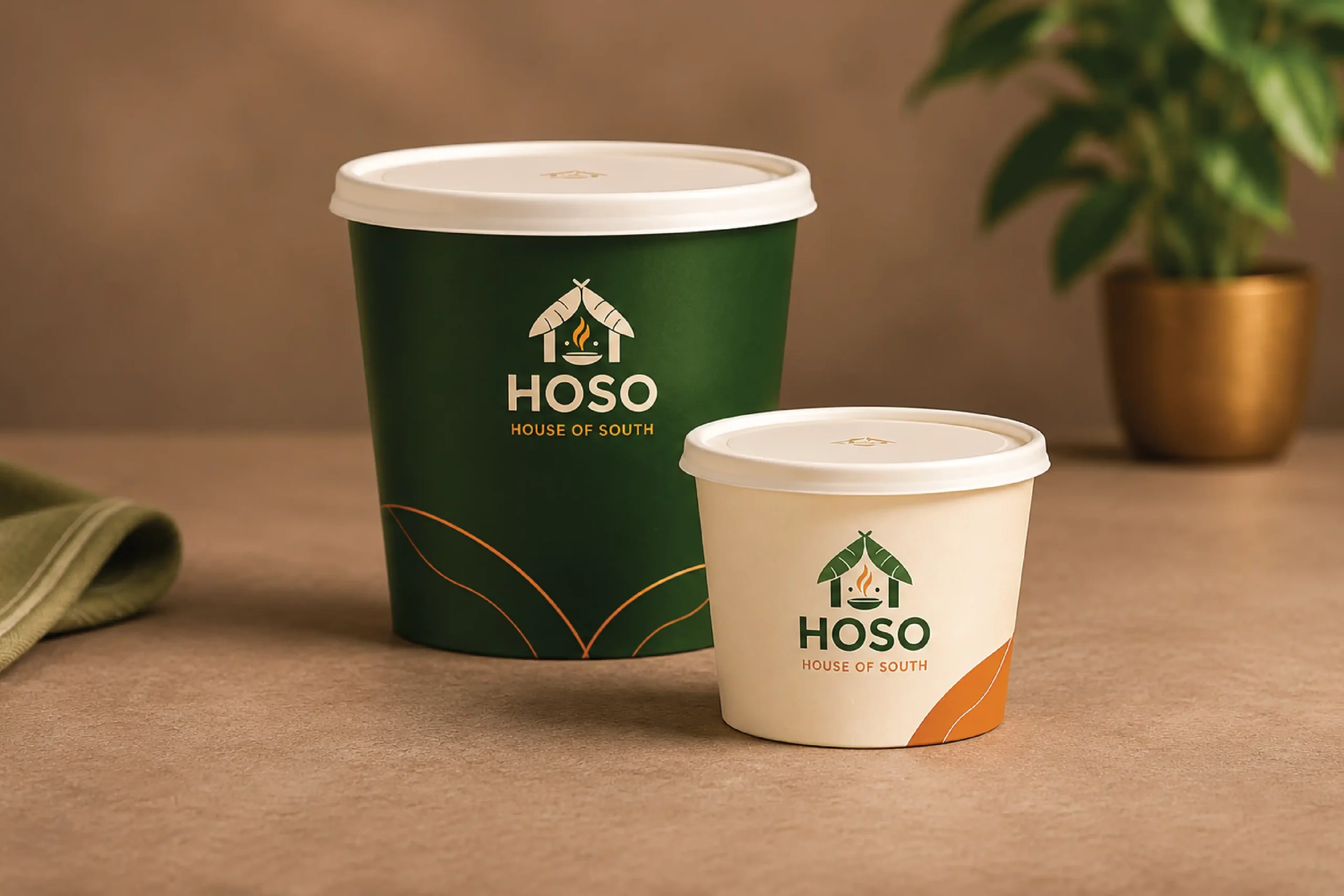
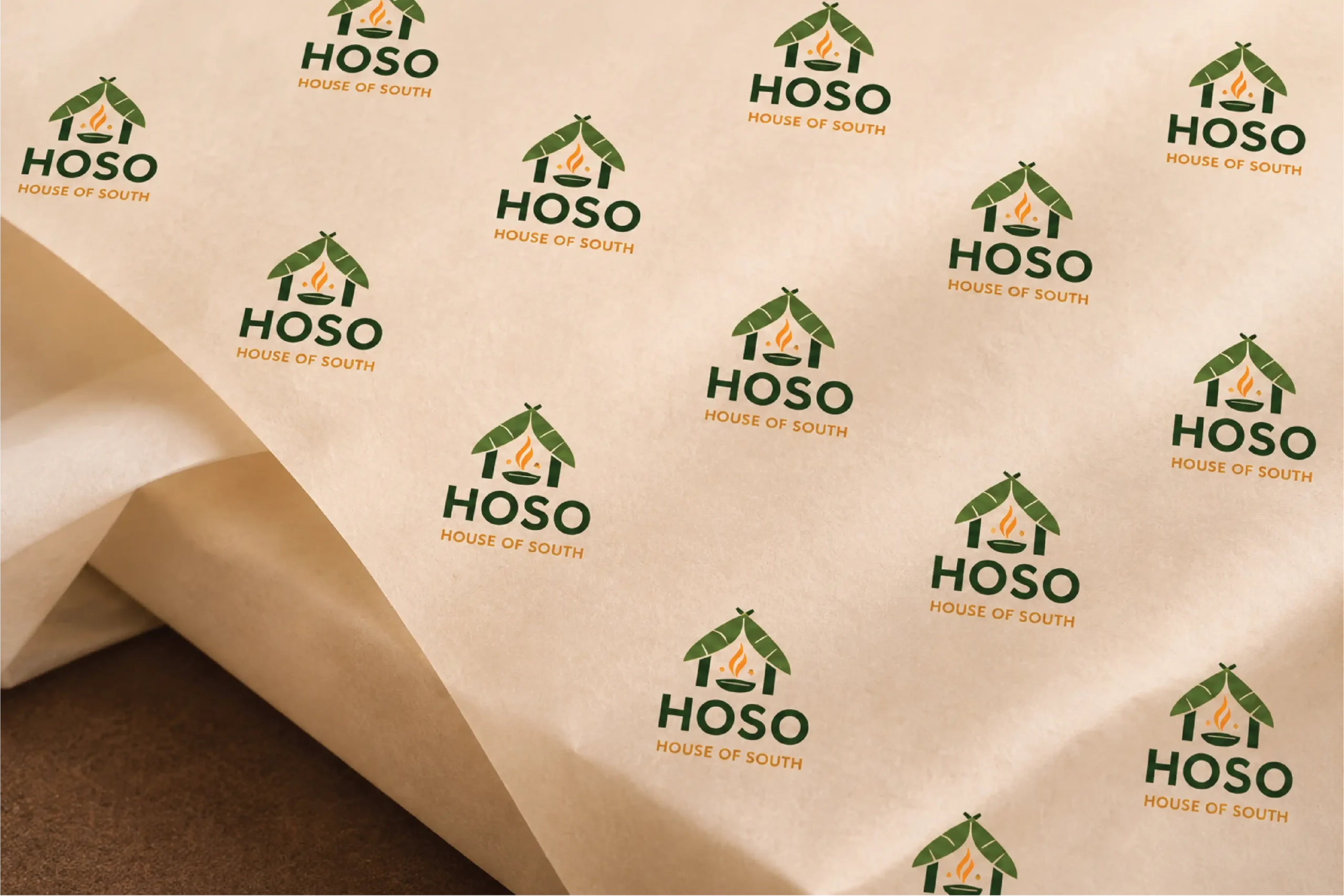
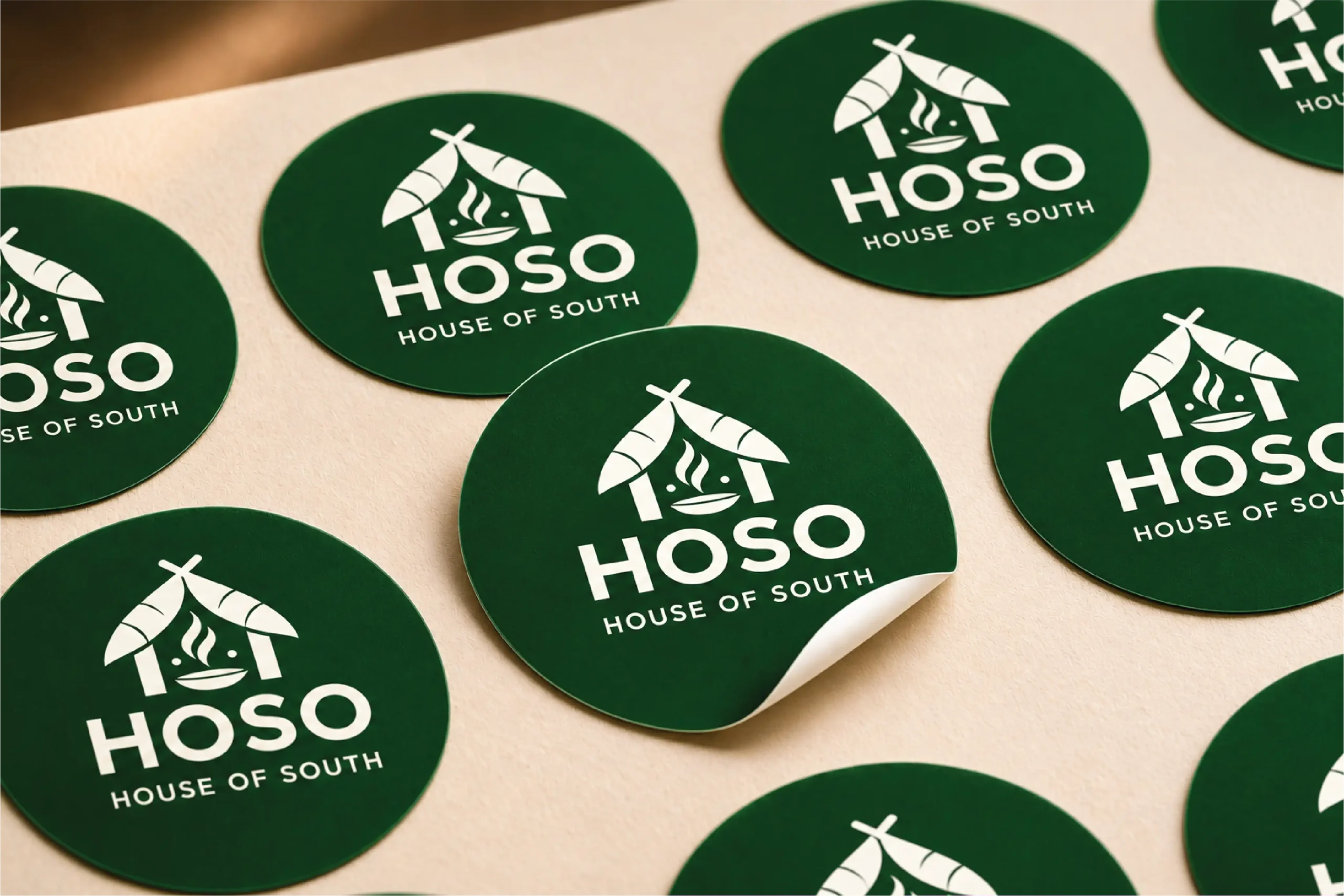
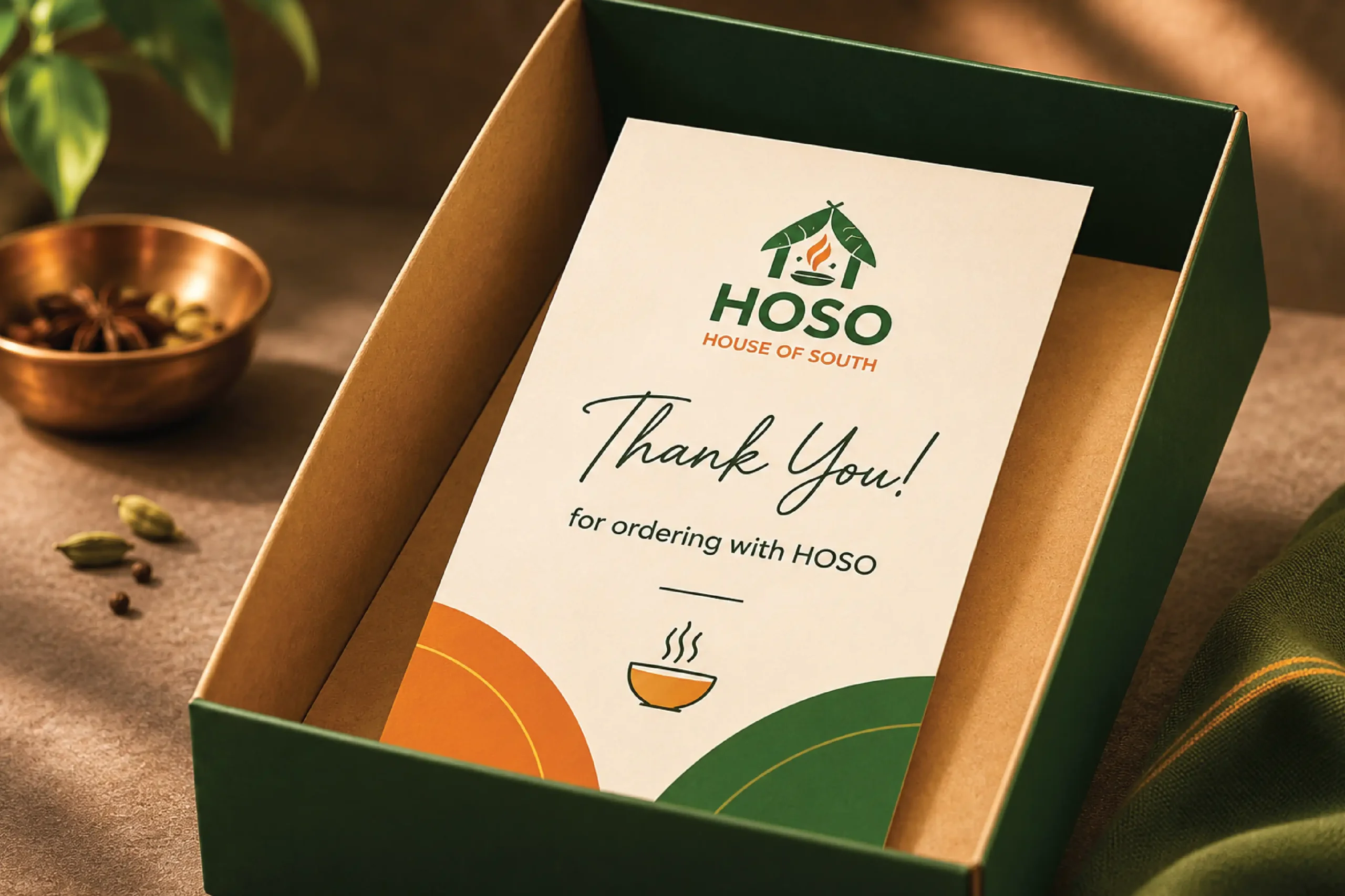
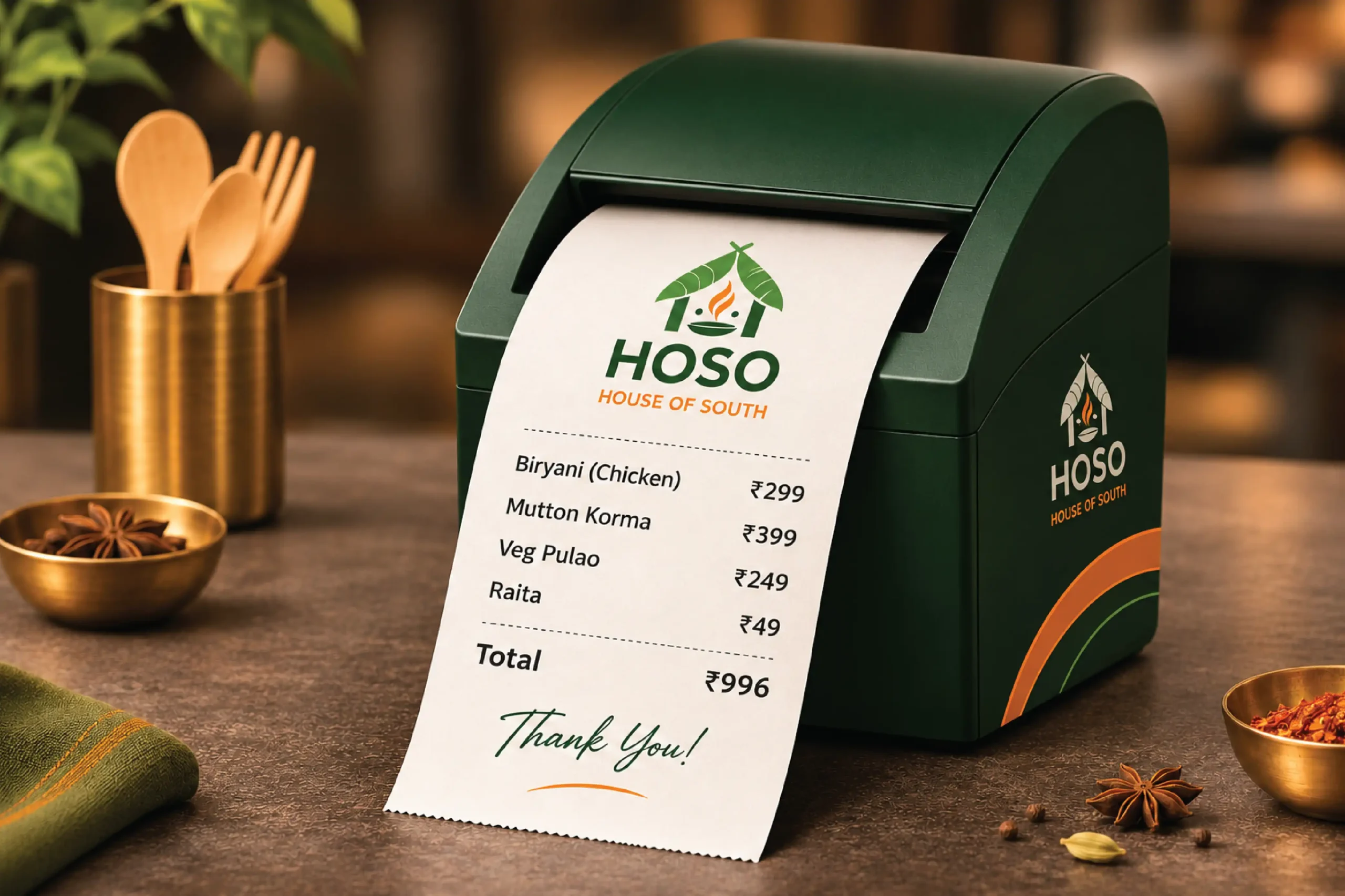
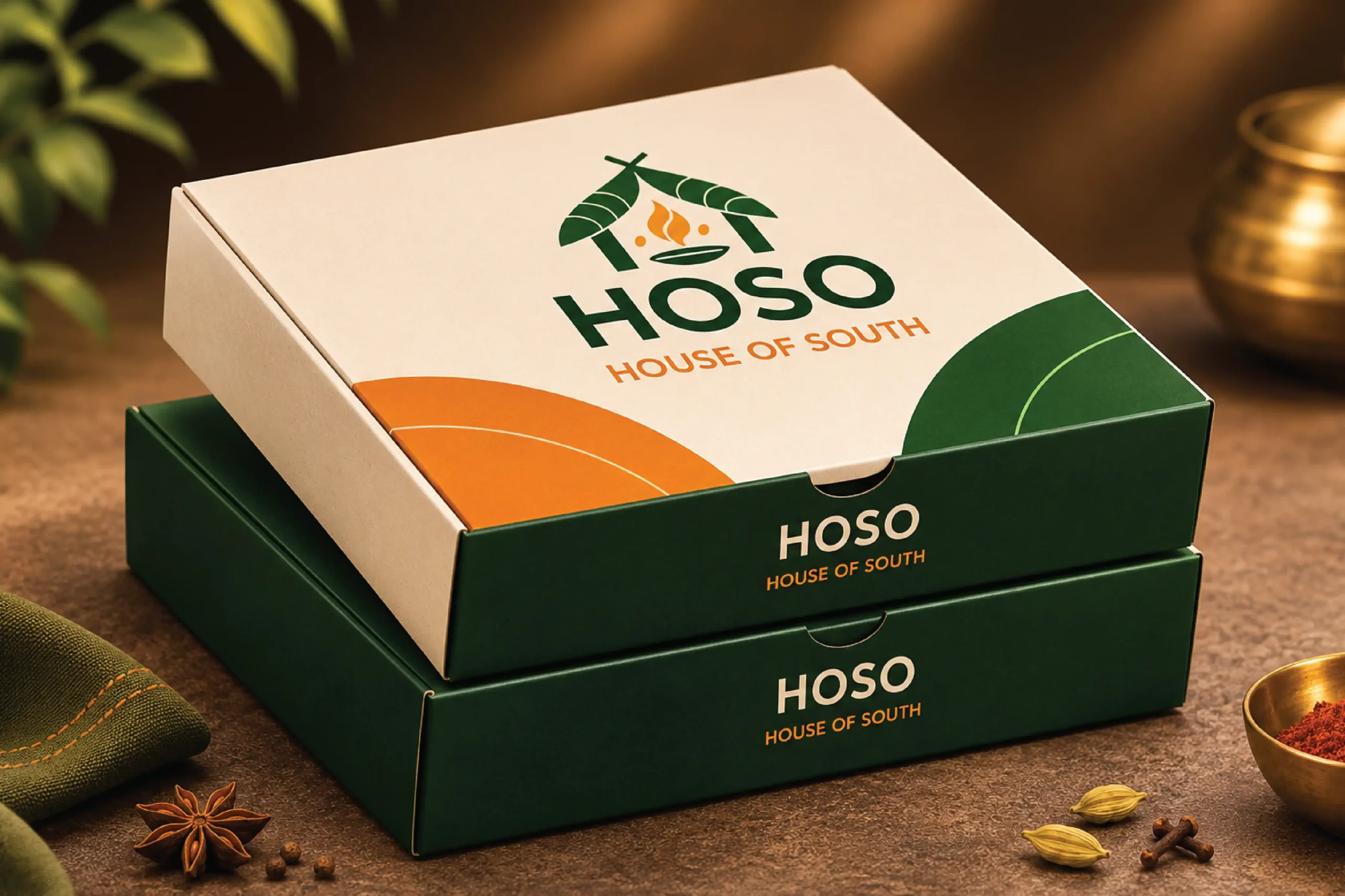
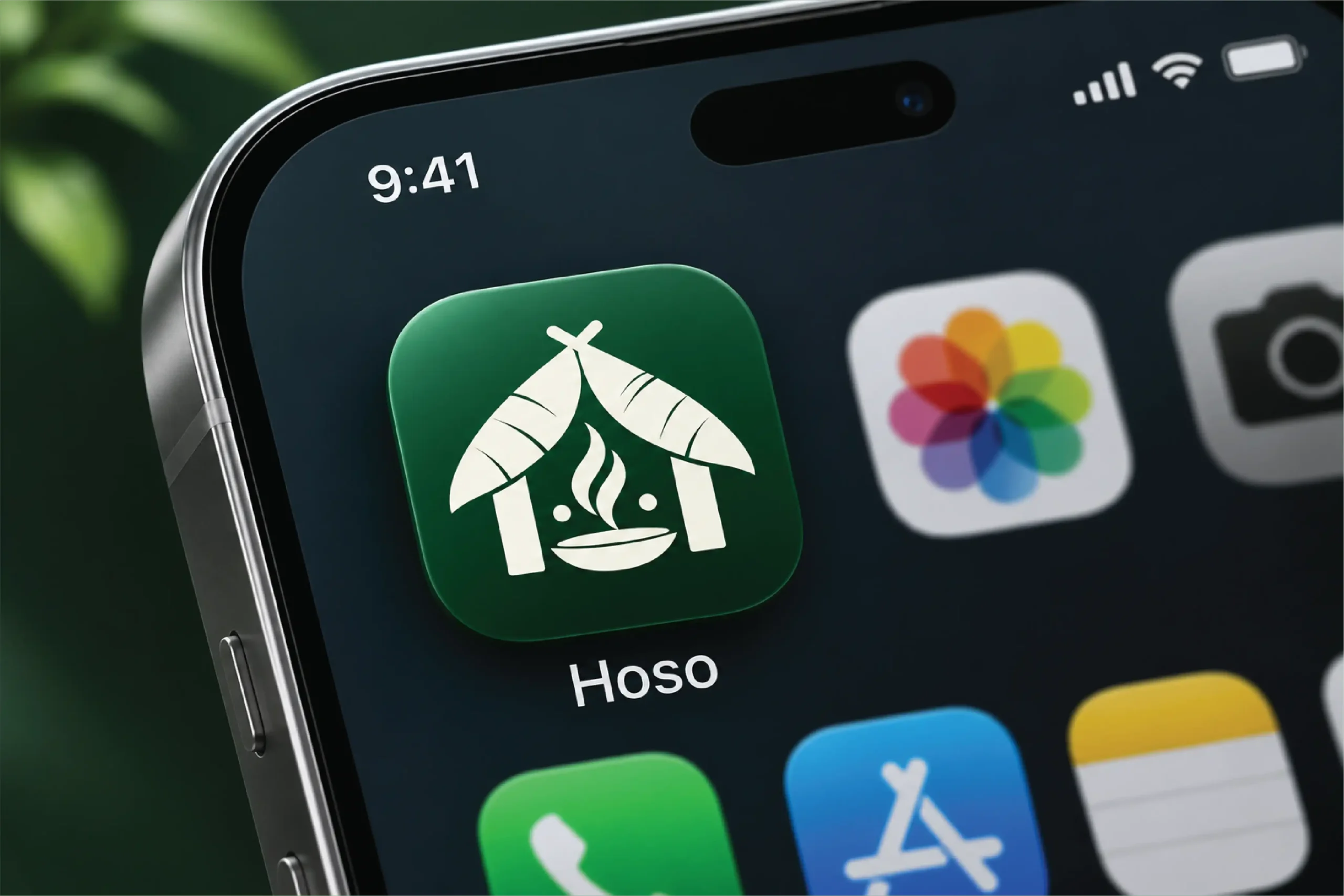
The Brand in Use
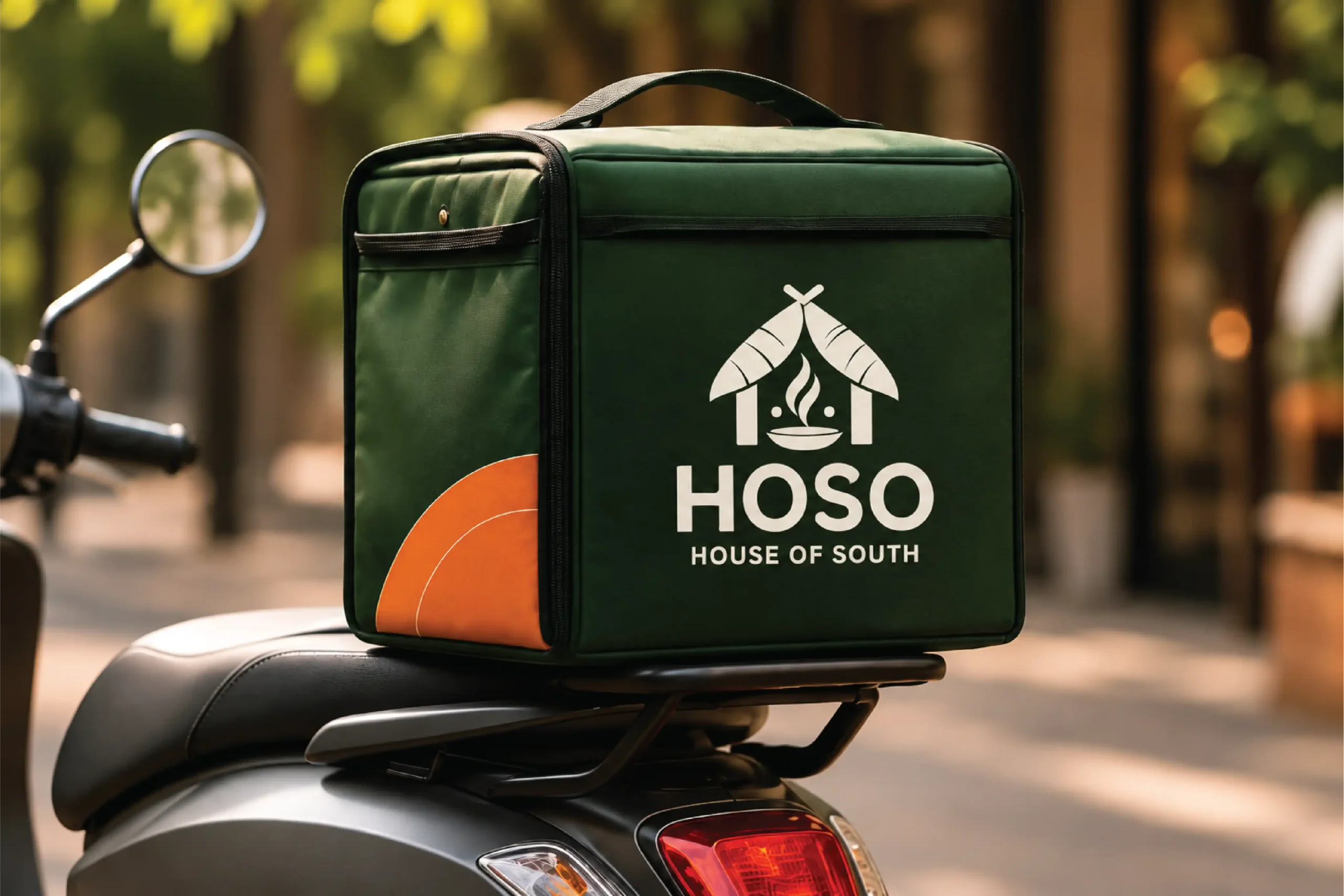
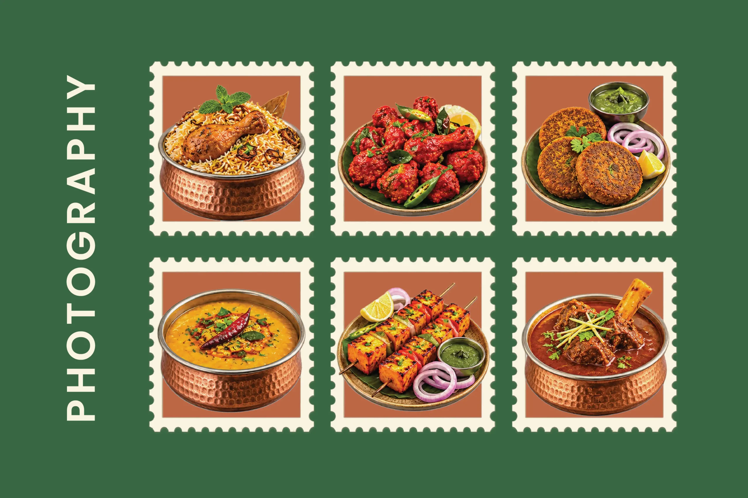
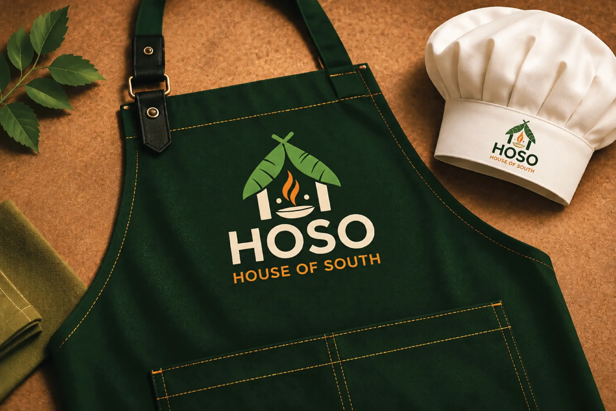
HOSO brings a broad food offering under one clear and recognisable identity. The brand balances its South Indian inspiration with the flexibility of a contemporary cloud kitchen, creating a visual system that can move confidently across cuisines, platforms and customer touchpoints.More than a logo, the identity gives HOSO a consistent way to show up — from the first digital impression to the moment the food arrives.