01) Overview
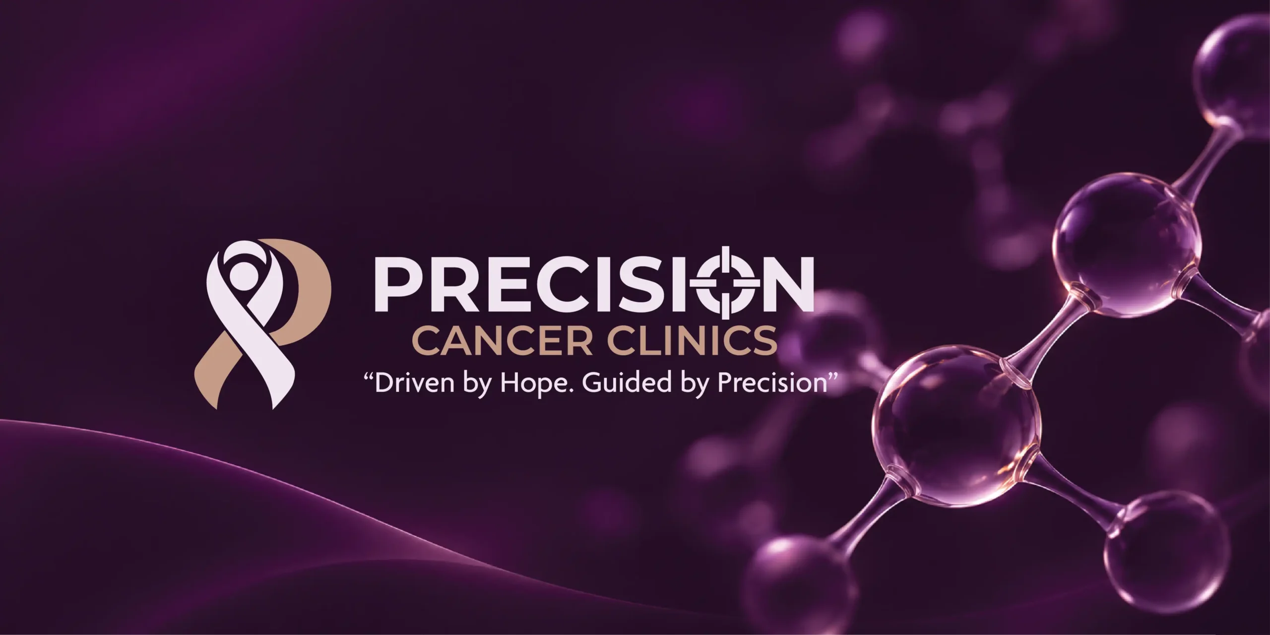
Precision Cancer Clinics is a cancer care brand built on two ideas: hope and precision. The brief was an identity that feels human, credible and calm, for people who arrive worried. IM Creative designed the cancer clinic branding: logo, colour, typography and applications. One line runs through all of it. Driven by Hope. Guided by Precision.
Client: Precision Cancer Clinics Industry: Healthcare & Oncology Scope of Work: Logo Design, Visual Identity, Typography, Colour System, Stationery, Signage, Social Media and Brand Applications.

02) The Creative Challenge
Clinical trust. Human warmth.
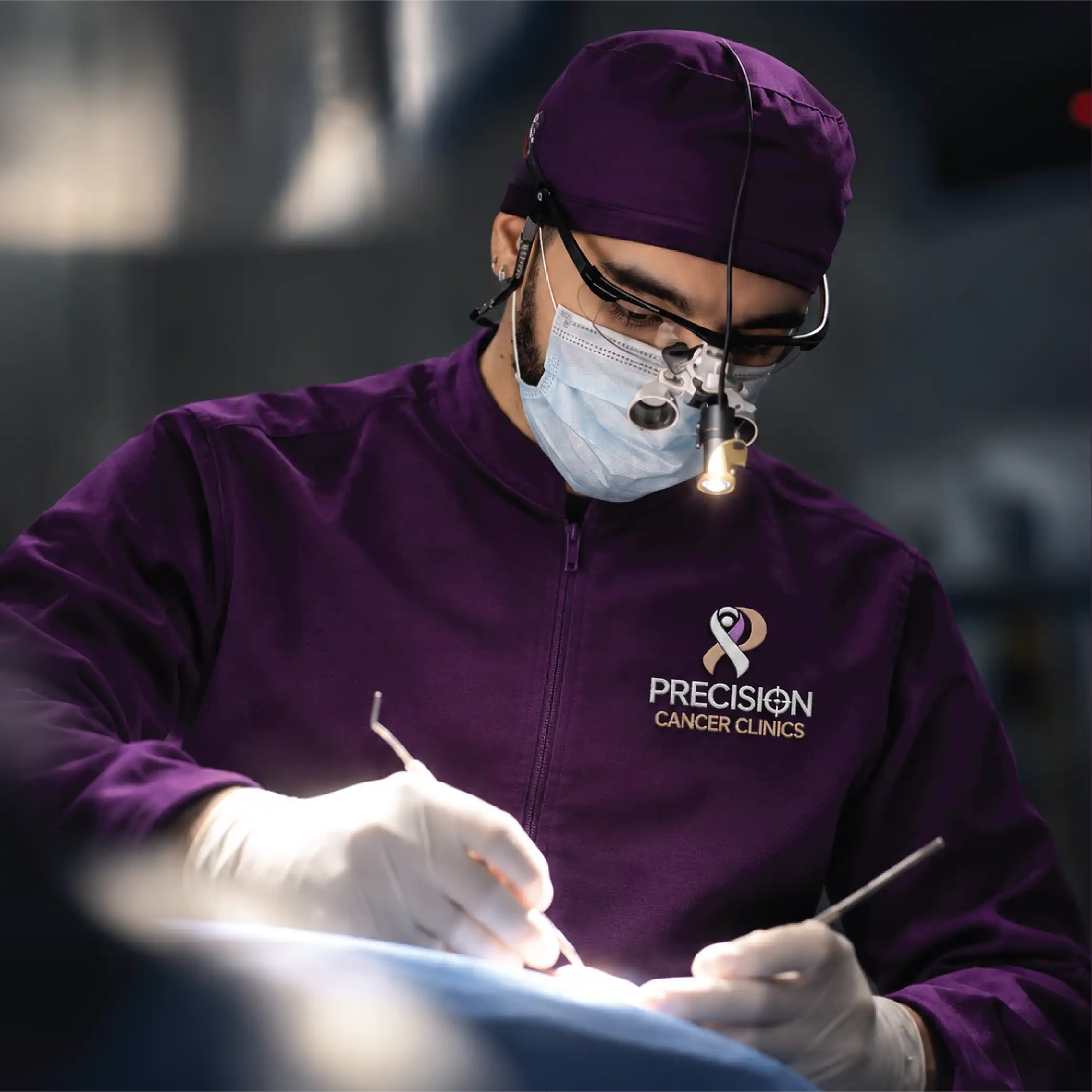
Cancer care is serious. It is also personal. The identity had to carry both.No cold hospital look. No false cheer. It had to work on a doctor's coat, a clinic wall and a patient's phone.
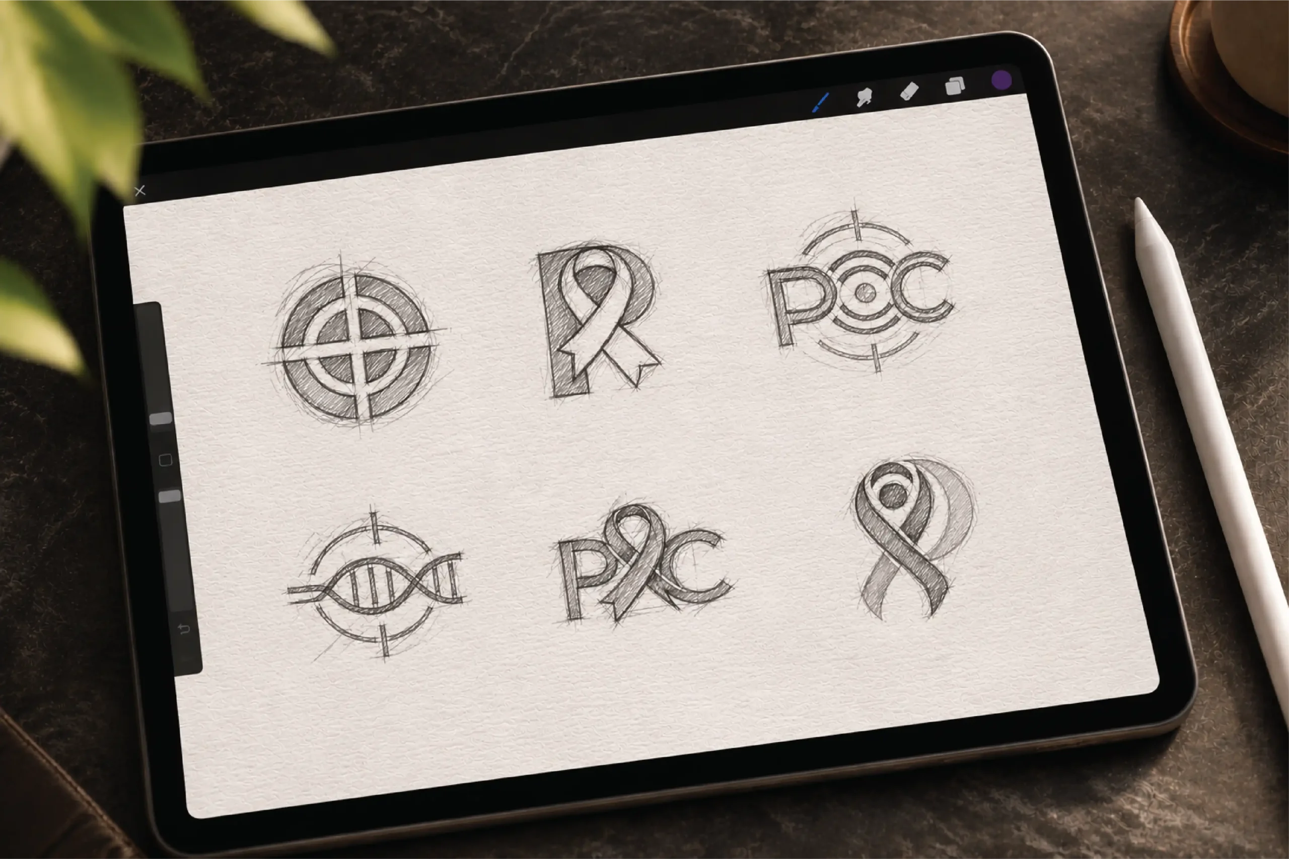
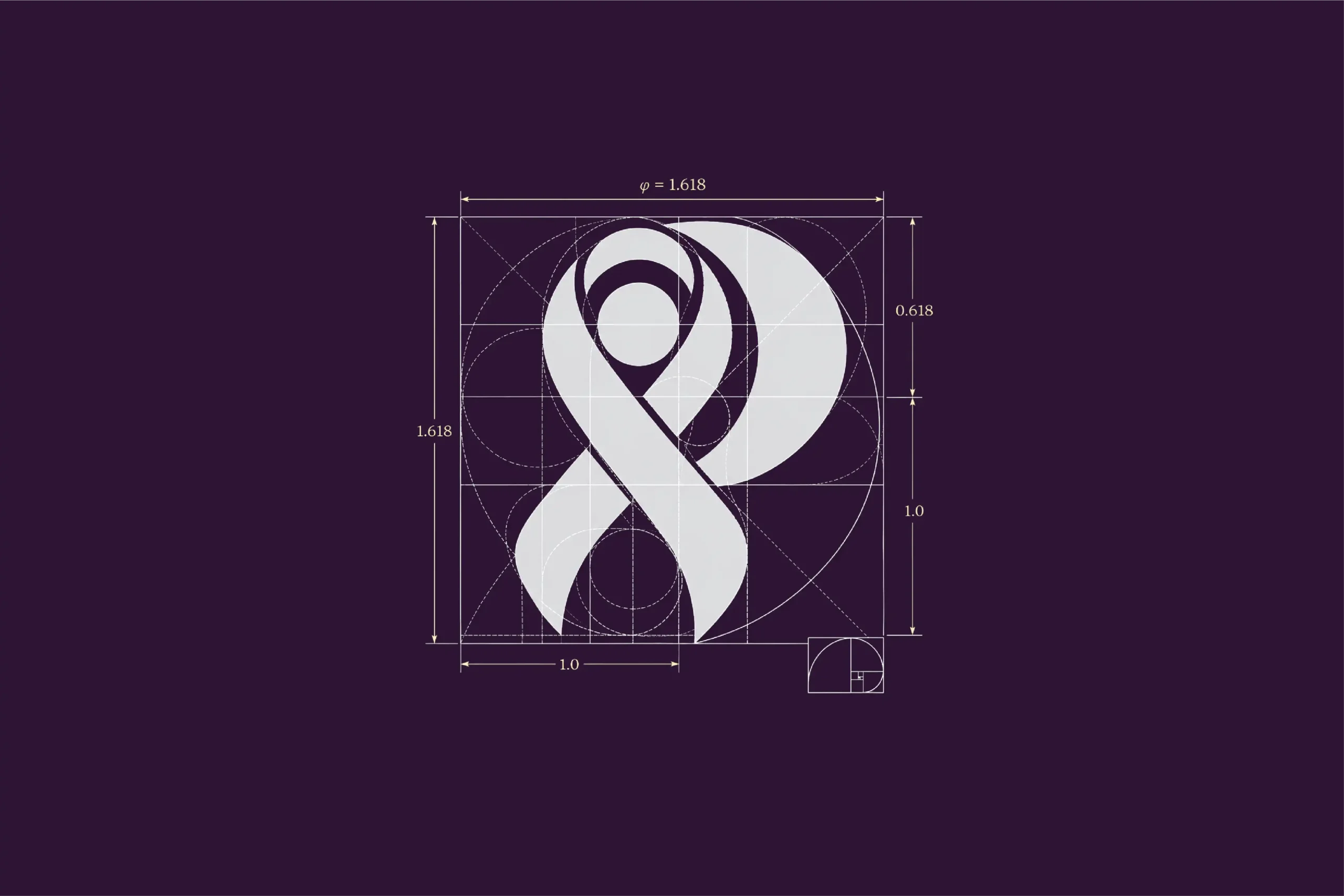
03) The Approach
Care at the centre. Precision behind it.
IM Creative built the direction on three ideas. Compassionate care. Accurate, personalised treatment. Hope. Purple for the awareness ribbon. Rose clay for warmth. Modern, humanist type for clarity. The patient sits at the centre of the mark.
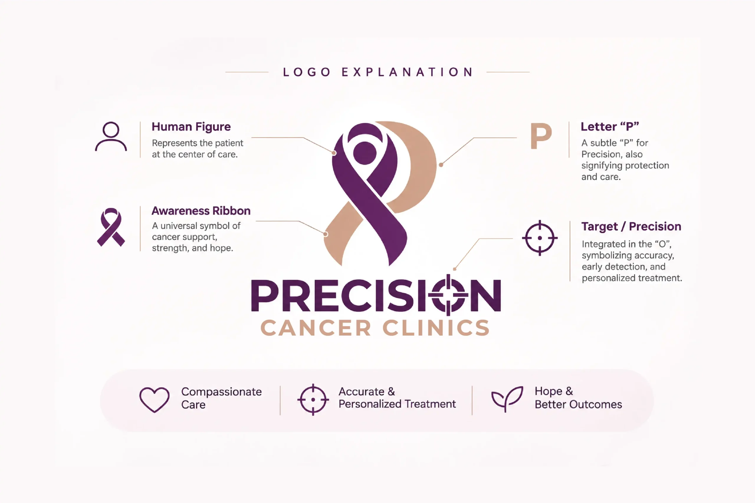
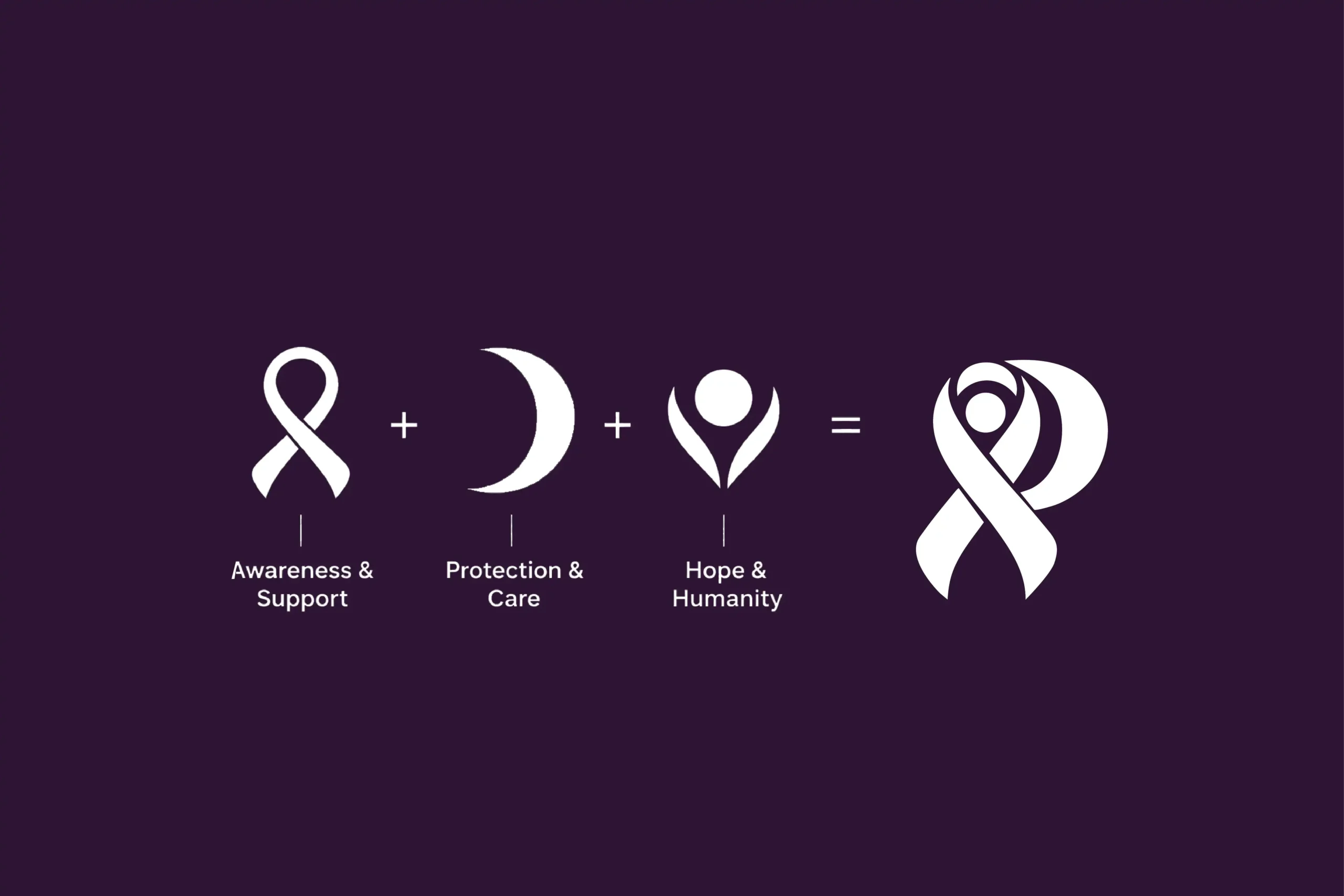
04) The Concept
A ribbon. A person. A target.
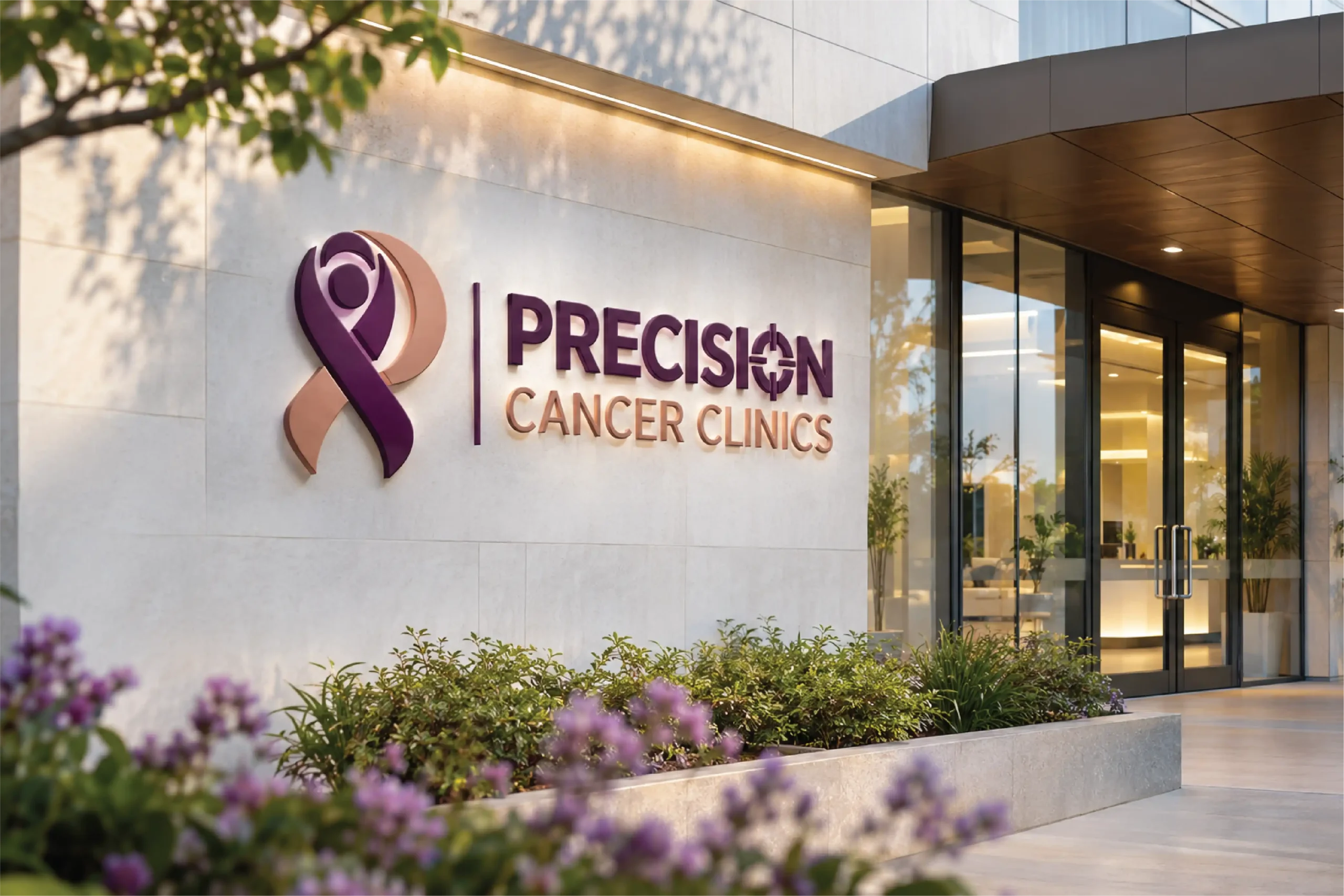
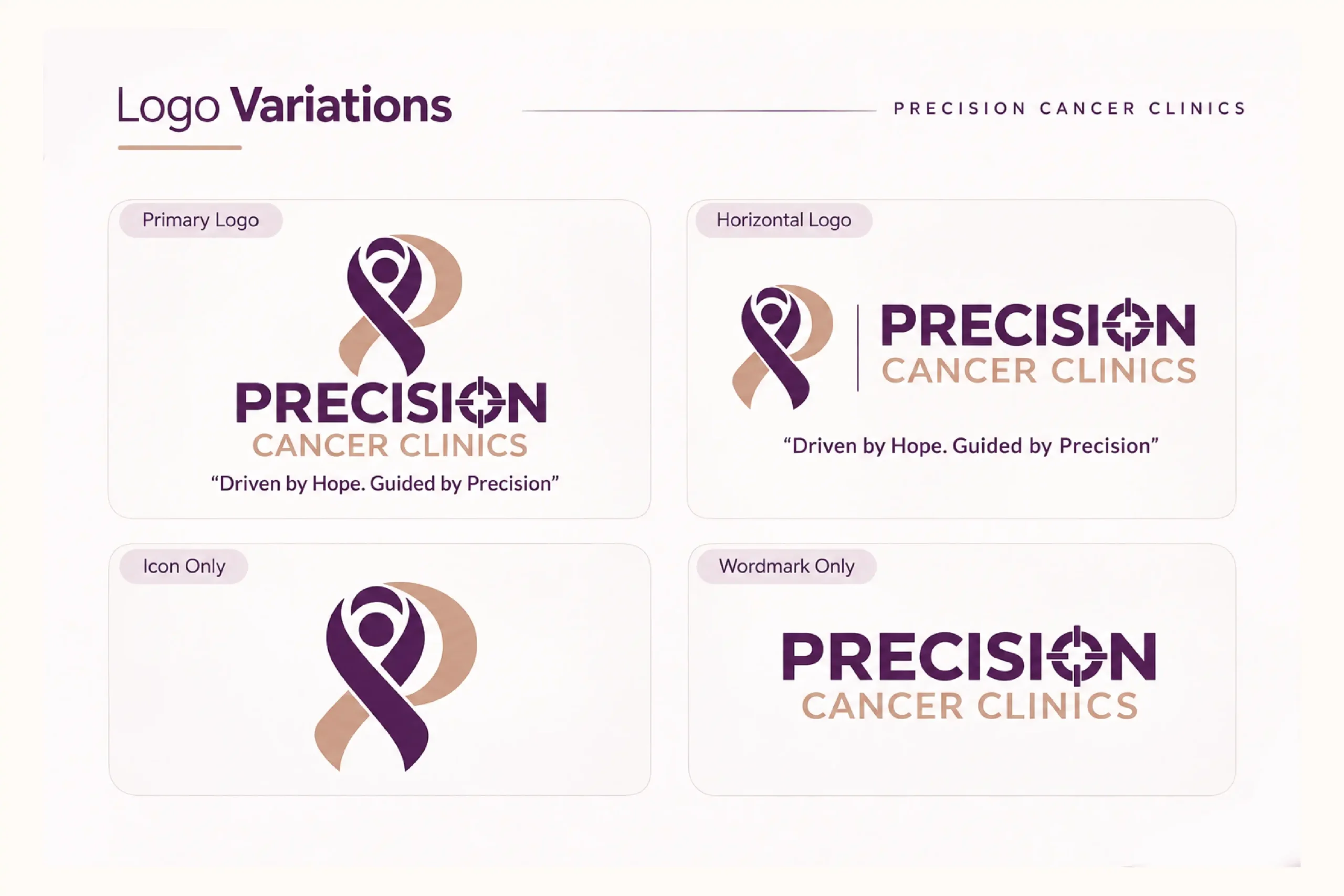
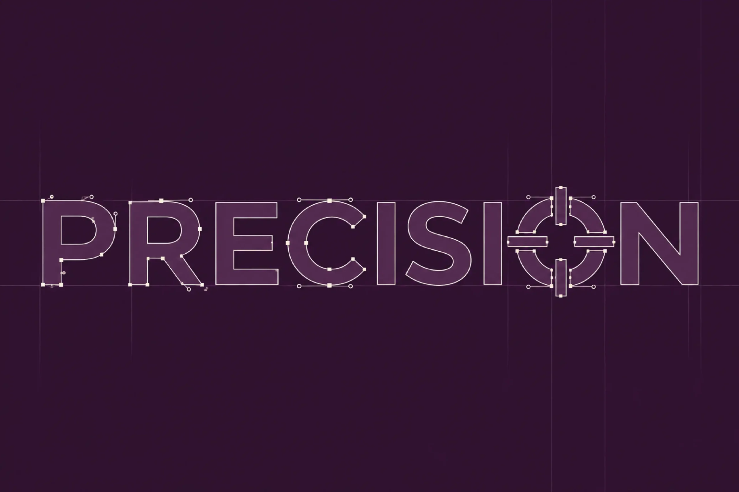
Three symbols. One mark. The awareness ribbon stands for awareness and support. The crescent stands for protection and care. The human figure stands for hope and humanity. Together they form a subtle P for Precision. The wordmark carries one more idea. A crosshair sits inside the O. It stands for accuracy, early detection and personalised treatment.

05) The Visual Identity
Calm. Credible. Human.
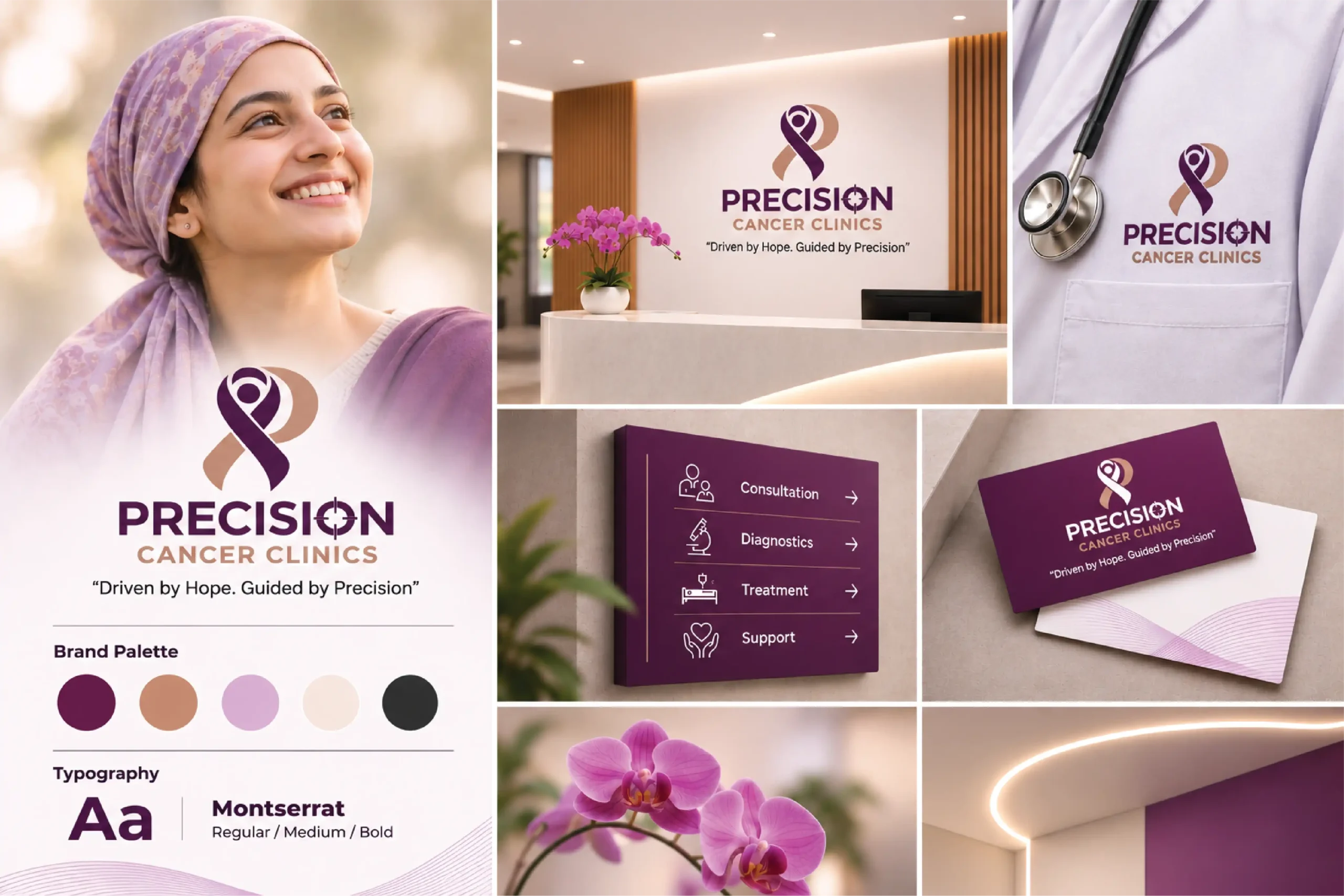
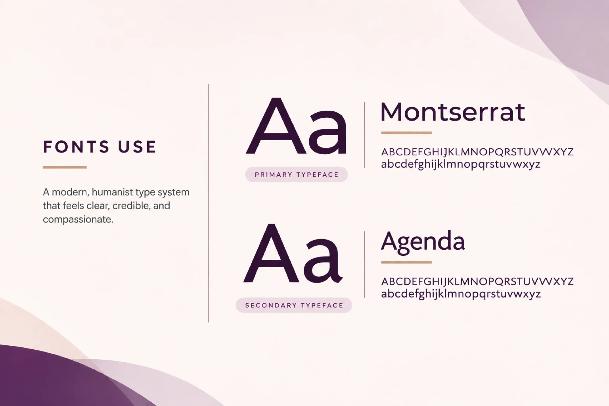
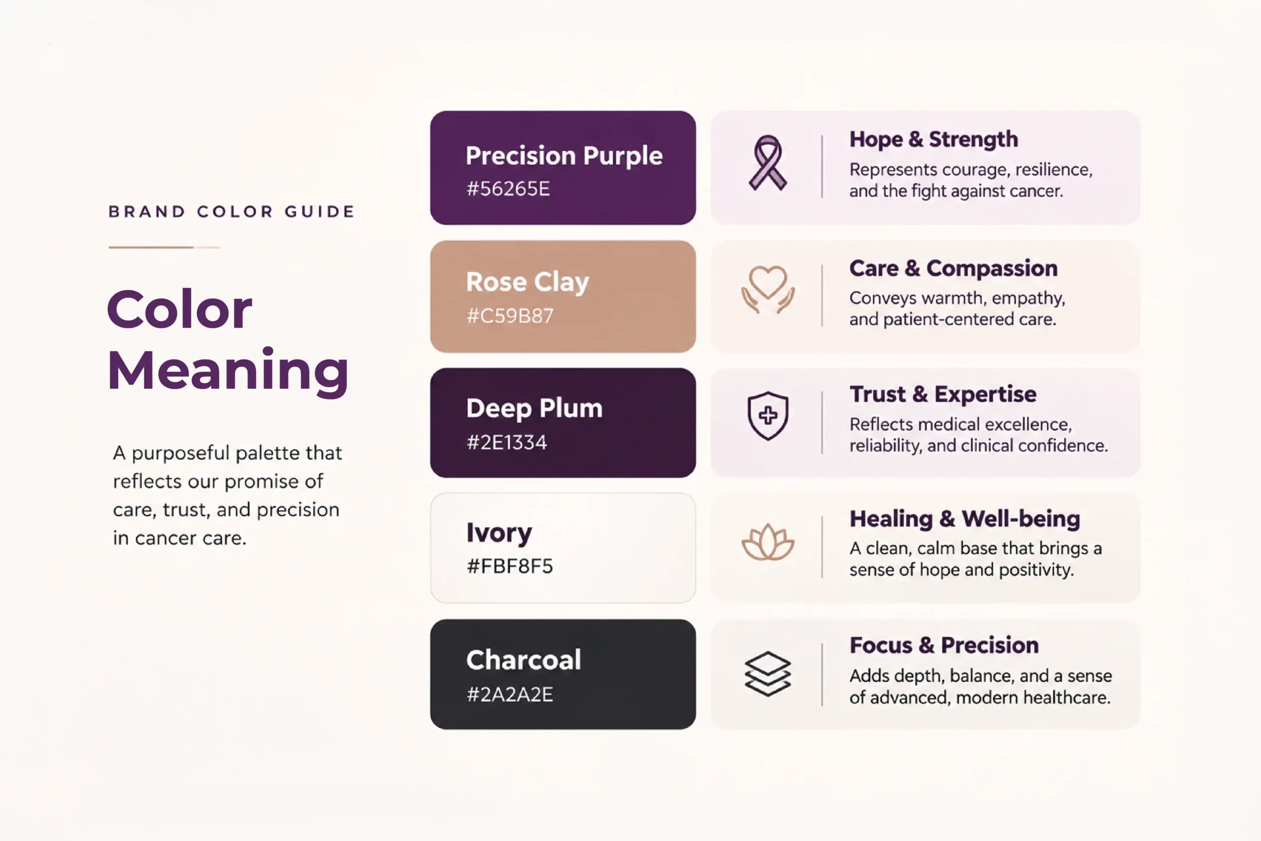
Montserrat leads. Agenda supports. A modern, humanist type system that feels clear and compassionate. Five colours. Each with a job.
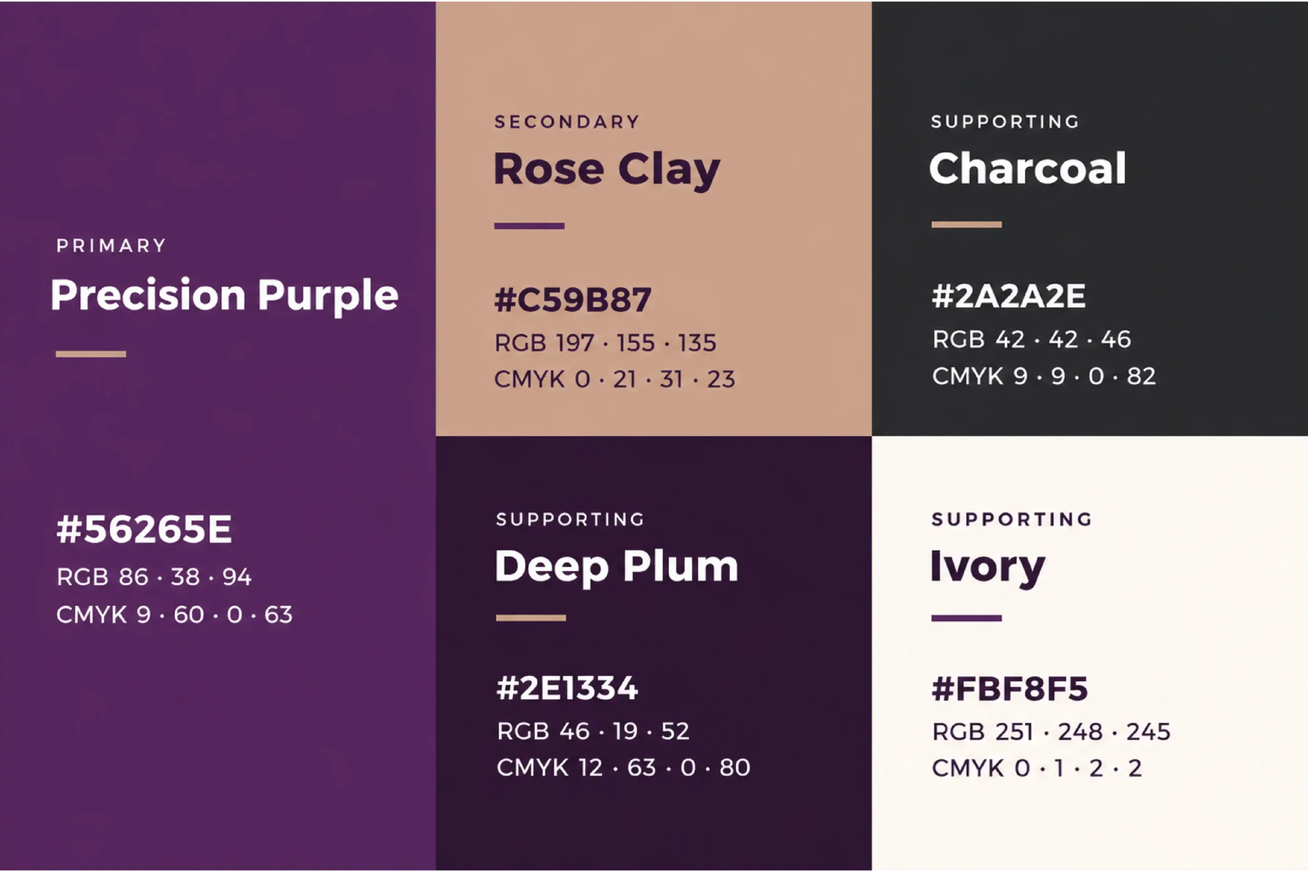
Precision Purple #56265E: hope and strength. Rose Clay #C59B87: care and compassion. Deep Plum #2E1334: trust and expertise. Ivory #FBF8F5: healing and well-being. Charcoal #2A2A2E: focus and precision. The logo comes in four forms: primary, horizontal, icon and wordmark. Each holds on light and dark.

06) The Brand in Application
One identity. Every touchpoint.
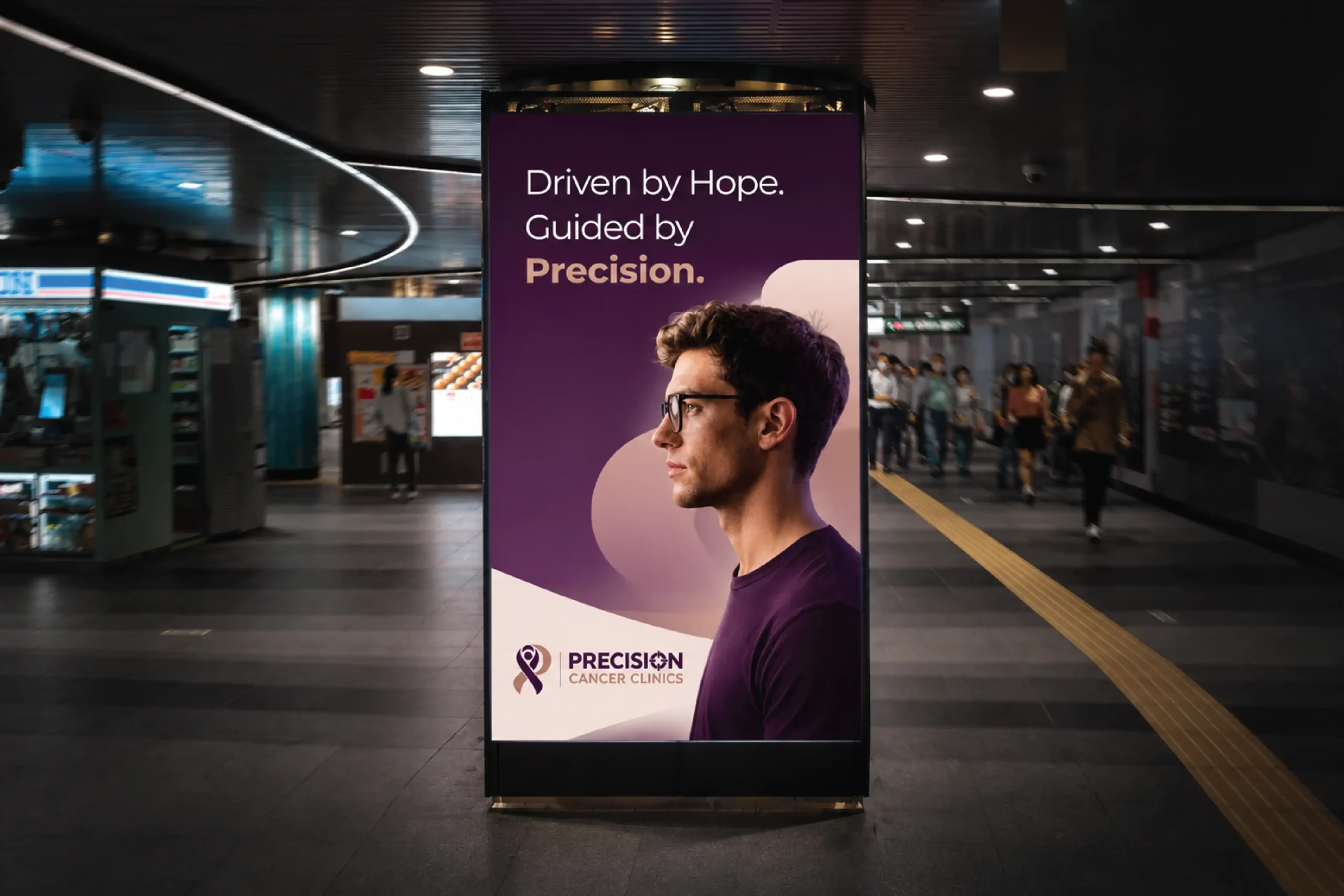
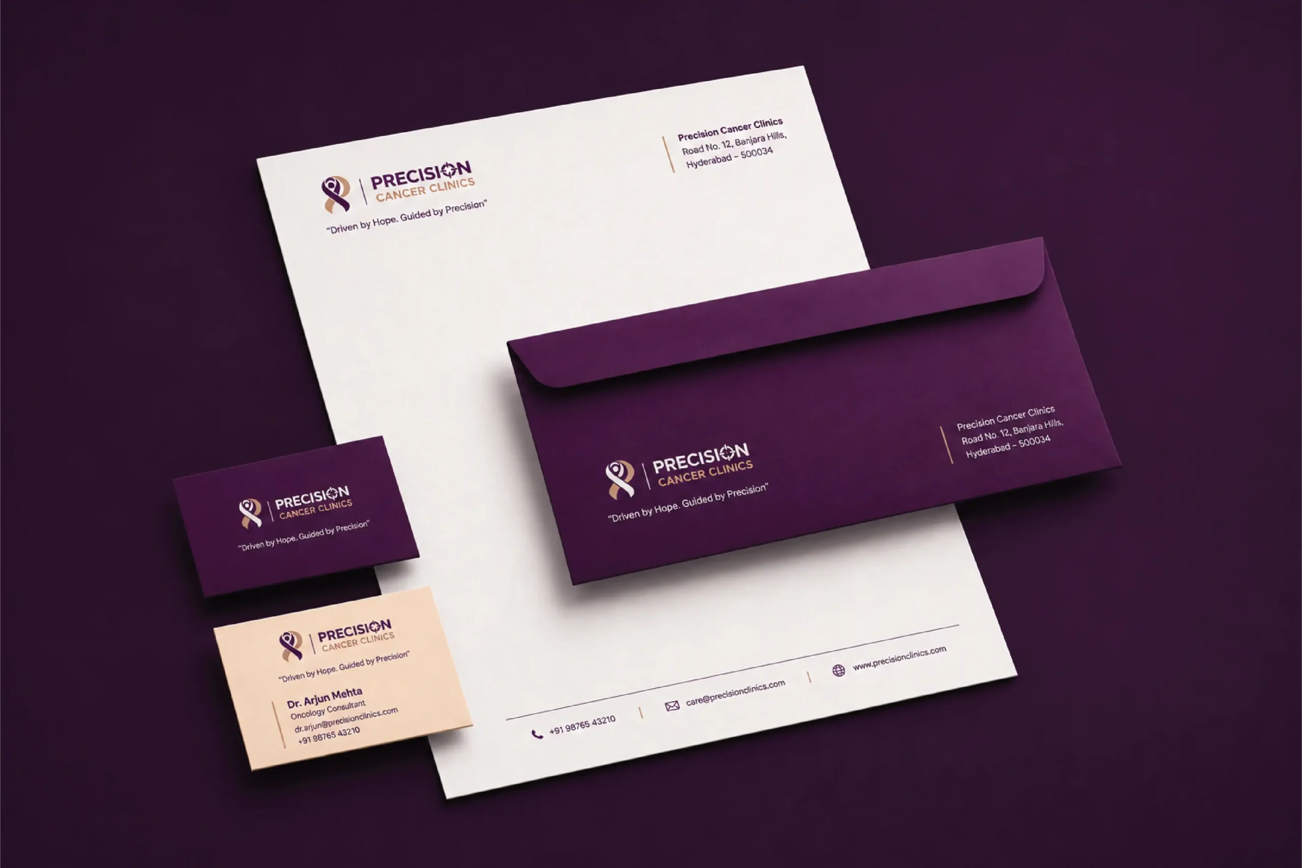
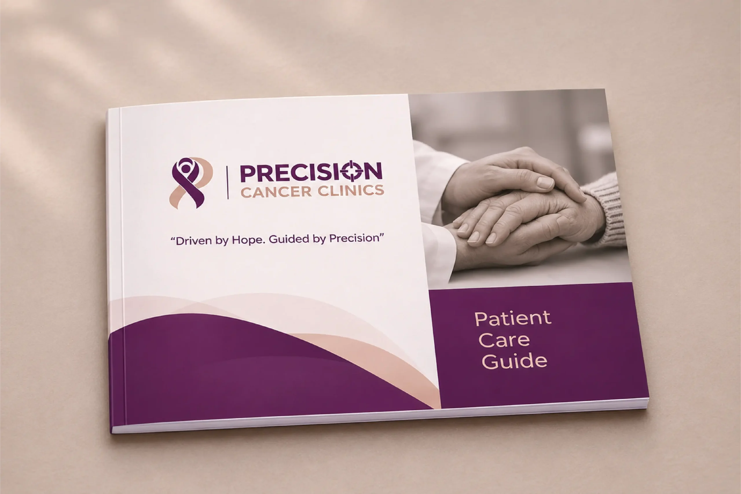
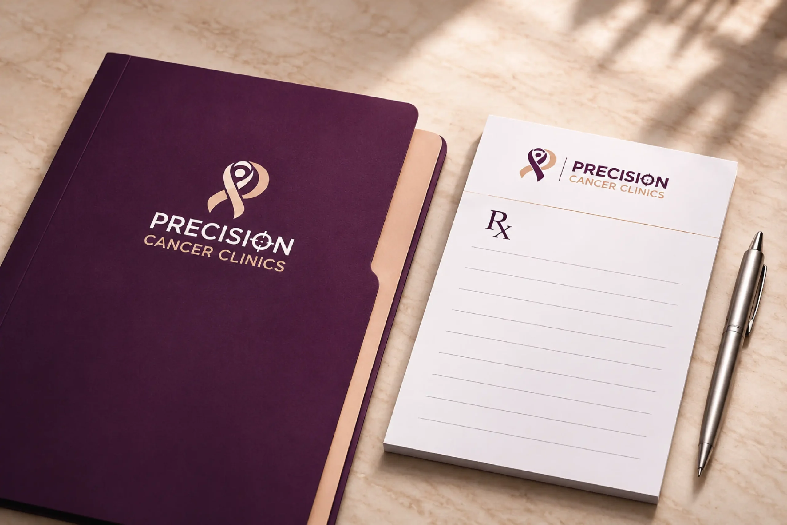
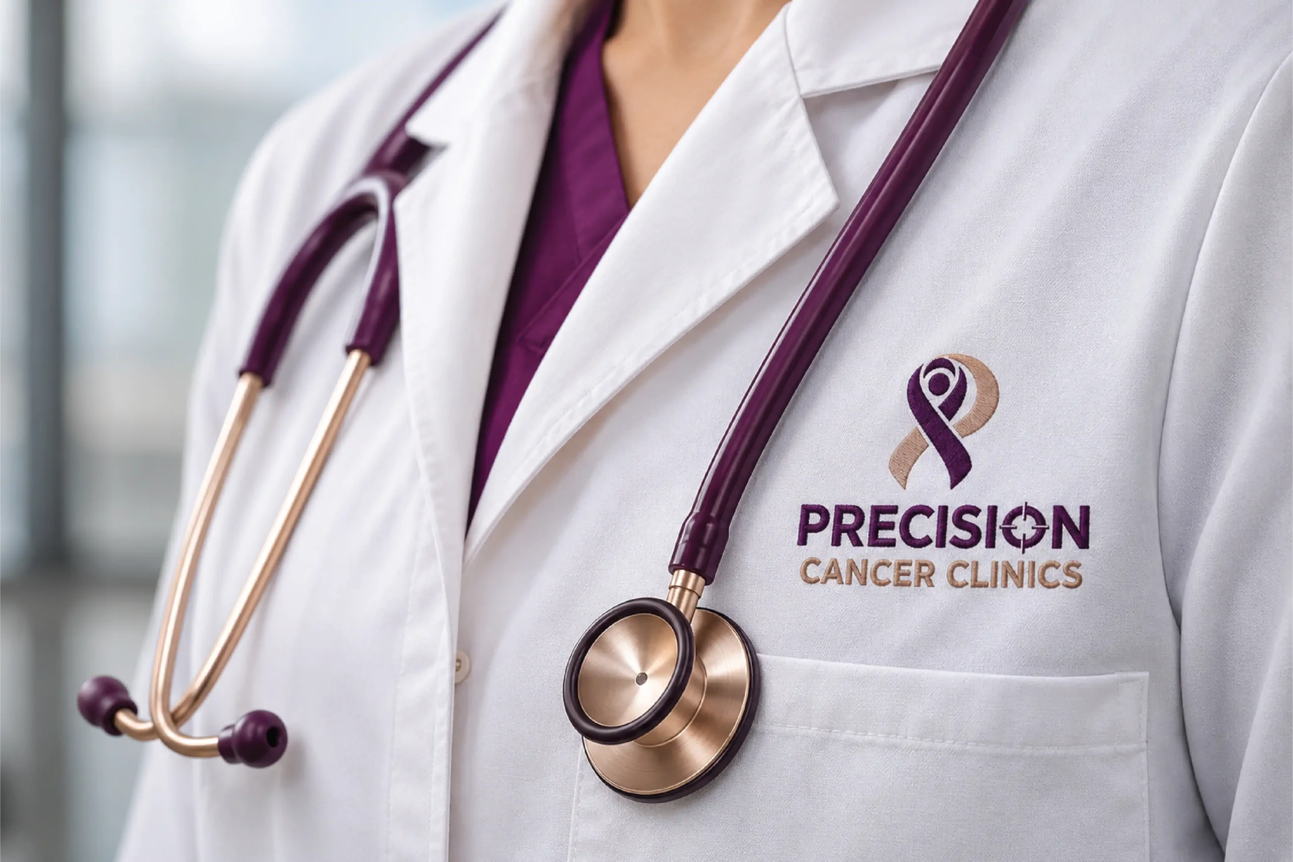
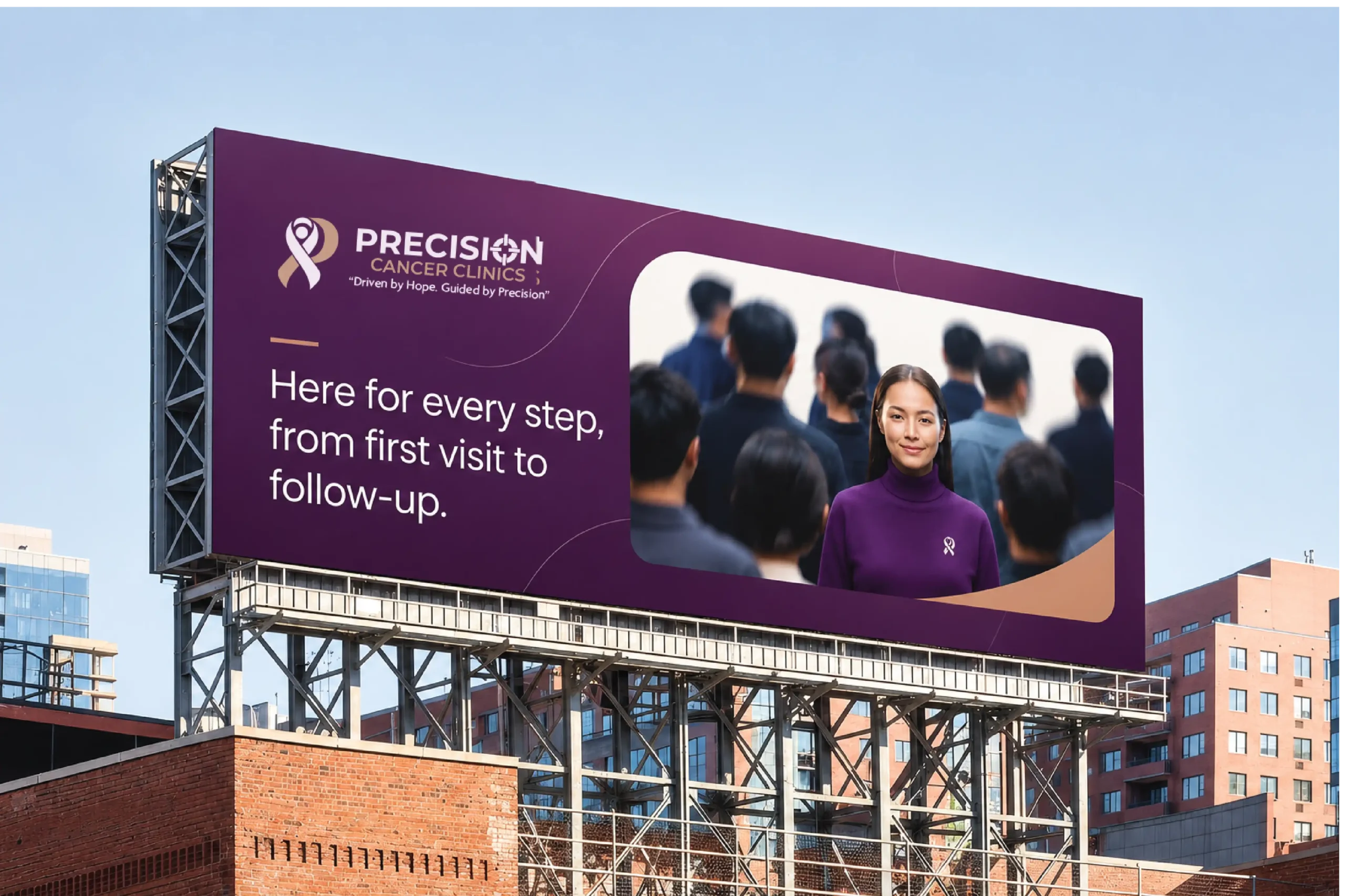
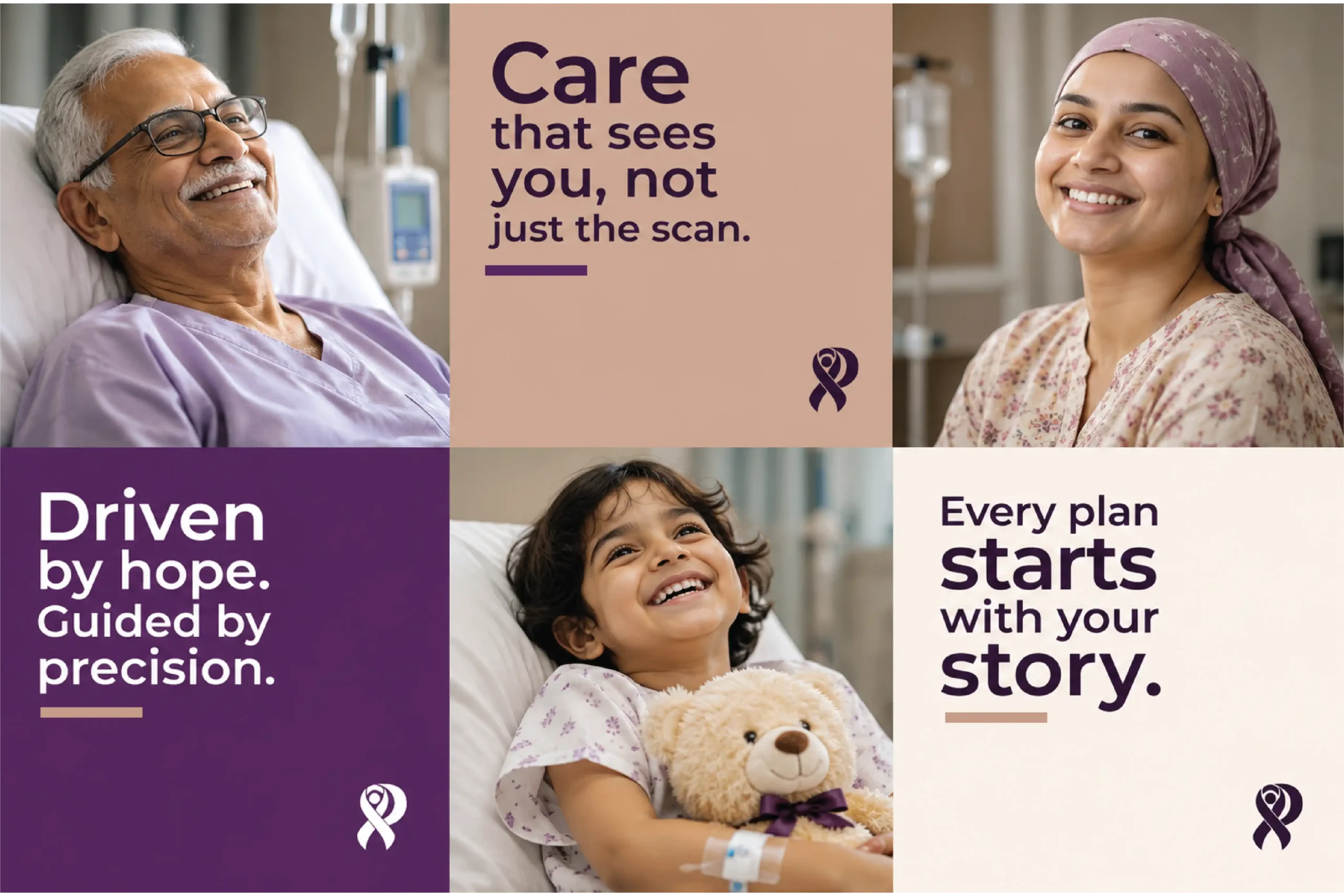
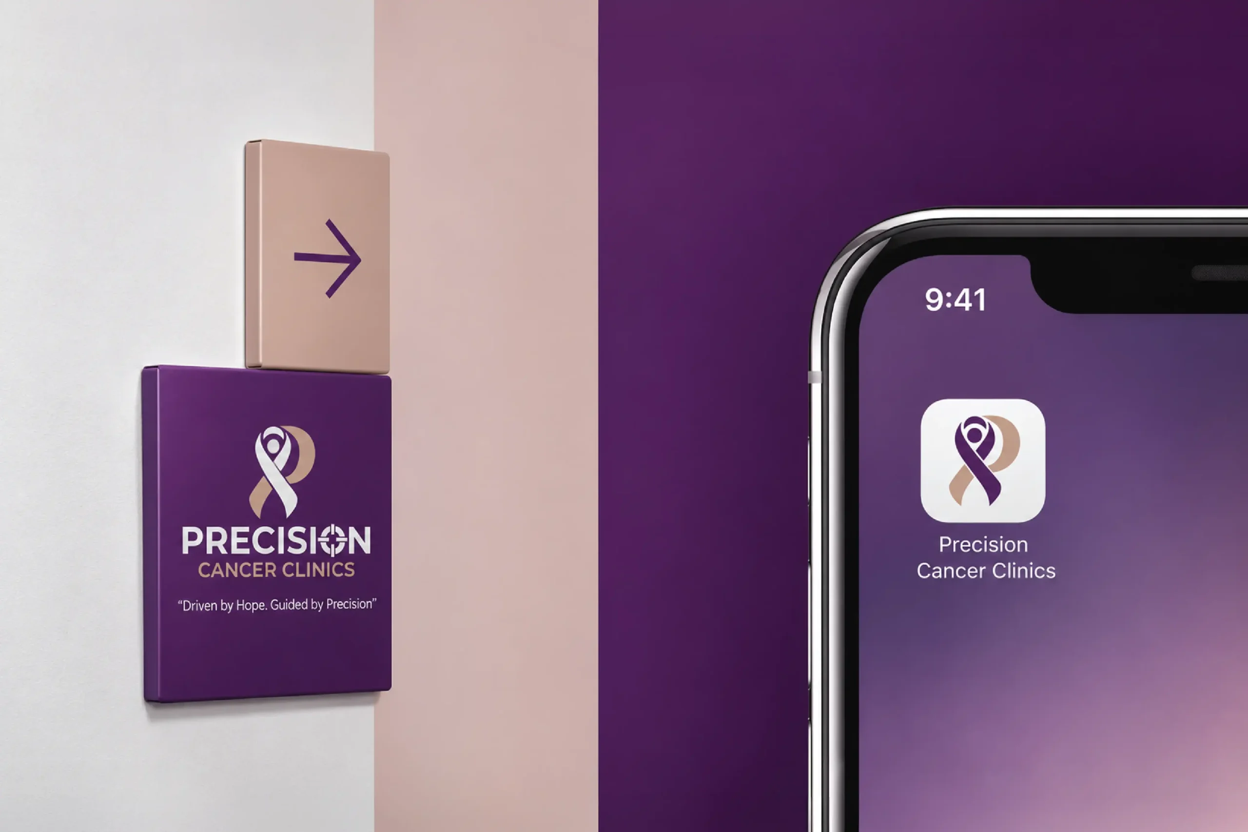
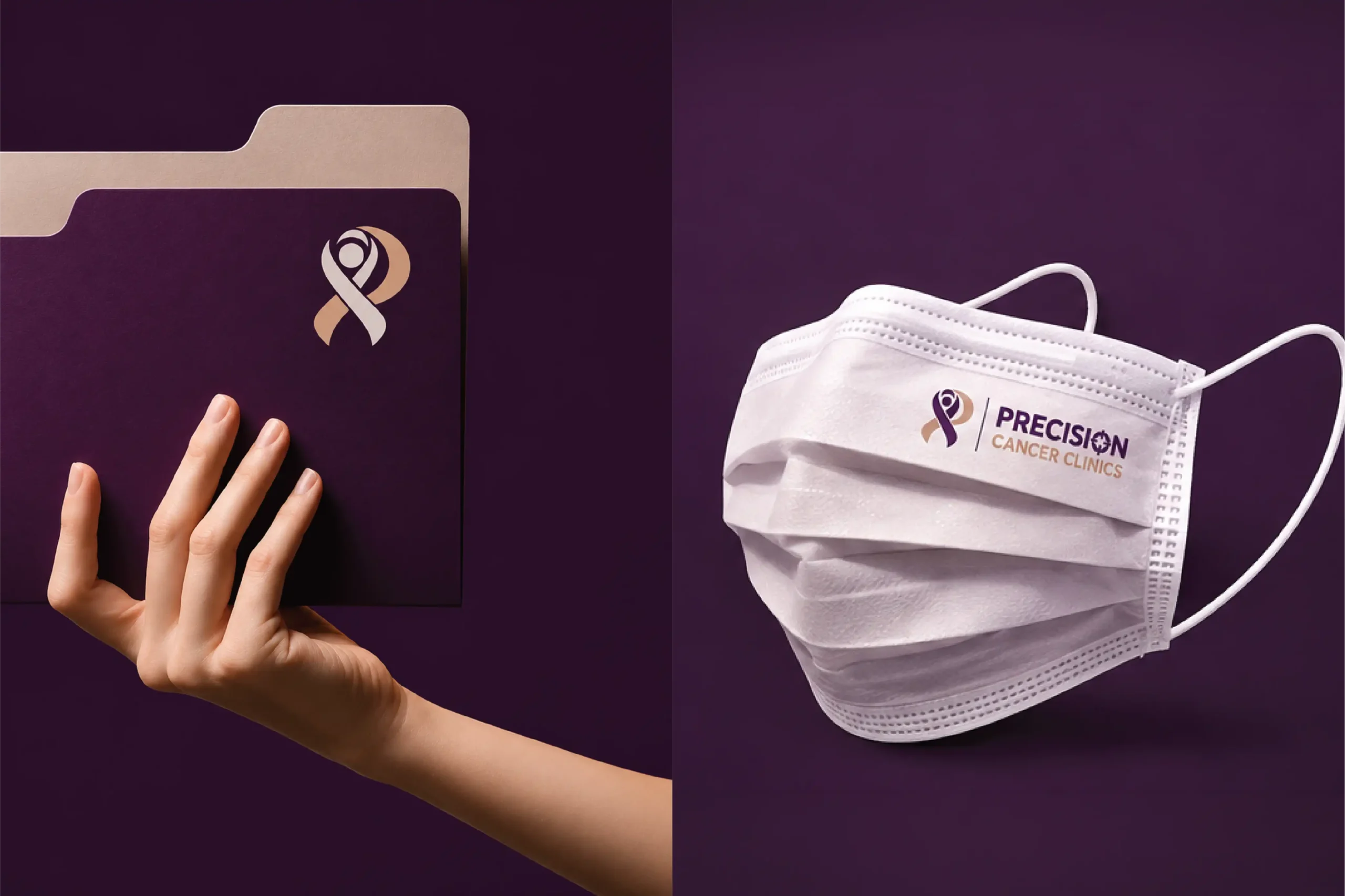
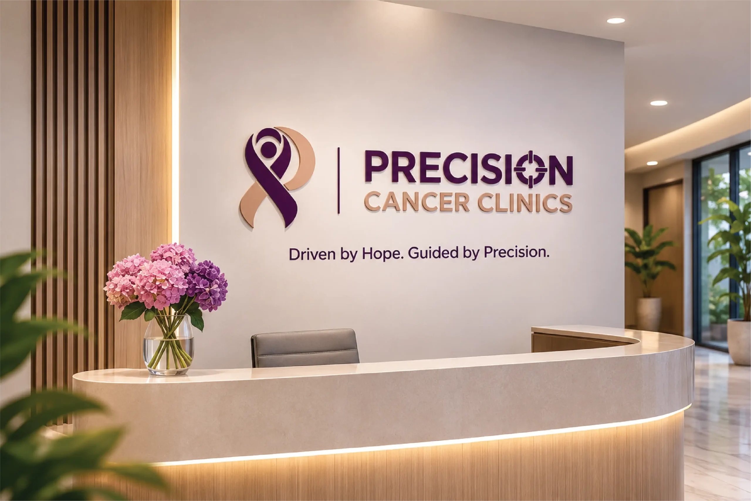
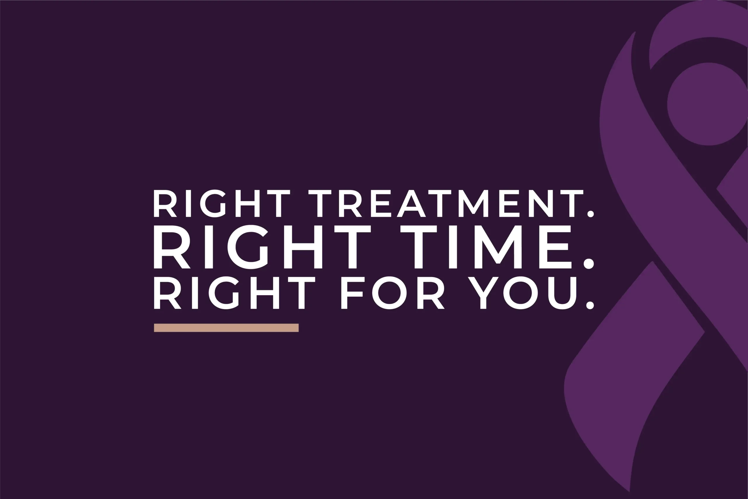
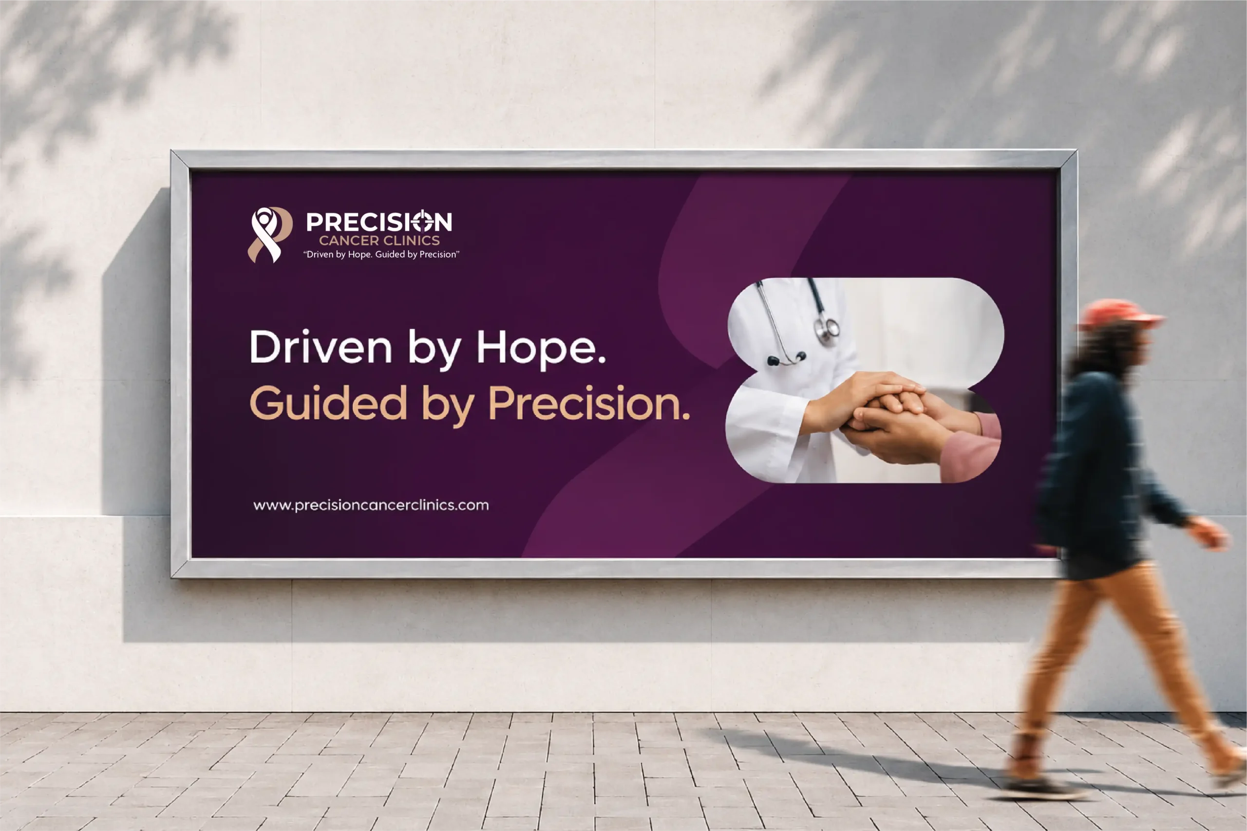
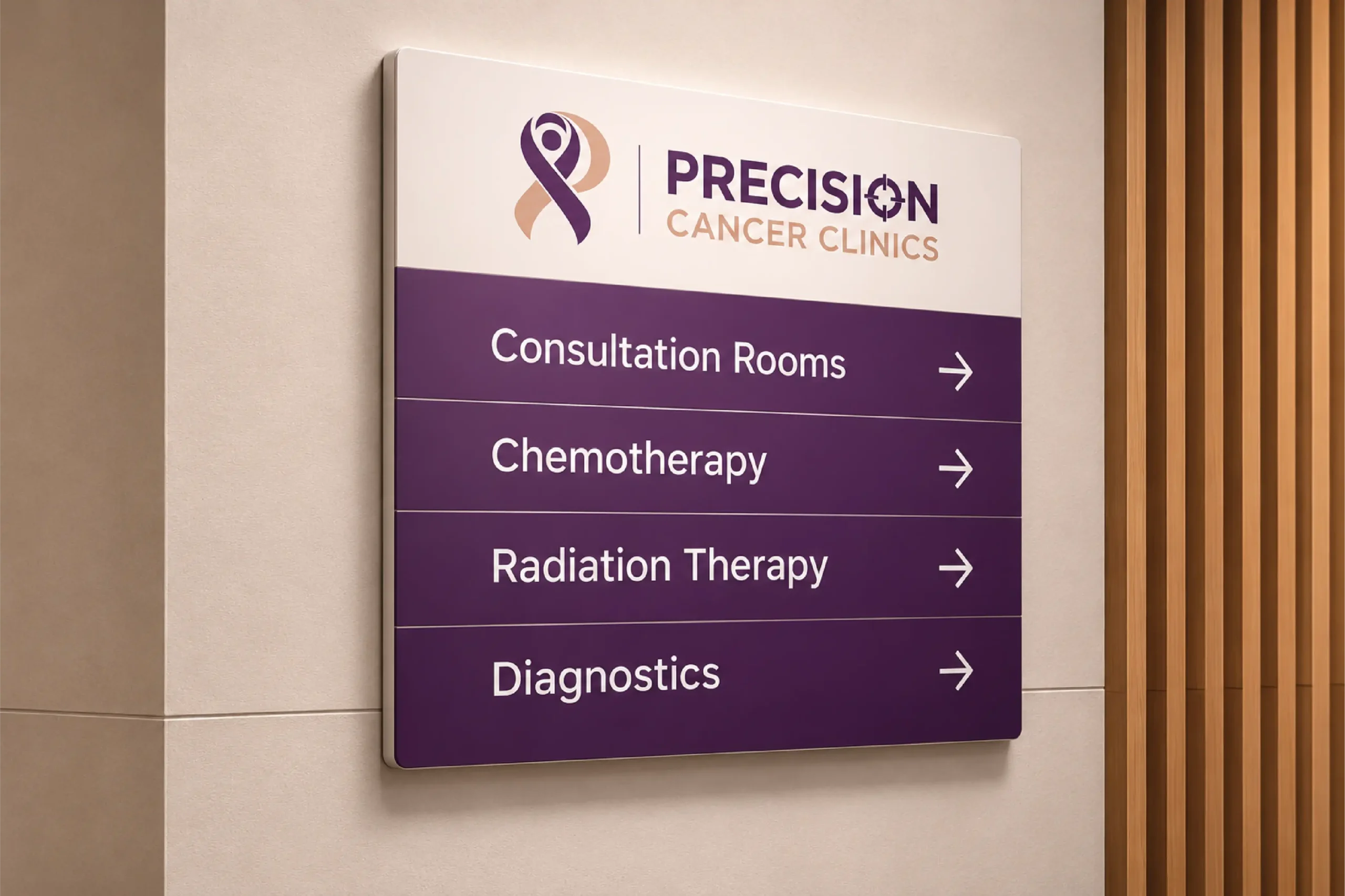
Same ribbon. Same purple. Same calm voice. Stationery, patient care guides, prescription pads, folders, doctor's coats, scrubs, masks, wayfinding signage, reception walls, building facades, billboards, social media and the app icon. Messaging speaks to the patient directly. You are never just a case number.