Overview
Aura is a contemporary energy drink brand built around a simple idea: energy doesn't have to feel artificial. Combining natural fruit flavours, B-vitamins and natural caffeine, Aura brings a refreshing perspective to the energy drink category.
The brief was to create a brand that felt energetic without being aggressive, premium without being intimidating, and natural without losing its modern appeal. With three distinctive flavour combinations, the identity needed to establish a recognisable master brand while giving each variant its own personality.Our role was to translate this vision into a cohesive brand identity and packaging system that could stand out on shelves, connect with a younger audience and create a consistent experience across every brand touchpoint.
Client: Aura Energy Drink
Industry: Food & Beverage / Energy Drinks
Scope of Work: Brand Strategy, Naming Interpretation, Logo Design, Visual Identity, Typography, Colour System, Illustration, Packaging Design, Brand Collateral and Marketing Applications.
The Creative Challenge
Standing out in a category that rarely slows down.
The energy drink category is crowded with aggressive graphics, intense colours and high-performance visual language. Aura needed a different kind of presence.
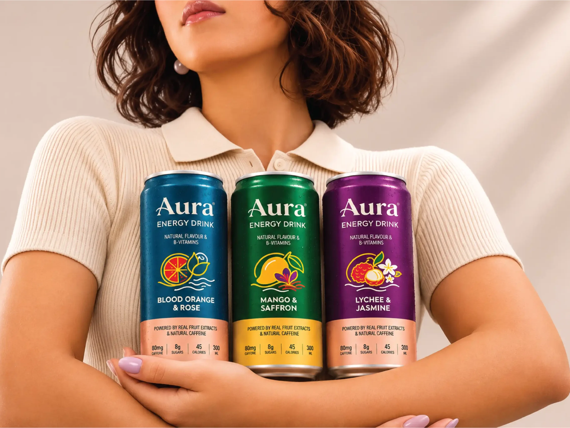
The challenge was to create an identity that communicated energy and performance while moving away from the conventional visual codes of the category. The brand had to feel fresh, confident and premium, with a stronger connection to natural ingredients and flavour.Another important consideration was the product range. With three different flavour profiles — Blood Orange & Rose, Mango & Saffron, and Lychee & Jasmine — each variant needed a distinct visual personality while remaining unmistakably part of the Aura family.The identity had to work across aluminium cans, promotional materials, digital platforms and retail environments without losing its character.
The Strategy
Natural energy. Distinctive flavour. A refreshing identity.
We approached Aura with the idea of balancing two contrasting worlds: the natural character of fruit and botanicals, and the energetic personality of a modern functional beverage.
Rather than relying on conventional energy drink aesthetics, the direction focused on creating a more refined and expressive visual identity. The strategy was built around three key principles:01. Premium PresenceEstablish a distinctive brand identity through elegant typography, a refined wordmark and a confident visual language. 02. Natural ExpressionBring the ingredients and flavour combinations into the spotlight through expressive illustrations and a colour system inspired by nature. 03. Variant RecognitionCreate a flexible packaging architecture where every flavour has its own colour identity while maintaining consistency across the product range.The result is a brand that feels energetic, refreshing and contemporary, with a personality of its own.
The Execution
The Concept — Energy with a Natural Character
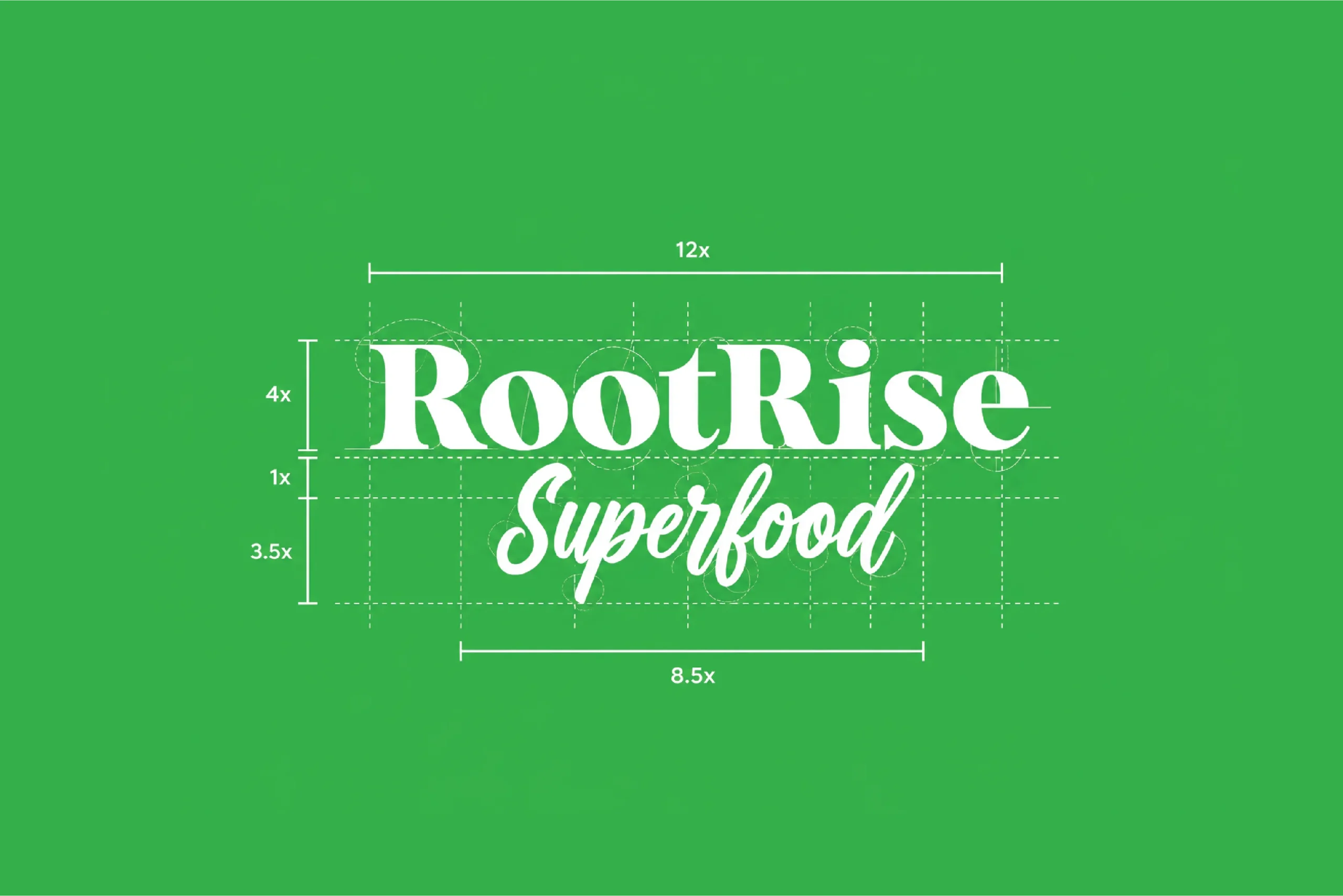
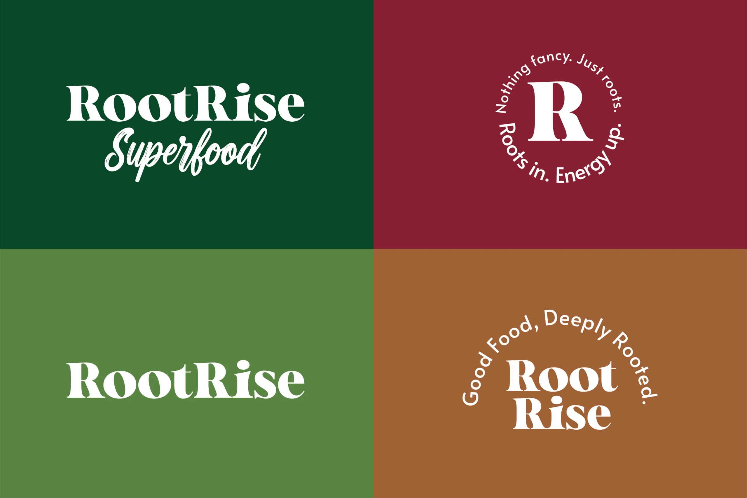
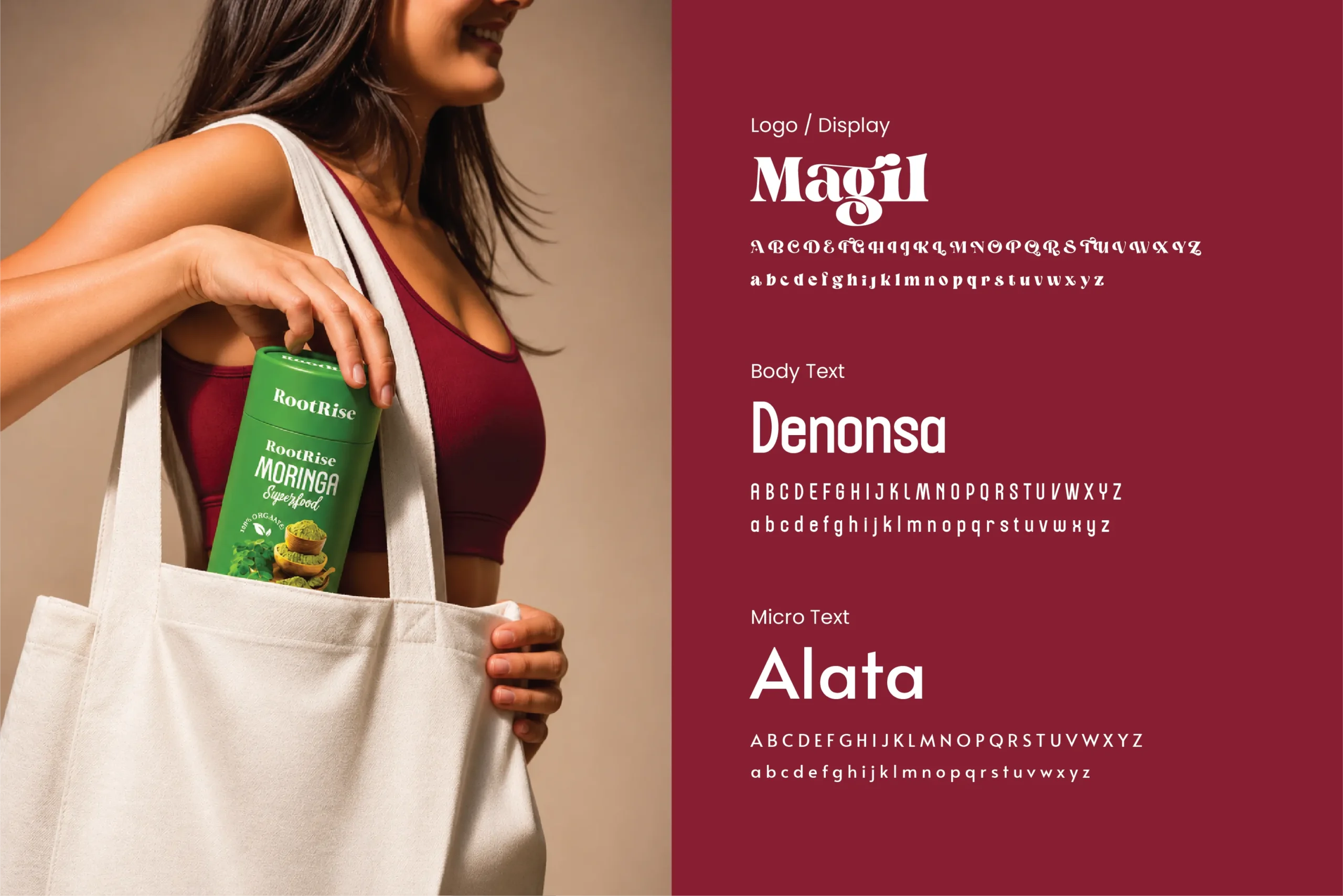
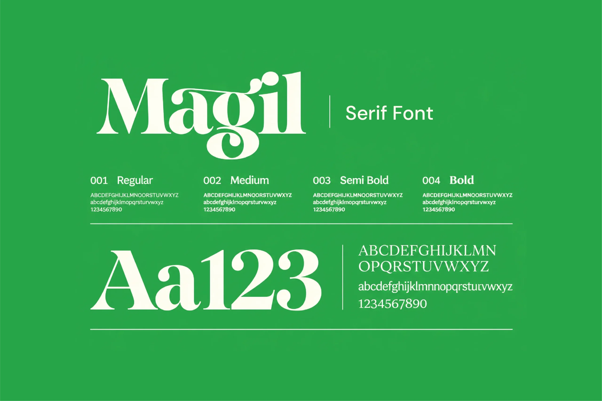
The visual identity centres around a distinctive serif wordmark. Its refined letterforms and characteristic sweeping detail on the letter 'A' create an elegant yet confident brand signature. The typography was intentionally chosen to give Aura a premium presence, setting it apart from the bold, aggressive identities commonly found in the energy drink category.Supporting typography introduces a clean, modern contrast, ensuring clarity across packaging and communication materials.The overall visual language brings together expressive typography, vibrant colours and ingredient-inspired illustrations to create an identity that feels both sophisticated and approachable.
The Colour Story
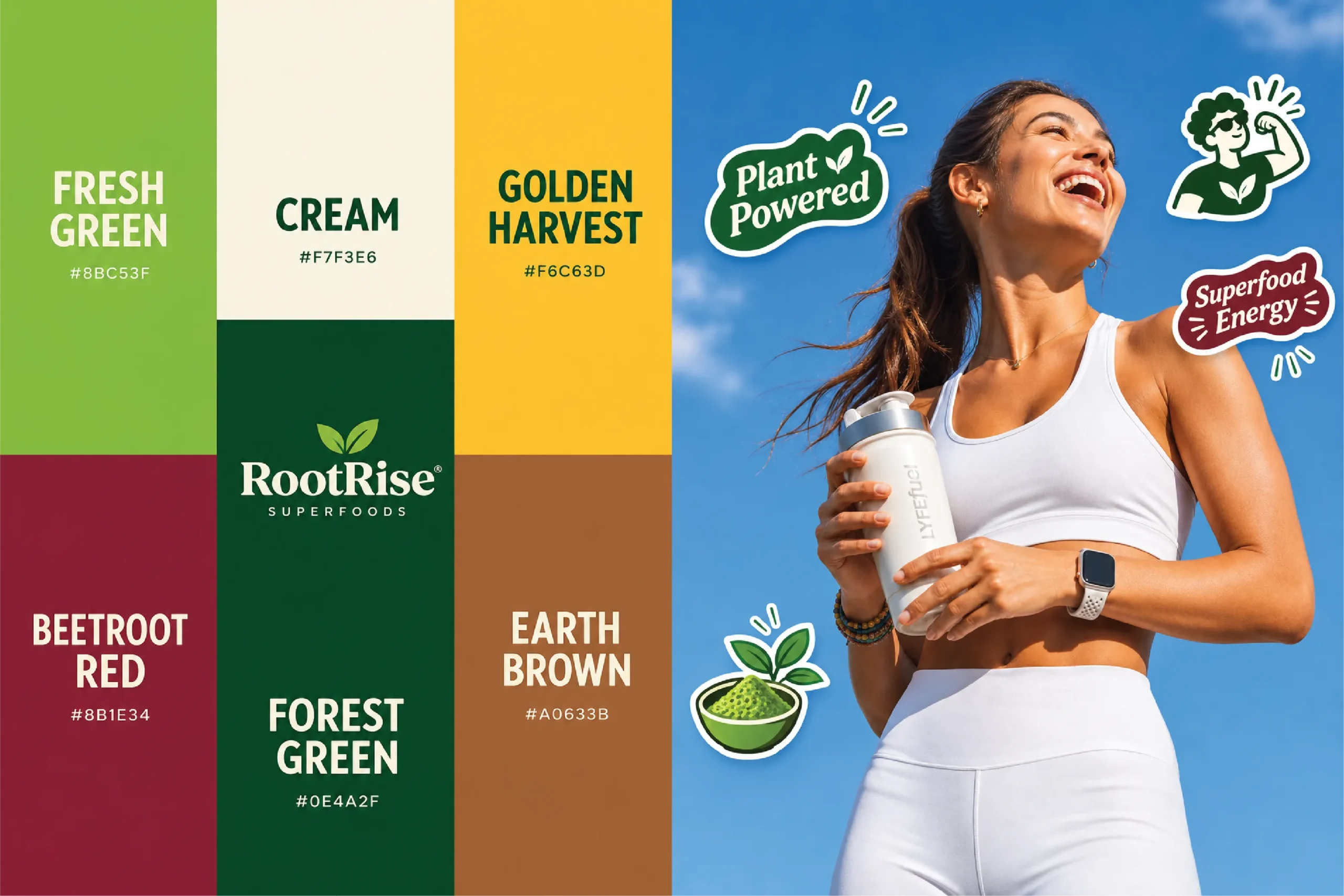
Colour plays an important role in how Aura communicates its different flavour experiences. Each variant has been given a distinctive palette inspired by its ingredients, creating recognition while maintaining a unified brand language. Aura Blue — #095F81Inspired by freshness and refreshment, the deep blue establishes a confident and contemporary identity for Blood Orange & Rose. Aura Green — #105B4BA rich, natural green that communicates freshness and botanical character, forming the foundation for Mango & Saffron. Aura Plum — #4B1F44A deep, expressive plum that brings richness and sophistication to the Lychee & Jasmine variant. Supporting shades of Aura Gold, warm peach, cream and vibrant ingredient colours bring balance, contrast and energy to the overall system.Together, the palettes create three individual flavour identities that remain connected through a consistent visual foundation.
The Illustration Language
Giving every flavour a visual identity of its own.
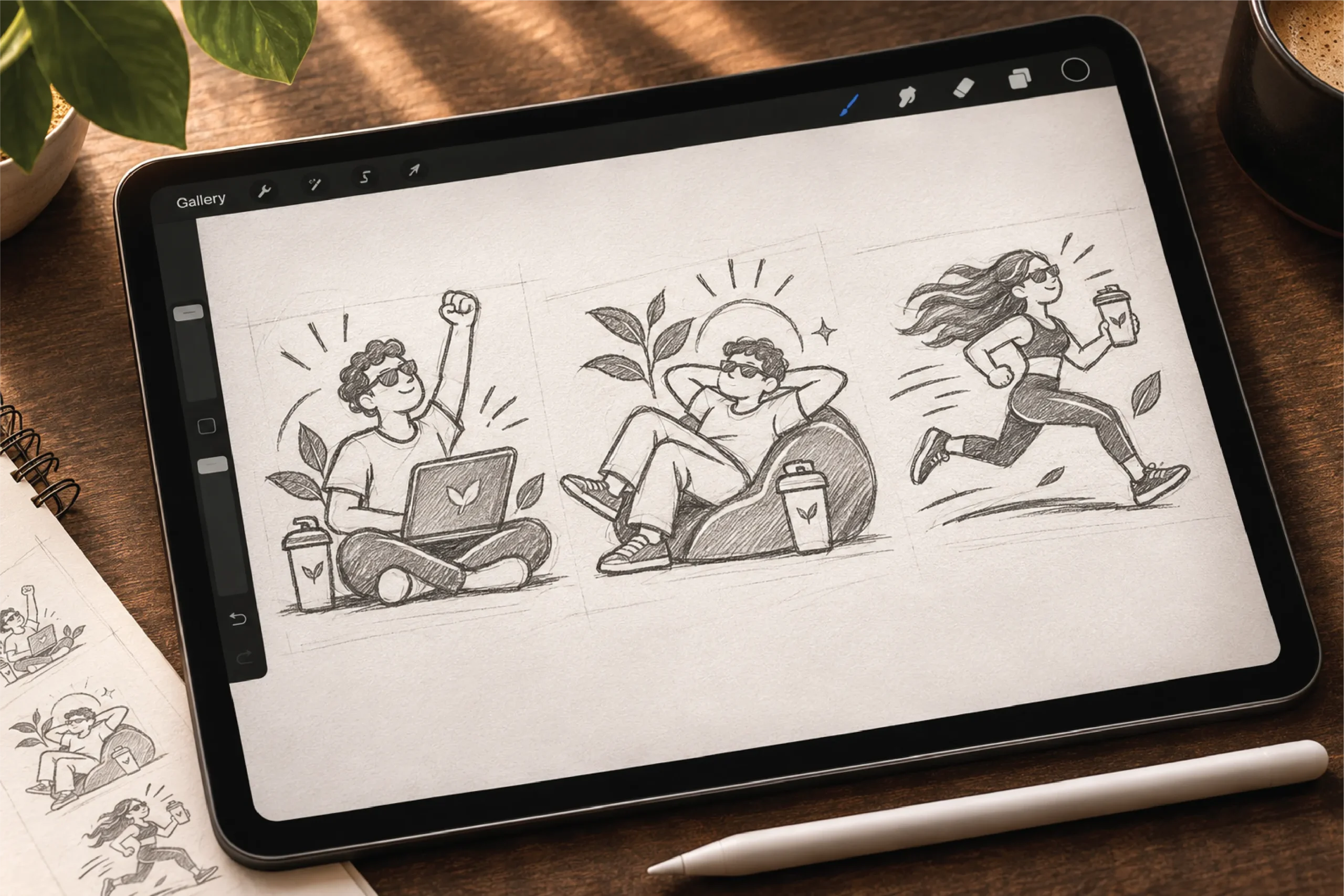
The illustrations were developed to make the ingredients instantly recognisable while adding character to the packaging. Each composition combines fruits, botanicals and expressive flowing elements to represent the flavour experience. Blood Orange & Rose brings together citrus and floral elements. Mango & Saffron celebrates the richness of tropical fruit with botanical accents. Lychee & Jasmine combines delicate floral details with the distinctive character of lychee. The illustrations use a consistent graphic style, allowing the three variants to feel connected while retaining their individuality.