
Mediserve — Brand Identity for a Dubai Pharmaceutical Company
Client: Mediserve, Dubai, UAE Industry: Pharmaceuticals — research, development, manufacturing & distribution Scope: Logo design, visual identity system, brand collateral

The Brief
Mediserve needed a brand identity that could operate at an international level. Based in Dubai and serving healthcare markets across the region, they required a logo that communicated trust, medical credibility, and human care — without falling into the generic blue-and-cross visual language that most pharmaceutical companies default to. The challenge was to design something that felt genuinely premium, worked across print and digital environments, and held up on everything from letterheads to product packaging.
The Design Approach
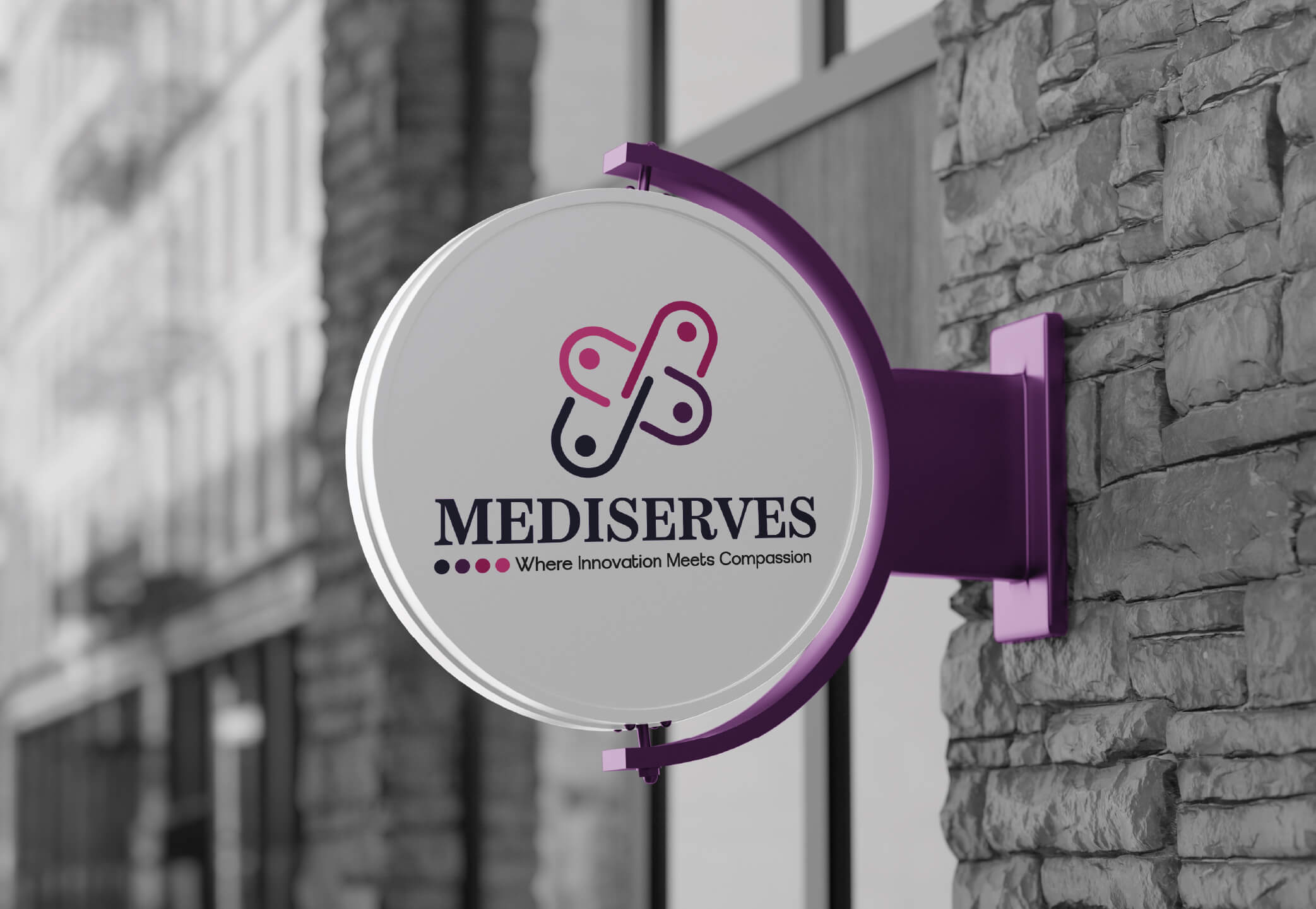
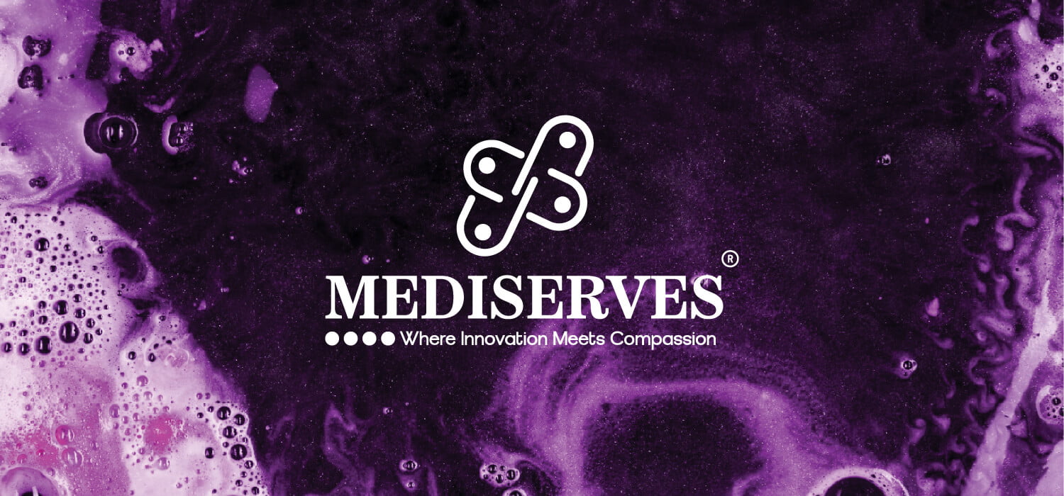
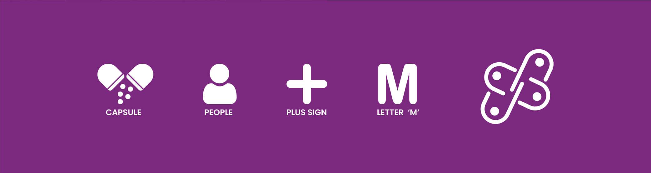
The core of the Mediserve logo is built around four elements layered into a single mark: a capsule form, a human silhouette, a plus sign, and the initial 'M' of the brand name. Each element earns its place. The capsule anchors the mark to pharmaceuticals immediately and without ambiguity. The human silhouette keeps the brand human — this is a company whose work affects real people's lives, and the identity needed to reflect that. The plus sign adds a universal healthcare signal, while the letter 'M' ties everything back to the name. What holds it all together is restraint. Rather than stacking these elements literally, they were resolved into a single unified mark where each shape reads as part of a coherent whole.


color palette


Why Purple
Most pharmaceutical brands use blue. It is safe, clinical, and forgettable. For Mediserve, purple was the right call. Purple sits at the intersection of trust and innovation — it carries the dependability of blue with the forward-thinking energy of a brand that is genuinely investing in better healthcare solutions. The palette moves through three tones: a deep anchor shade for strength, a mid-tone for everyday brand applications, and a lighter tint for backgrounds and secondary use. Together they give the identity flexibility without losing identity.





What Was Delivered
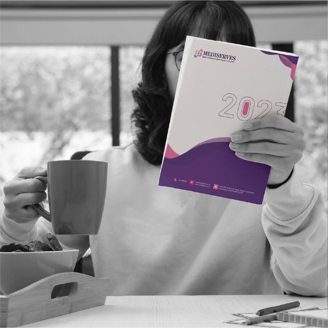
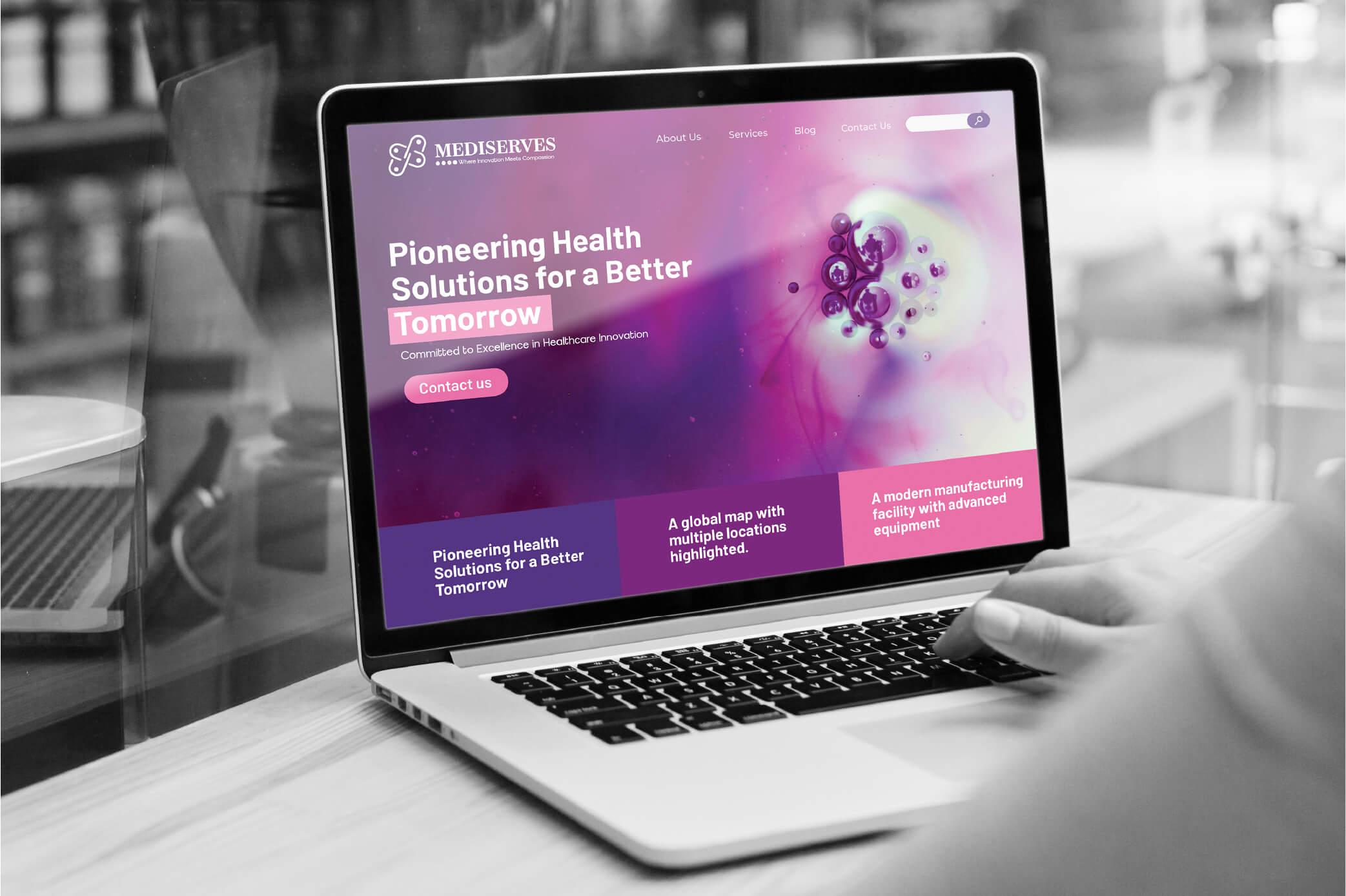
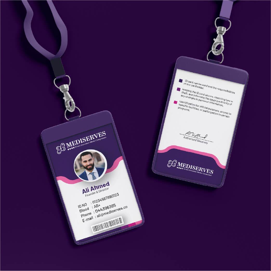
The project covered the full brand identity system — not just the logo mark. Every touchpoint was considered: how the brand looks on a business card, on a letterhead, on packaging, on a signage environment, and on digital platforms. Delivered files included the primary logo, reverse and single-colour variations, the colour palette with exact values, typography guidelines, and a complete stationery set ready for print.



The strategic use of purple shades adds depth, elegance, and symbolism, reflecting trust, reliability, innovation, and diversity. The three parallel lines reinforce Mediserve’s connection to the pharmaceutical industry while strengthening the brand’s identity and commitment to better healthcare outcomes