01) Overview
Muddle Nut is a peanut butter brand with a bold, playful personality and a love for all things rich, creamy and delicious. The brief was to build an identity that feels fun and full of character while giving the product range a strong, recognisable presence. We brought the brand to life through a distinctive wordmark, expressive packaging, flavour-led colours and a flexible campaign style.
Client: Muddle Nut Industry: Food & Beverage Services: Brand Identity, Logo Design, Visual Direction, Colour System, Typography, Illustration, Packaging Design, Campaign Design and Brand Applications.
02) The Creative Challenge
Making peanut butter hard to miss.
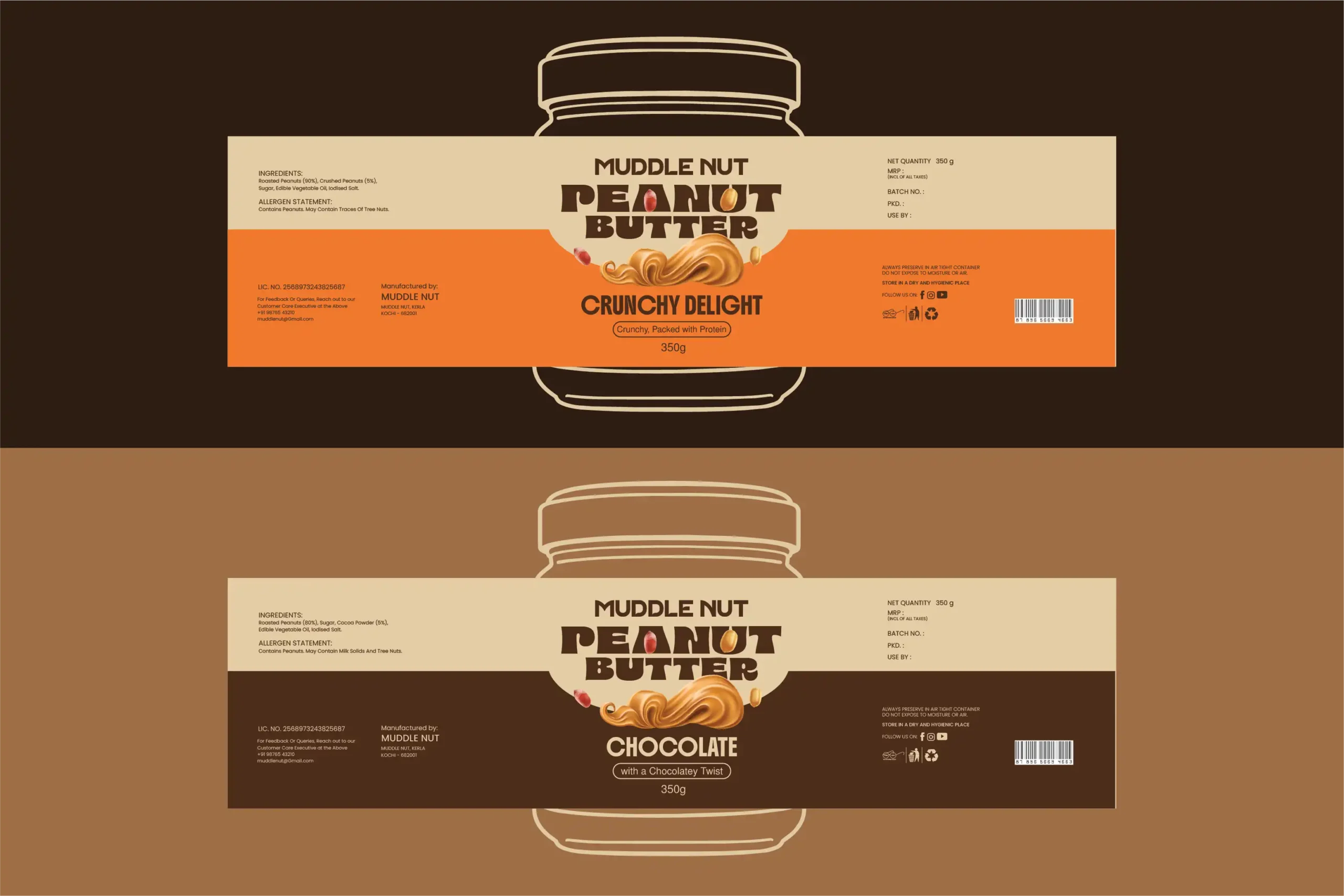
The challenge was to create a peanut butter identity that could stand out on the shelf and feel memorable across different flavours. The brand needed to communicate its rich, indulgent character without looking too serious or generic. It also needed a flexible design system that could bring the Classic Creamy, Crunchy Delight and Chocolate variants together as one unmistakable family.
03) The Approach
Bold flavour. Bigger personality.
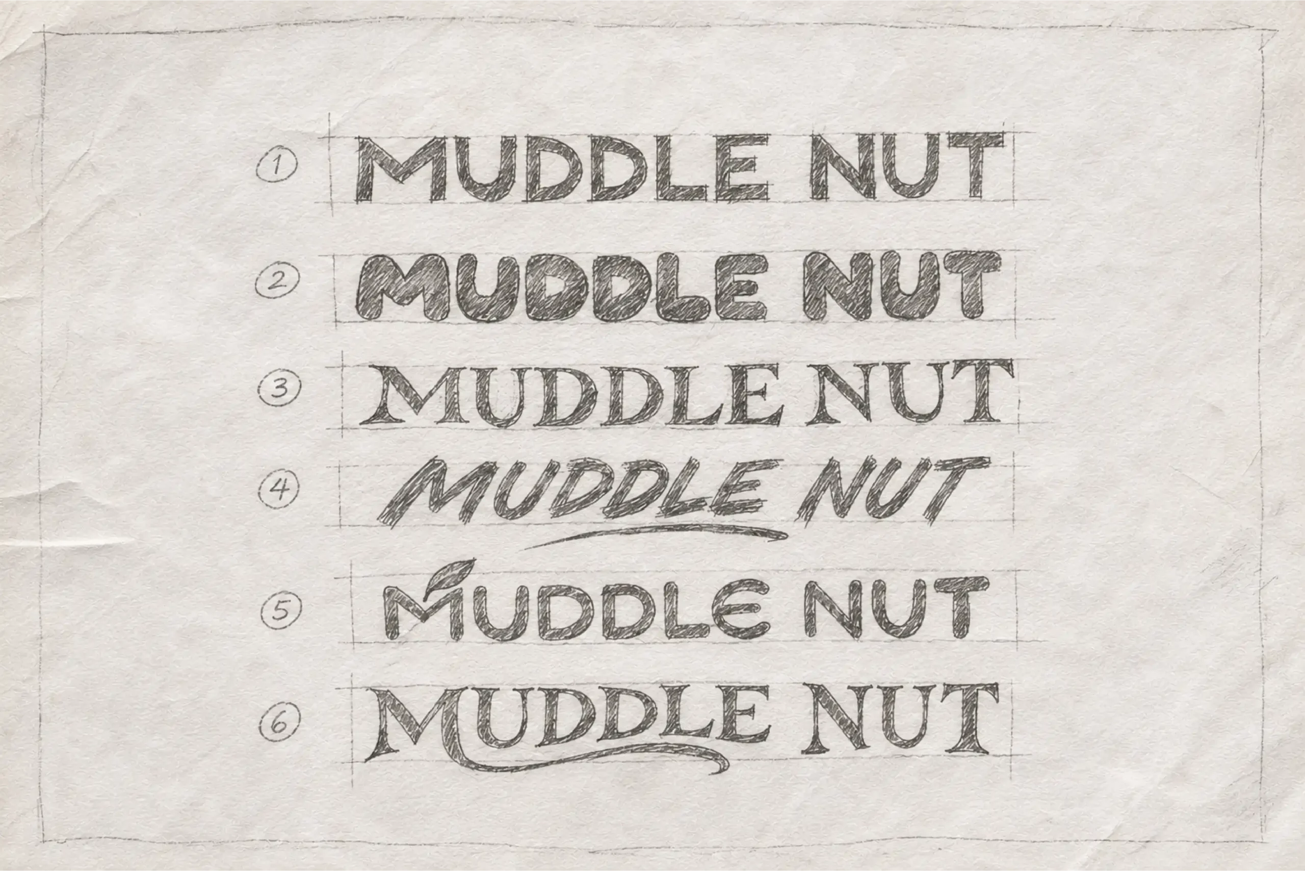
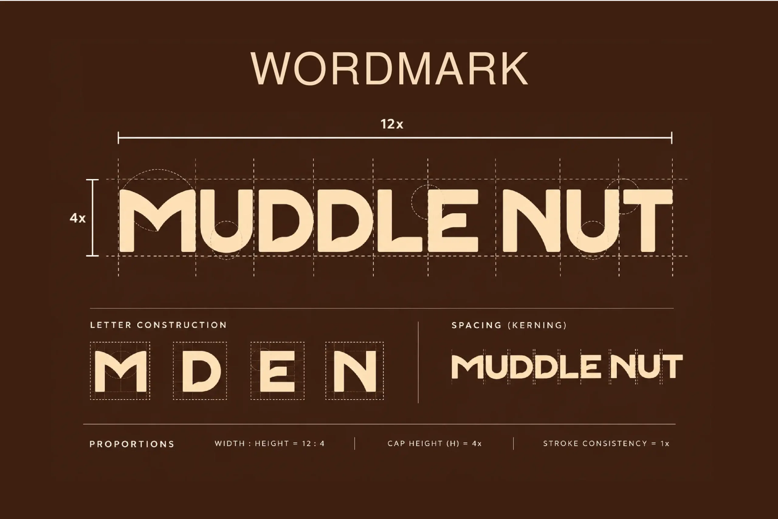
IM Creative shaped the creative direction around the product itself: rich textures, warm colours and an upbeat, playful attitude. A bold wordmark gives the brand instant presence, while flavour-specific colours make each variant easy to recognise. Peanut-inspired illustrations, expressive typography and simple, punchy messages bring energy to the identity and keep the system consistent across every touchpoint.
04) Brand Positioning
Wholesome at heart. Fun by nature.
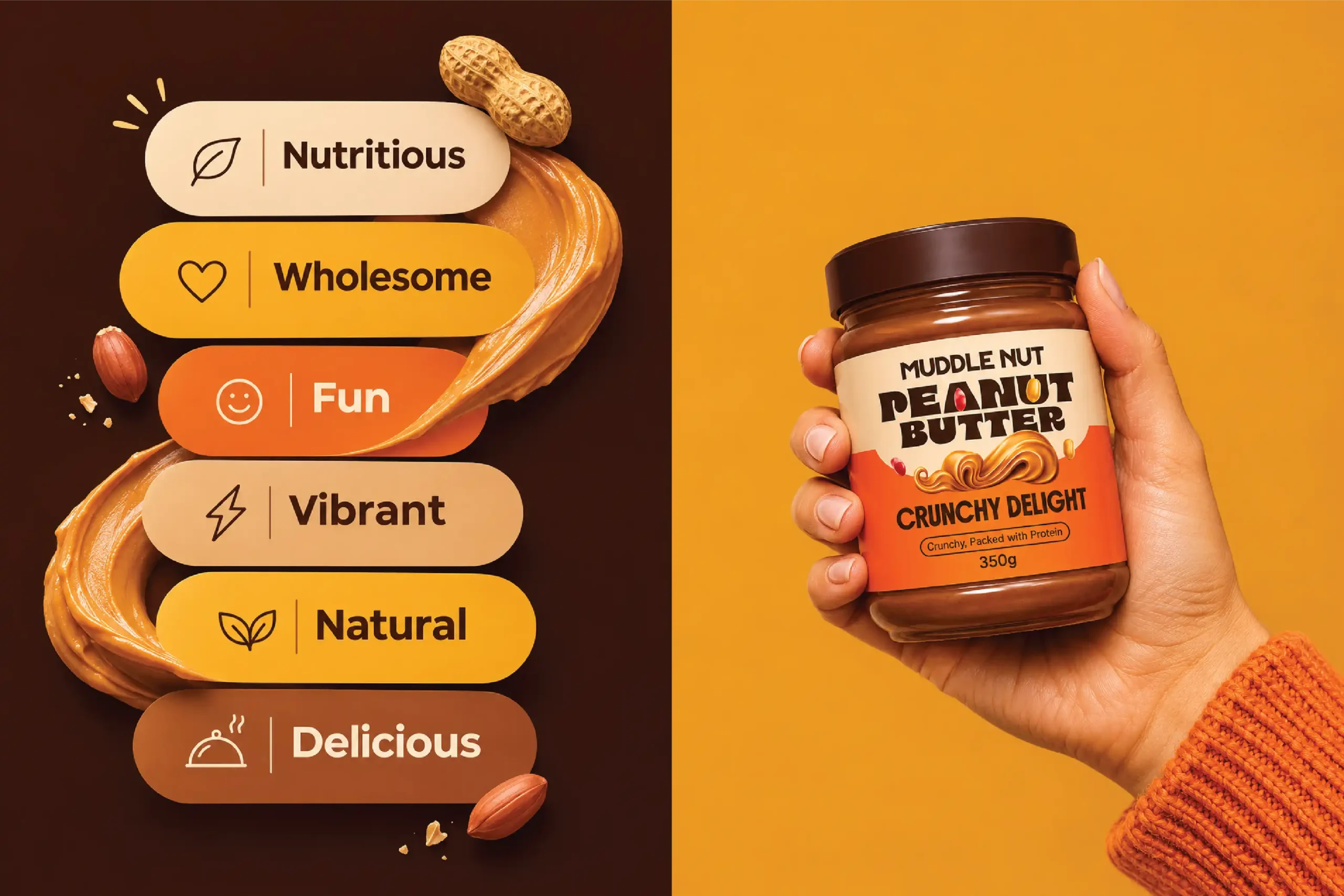
Muddle Nut is positioned as a vibrant, approachable peanut butter brand that makes everyday moments feel a little more enjoyable. Its personality balances natural goodness with a sense of fun, using a confident visual voice that feels warm, delicious and easy to connect with. The brand celebrates the simple pleasure of a good spread, one jar and one bite at a time.
05) Visual Identity
A bold identity with a playful twist.
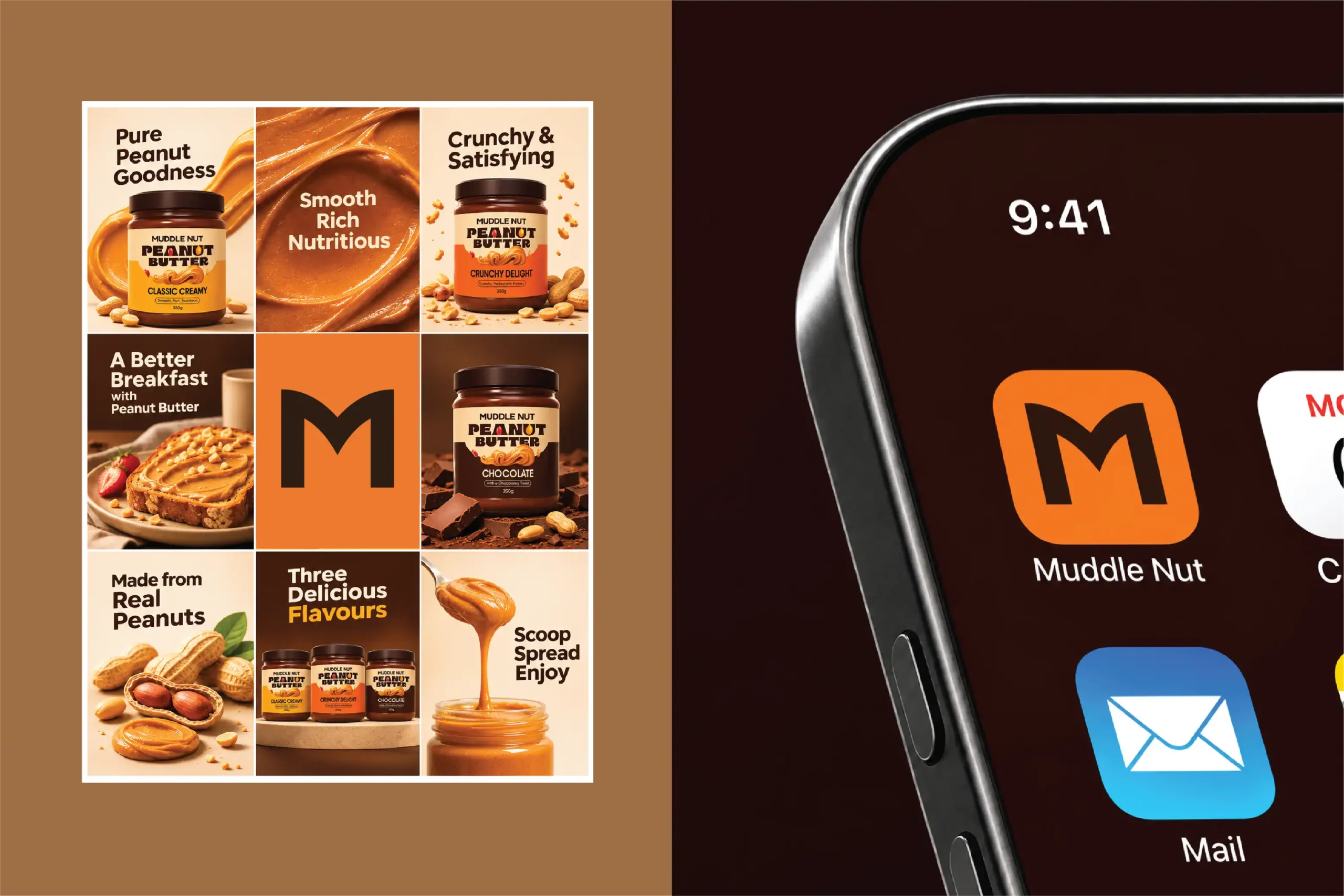
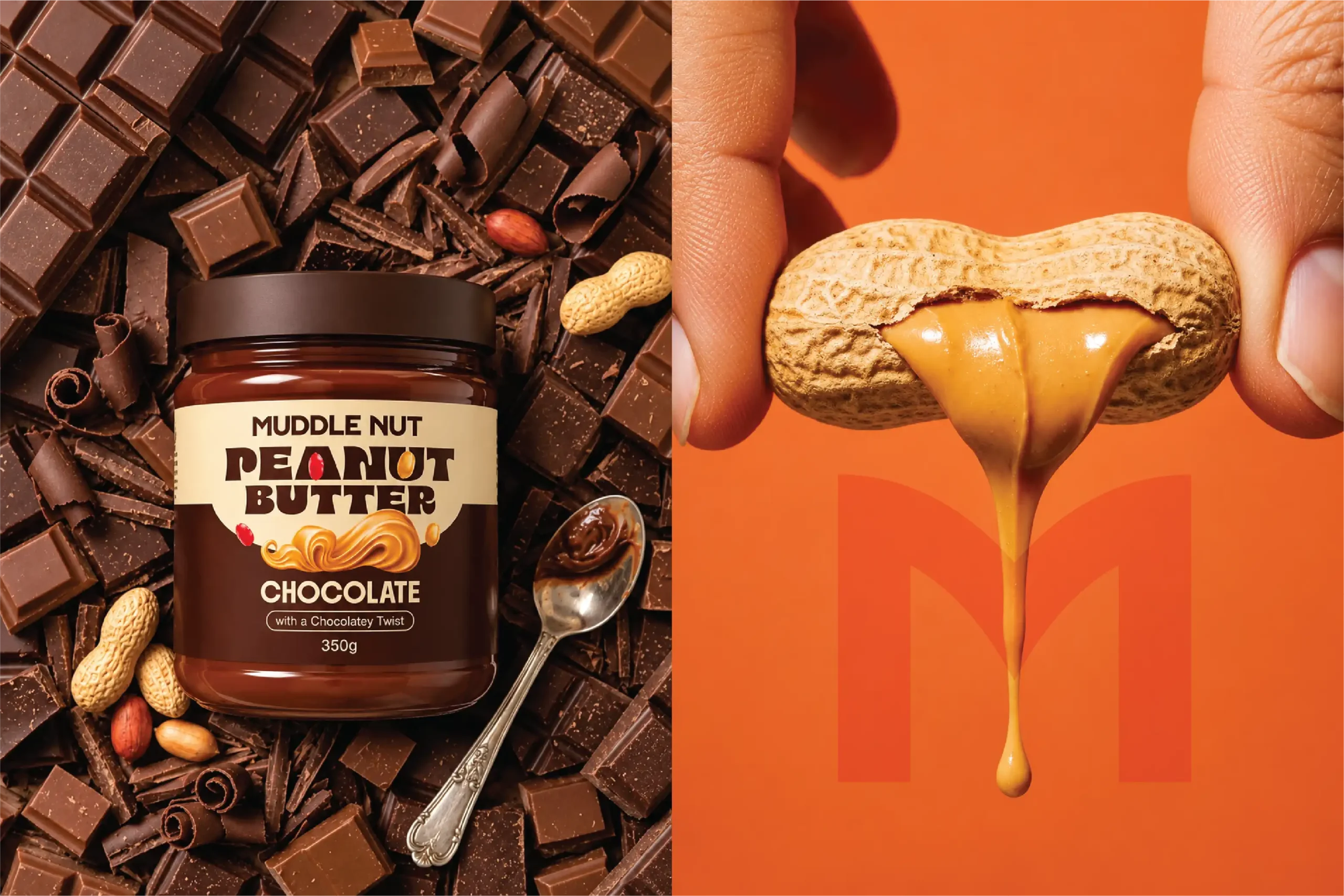
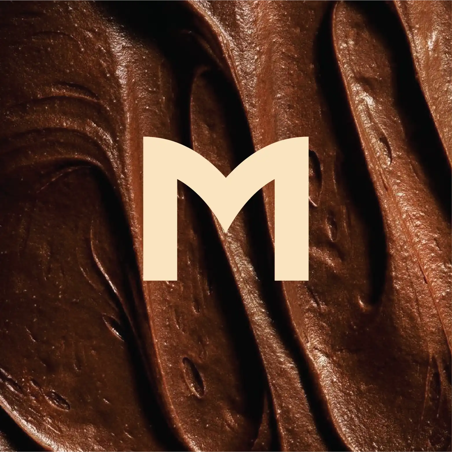
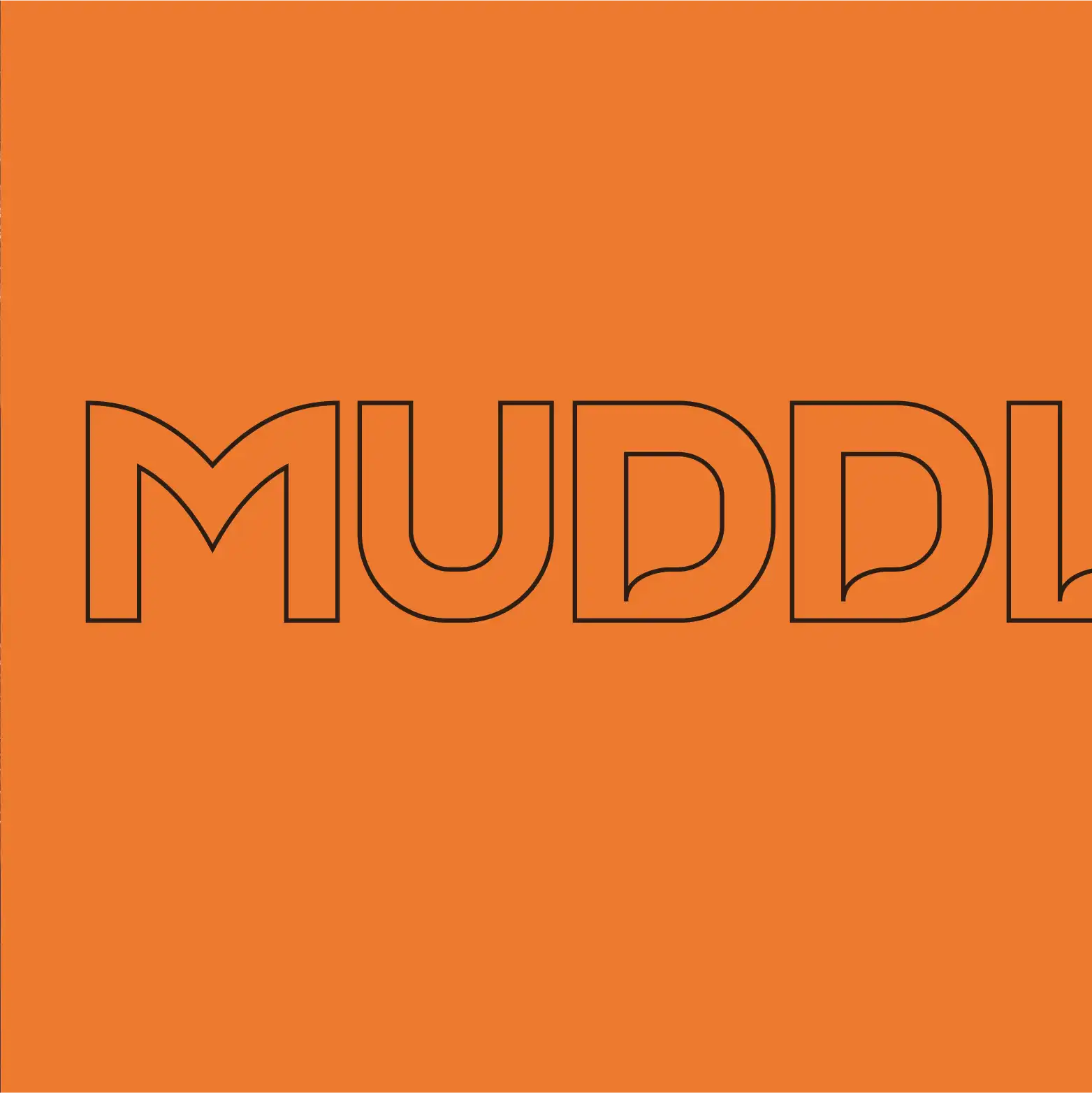
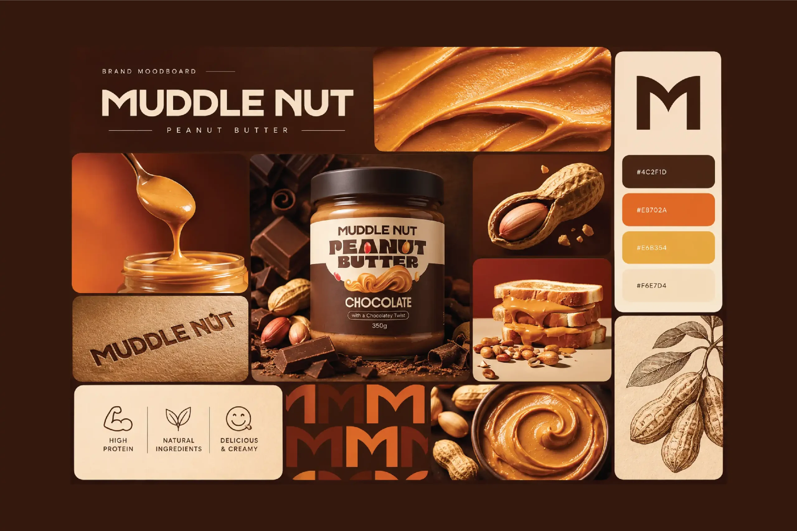
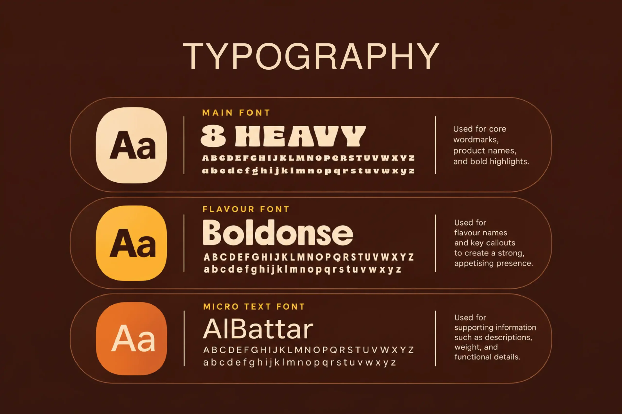
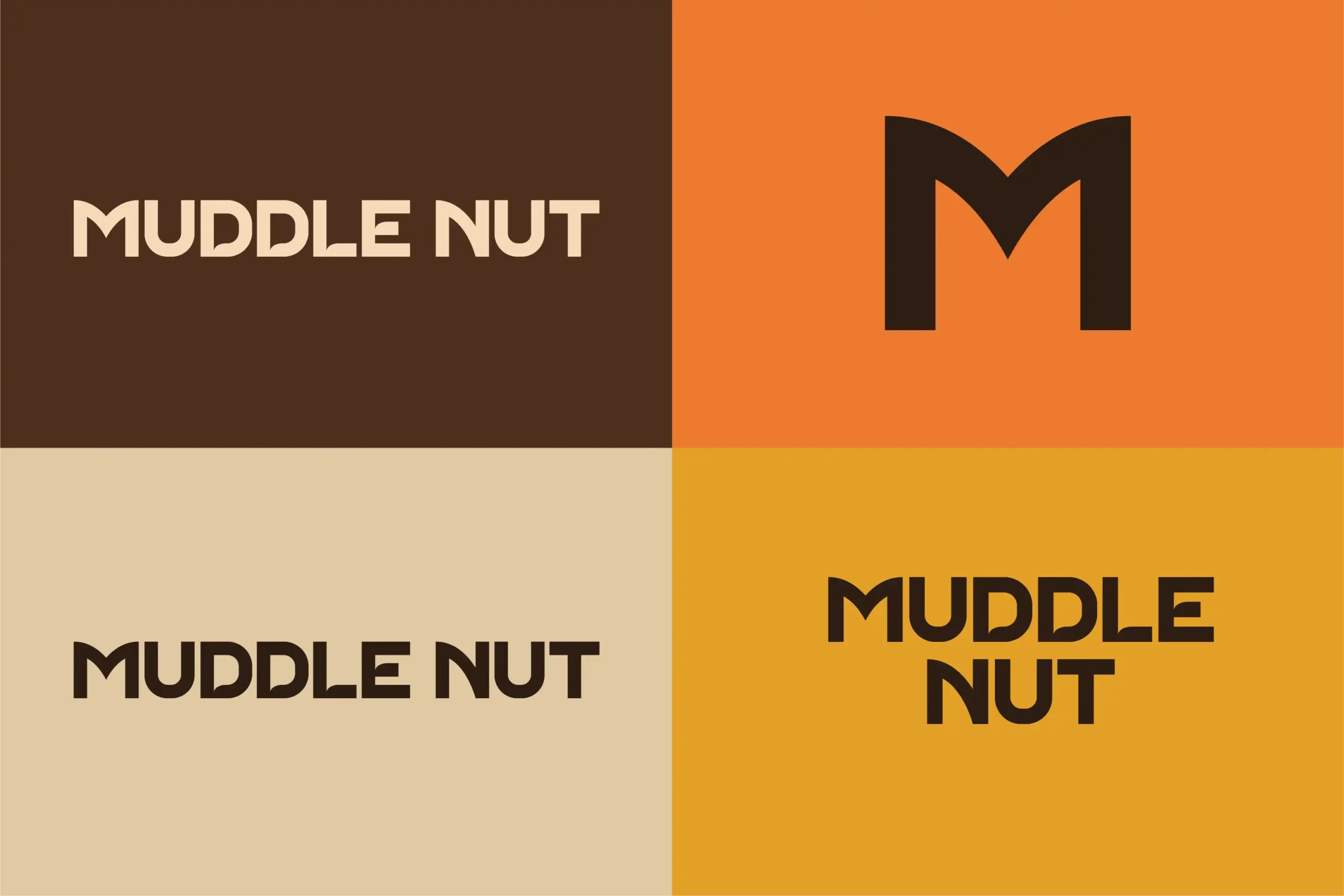
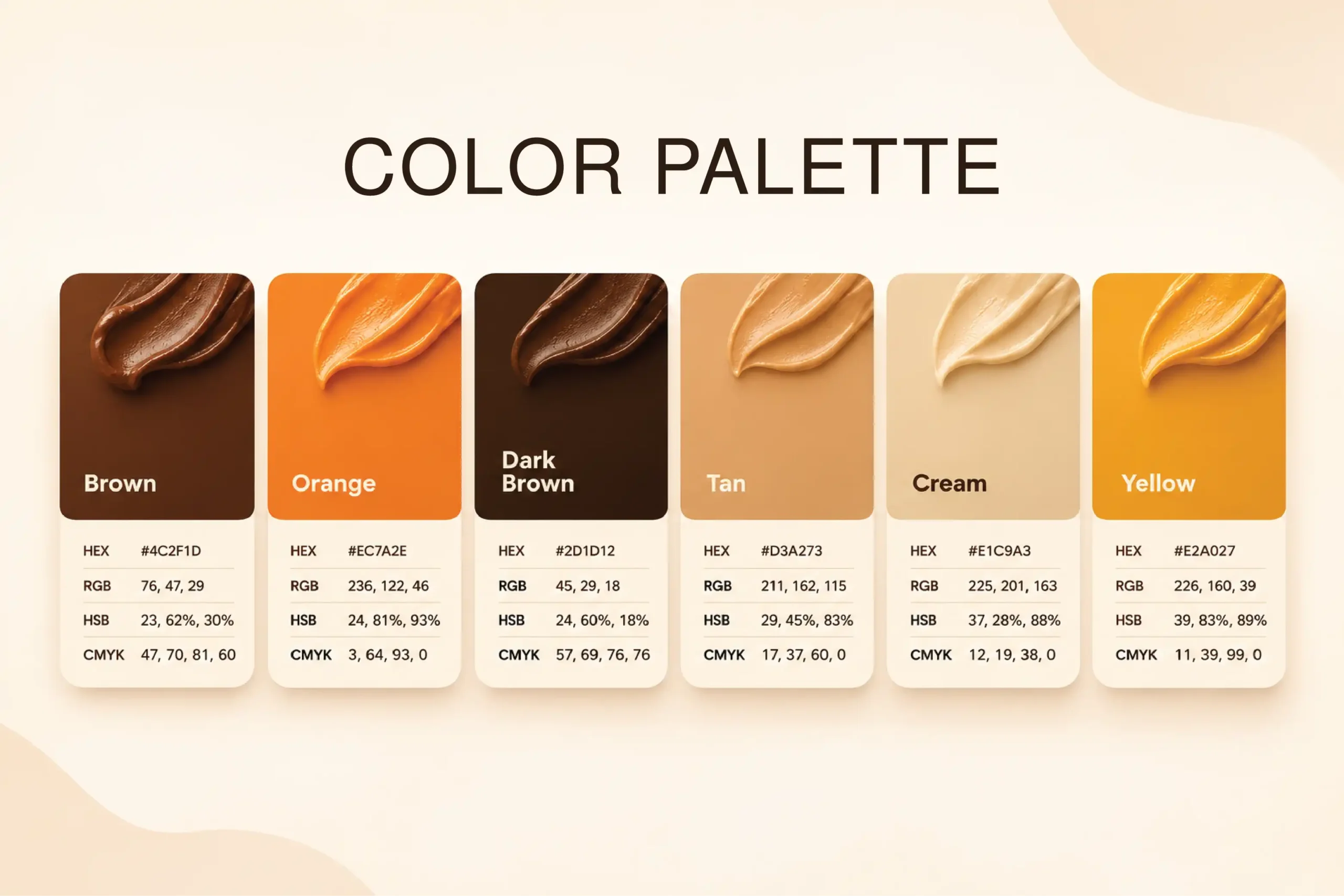
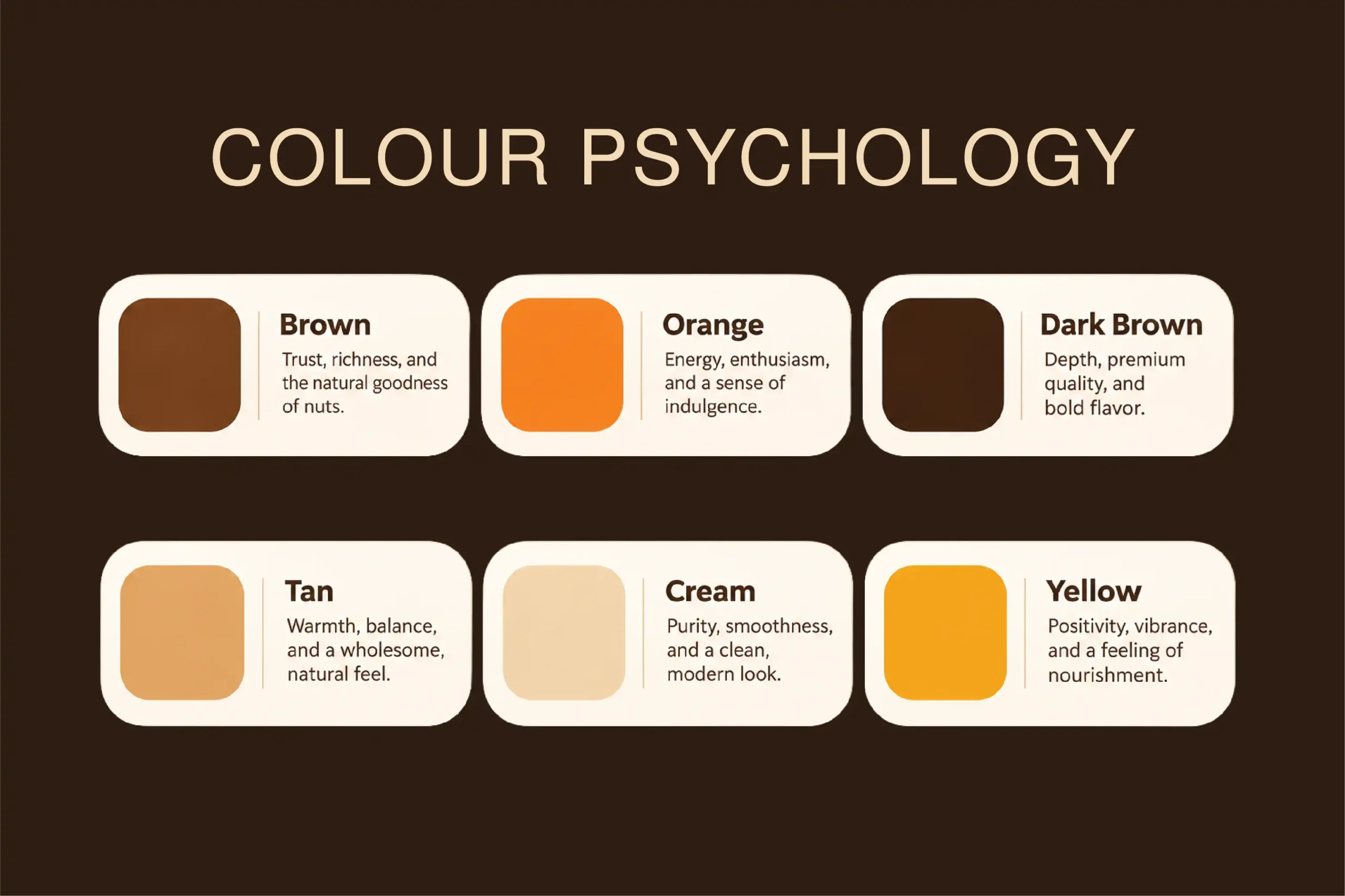
The Muddle Nut identity is built around a distinctive wordmark and a bold “M” symbol, designed to make the brand instantly recognisable. A warm palette of brown, dark brown, orange, tan, cream and yellow draws from the rich tones of peanut butter and its ingredients. The typography pairs 8 Heavy for the core wordmark and product names, Boldonse for flavour names and key callouts, and AlBattar for supporting information. Together with playful peanut characters and expressive graphic elements, these components create a visual language that feels energetic, appetising and unmistakably Muddle Nut.
06) Packaging Design
Three flavours. One bold family.
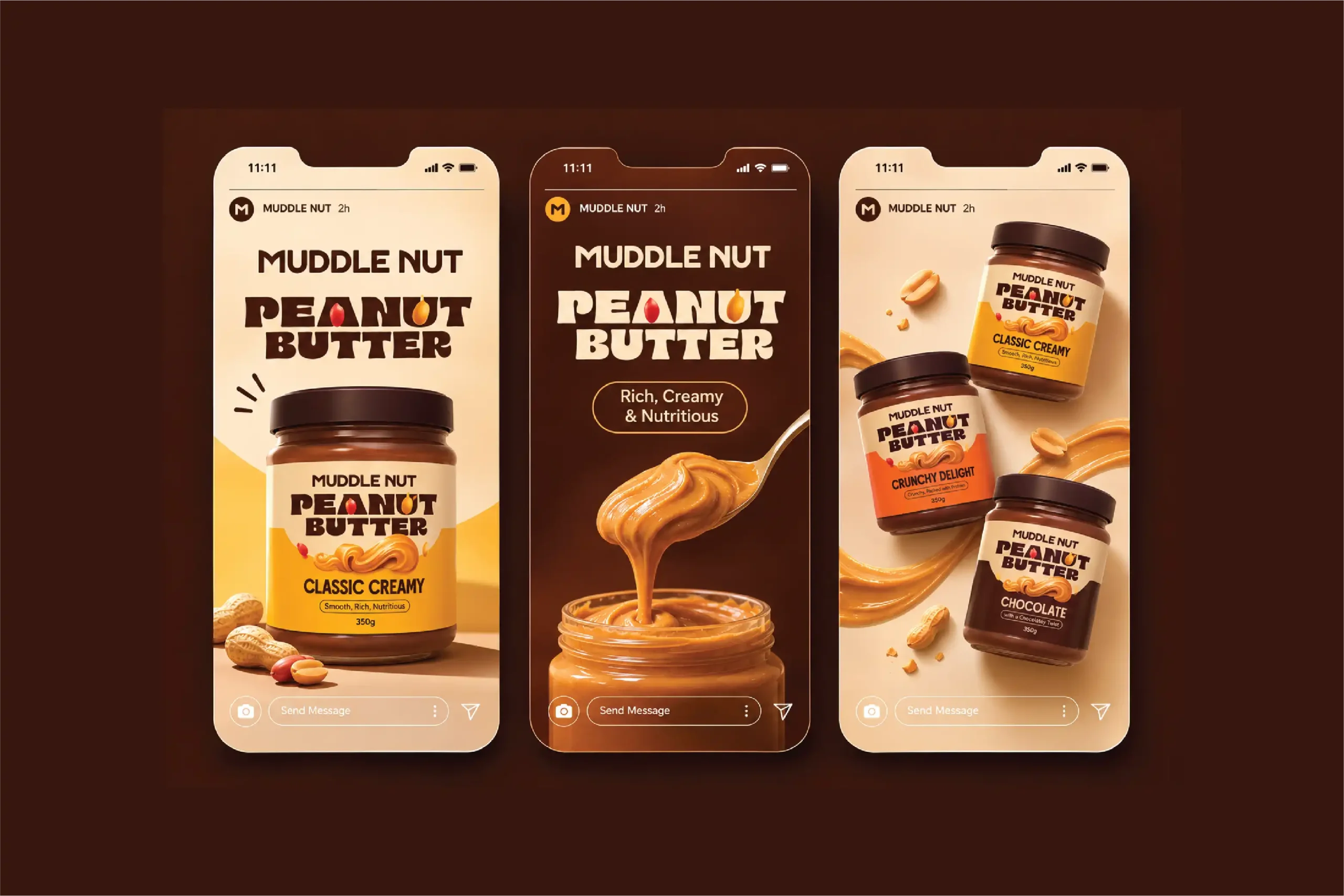
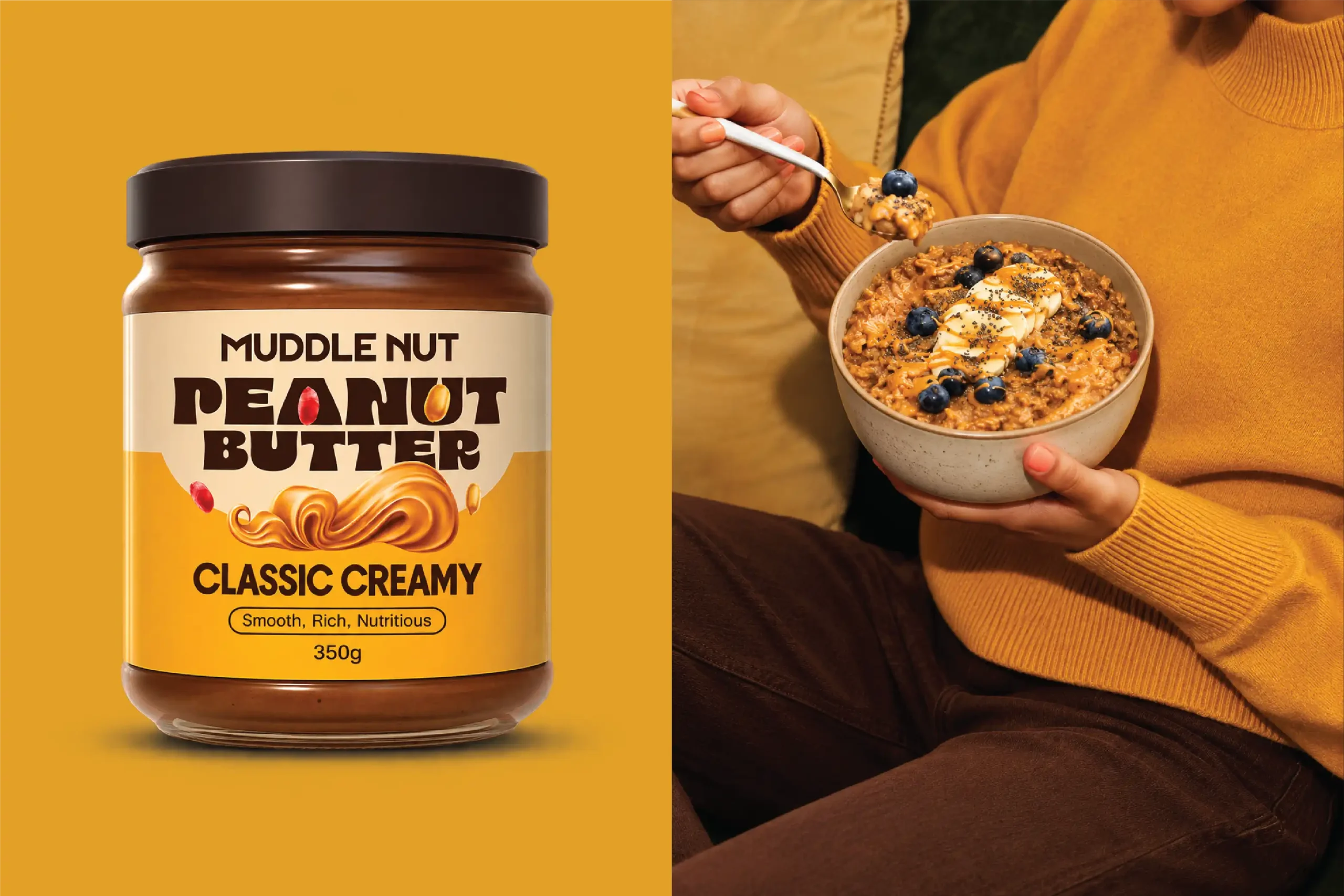
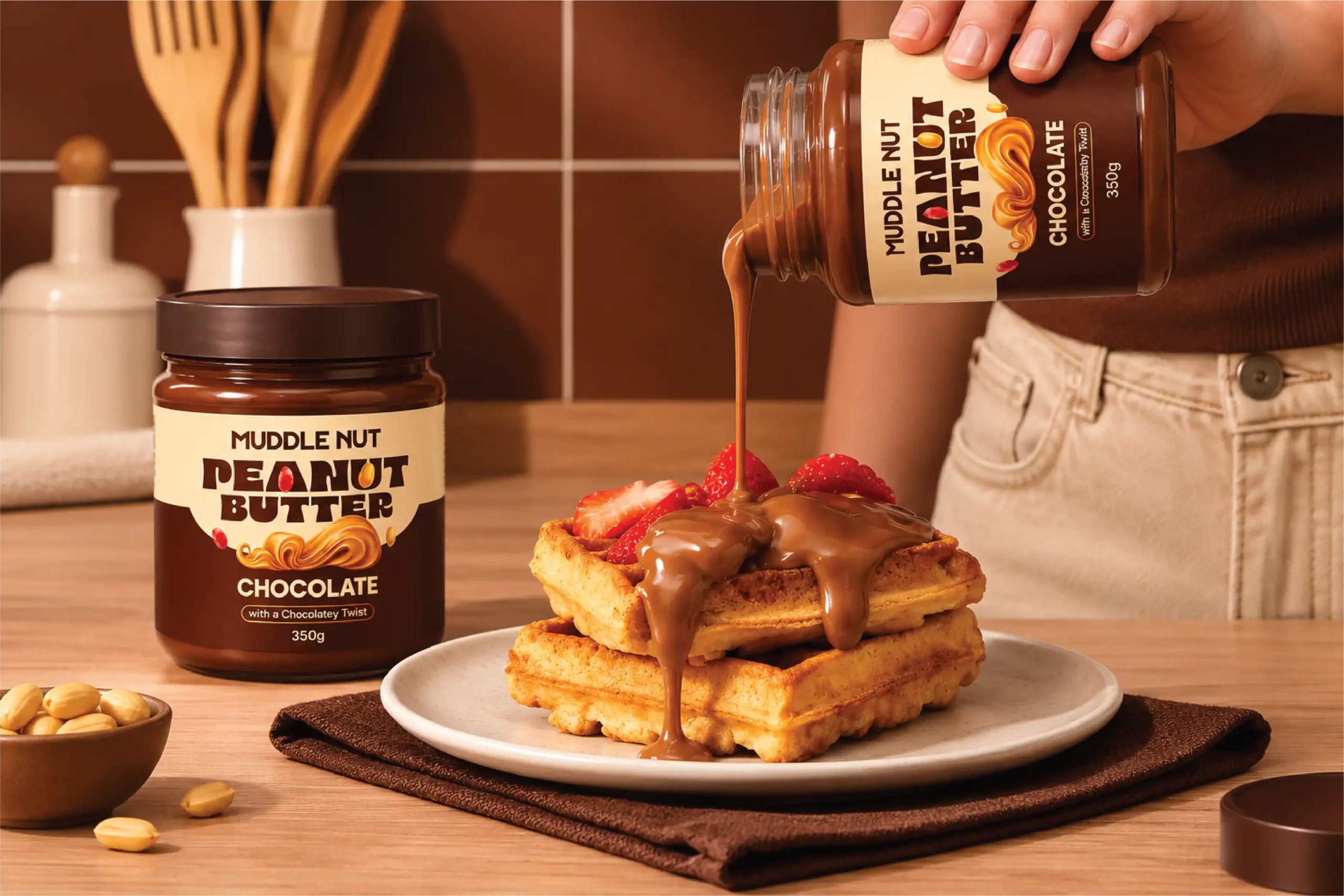
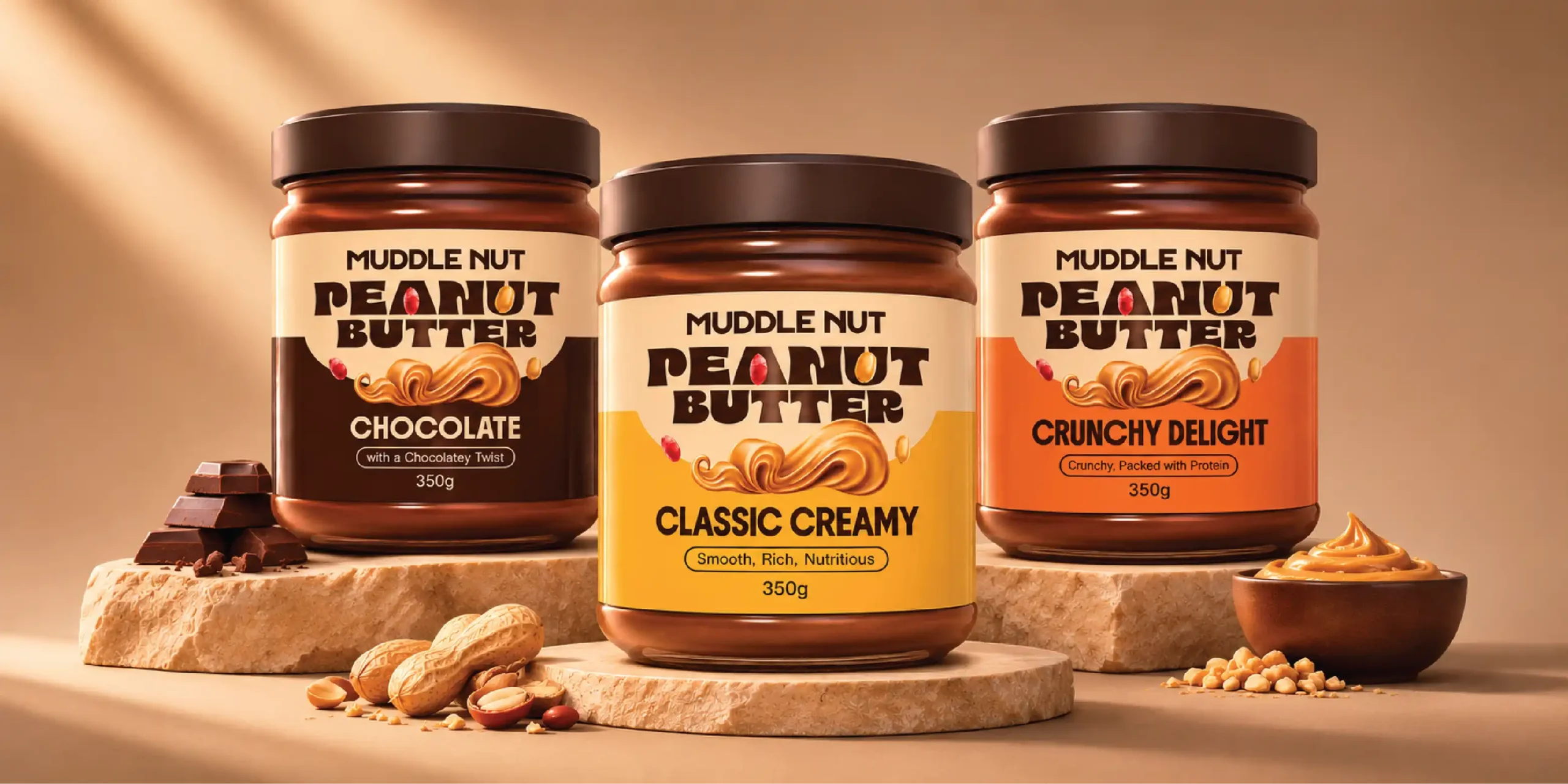
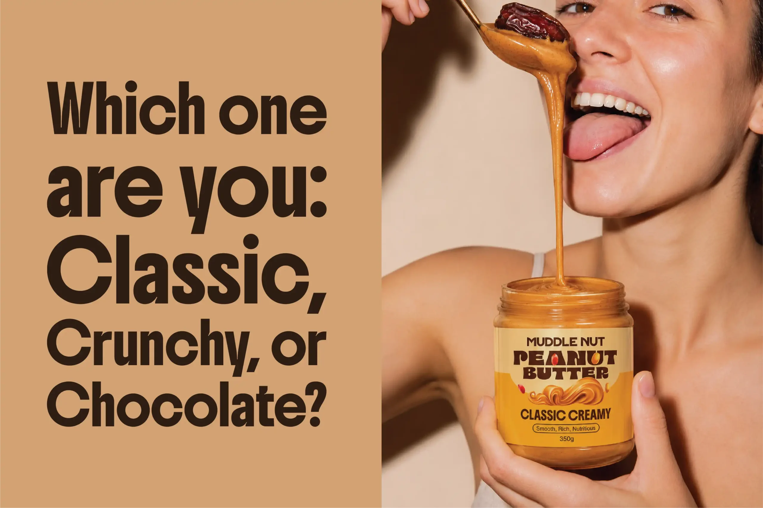
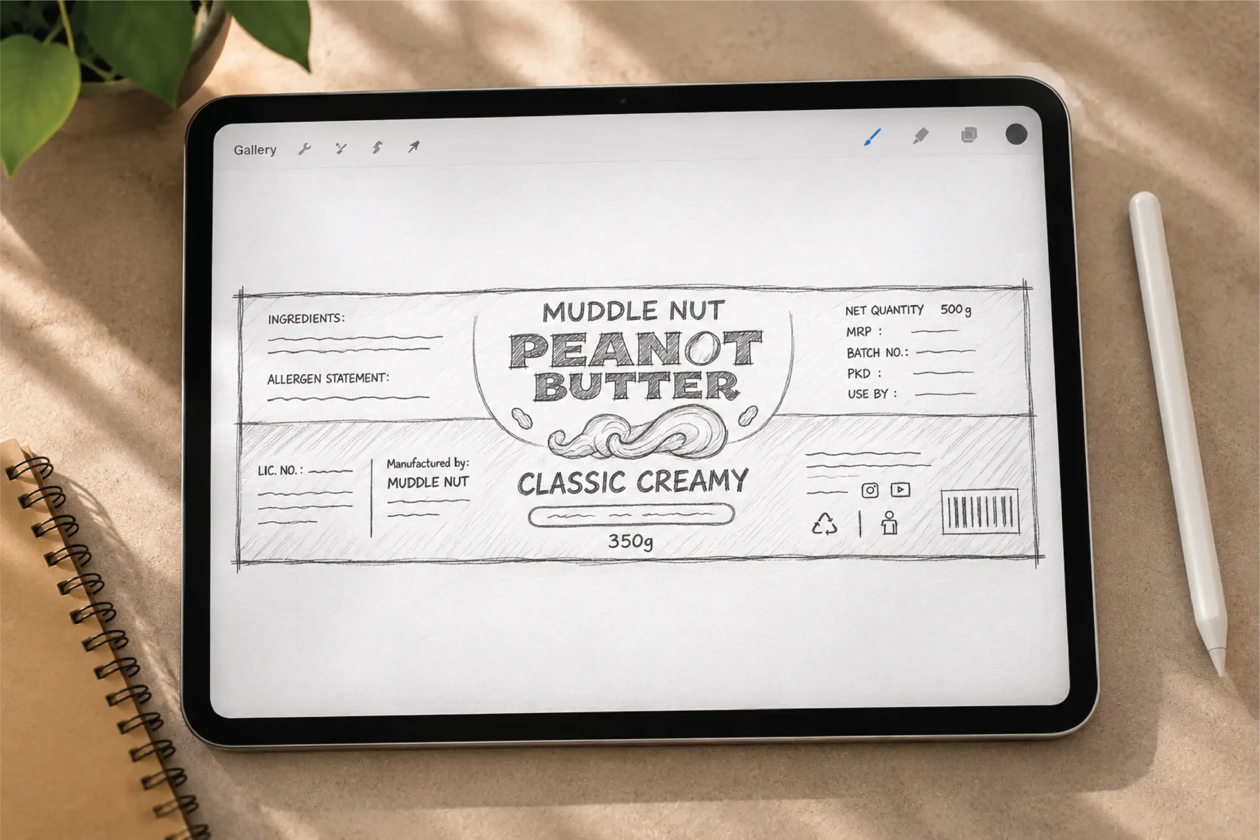
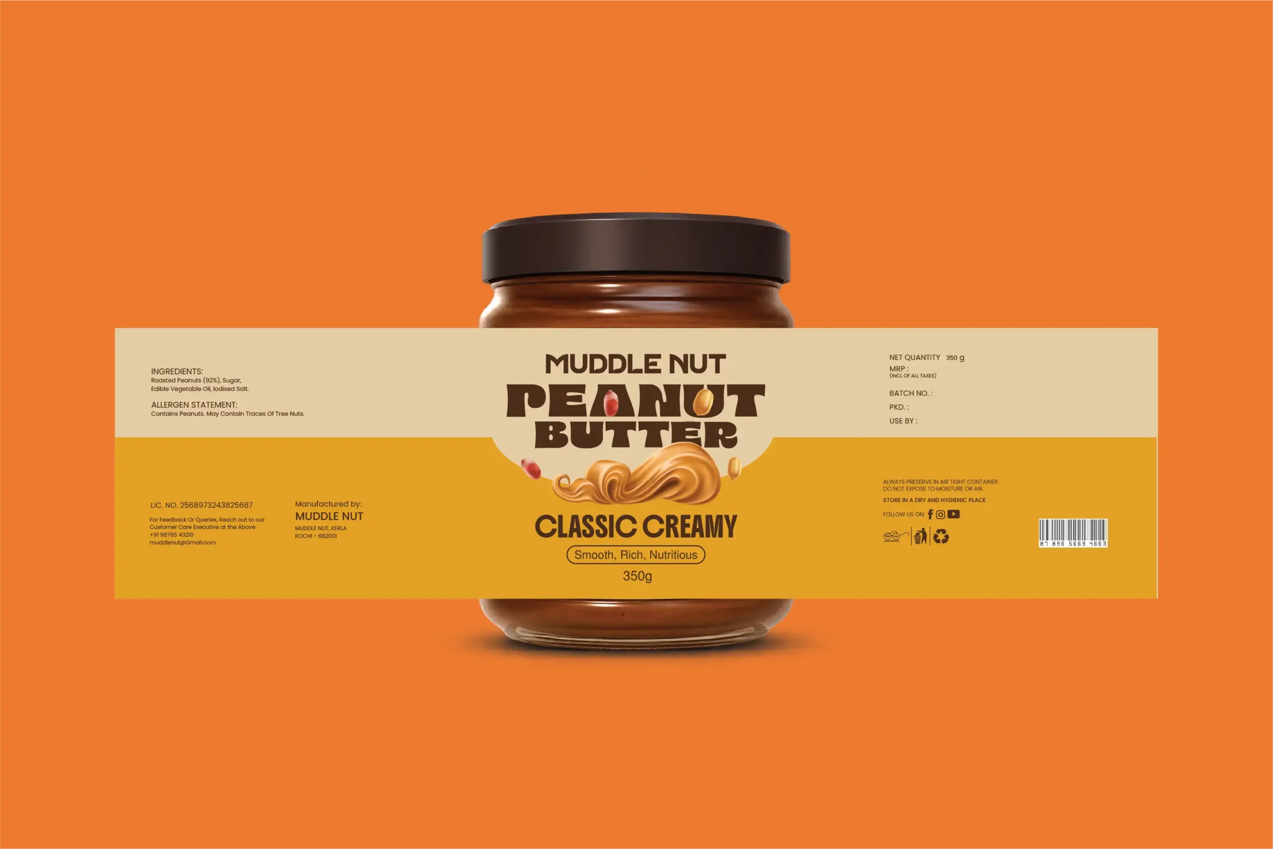
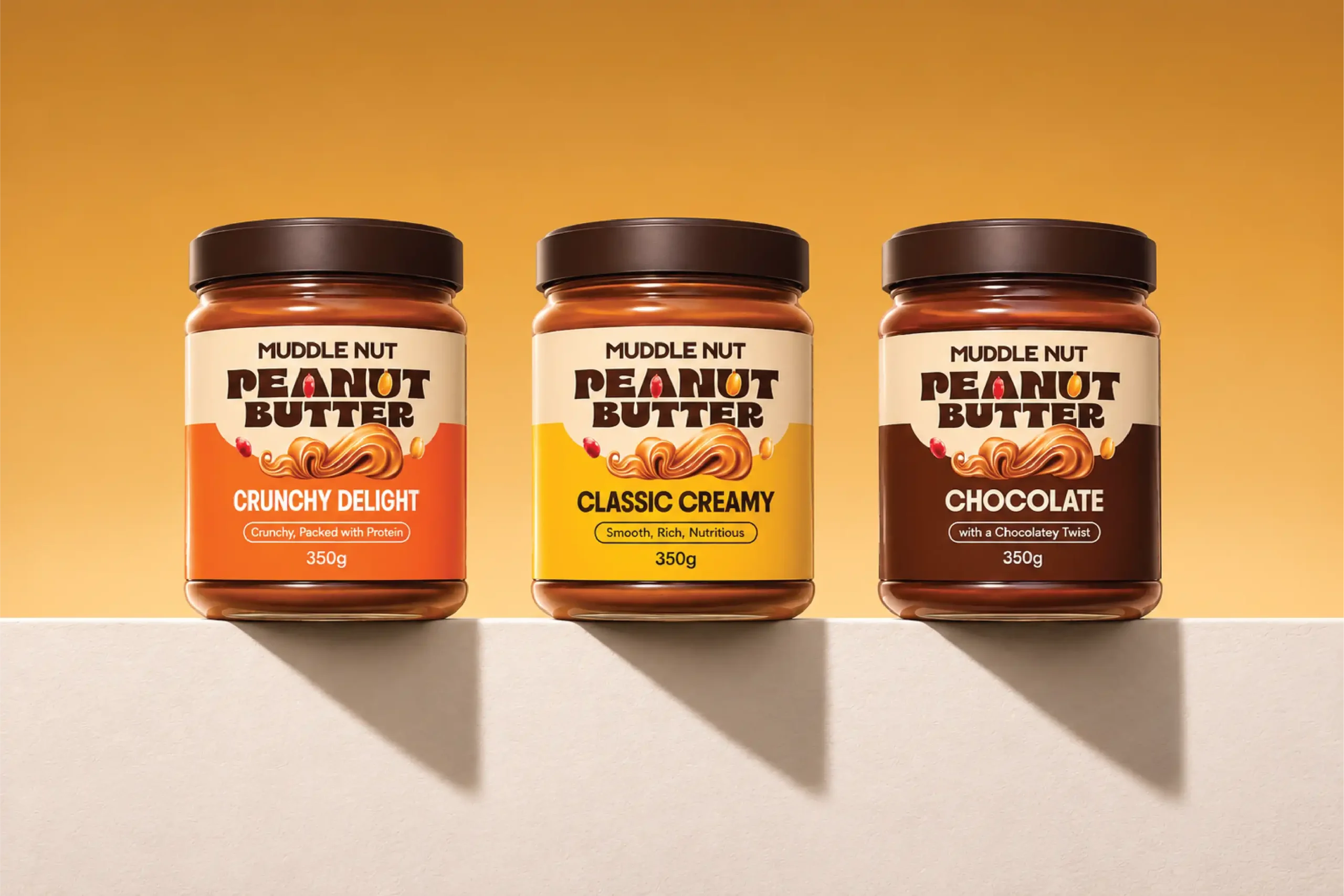
The packaging system brings the Muddle Nut personality straight to the jar. A consistent label structure keeps the range connected, while distinct colour treatments help separate Classic Creamy, Crunchy Delight and Chocolate. Bold product naming, rich ingredient cues and clear flavour details give each variant its own character while keeping the full range cohesive on the shelf.
07) Campaigns & Brand Applications
Taking the good stuff beyond the jar.
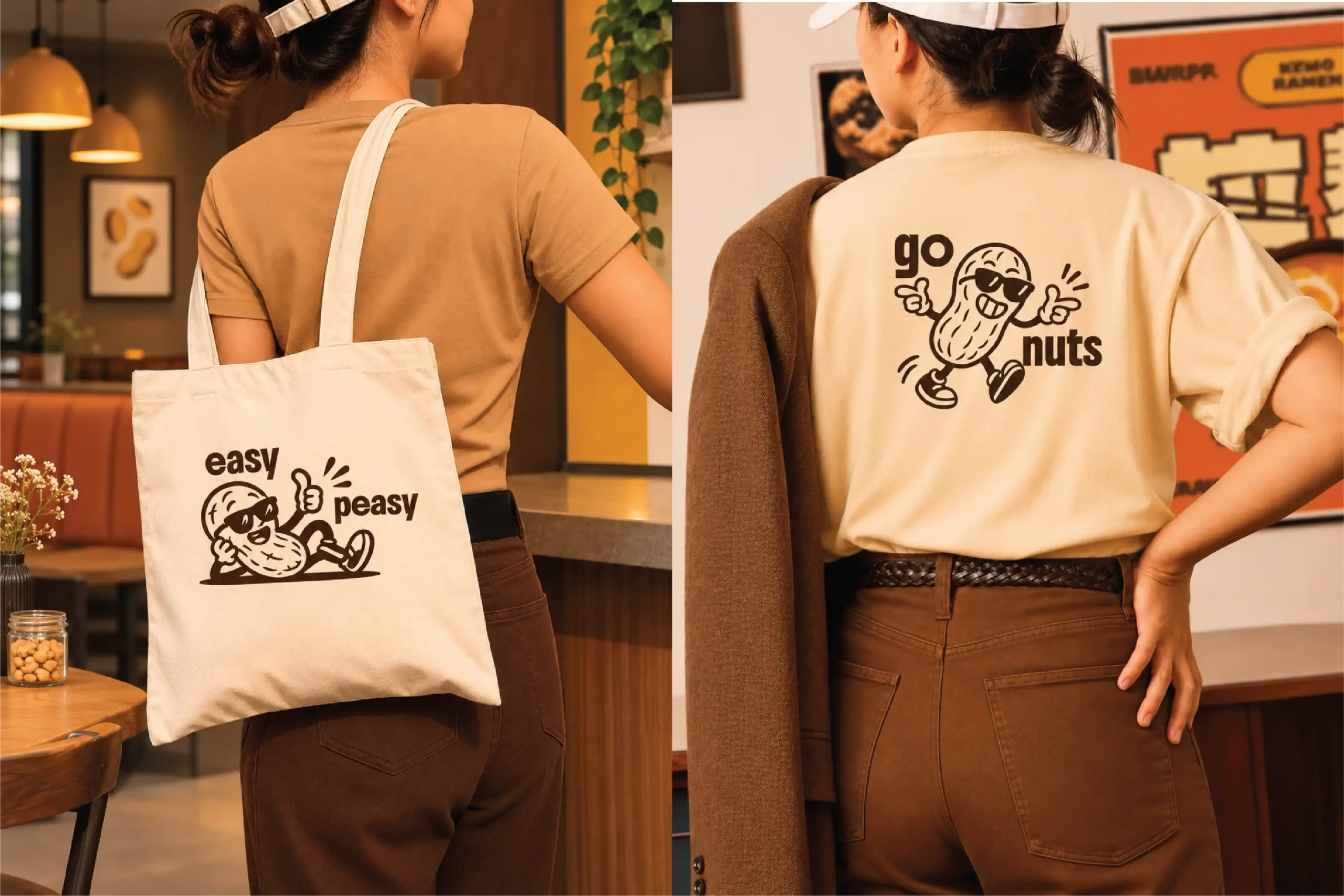
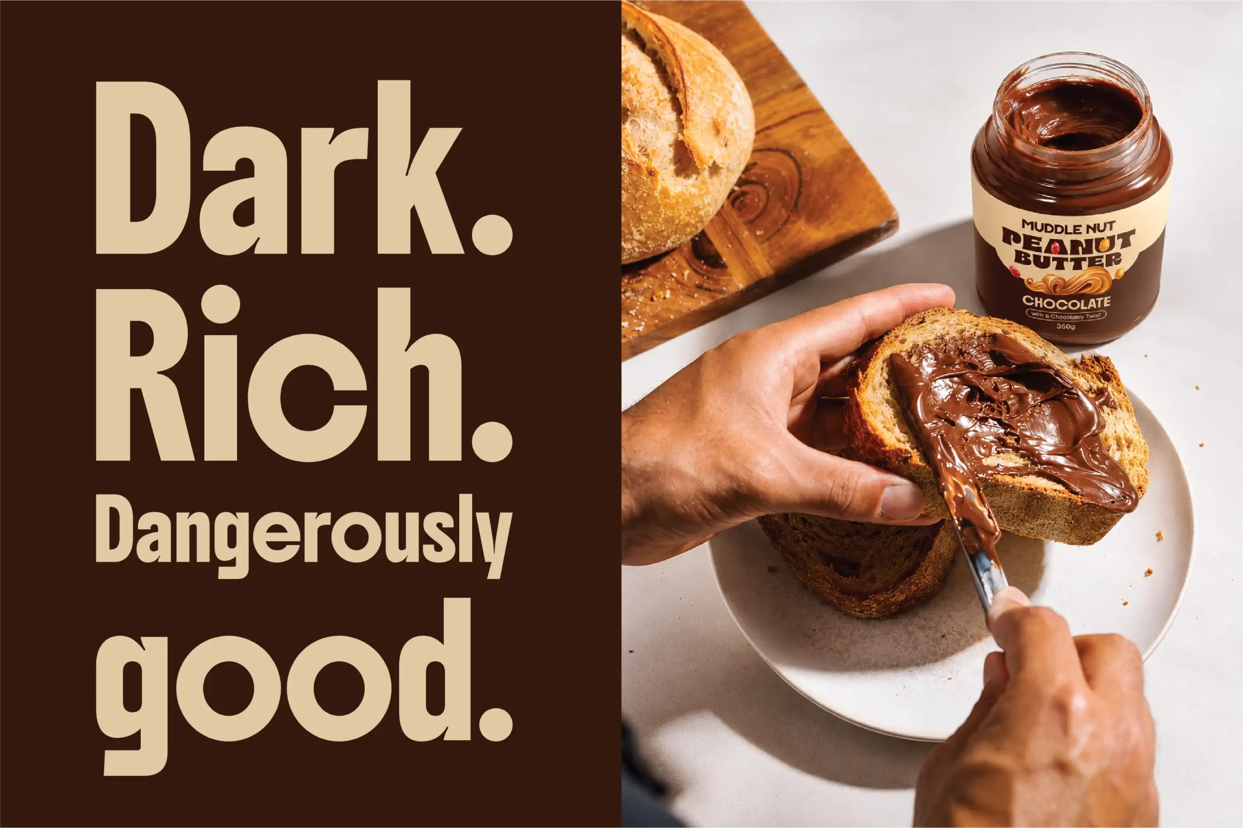
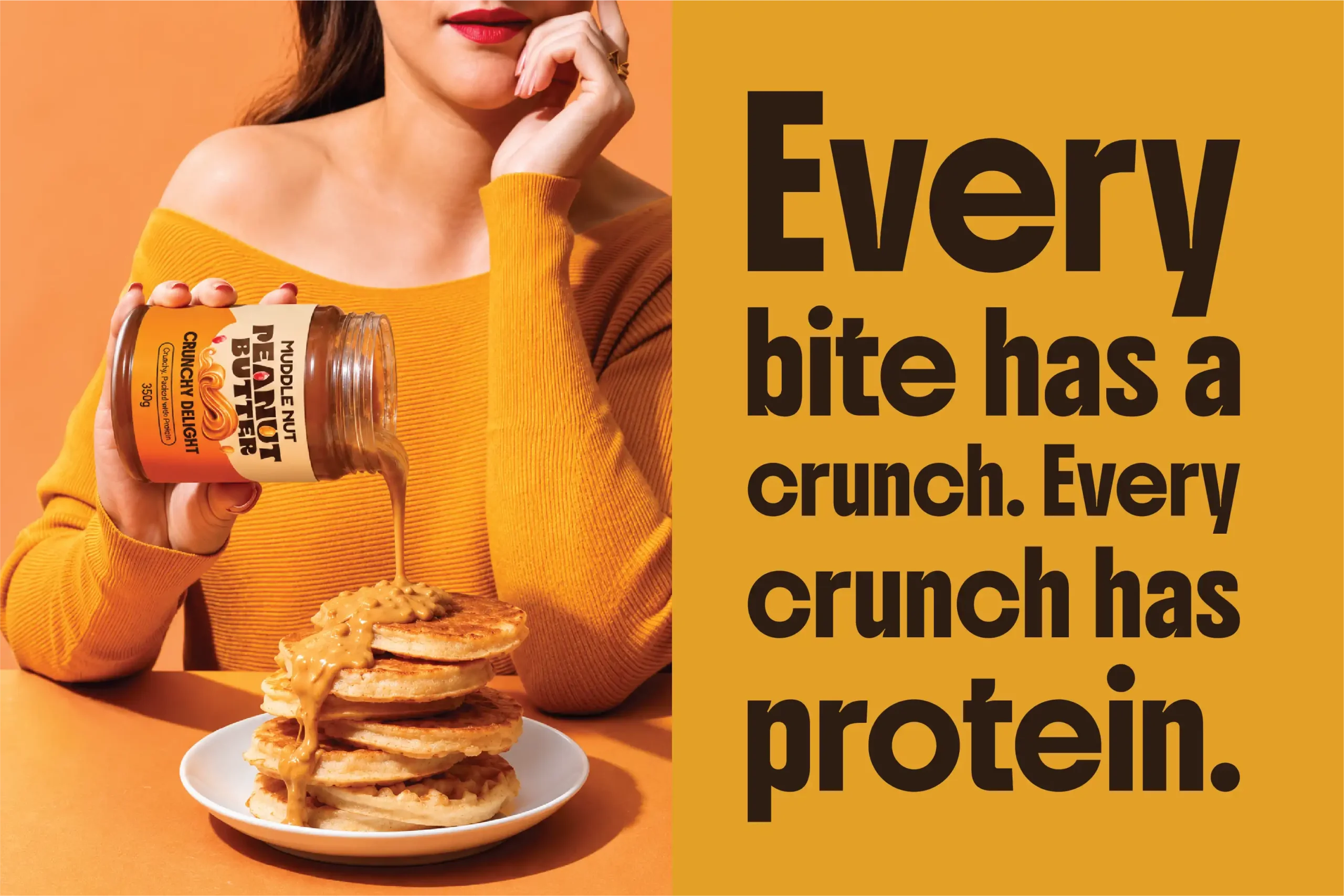
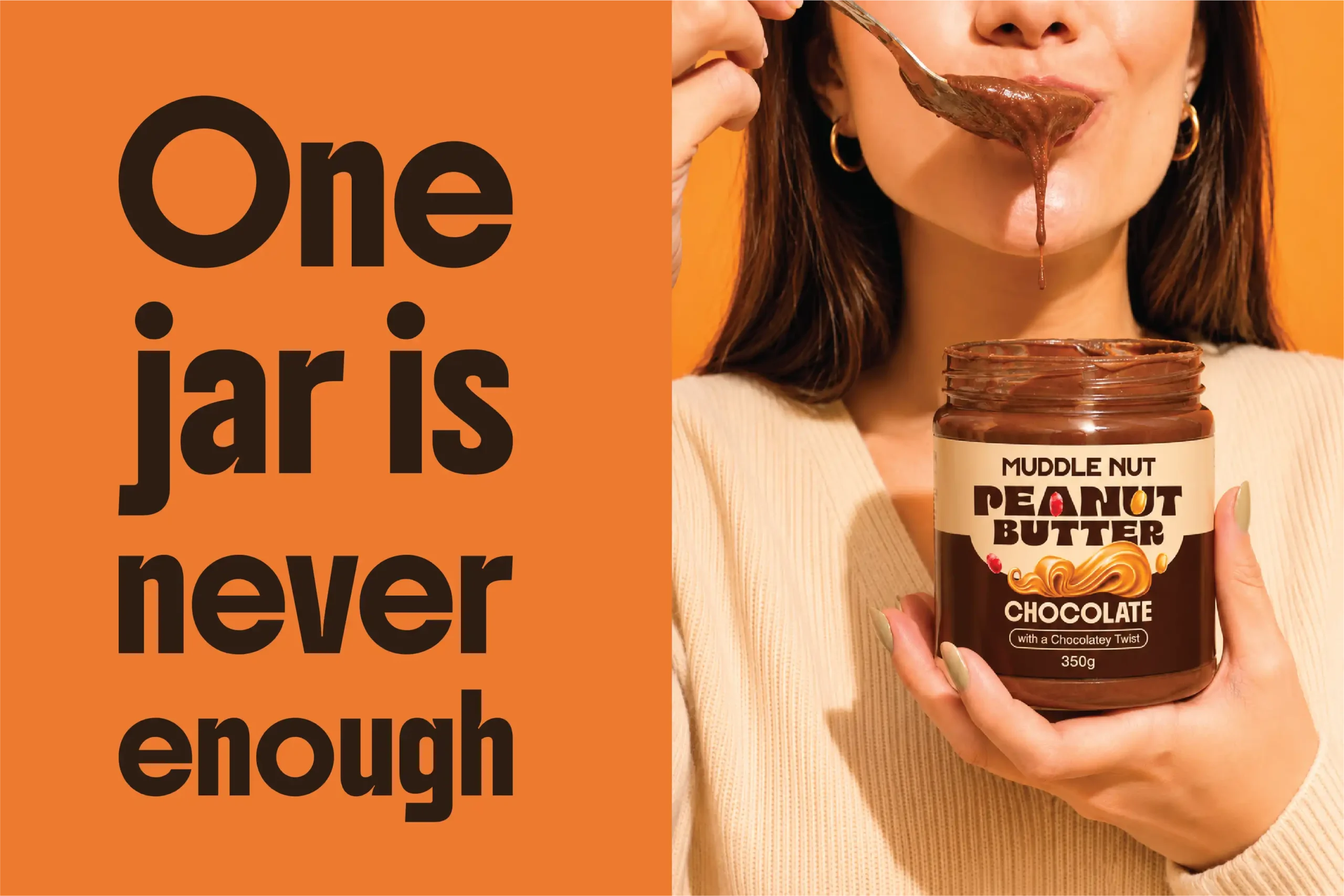
The identity extends into social media stories, product campaigns, lifestyle visuals, merchandise and apparel. Playful headlines such as “One jar is never enough” and “Which one are you: Classic, Crunchy, or Chocolate?” give the brand a conversational voice, while the peanut character adds personality to its applications. Across digital and physical touchpoints, the same colours, typography and graphic style keep Muddle Nut easy to spot and remember.