01) Overview
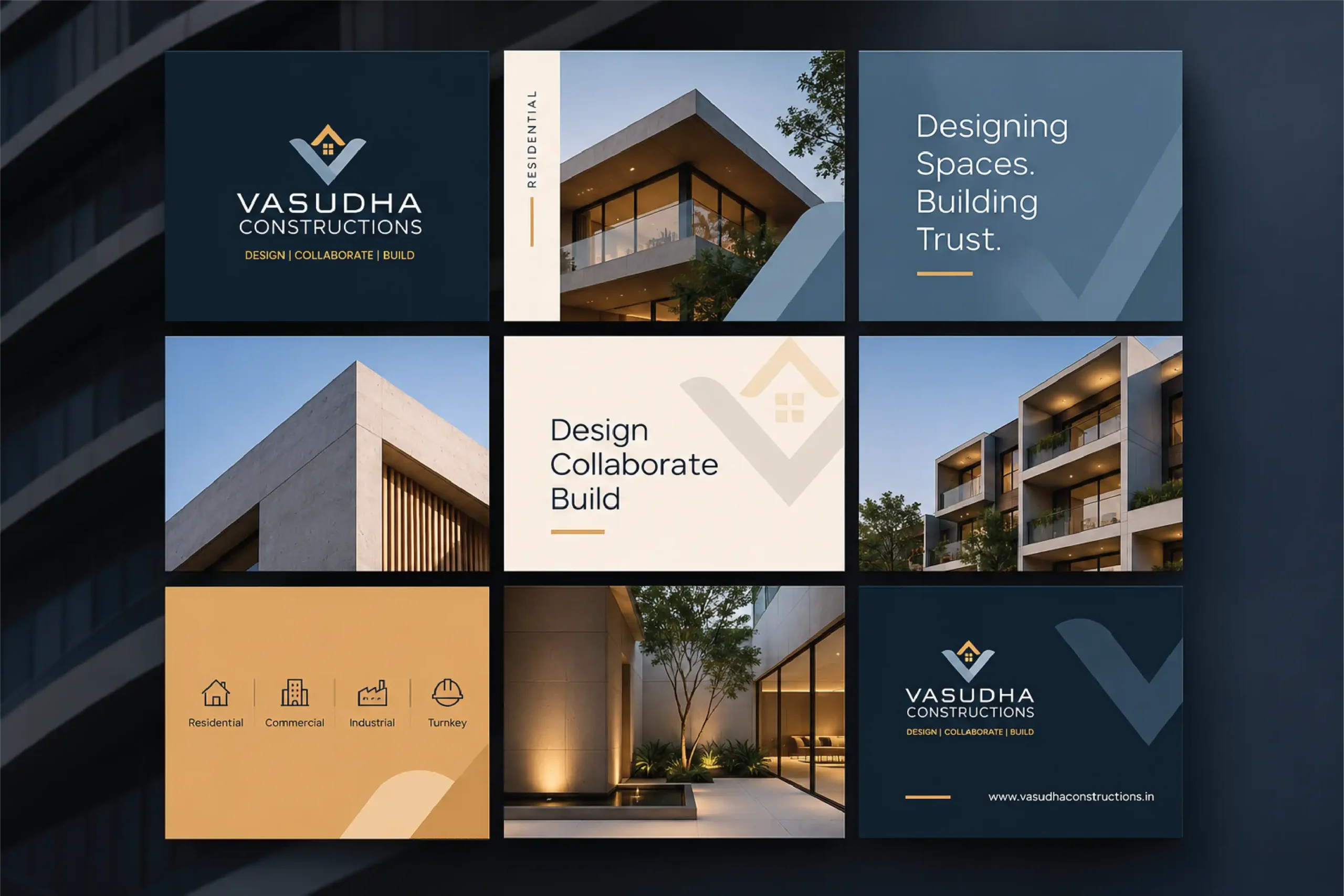
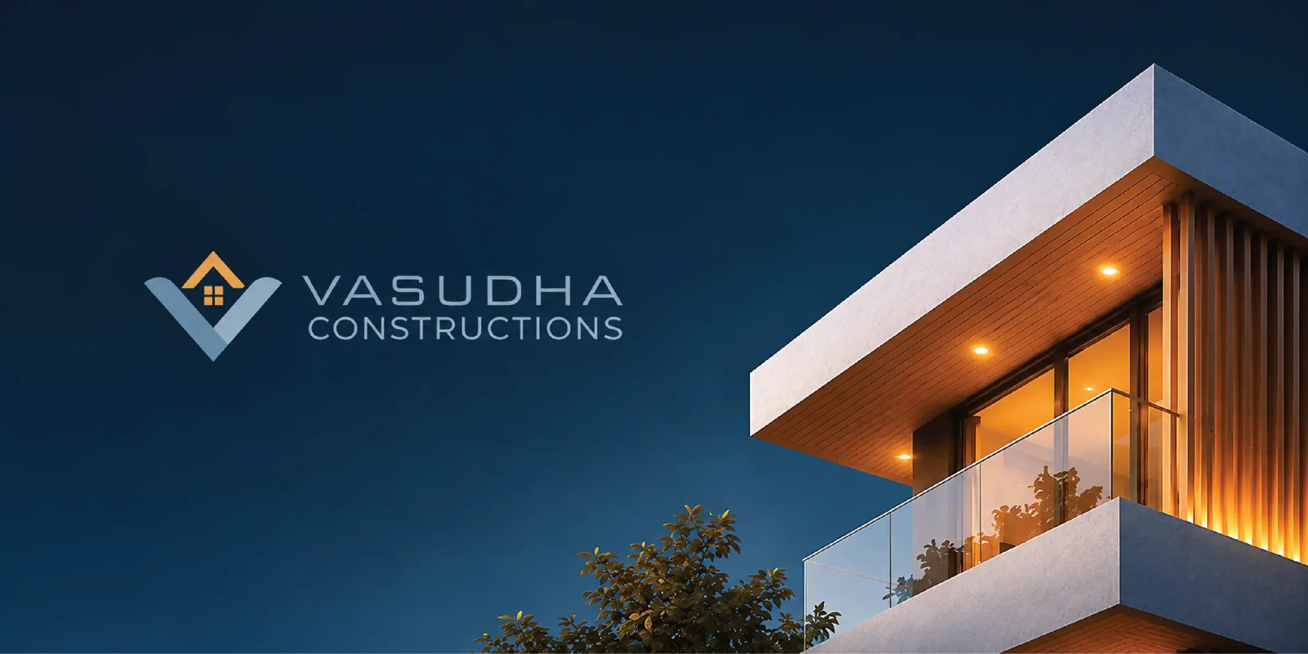
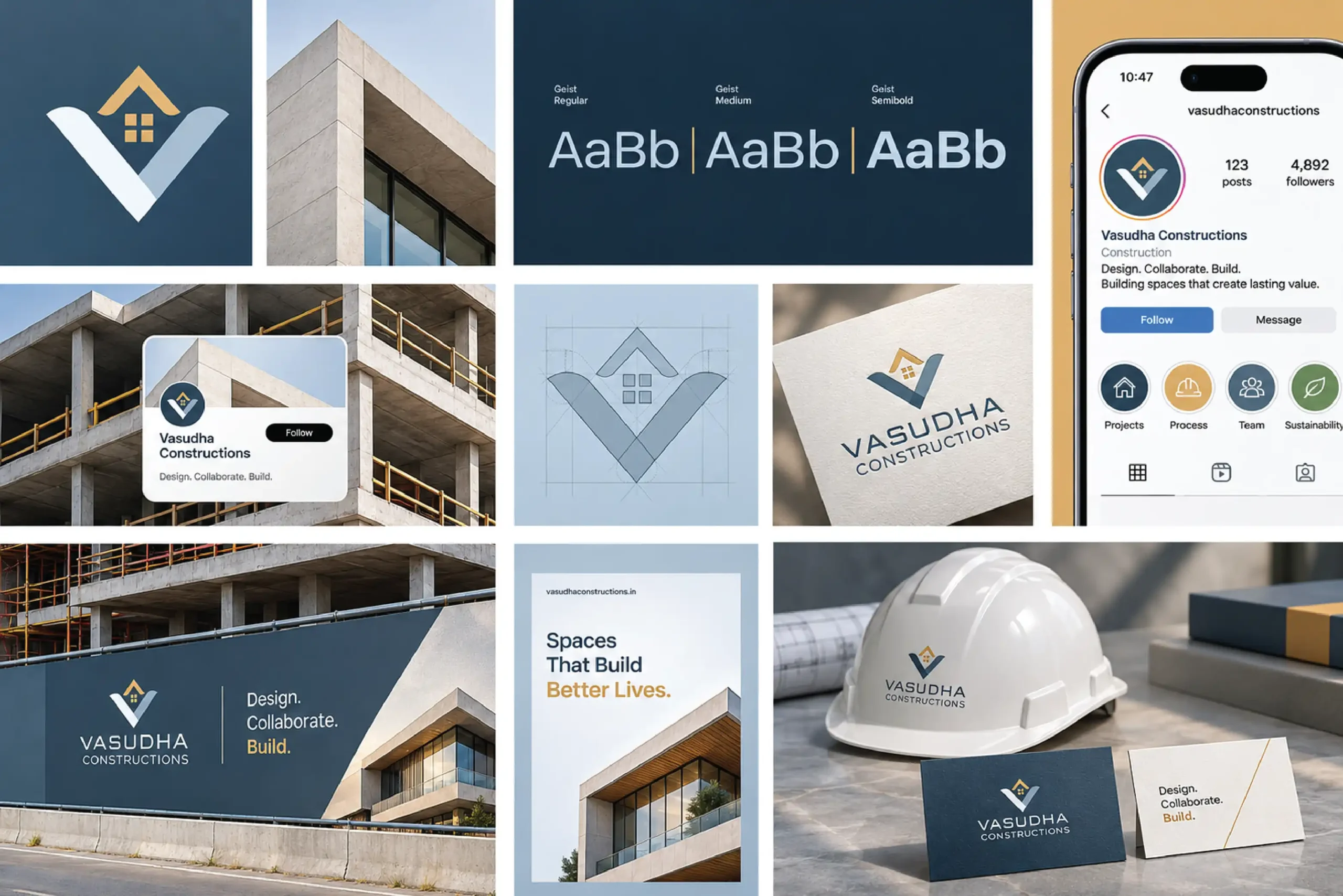
Vasudha Constructions builds spaces that last. The brief was an identity that feels strong, stable and trustworthy, with a contemporary architectural edge. IM Creative designed the construction company branding: logo, colour, typography, pattern and applications. One idea runs through all of it. Design. Collaborate. Build.
Client: Vasudha Constructions Industry: Construction & Built Environment Scope of Work: Logo Design, Visual Identity, Typography, Colour System, Iconography, Brand Pattern, Stationery and Brand Applications
02) The Creative Challenge
Strength on site. Trust at home.
Construction is structure and stability. A home is trust. The identity had to carry both.It also had to hold across site hoardings, stationery, apparel and digital. Dependable. Professional. Never generic.
03) The Approach
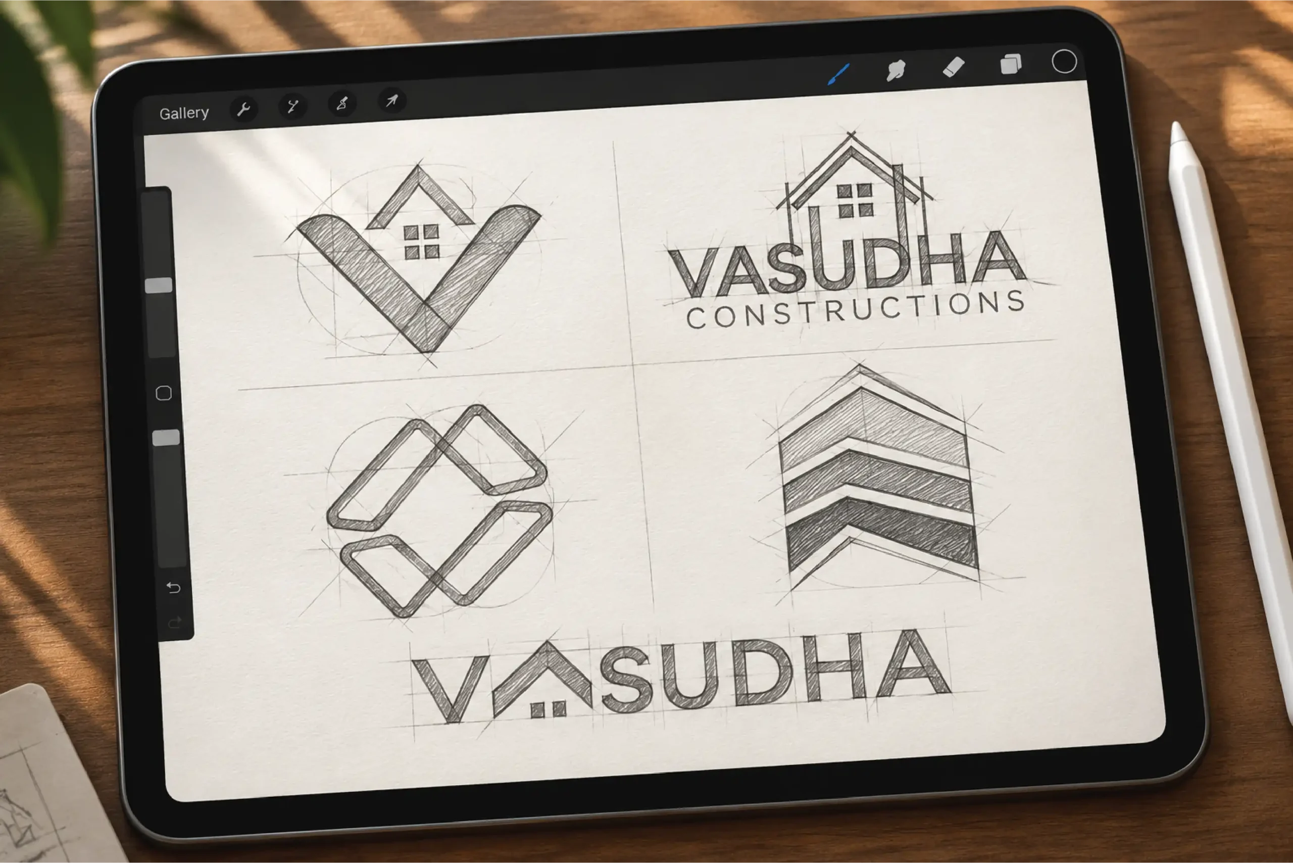
A strong foundation. A clear direction
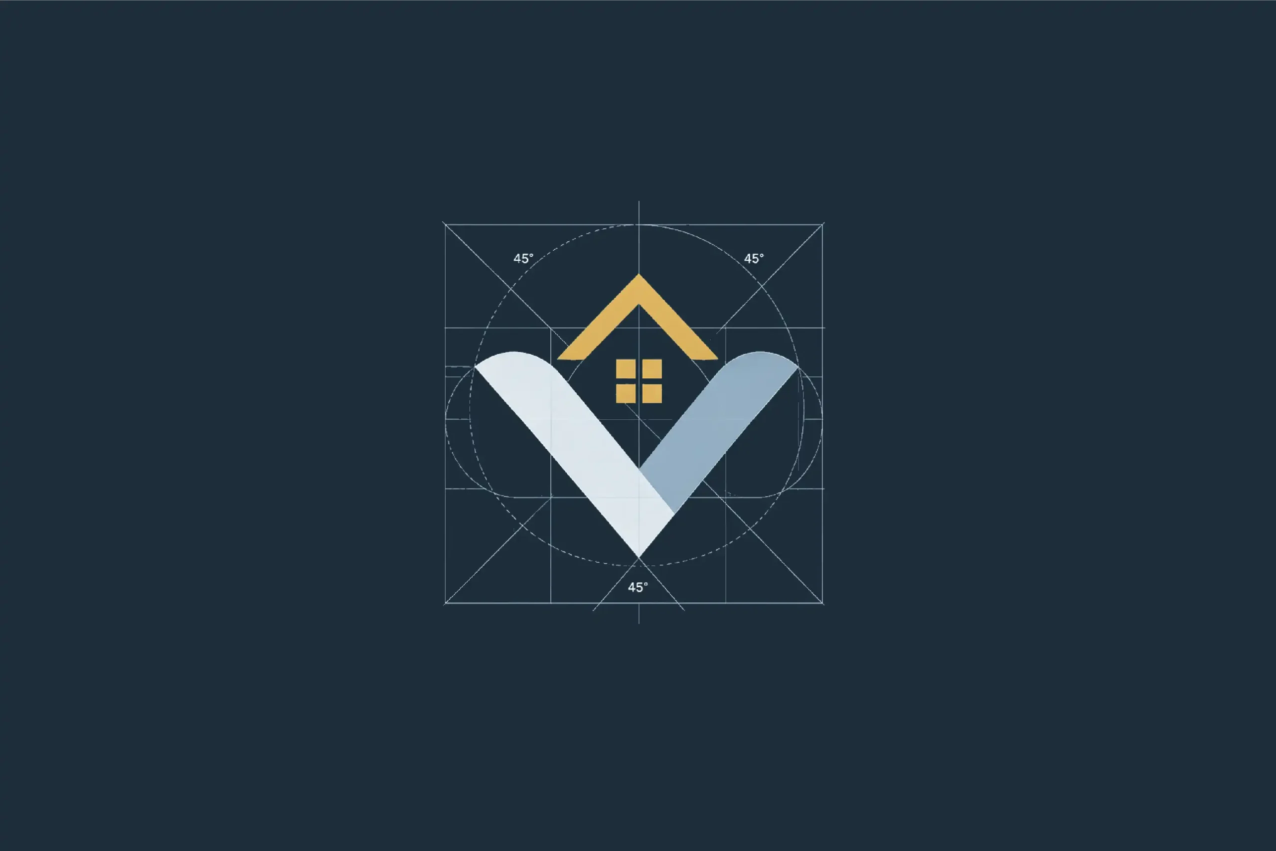
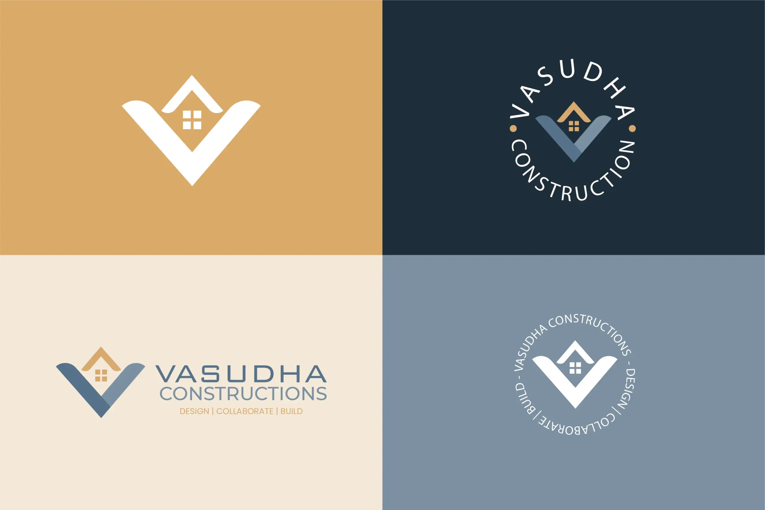
IM Creative built the direction on three ideas. The strength of construction. The reassurance of a home. The value of collaboration.A structured logo. A restrained architectural palette. Clean typography. The system works from a small icon to a full site hoarding.
04) The Concept
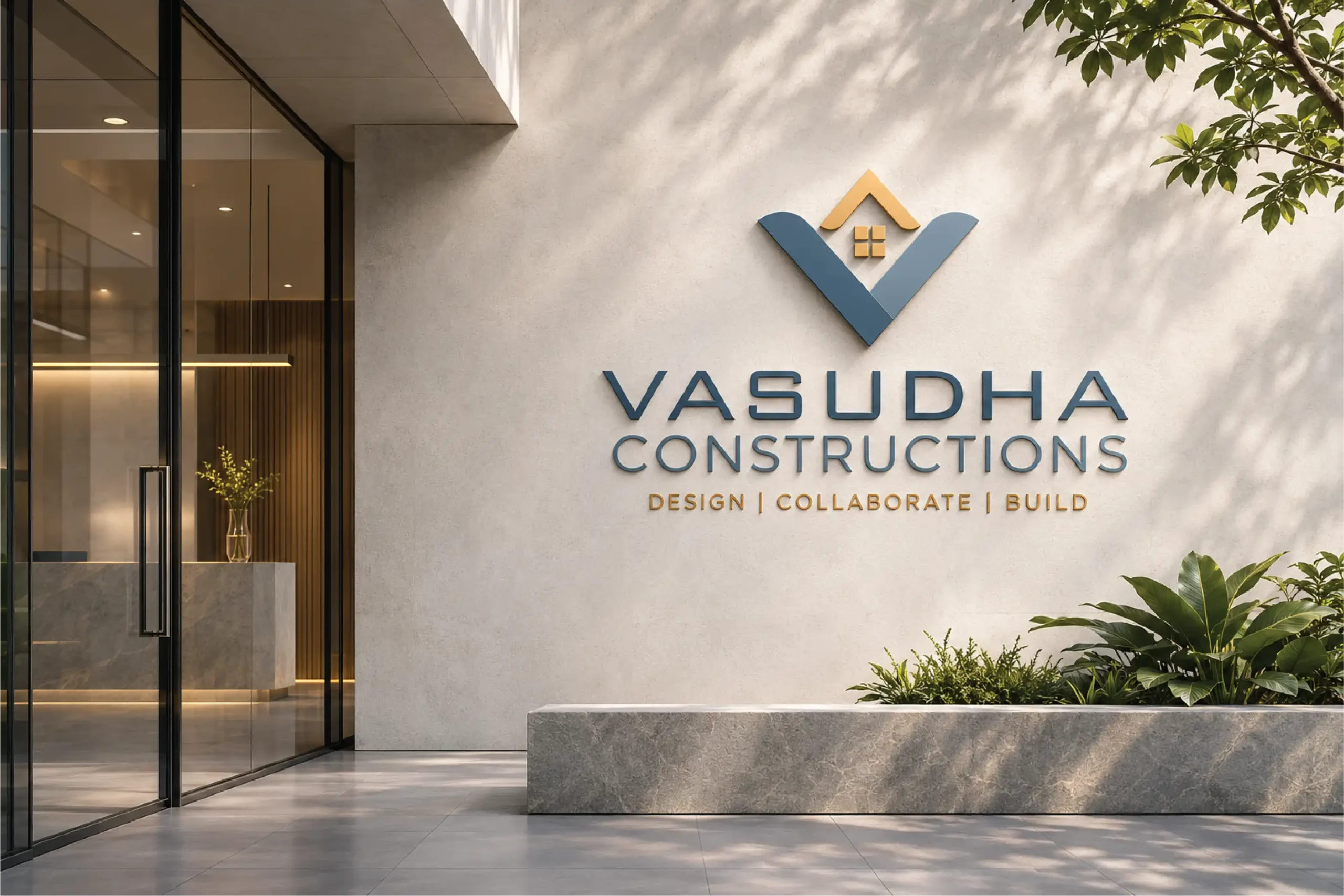
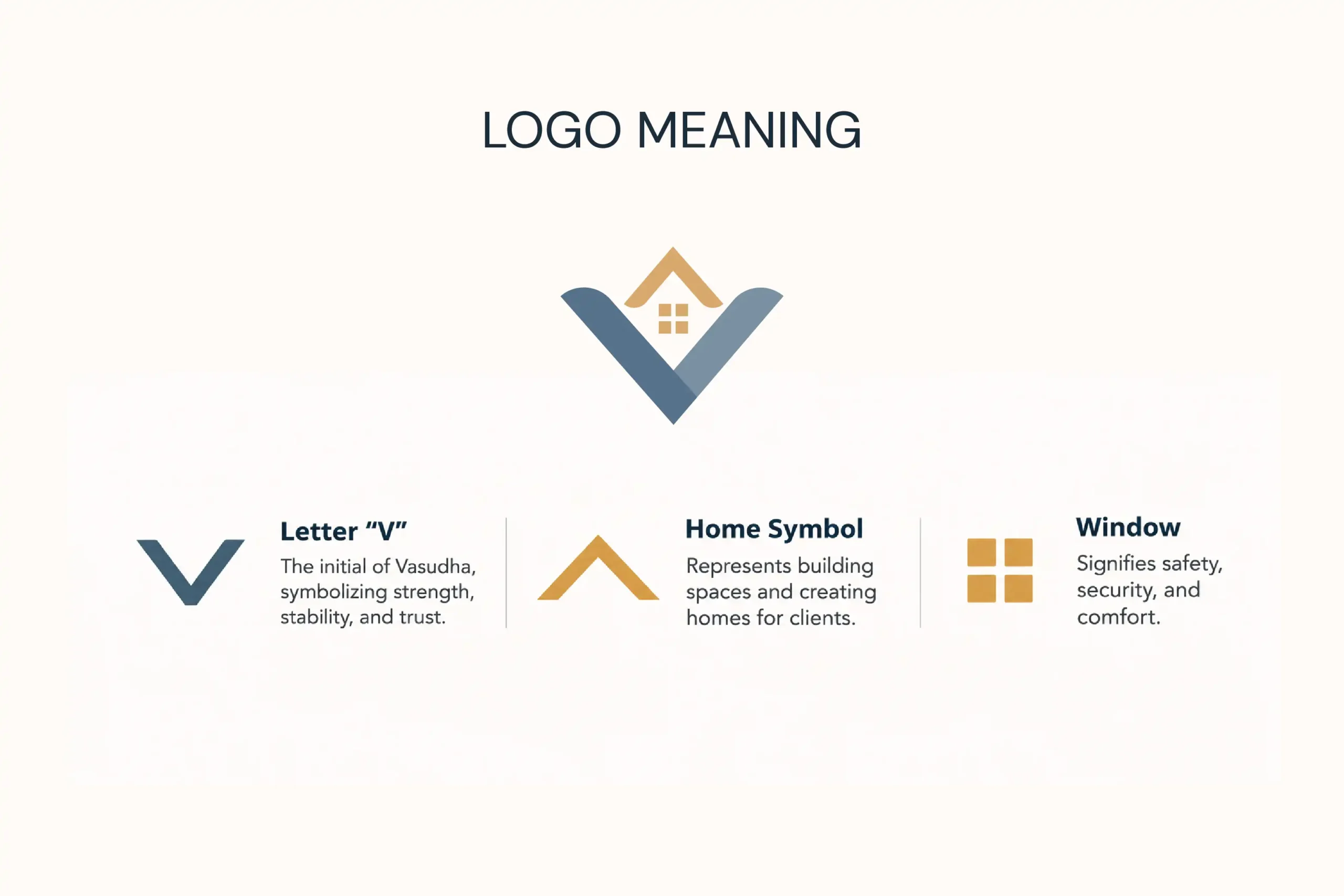
A home, built into the letter V.
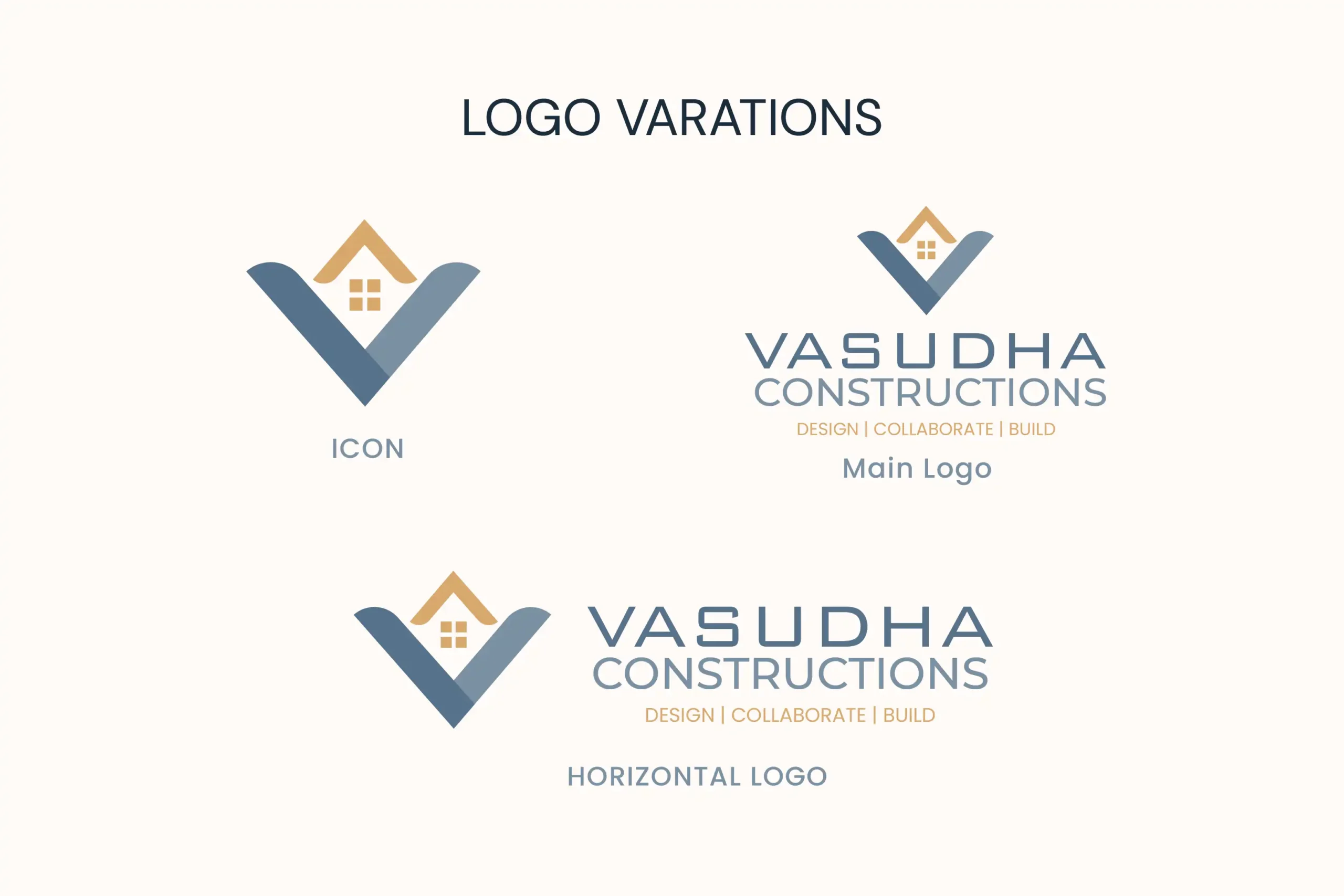
One letter. One home. The two angled strokes form the V of Vasudha. The V stands for strength, stability and trust. The roof stands for building and creating spaces. The four-pane window stands for safety, security and comfort. The mark is compact. The meaning is complete.
05) The Visual Identity
Simple system. Strong presence.
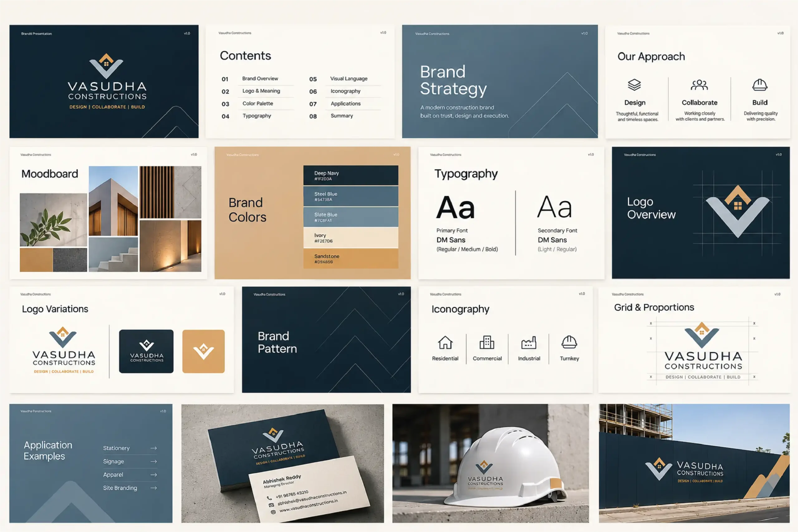
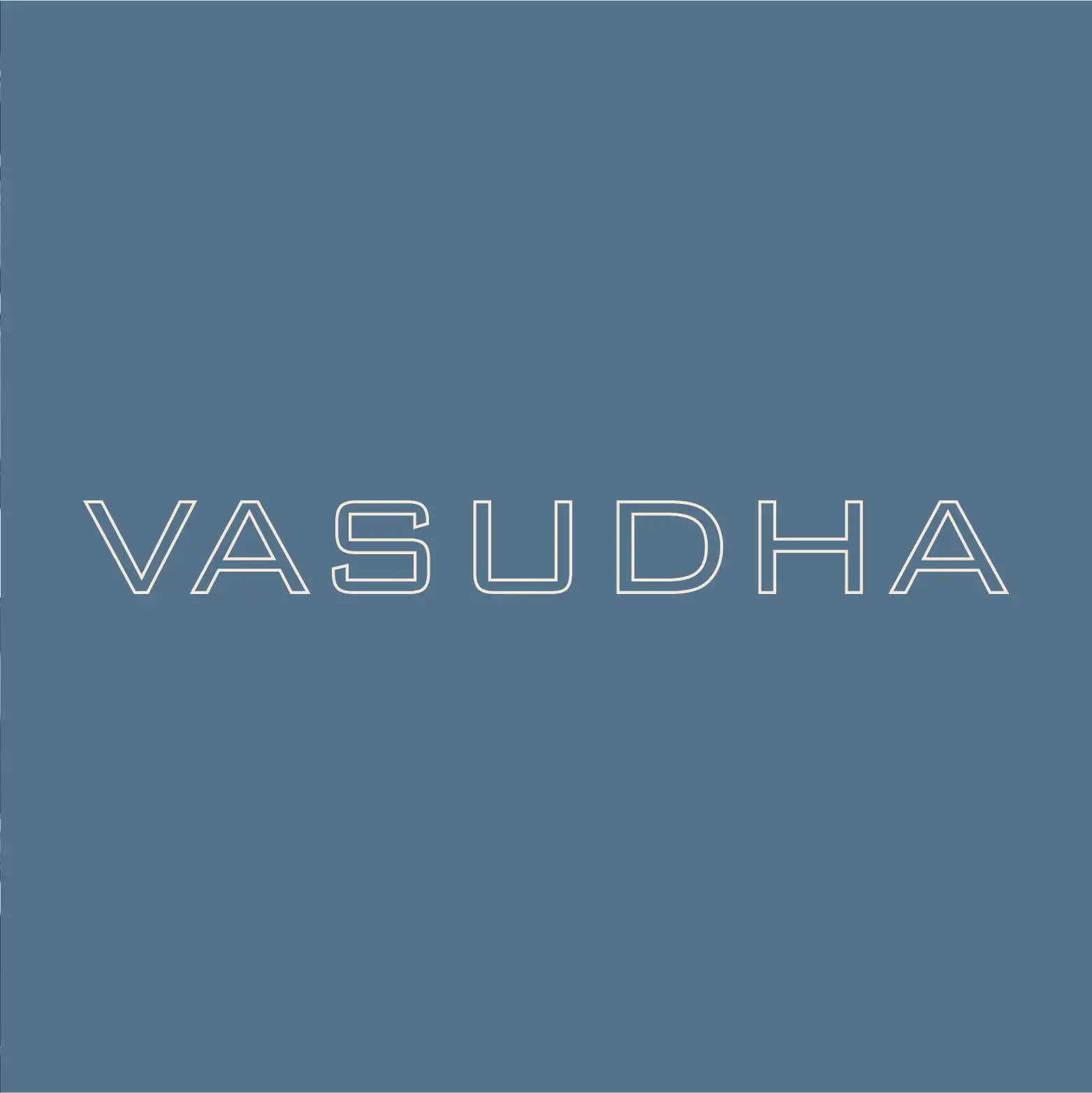
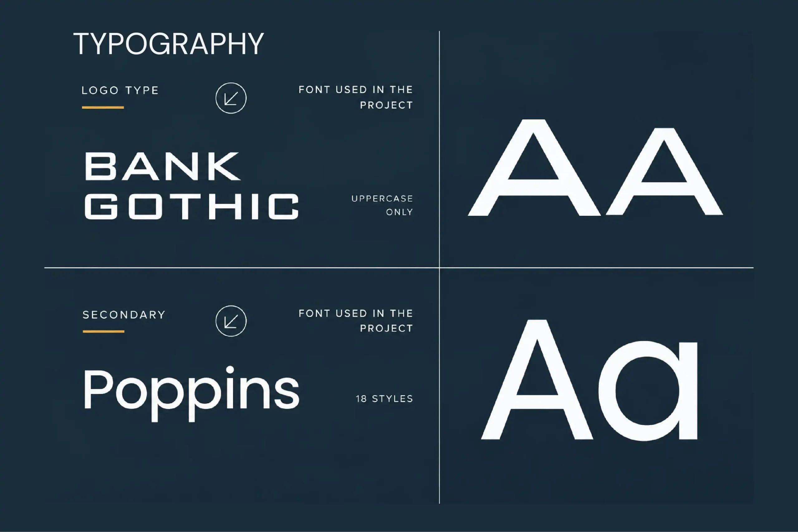
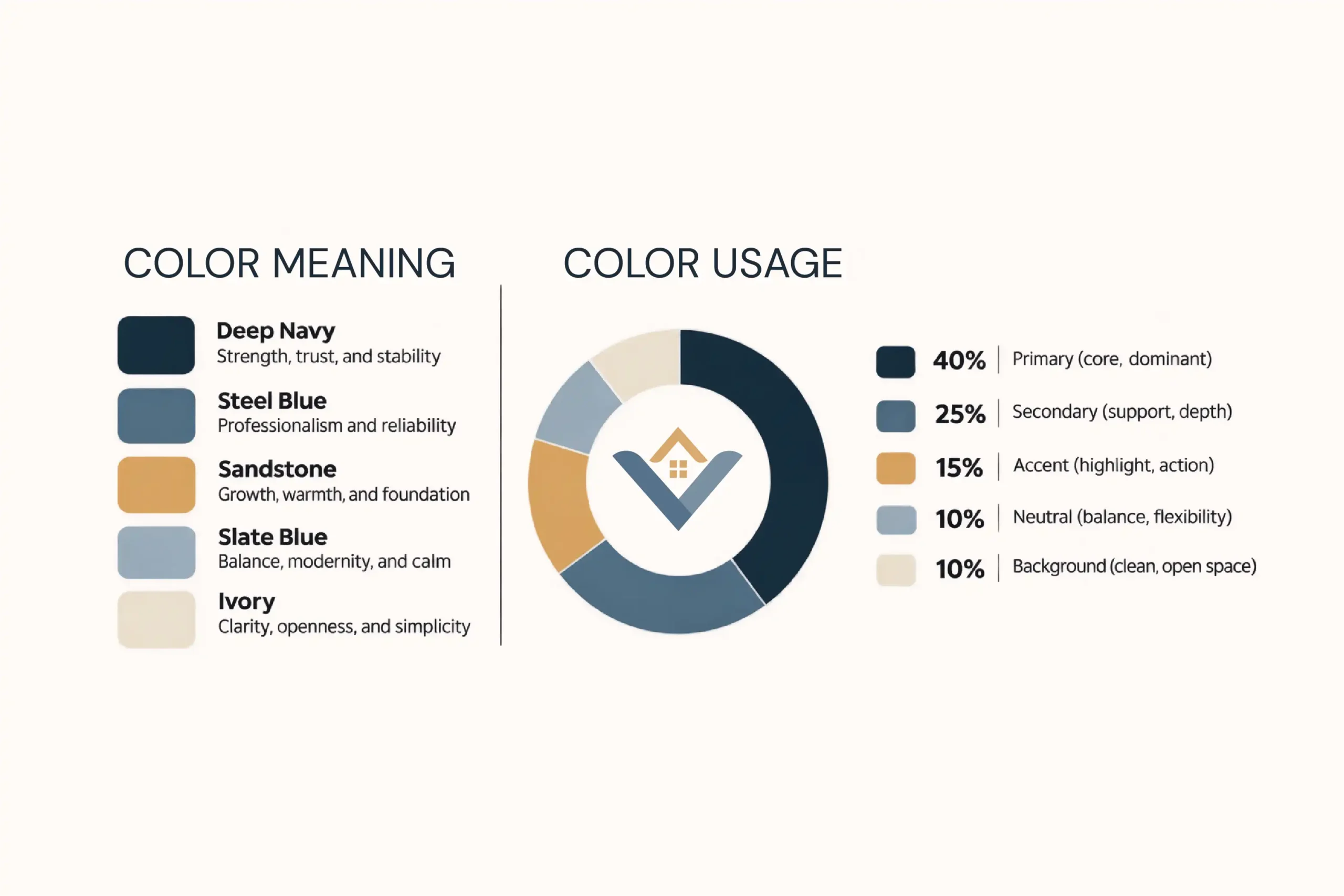
Bank Gothic, set in uppercase, carries the wordmark. Poppins supports everything else. Five colours. Each with a job.
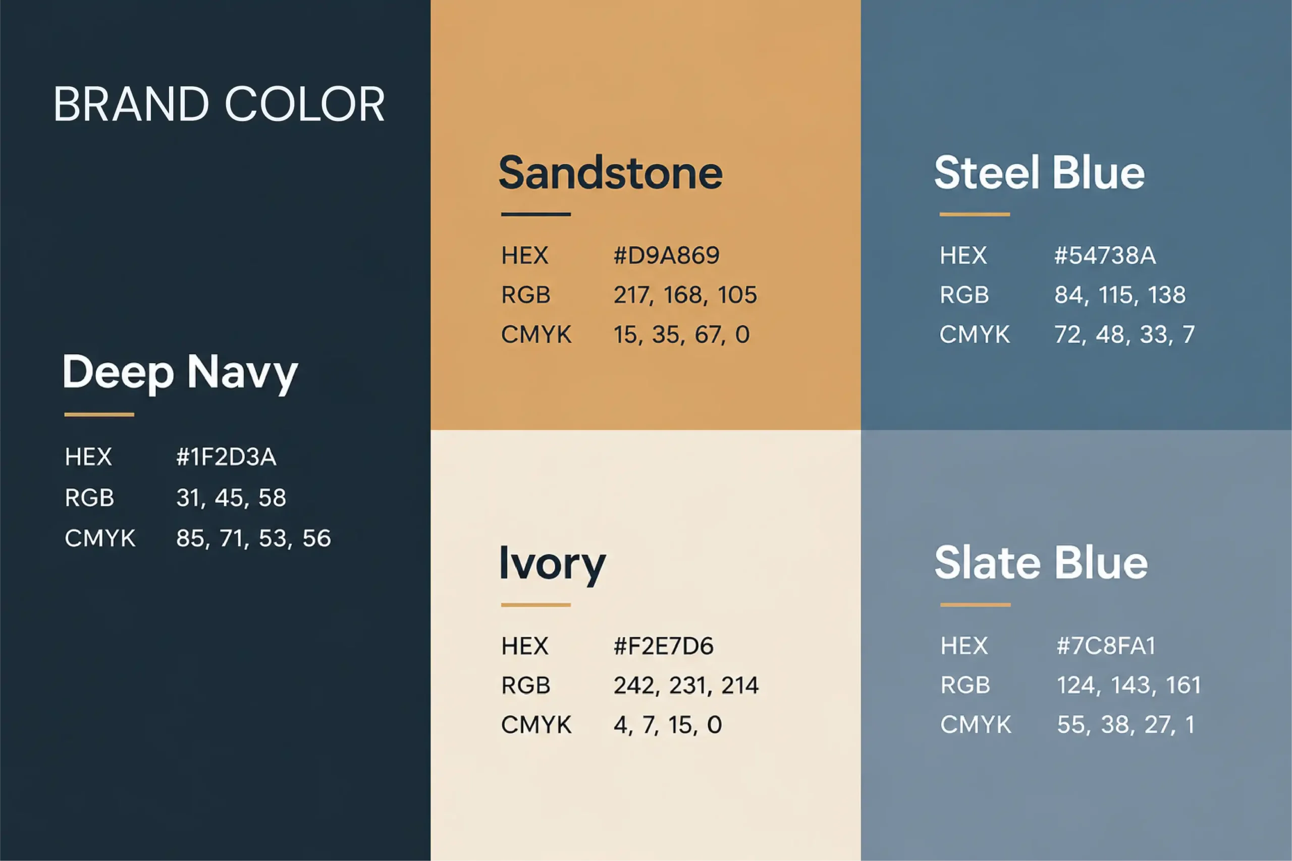
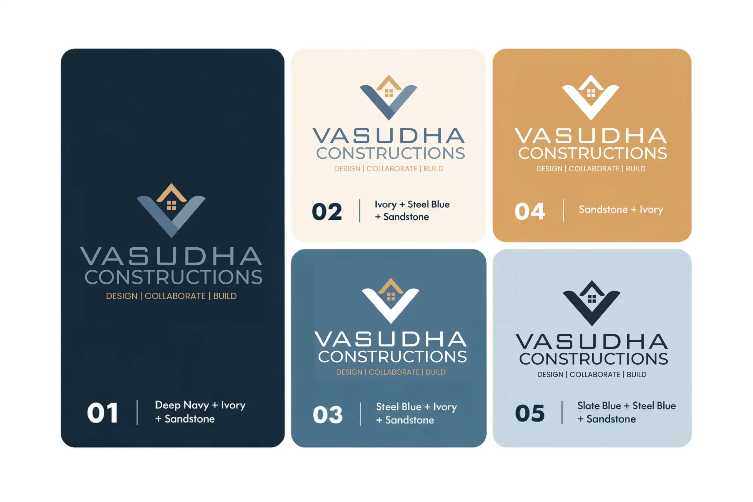
Deep Navy #1F2D3A: strength and stability. Steel Blue #54738A: professionalism and reliability. Sandstone #D9A869: warmth and foundation. Slate Blue #7C8FA1: balance and calm. Ivory #F2E7D6: openness and simplicity. A simple icon set and a V-inspired brand pattern extend the identity. Structured. Recognisable.
06) The Brand in Application
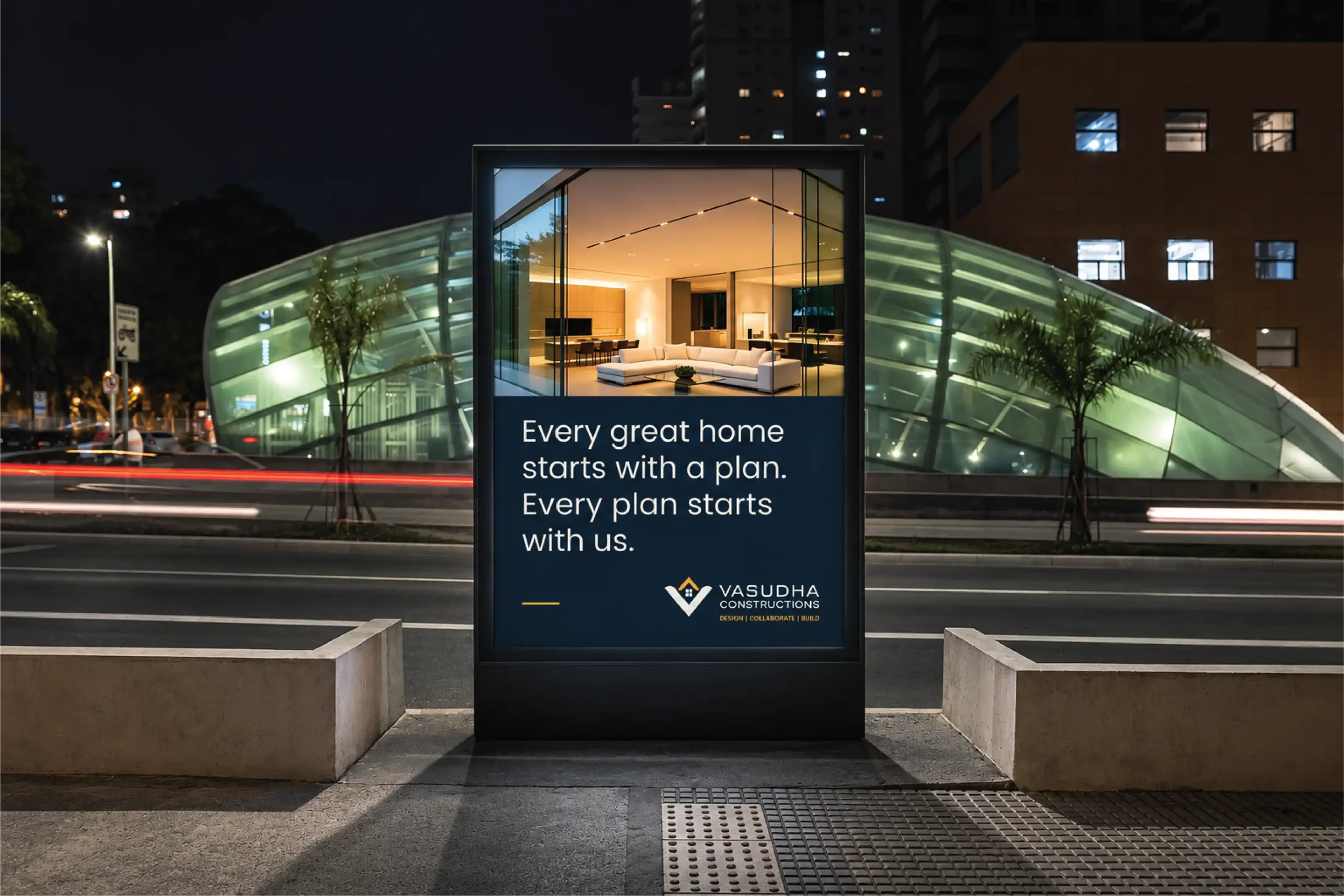
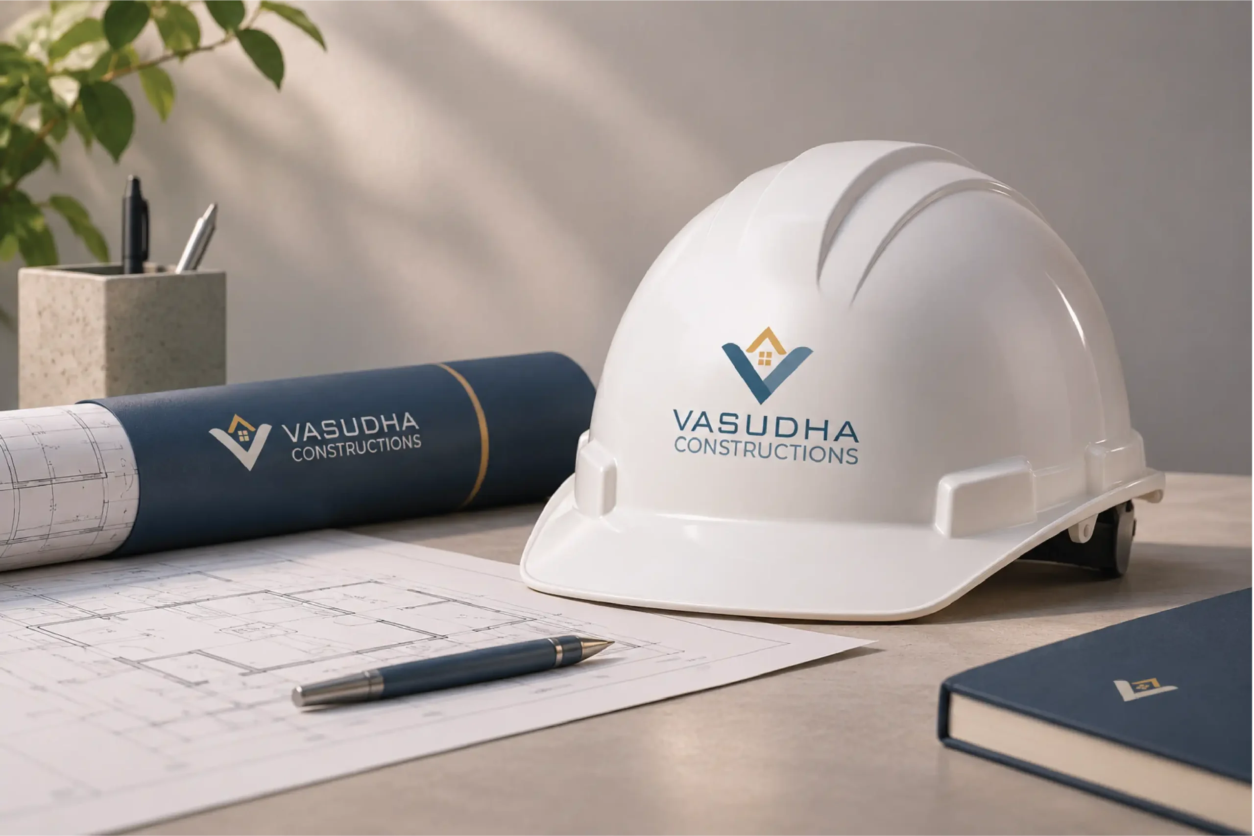
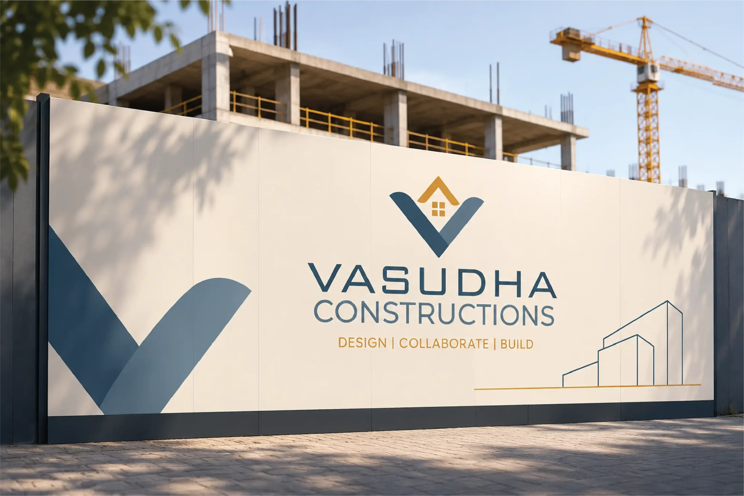
One identity. Every touchpoint.
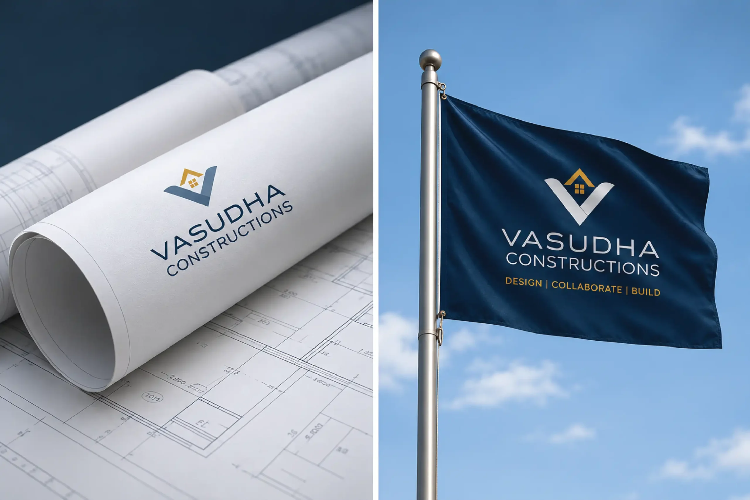
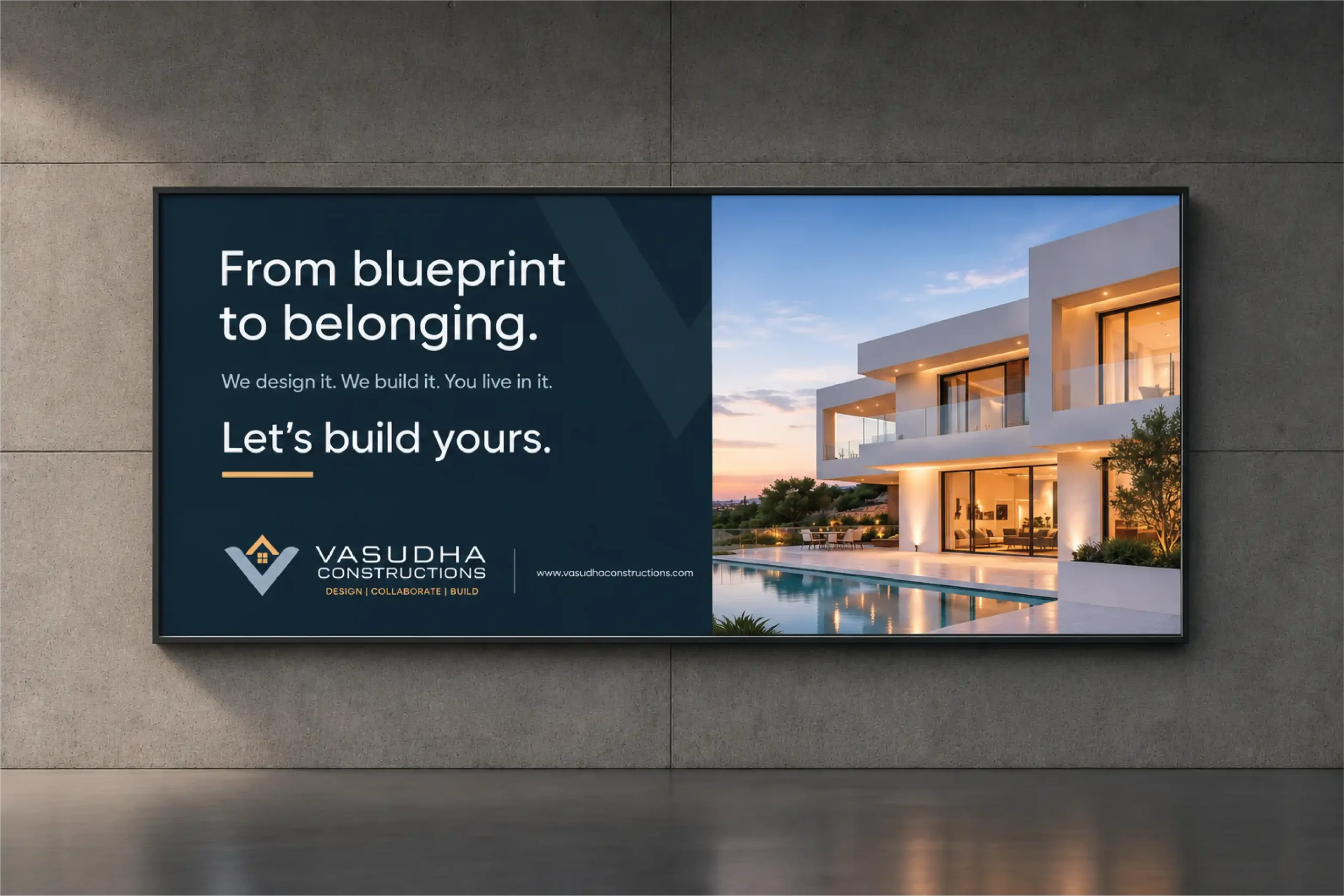
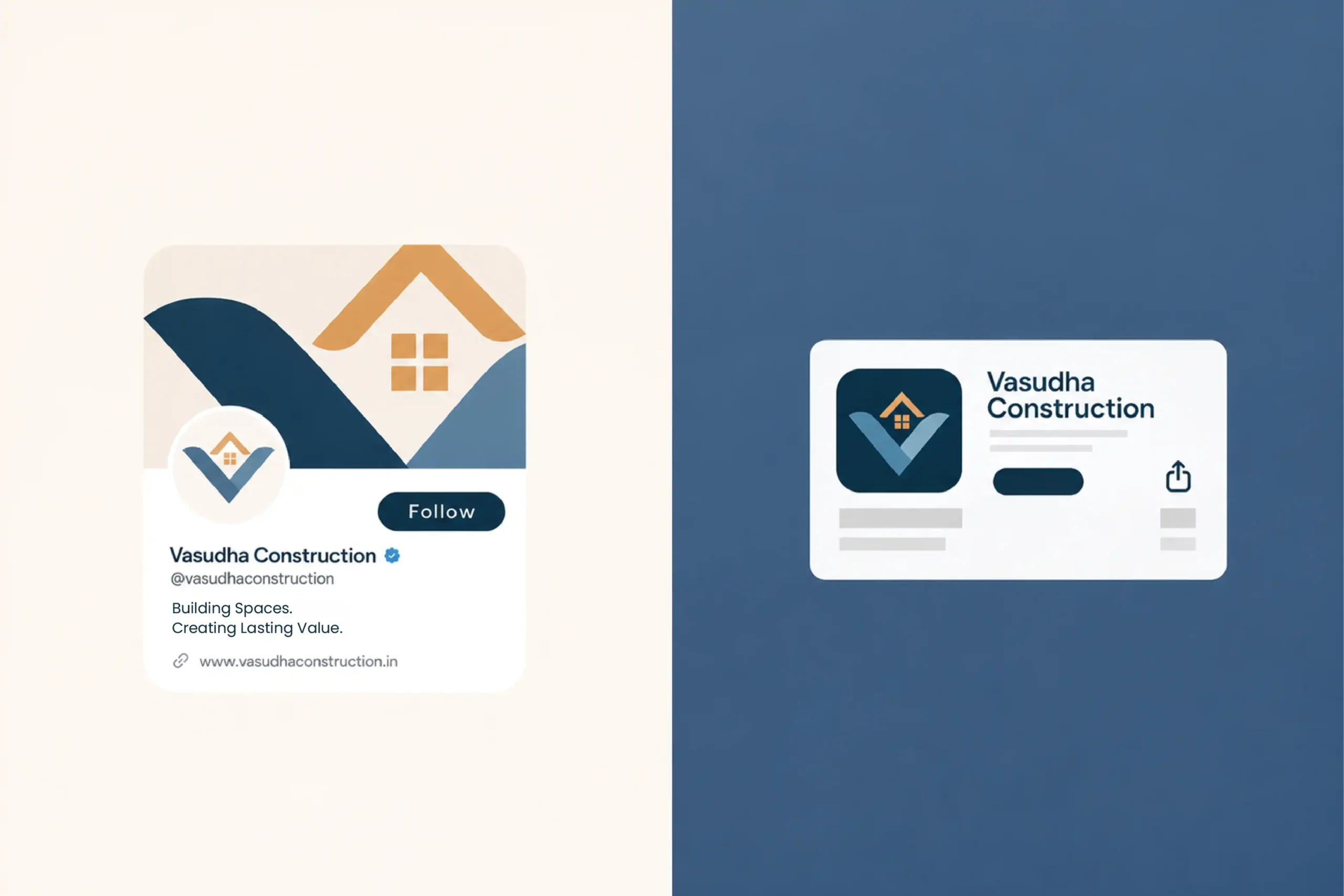
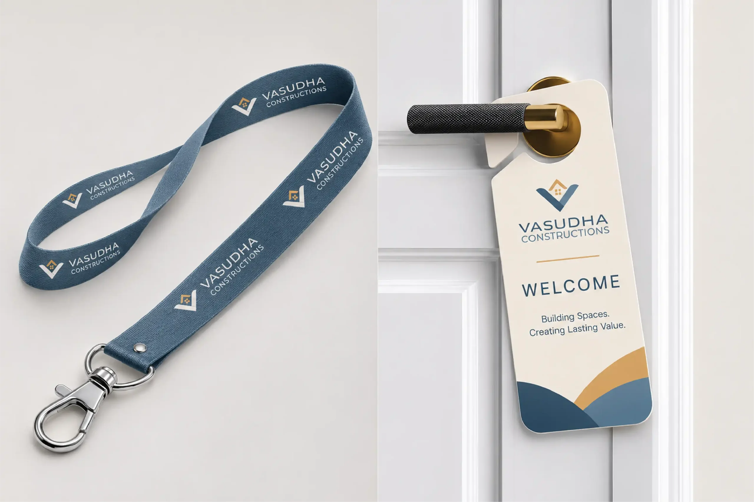
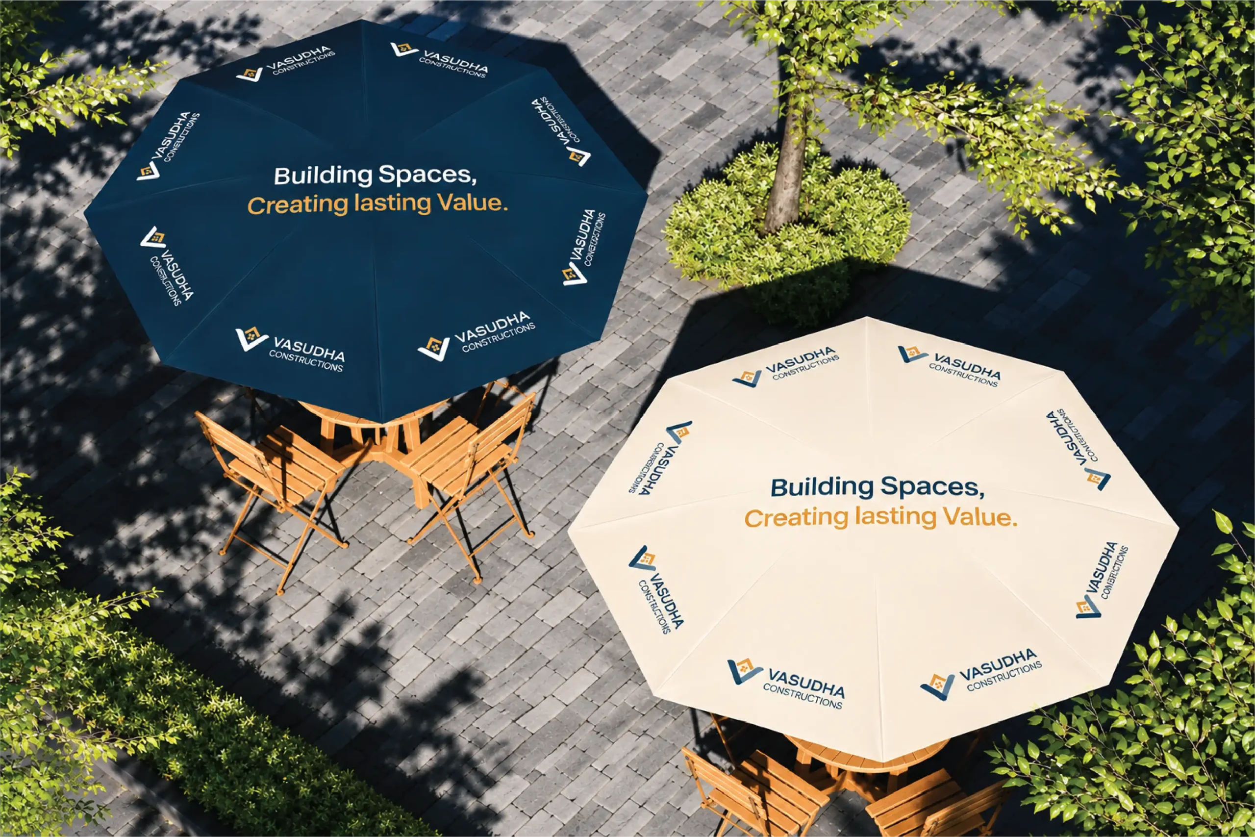
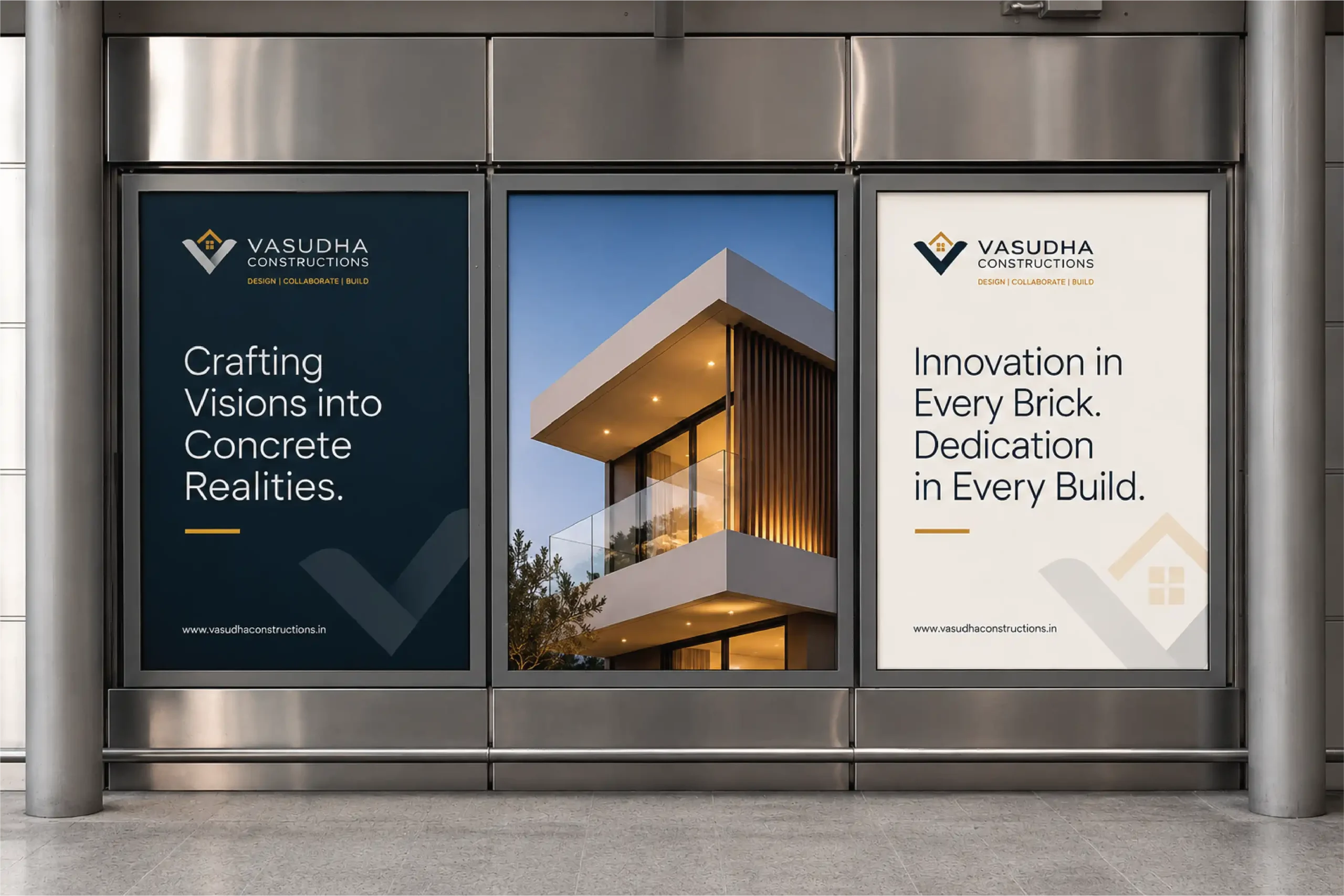
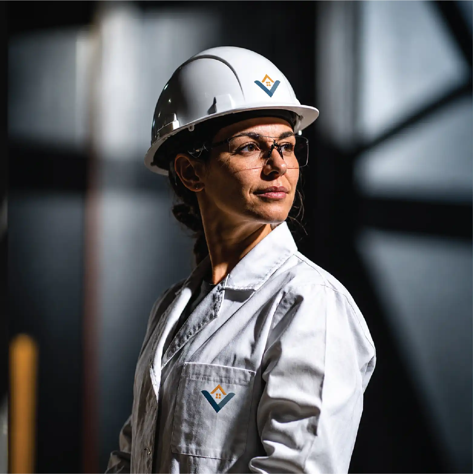
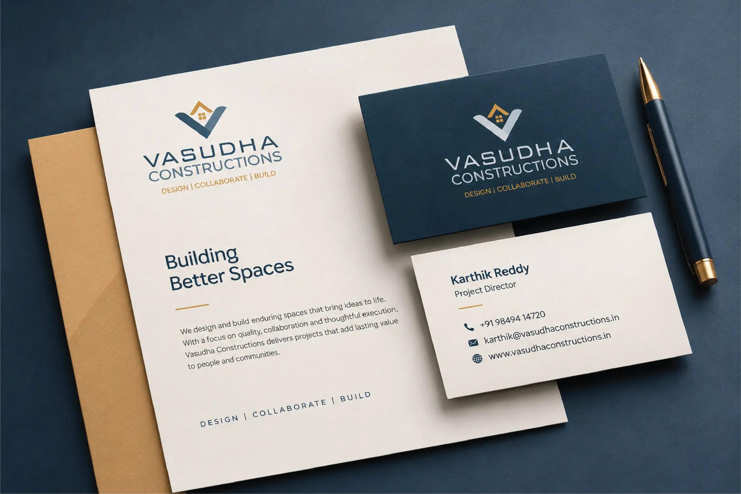
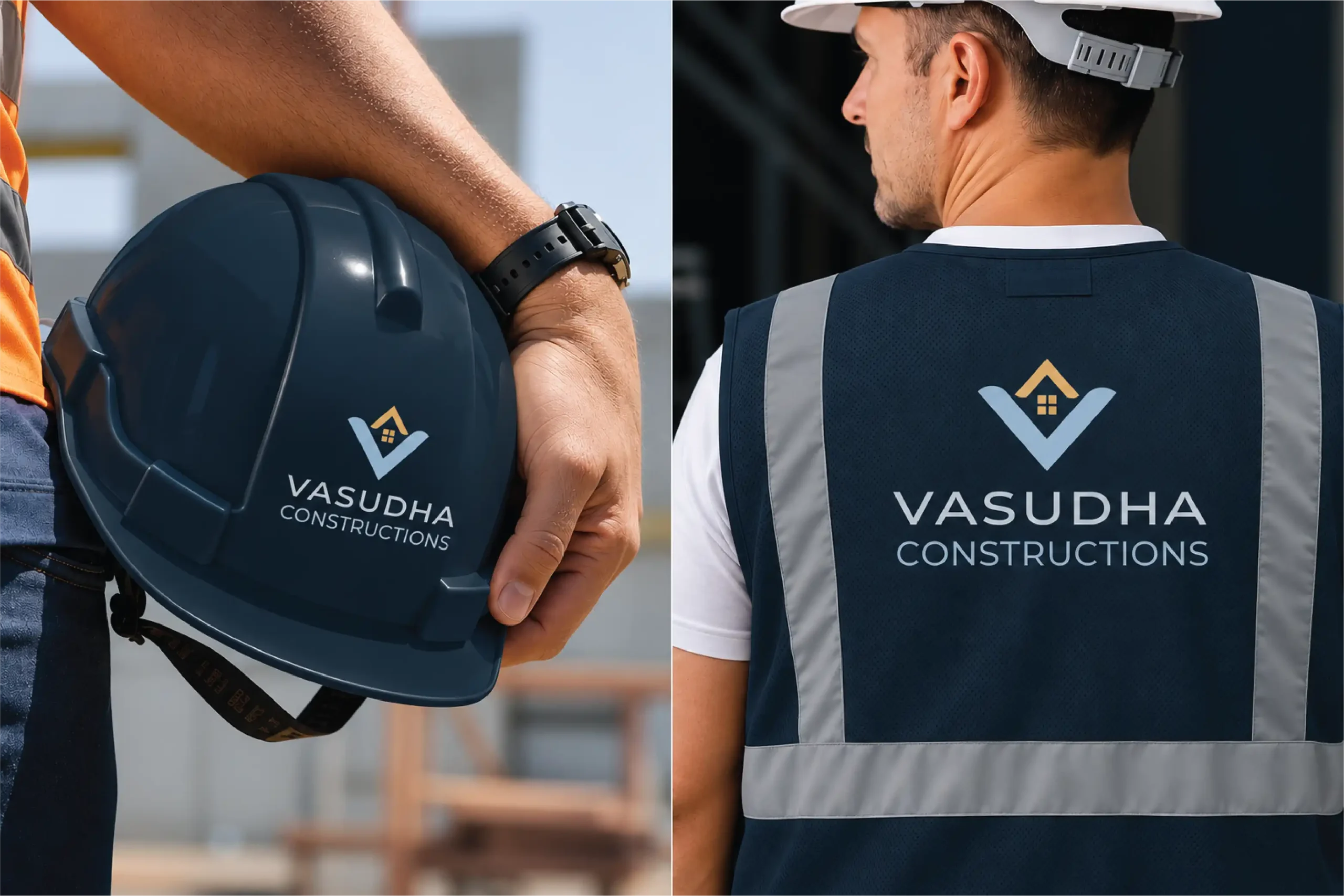
Same logo placement. Same colours. Same typography. Stationery, presentations, social media, site hoardings, flags, hard hats, safety apparel and vehicles. Office, digital and site speak one language.