Overview
Health Point is a premier herbal clinic dedicated to natural healing, holistic wellness, and alternative healthcare. They approached us with a need to establish a brand presence that reflected the profound impact of their herbal-based treatments. Our objective was to craft a visual identity that resonated with wellness while exuding the professionalism and trust expected from a top-tier healthcare provider.
Client: Health Point Herbal Life Clinic Industry: Healthcare & Alternative Wellness Scope of Work: Brand Identity, Logo Design, Visual Strategy, Typography

The Challenge
The alternative healthcare sector frequently struggles with a visual divide: brands often appear either overly clinical and sterile, or too informal and lacking in medical credibility. Health Point needed to bridge this gap. The challenge was to create an identity that immediately communicated the organic, natural roots of their treatments, while firmly positioning the clinic as a luxurious, reputable, and authoritative wellness destination.
The Strategy
The alternative healthcare sector frequently struggles with a visual divide: brands often appear either overly clinical and sterile, or too informal and lacking in medical credibility. Health Point needed to bridge this gap. The challenge was to create an identity that immediately communicated the organic, natural roots of their treatments, while firmly positioning the clinic as a luxurious, reputable, and authoritative wellness destination.


The Execution
The Mark: A Study in Balance
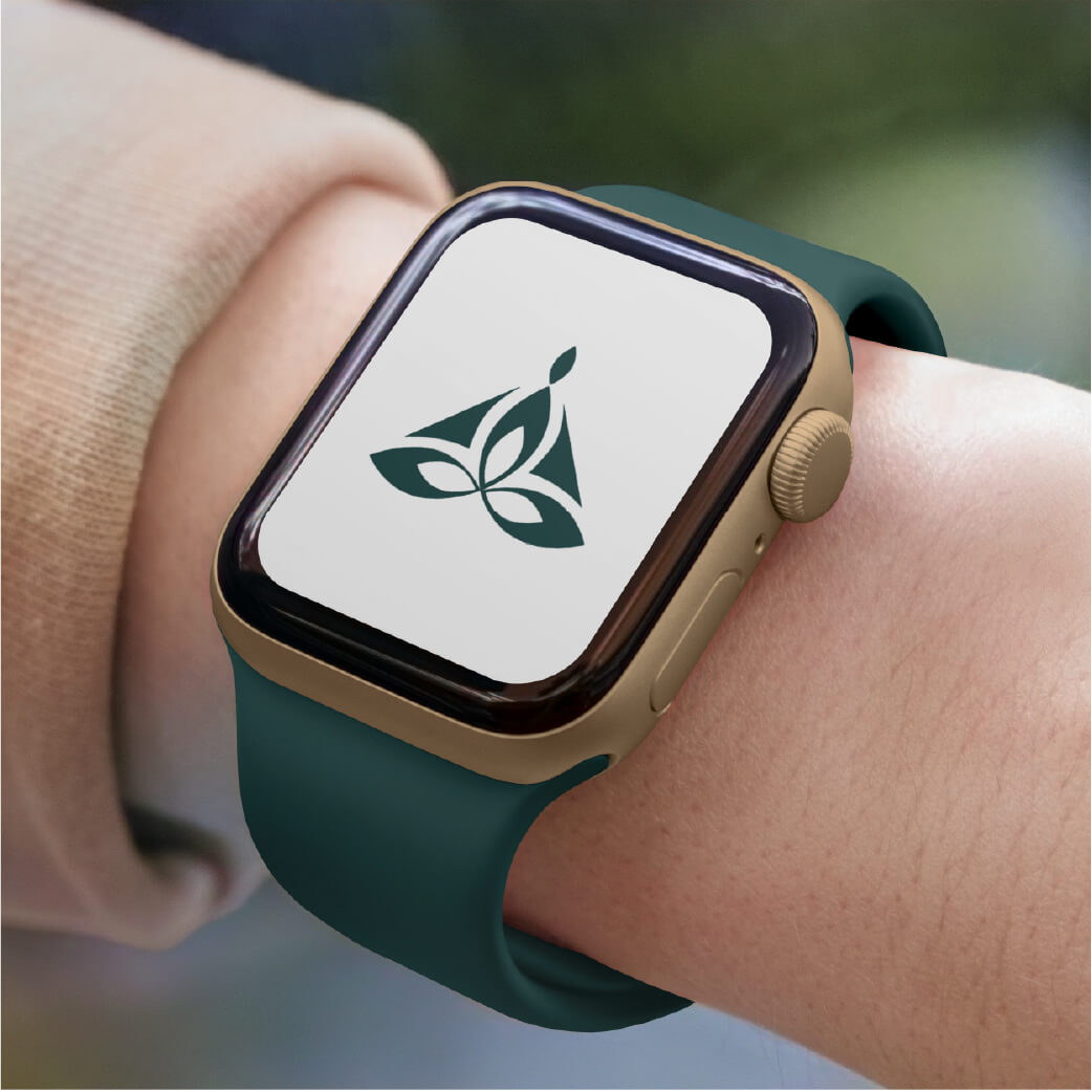
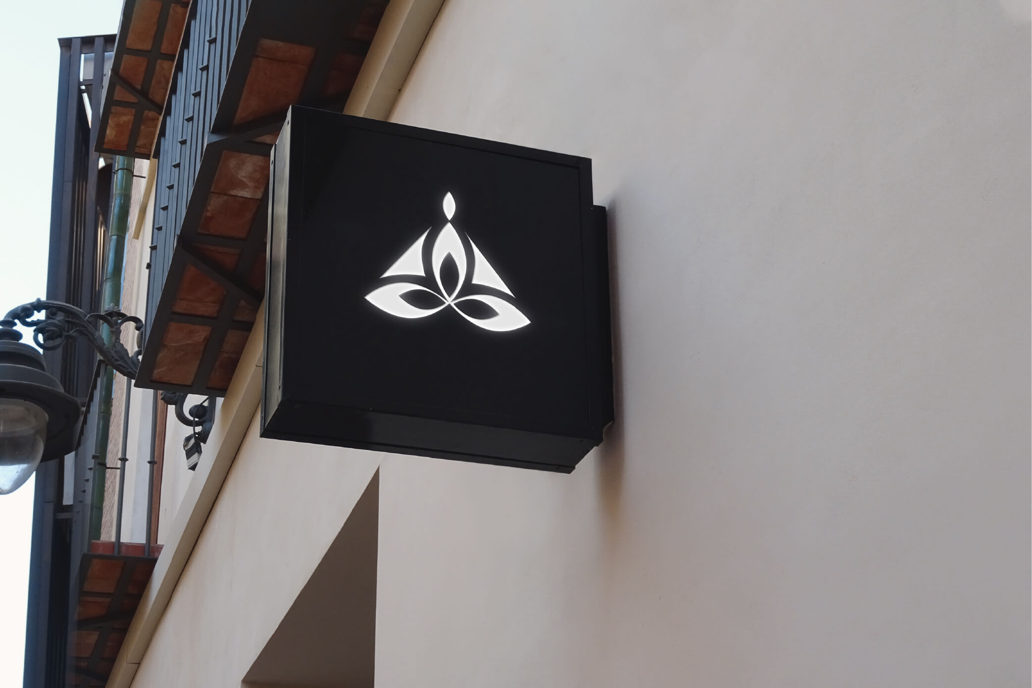
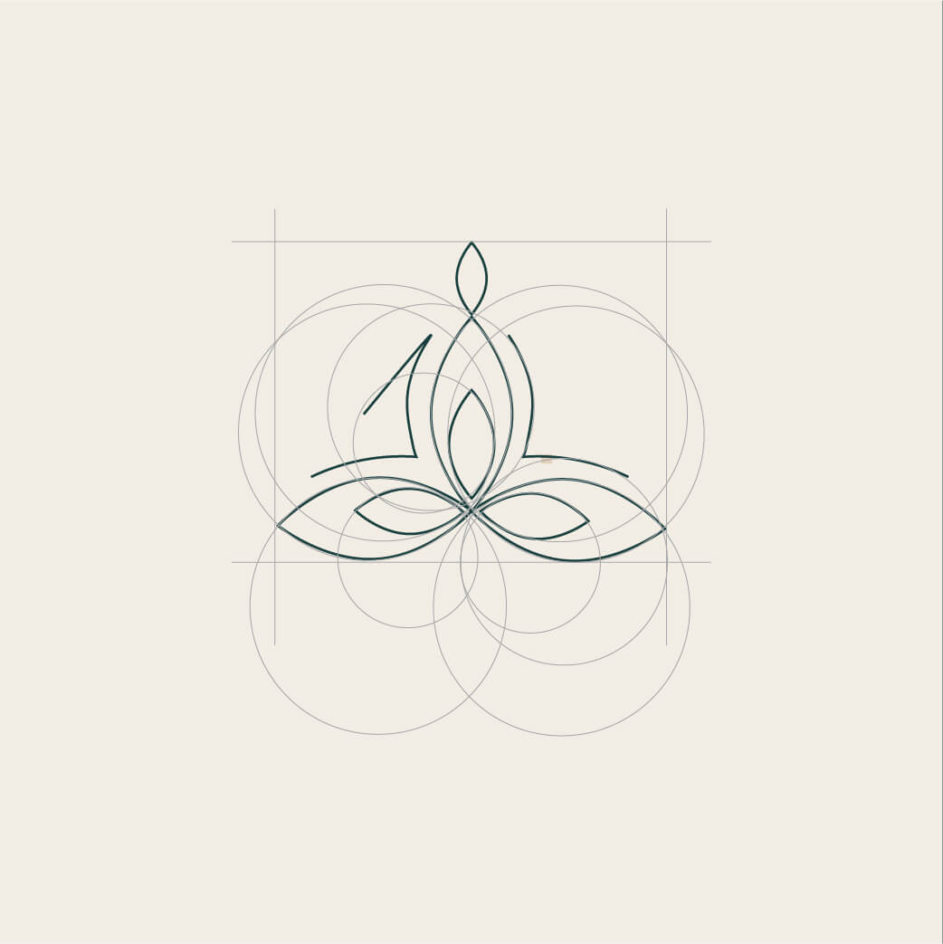
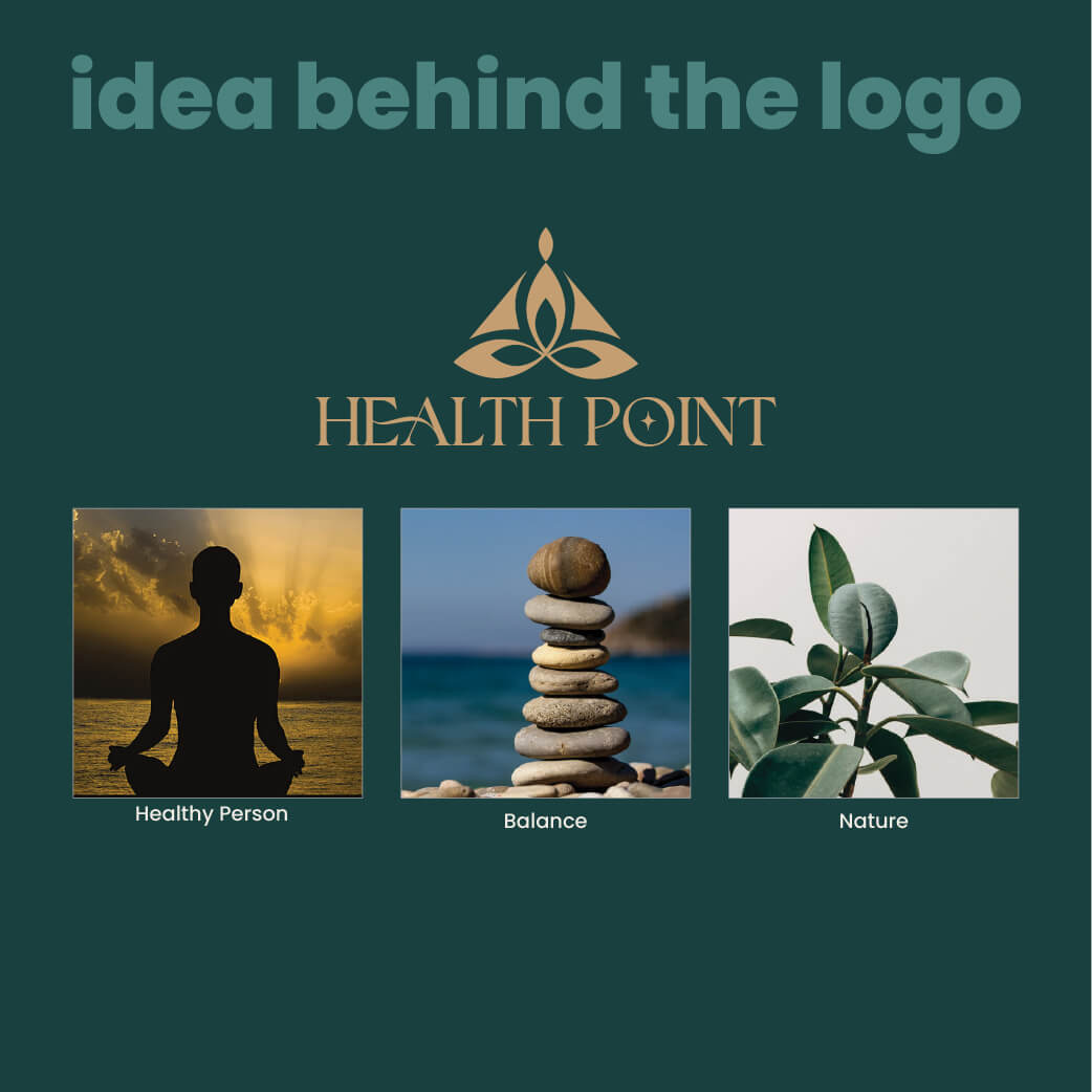
The central emblem is a minimalist fusion of human vitality and natural growth. We designed a subtle, elegant icon that evokes the figure of a seated person—a posture symbolizing grounding, stability, and inner calm. This figure is harmoniously interwoven with botanical leaf motifs, directly connecting the patient's journey to the restorative power of plant-based healing.
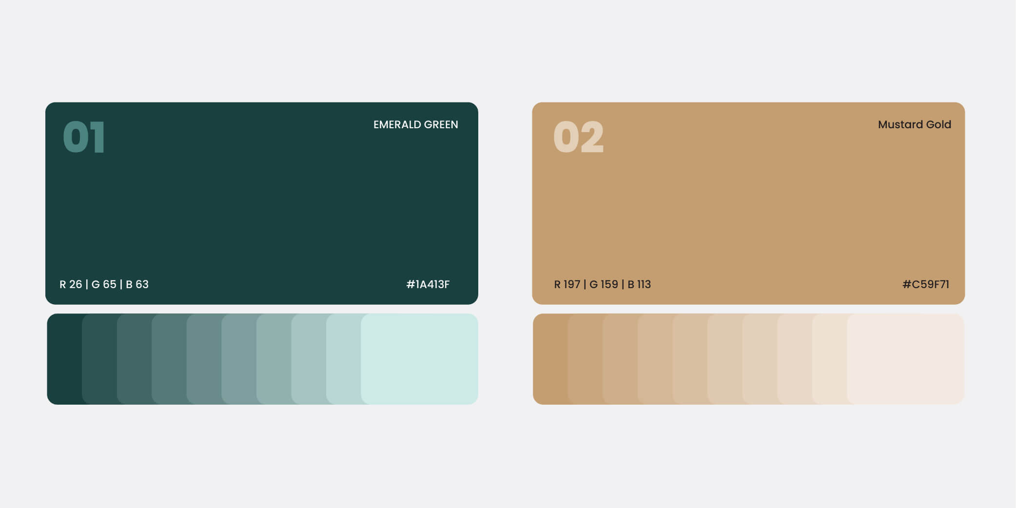
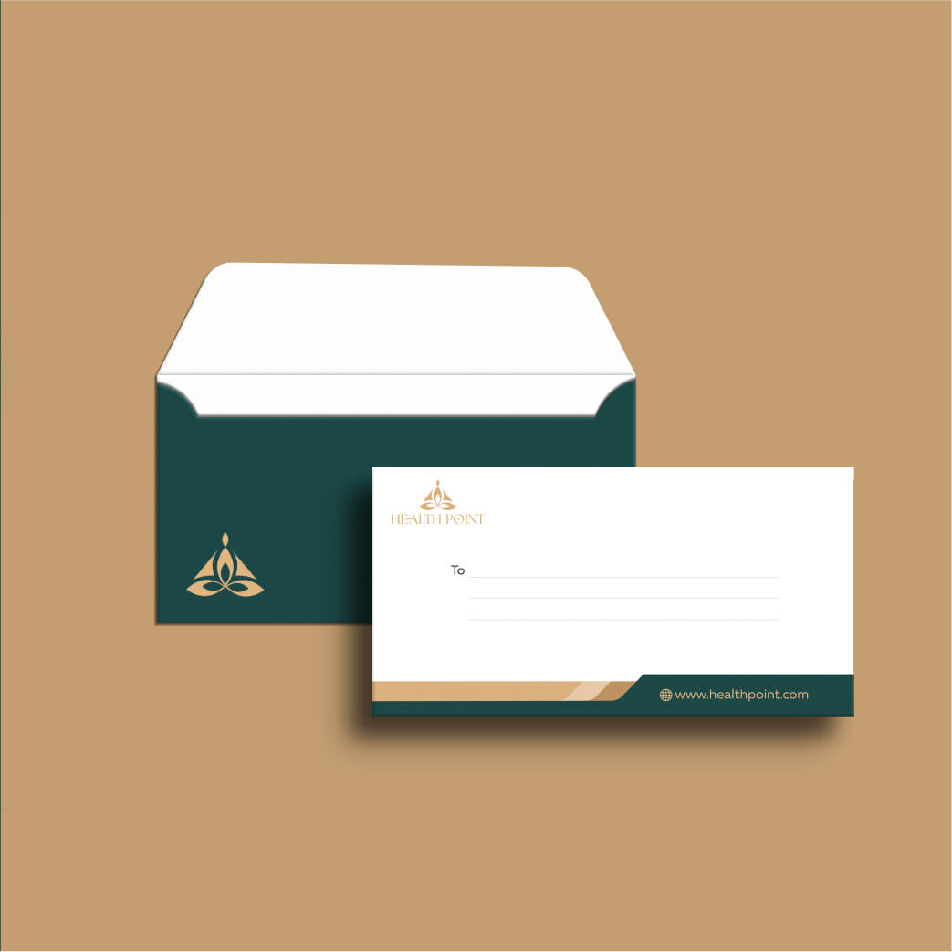
The Palette: Nature Meets Luxury
To position Health Point as a premium wellness destination, we developed a highly targeted dual-color system:
Botanic Green: Deep and soothing, this foundational tone represents nature, restorative growth, and serenity. Signature Gold: We introduced gold to elevate the brand beyond a standard clinic. It signifies excellence, prosperity, and the premium quality of care patients receive, instantly building consumer trust.
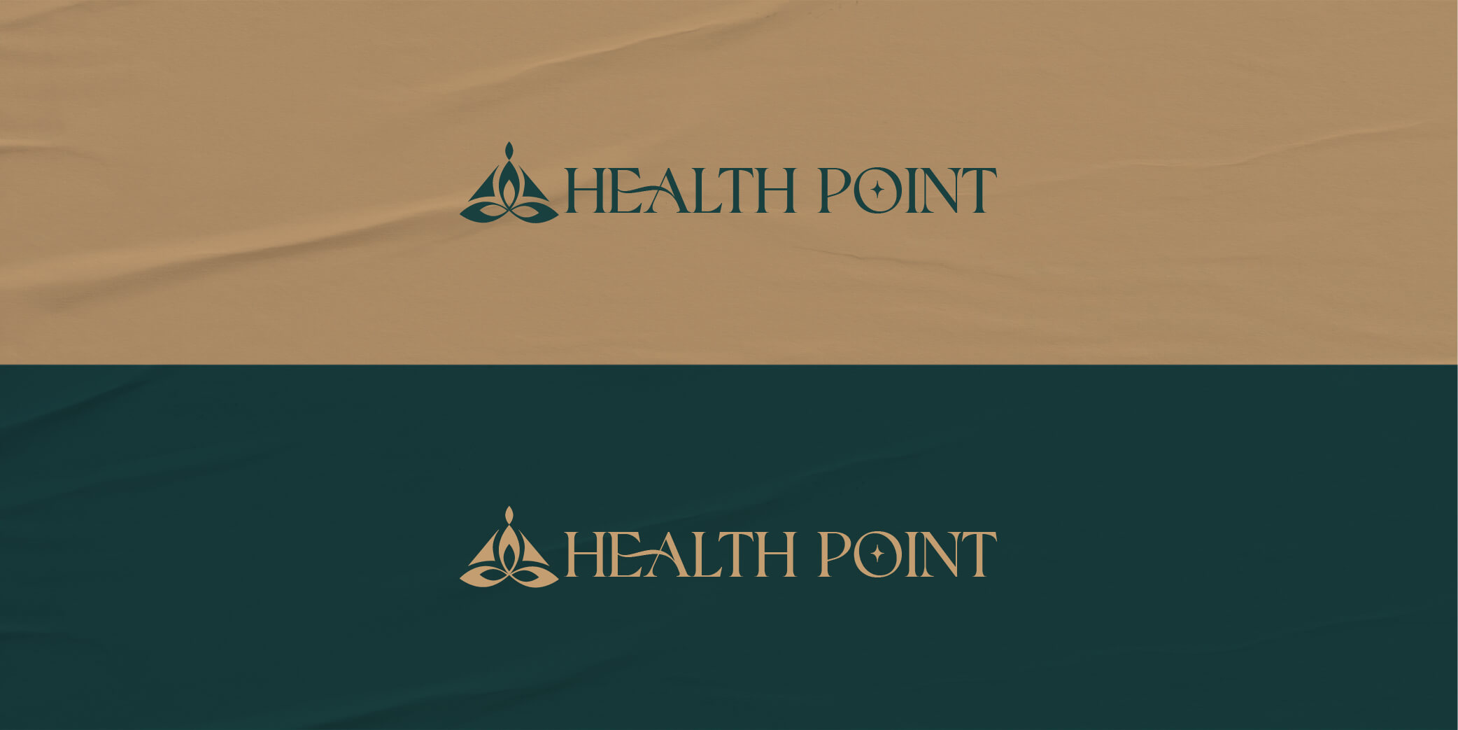
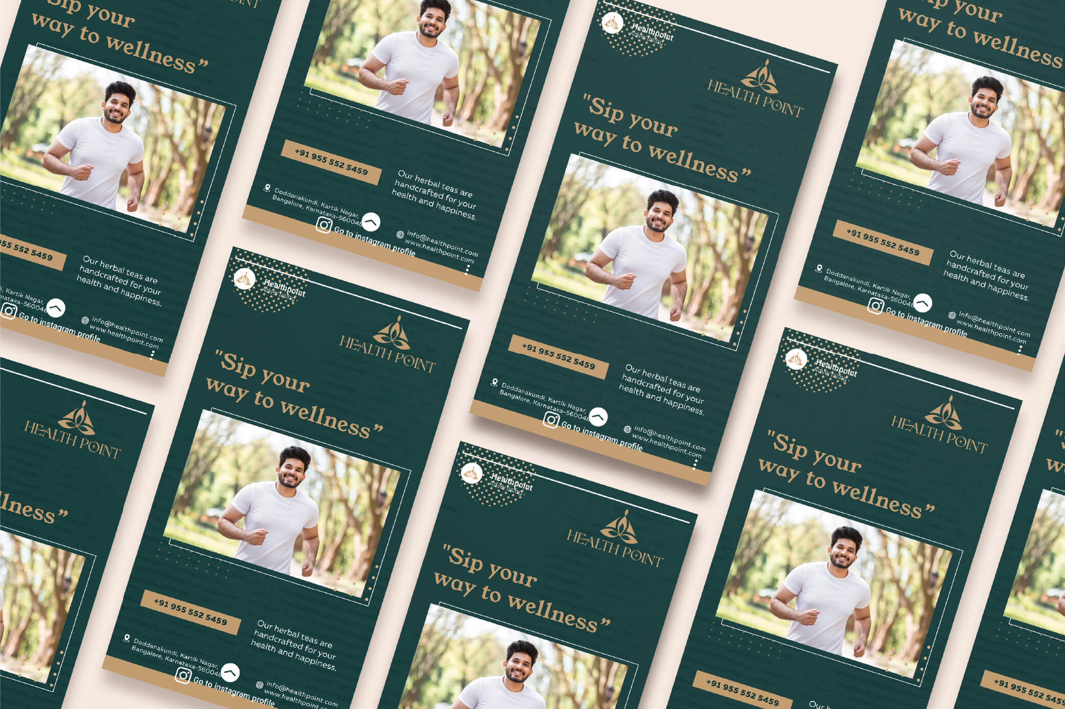
The Typography
To balance the organic curves of the emblem, we selected a clean, highly legible, modern typeface. This ensures the brand retains its clinical professionalism, allowing for crisp, authoritative communication across both digital platforms and printed medical collateral.


The figure of the Healthy Man is designed in a minimalistic style, with clean lines and subtle details. This simplicity enhances the logo's elegance and allows for easy recognition and versatility in various applications. whether it will be for digital or print Media


The Impact
The new Health Point identity successfully redefines how alternative healthcare presents itself. By combining natural symbolism with the aesthetics of high-end luxury, the brand now visually communicates its core promise: trustworthy, sophisticated, and deeply personalized natural healing. The resulting design system provides a calming, prestigious touchpoint for every patient, from the moment they see the clinic's sign to the moment they hold their prescription.