Overview
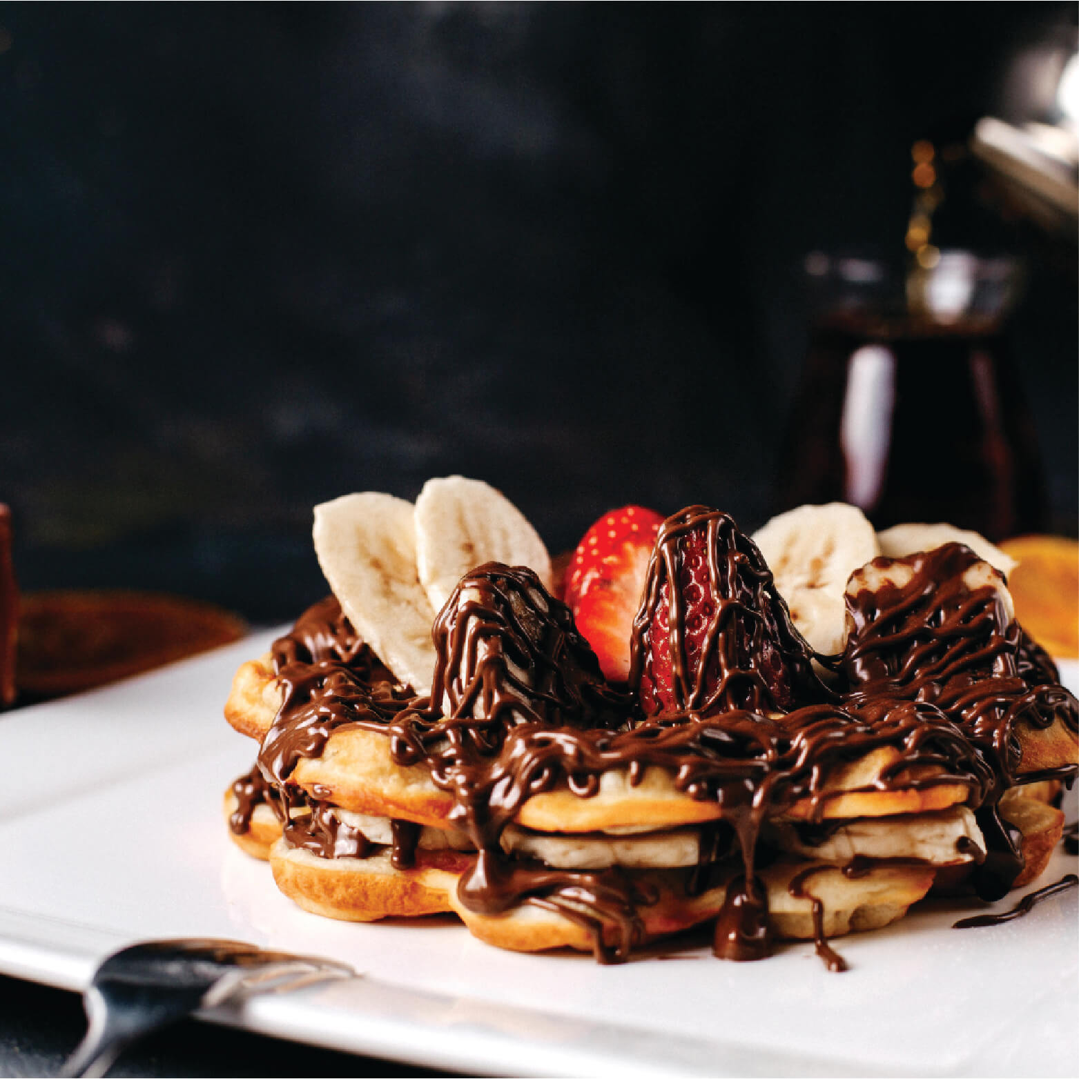
In the modern culinary landscape, dessert and breakfast cafes often lean entirely into sugary decadence, completely ignoring the growing consumer desire for wholesome, fresh ingredients. Waffle Garden approached us with a unique proposition: a dining experience that balances the nostalgic indulgence of a classic waffle with the vitality of an organic garden. We were tasked with designing an identity that captured this exact sweet spot—a charming culinary oasis that promised both comfort and quality.
Client: Waffle Garden Industry: Food & Beverage / Restaurant & Cafe Scope of Work: Brand Identity, Logo Design, Menu Architecture, Print Collateral
The Challenge
The dessert and cafe sector is visually saturated with hyper-vibrant, artificial colors and fast-casual aesthetics. The challenge was to elevate Waffle Garden above the noise and position it as a premium destination. The brand needed to immediately communicate two contrasting ideas—comforting indulgence and natural freshness—without confusing the consumer. We had to visually prove to the market that deliciousness and health-consciousness could seamlessly coexist on the same plate.
The Strategy
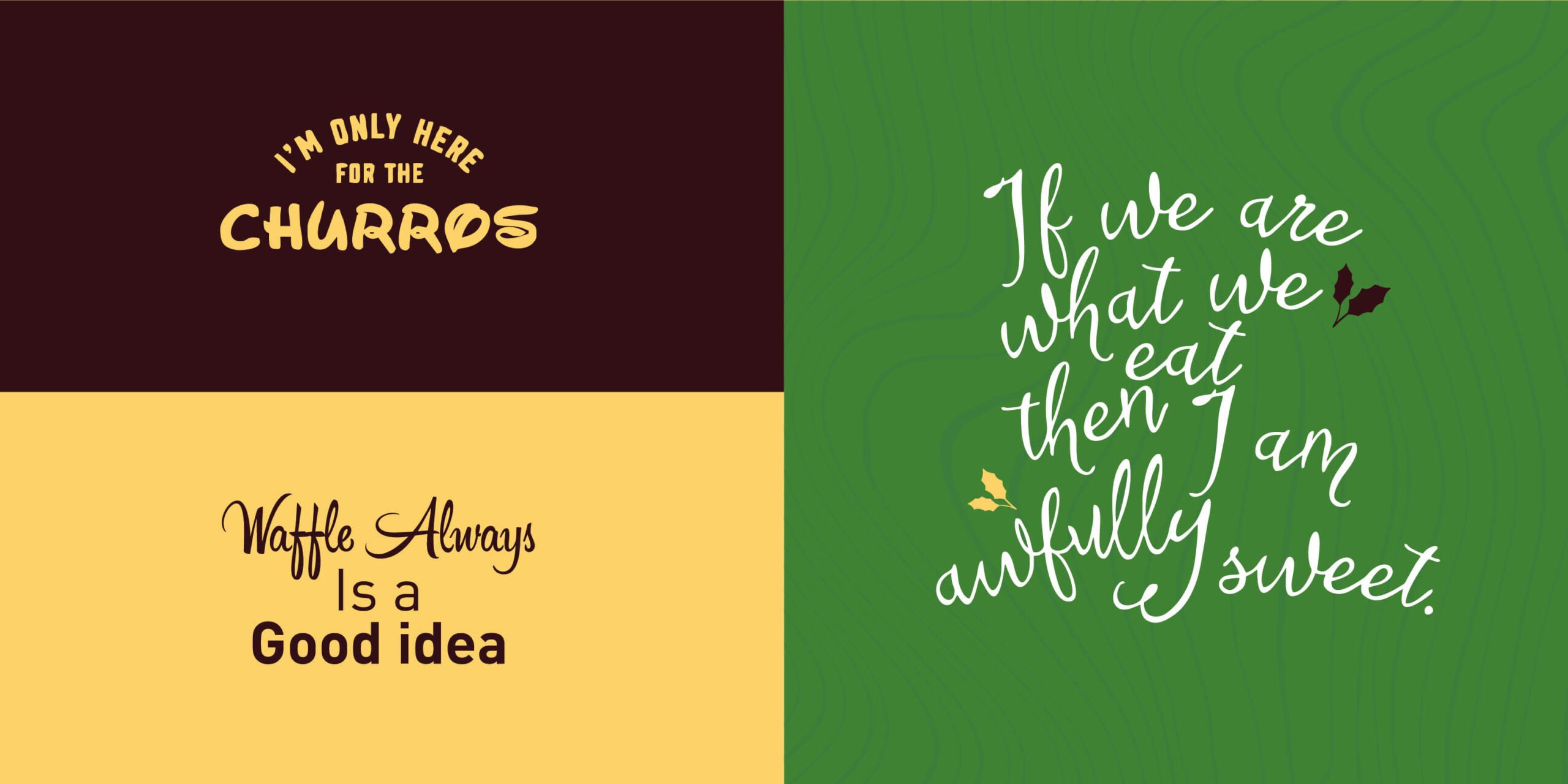
We bypassed the typical fast-food aesthetic and anchored the brand in the concept of "Handcrafted Harmony." By fusing organic botanical motifs with warm, inviting culinary cues, we designed an identity that feels akin to a modern artisanal bakery. The strategy was to create a visual language that promises a holistic dining experience, assuring patrons of ingredient quality before they even see a menu.
The Execution
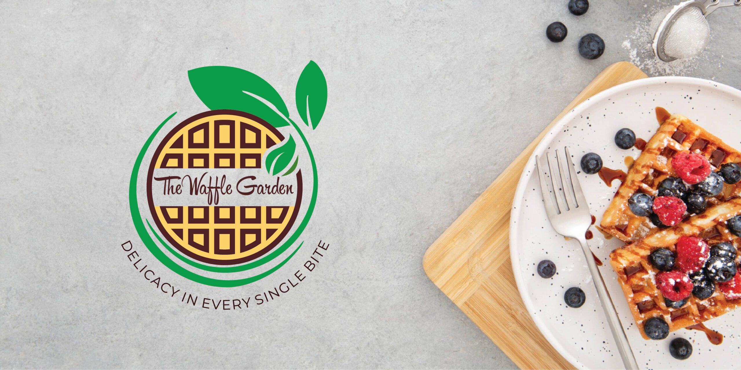
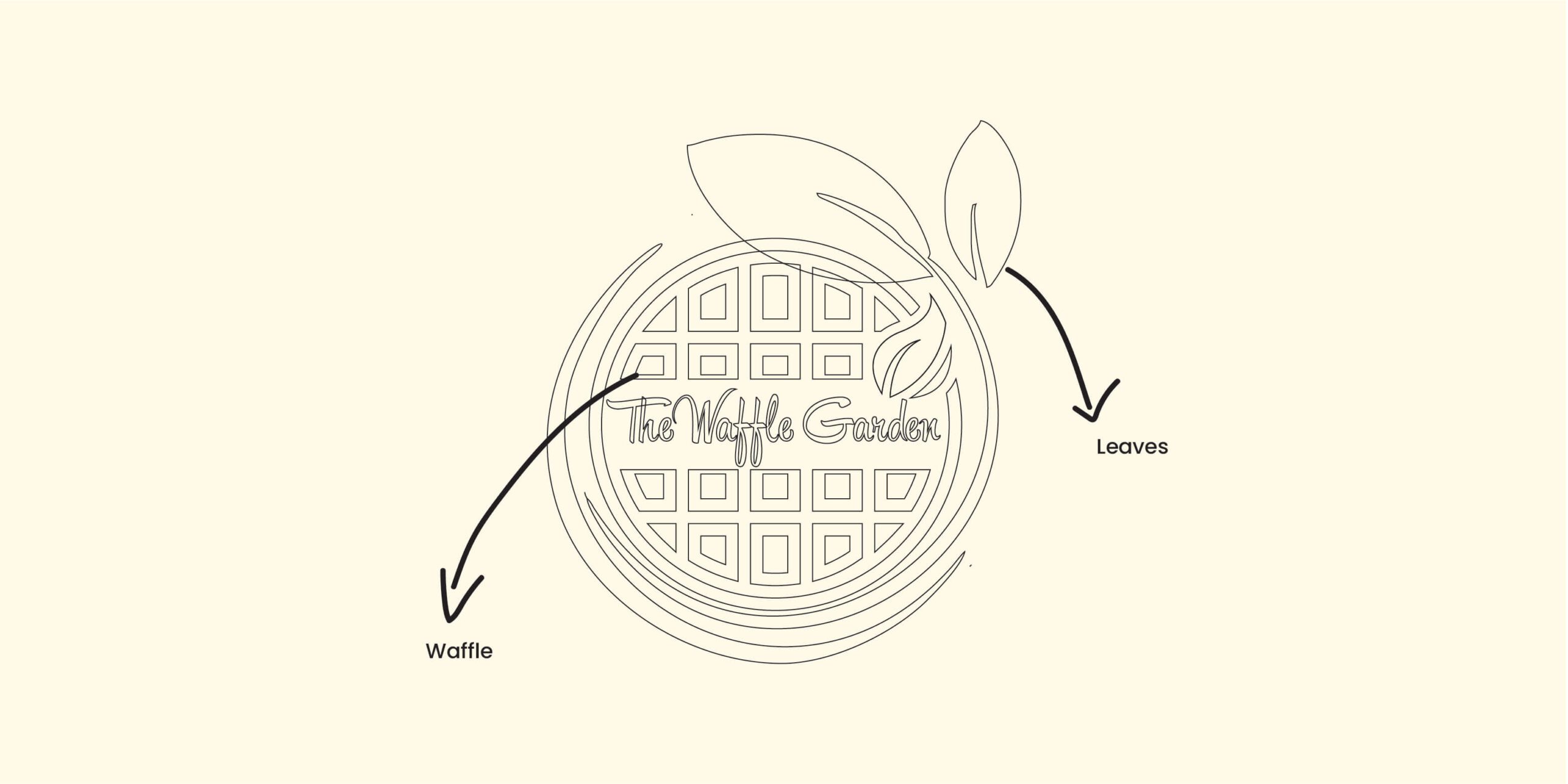
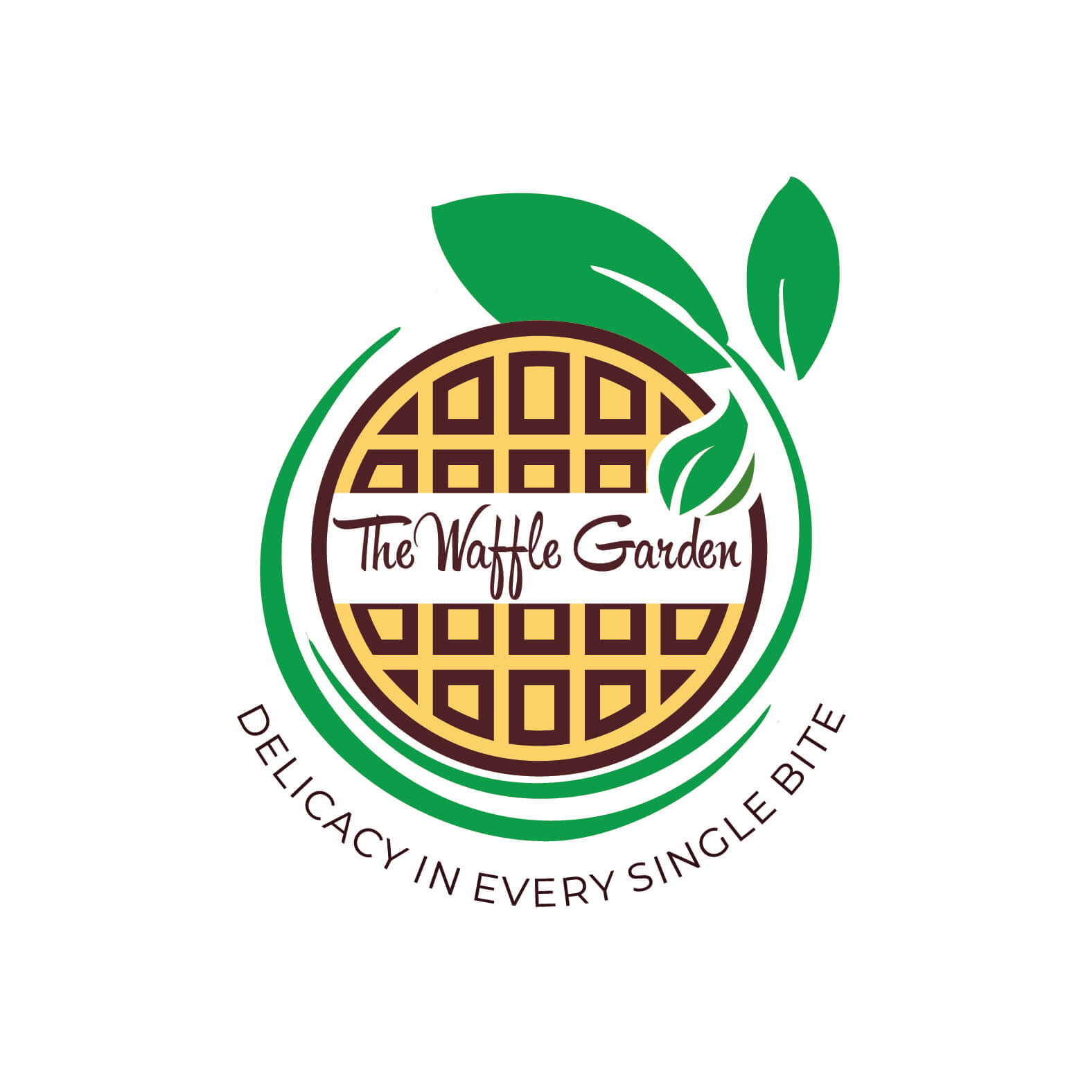
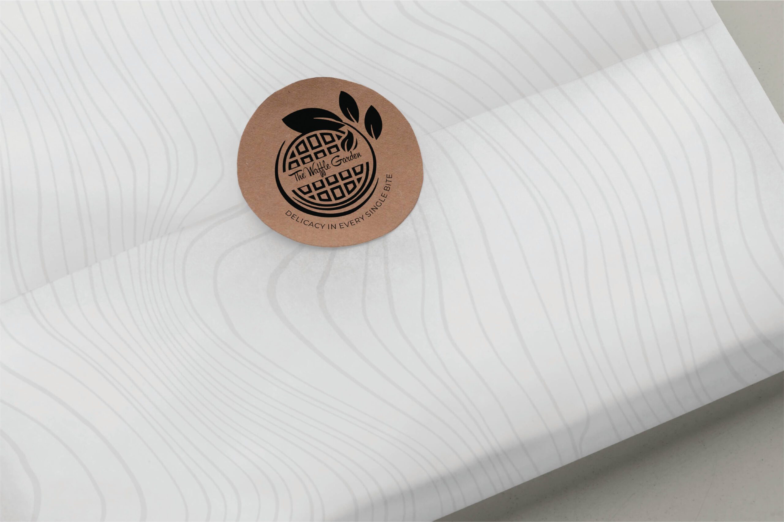
The Mark: Wholesome Unity
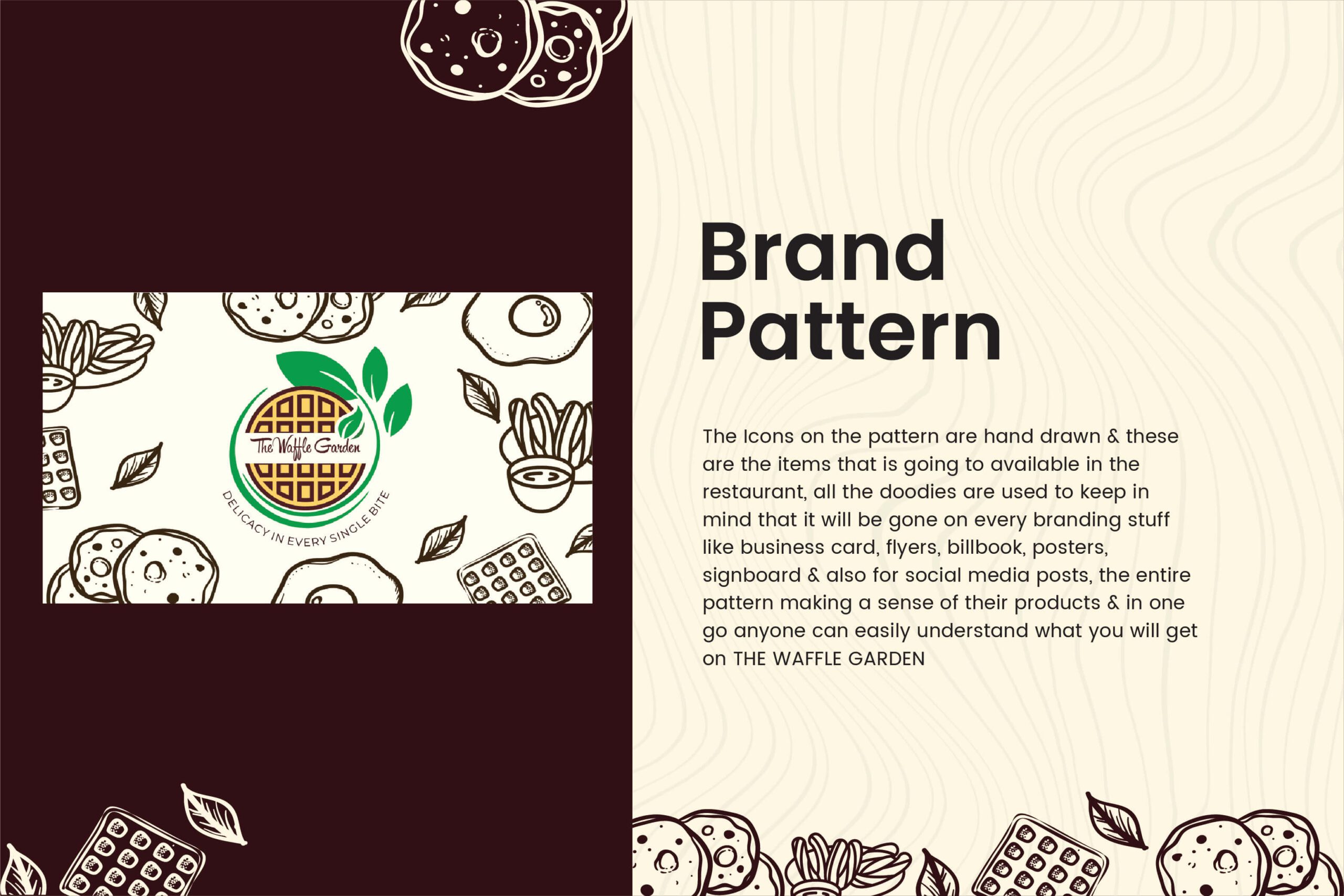
At the core of the visual identity is a clean, circular waffle emblem. This geometric foundation symbolizes completeness and culinary harmony. To break the rigid structure, we wrapped the emblem in fluid, vibrant green leaves—immediately bringing nature into the frame and signaling the brand’s commitment to organic, garden-fresh ingredients.
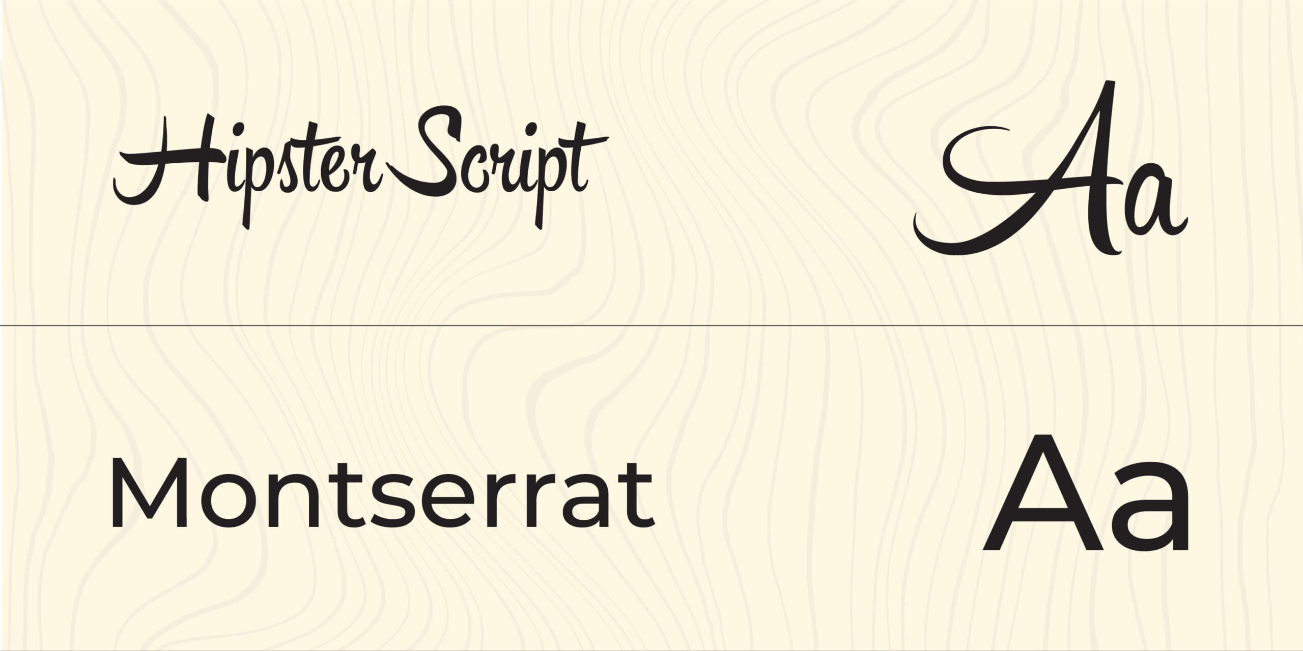
The Typography: Artisanal Elegance
To contrast the structural waffle icon, we centered the brand name in a flowing, sophisticated cursive typeface. This stylistic choice evokes the warmth of a handwritten, generational recipe, adding a layer of handcrafted elegance and establishing an immediate, personal connection with the patron.
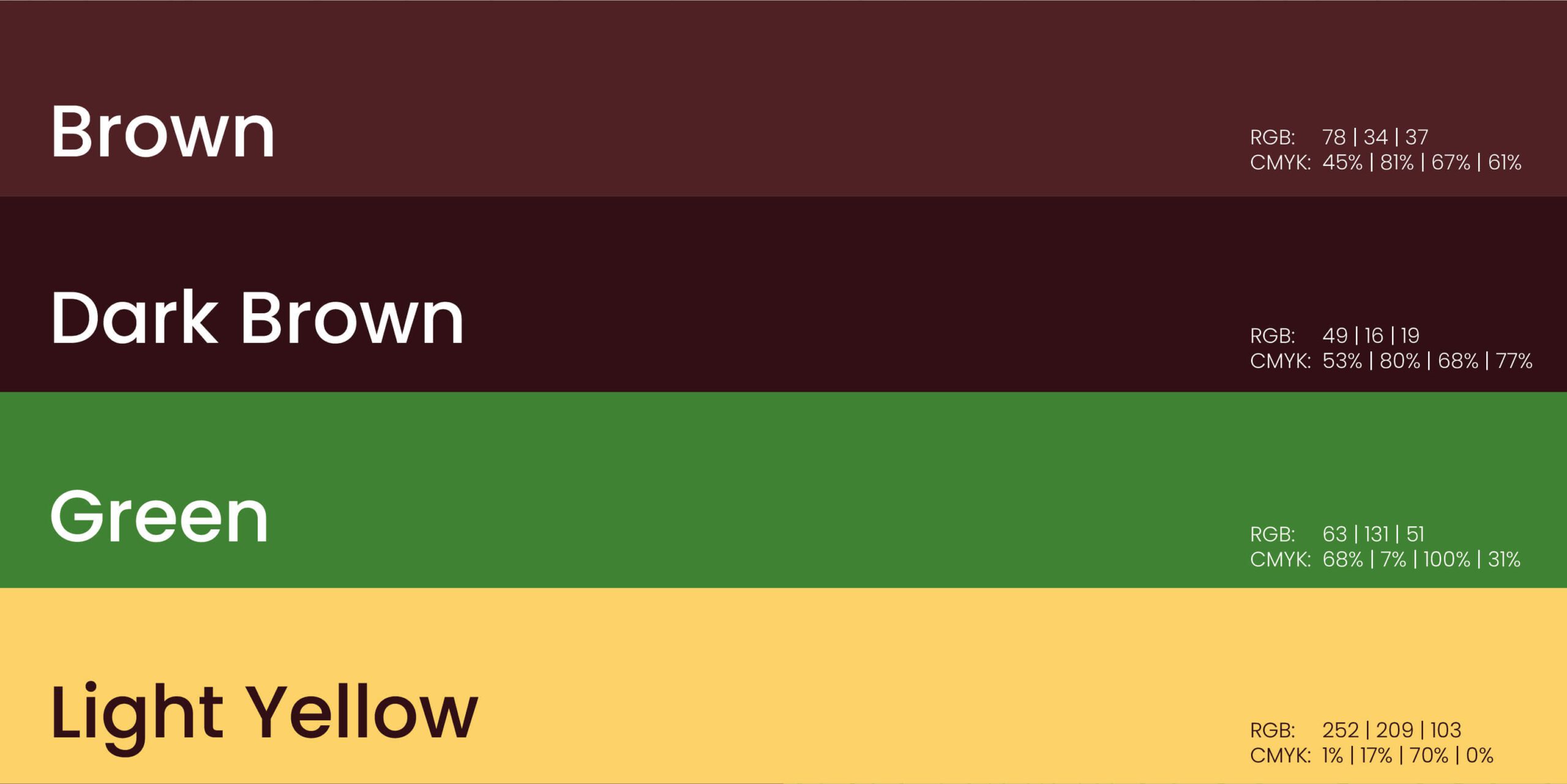
The Palette: Nature Meets Nostalgia
We engineered a highly intentional, dual-tone color system designed to stimulate both appetite and trust: Baked Cream Brown: A warm, inviting anchor tone that instantly triggers the comforting nostalgia of cozy Sunday mornings and freshly baked goods. Botanical Green: A crisp, vital hue that communicates nature and reassures the customer of health, freshness, and quality sourcing.


The primary purpose of any logo is to establish a memorable brand identity, and the Waffle Garden logo does this brilliantly. Its unique combination of elements ensures that customers remember the restaurant's name and associate it with a delicious and healthy dining experience.


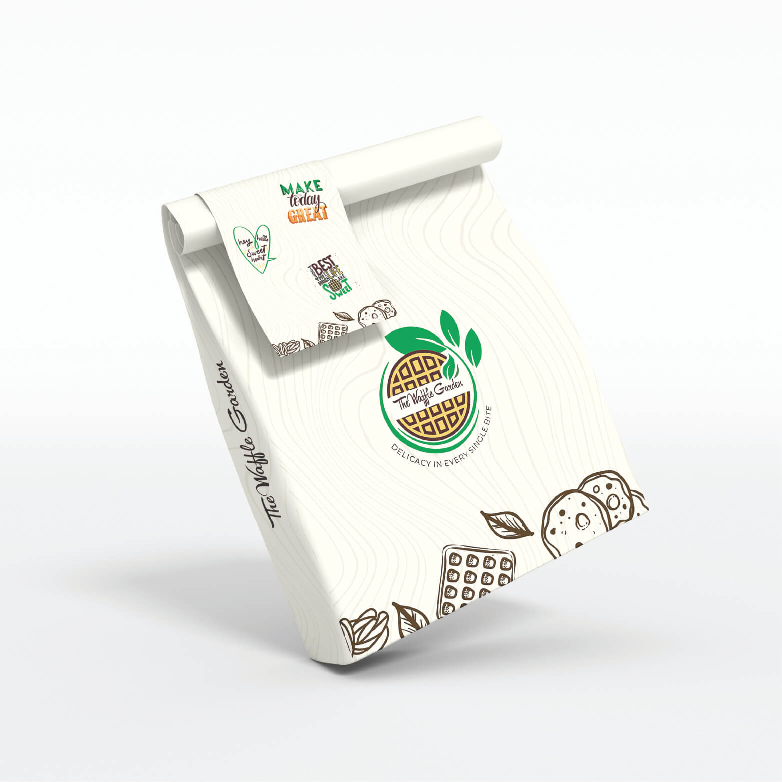
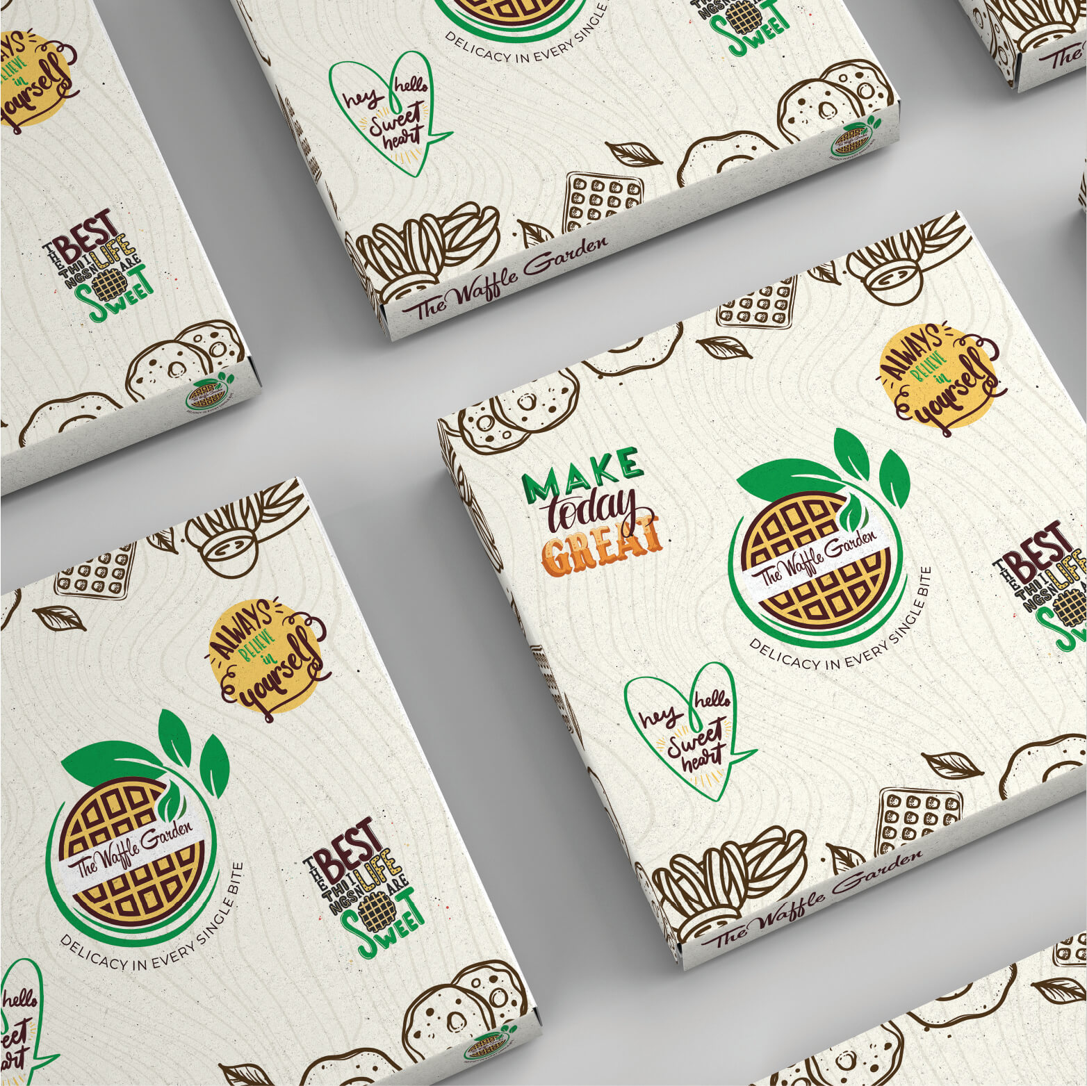
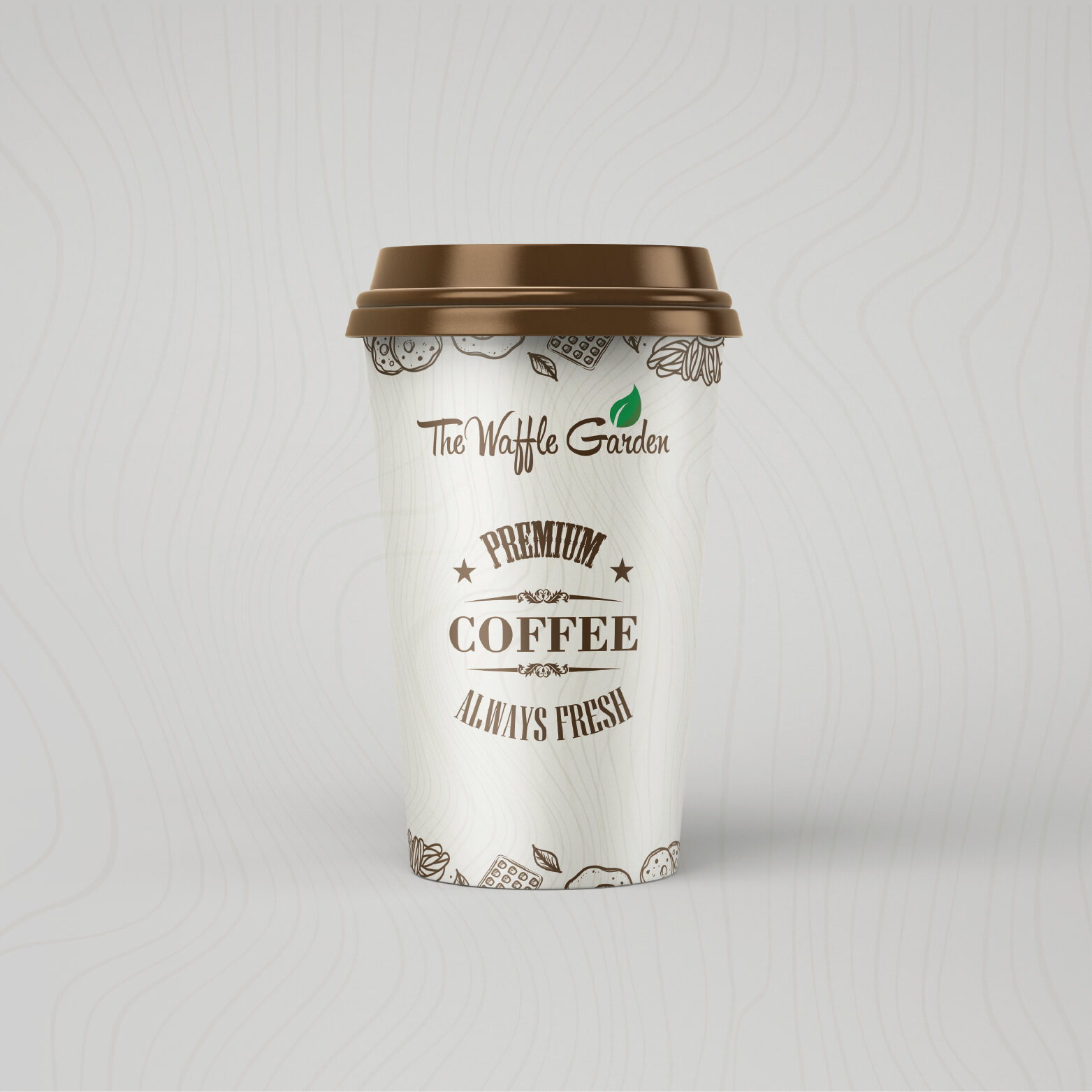
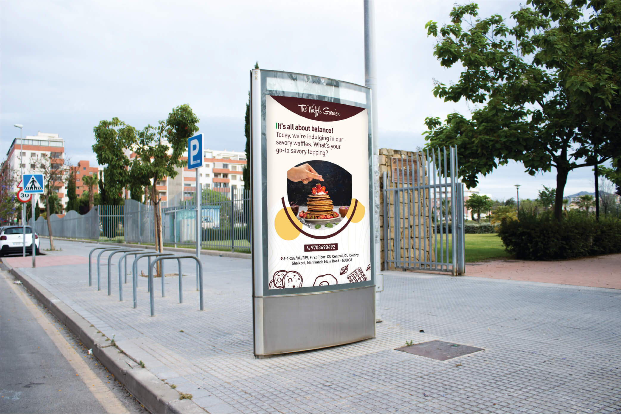
Tactile Menu & Print Expansion
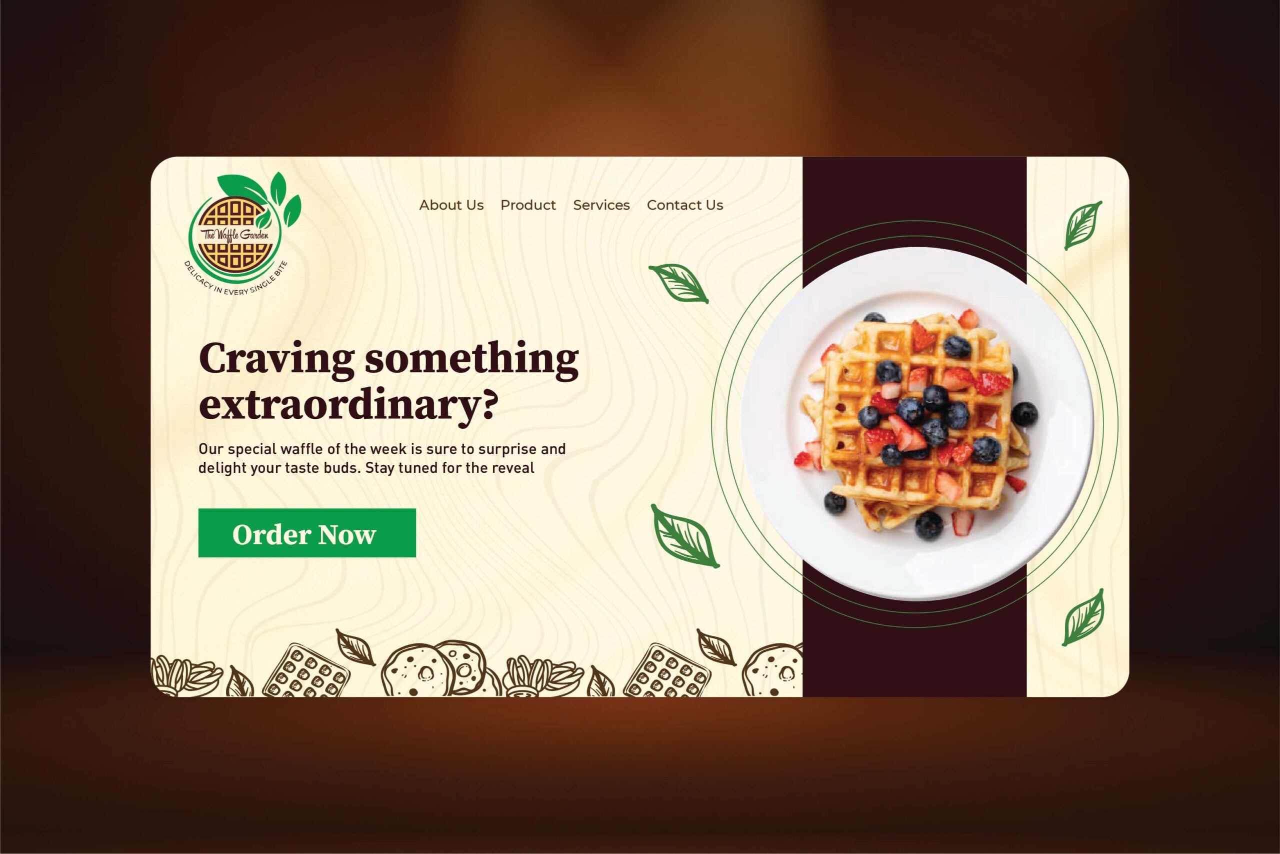
A restaurant brand lives in its physical touchpoints. We extended the visual identity into comprehensive menu designs and premium print collateral. By overseeing the print execution, we ensured that the tactile experience at the table perfectly matched the elegance of the brand's digital and exterior presence.
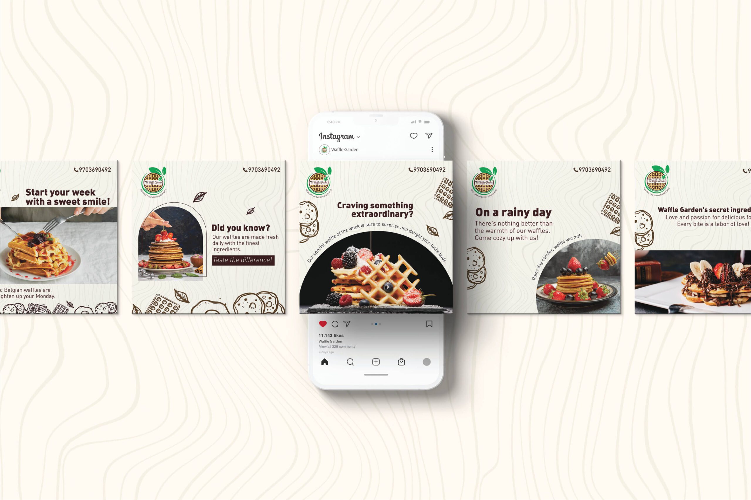
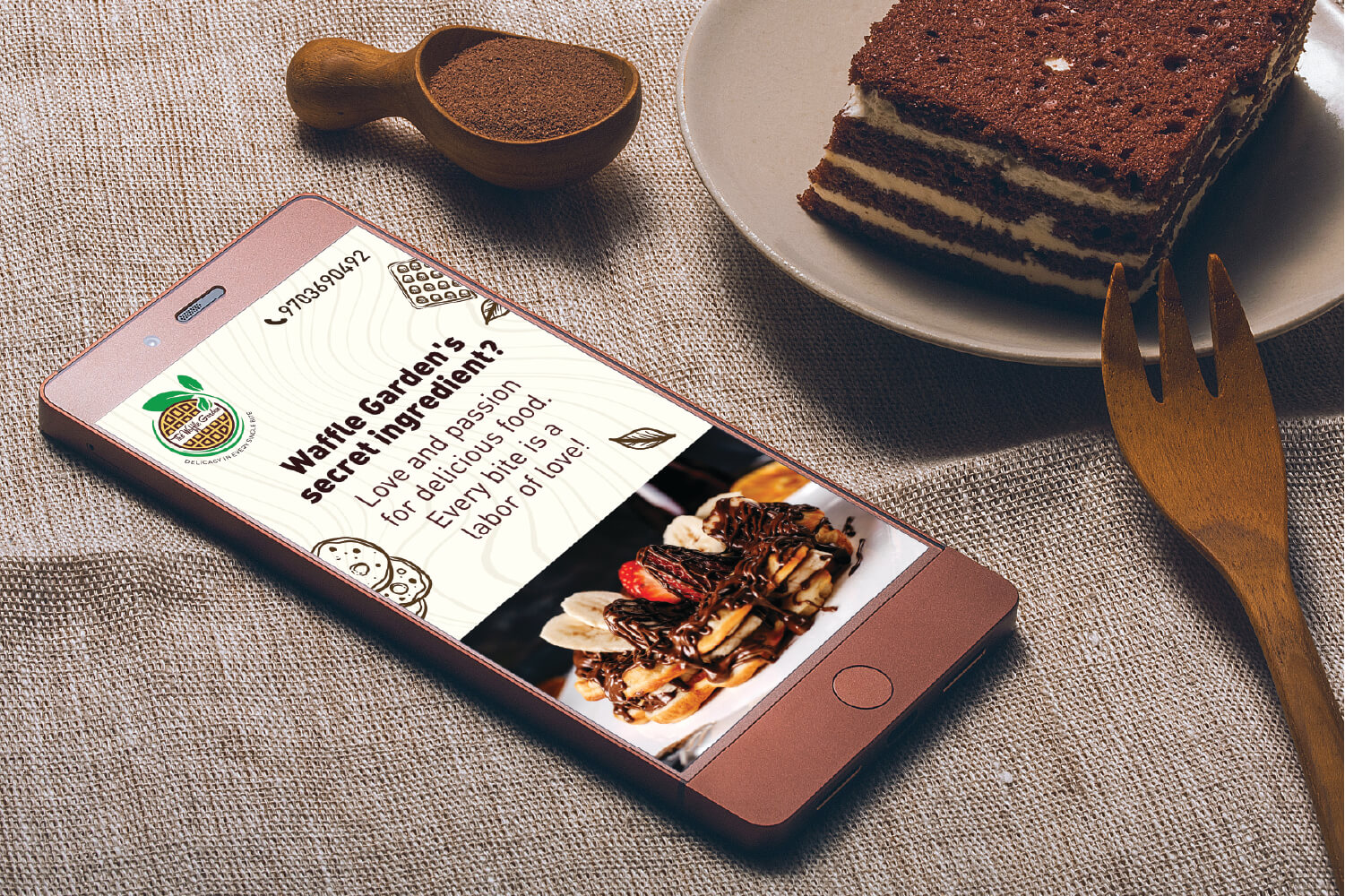

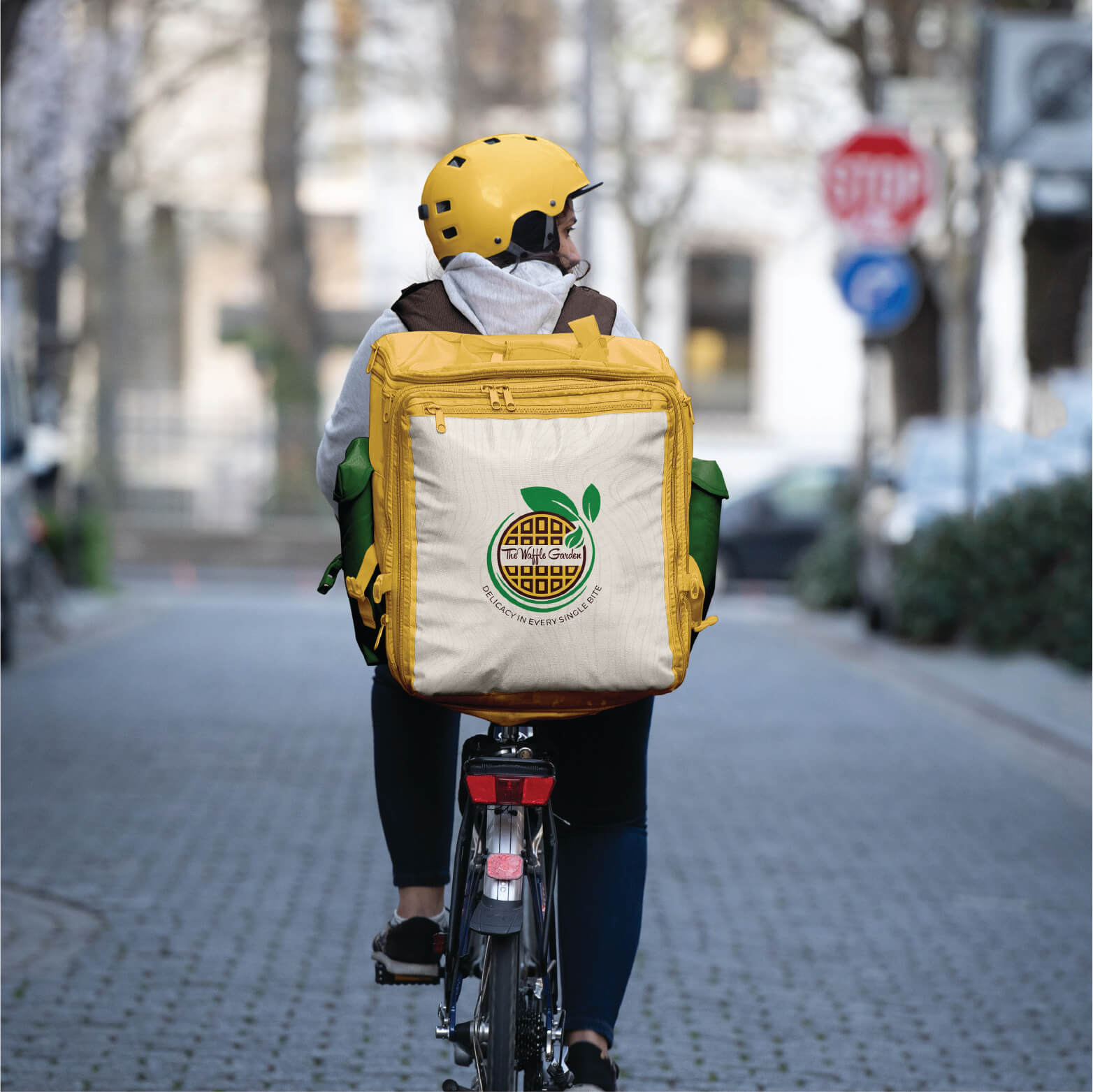
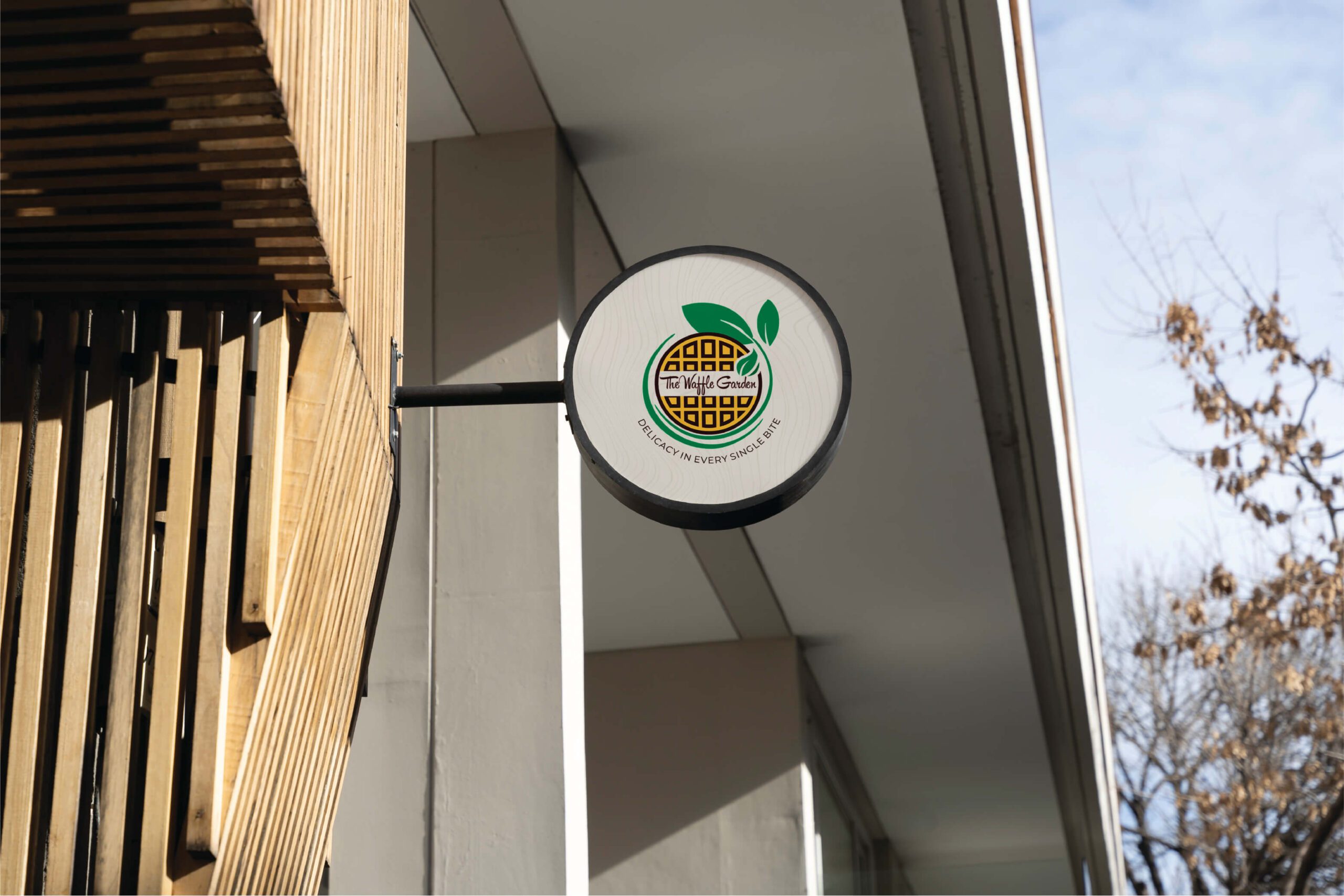
The Waffle Garden logo's design is versatile, making it suitable for various applications. It can be used on signage, menus, packaging, merchandise, and across digital platforms, ensuring a consistent brand presence.

The Impact
The Waffle Garden identity successfully bridges the gap between a wholesome eatery and an indulgent retreat. The cohesive design system not only sets a warm, inviting atmosphere but firmly establishes the restaurant as a standout culinary destination. The highly versatile mark transitions flawlessly from glowing exterior signage to intimate, handheld menu designs, wrapping patrons in a truly memorable, holistic dining experience.