Overview
Distance and reliability are the two greatest hurdles in offshore business. When an enterprise infrastructure firm operates half a world away from its clients, its visual identity must instantly bridge the geographic divide. Sucanatek, a premier project management firm catering to the US market, needed a brand presence that acted as a universal language for stability and progress. We developed a visual system designed to project immediate authority across borders.
Client: Sucanatek Industry: Offshore Project Management & IT Infrastructure Scope of Work: Corporate Identity, Logo Engineering, Visual Strategy, Color Psychology

The Challenge
In the B2B infrastructure space, offshore firms often battle the perception of being mere outsourced vendors rather than strategic partners. The objective was to craft an identity that felt native to the high-stakes US corporate ecosystem. Sucanatek required a brand that looked as rock-solid and dependable as the complex infrastructure projects they manage daily.
The Strategy
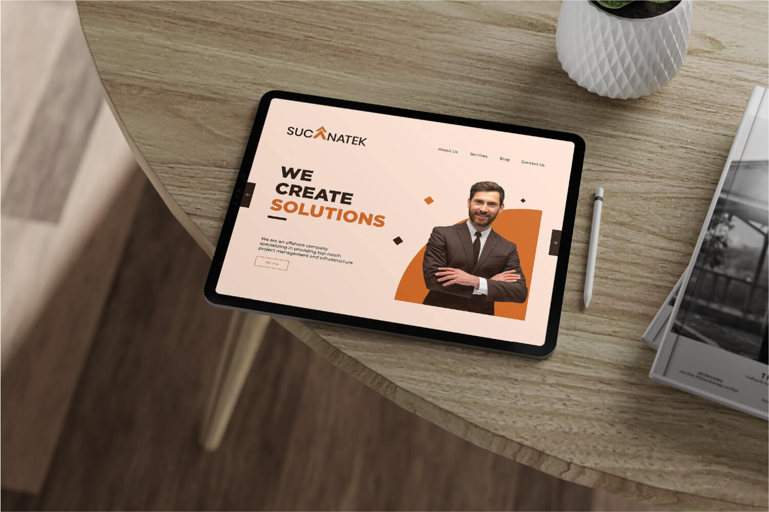
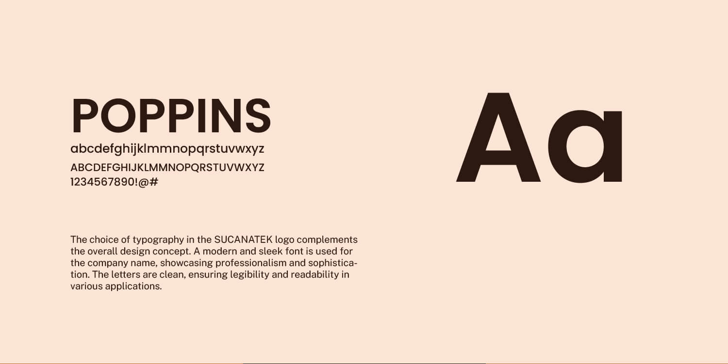
We bypassed the generic, overused tech and globe motifs common in the offshore industry. Instead, we focused entirely on corporate momentum and structural integrity. The strategy was to create a sharp, highly legible wordmark that embedded a subliminal message of growth, utilizing a warmer, grounded color palette to counteract the cold, sterile aesthetic typical of corporate B2B firms.


The Execution
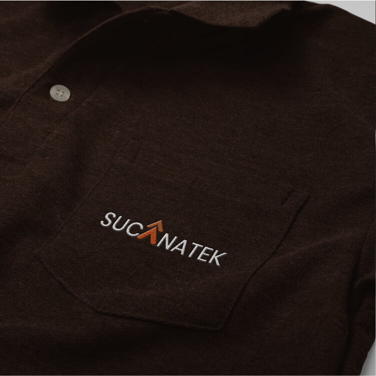
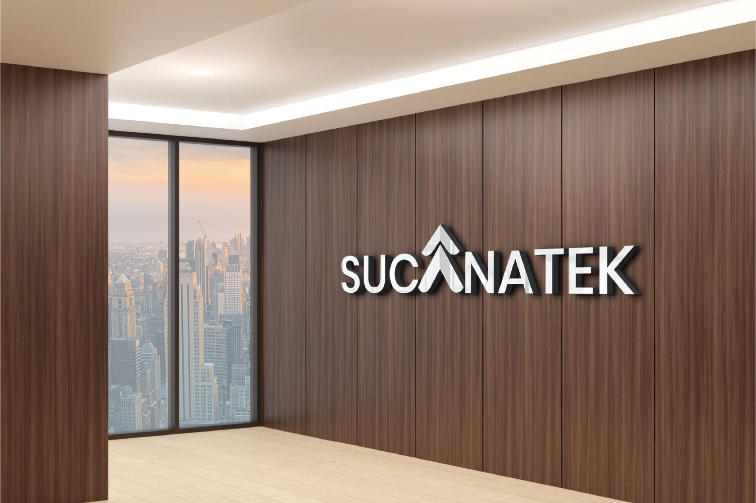
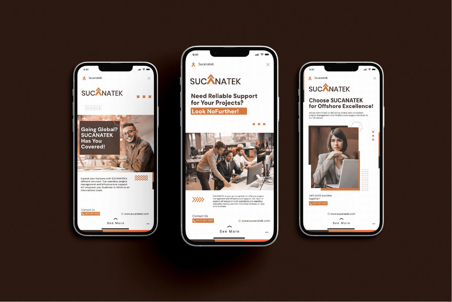
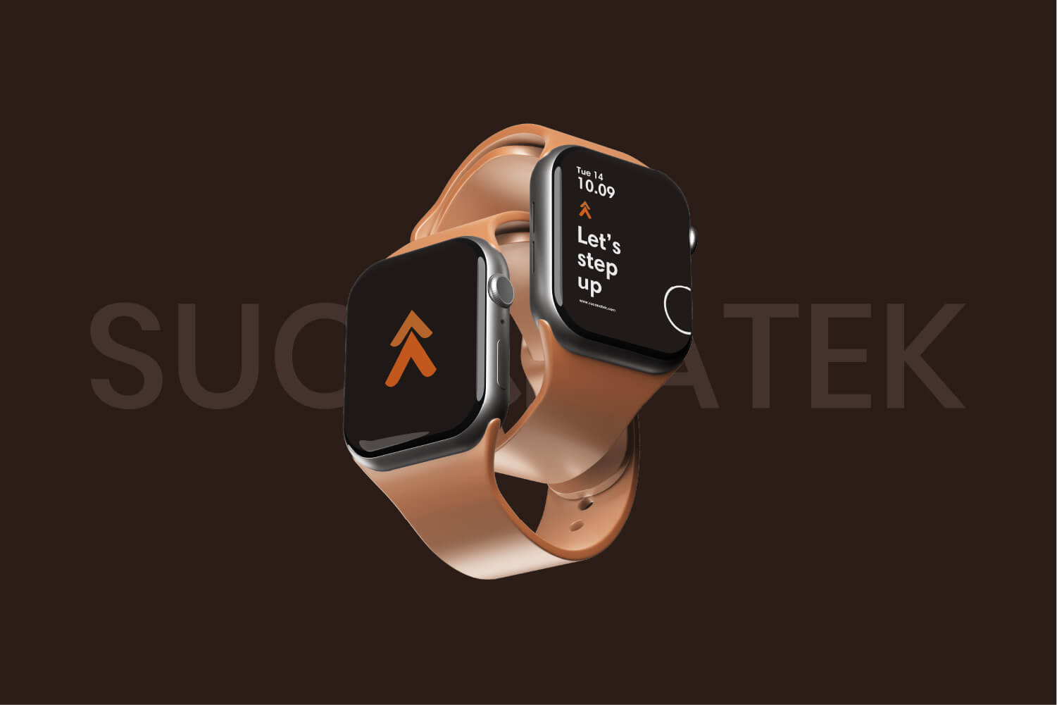
The Mark: Structured Momentum
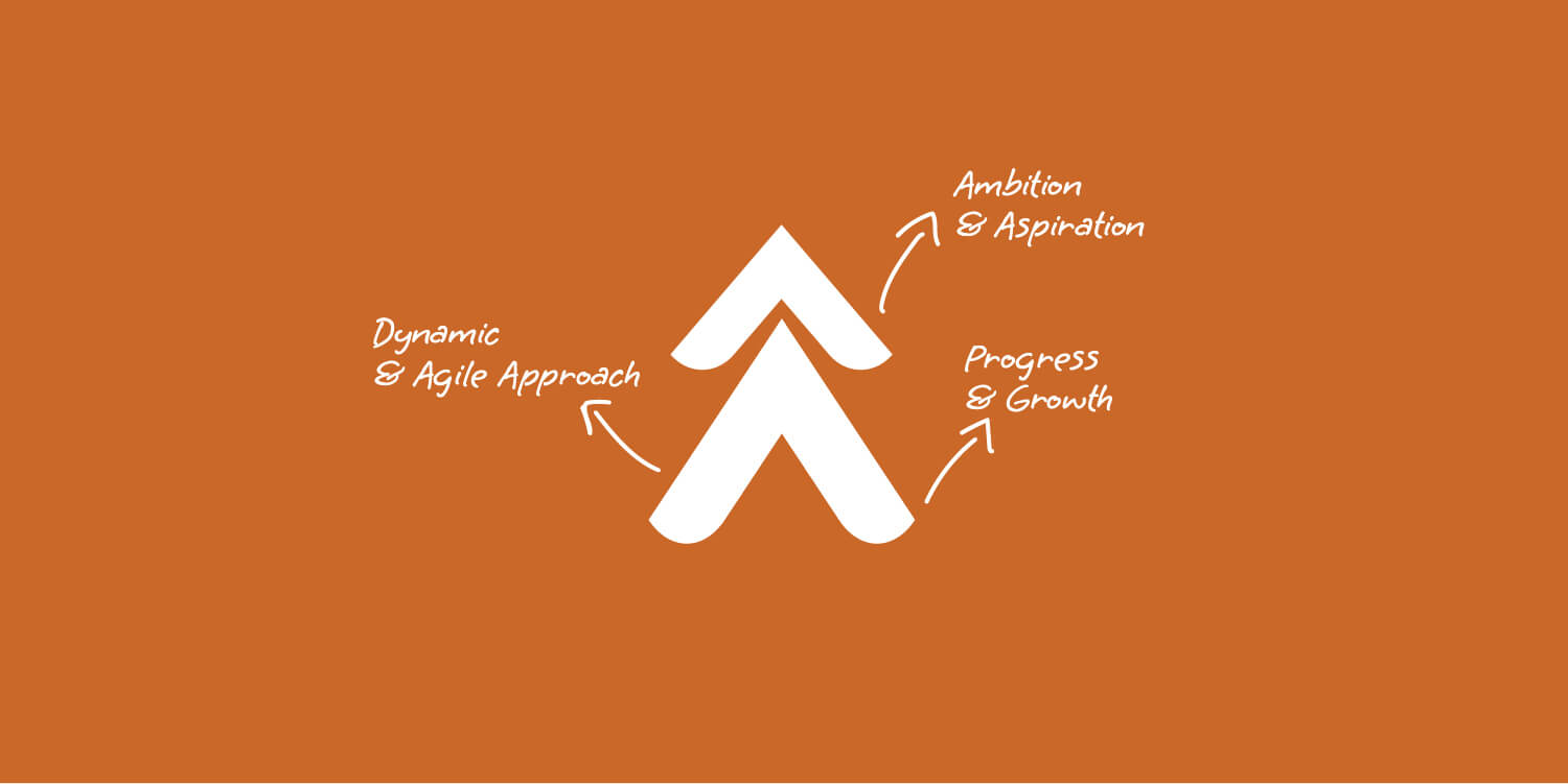
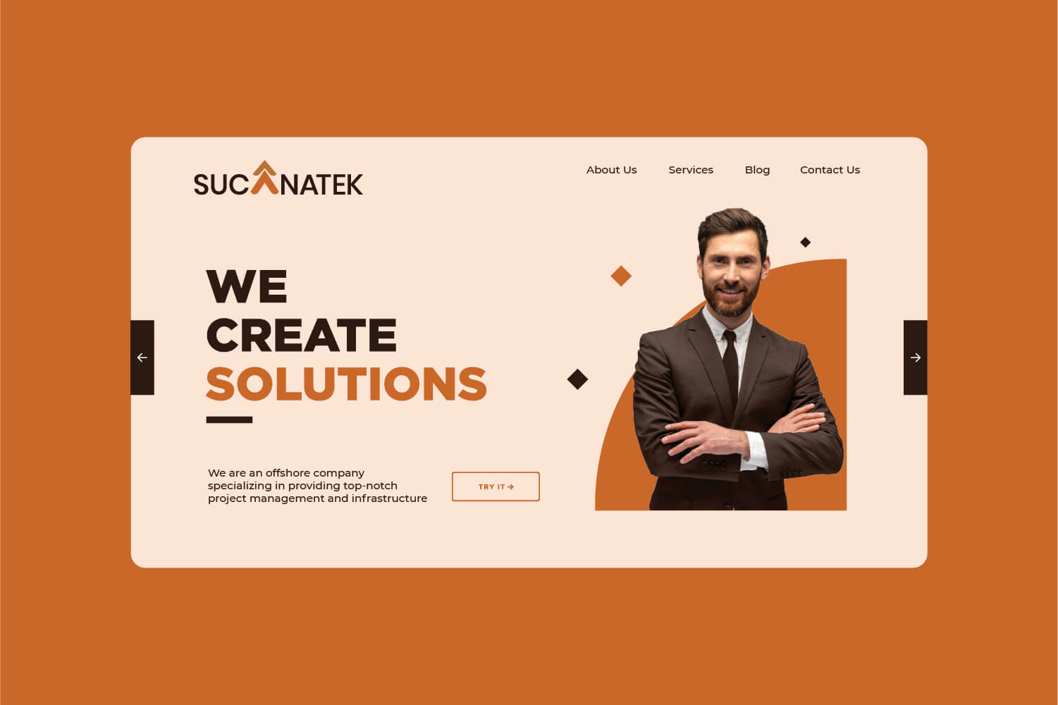
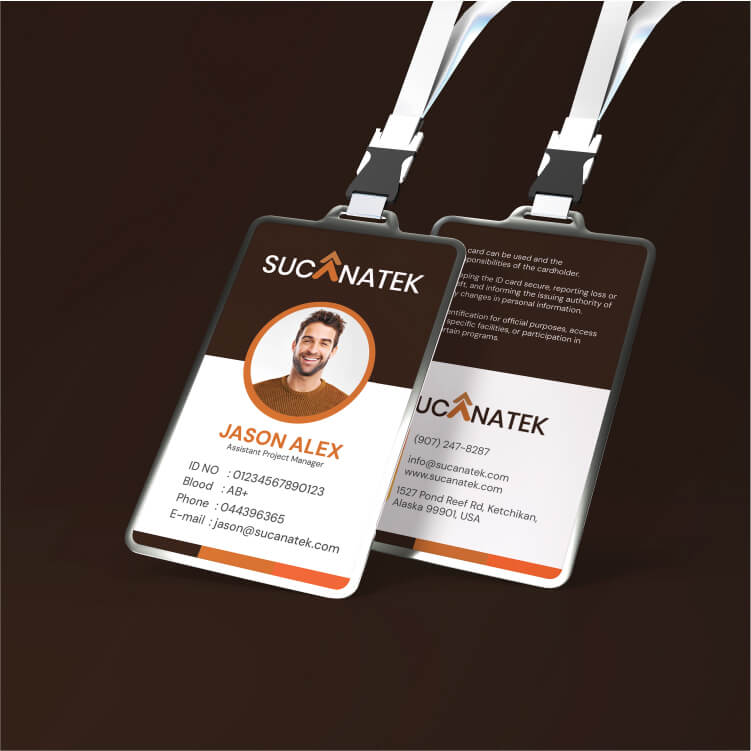
We engineered a custom wordmark that places the entire visual emphasis on the company name for maximum brand recall. Within this typography, the letter “A” is structurally transformed into dual upward-pointing arrows. This focal point operates as a visual anchor, symbolizing continuous progress, agility, and the direct elevation of client operations.

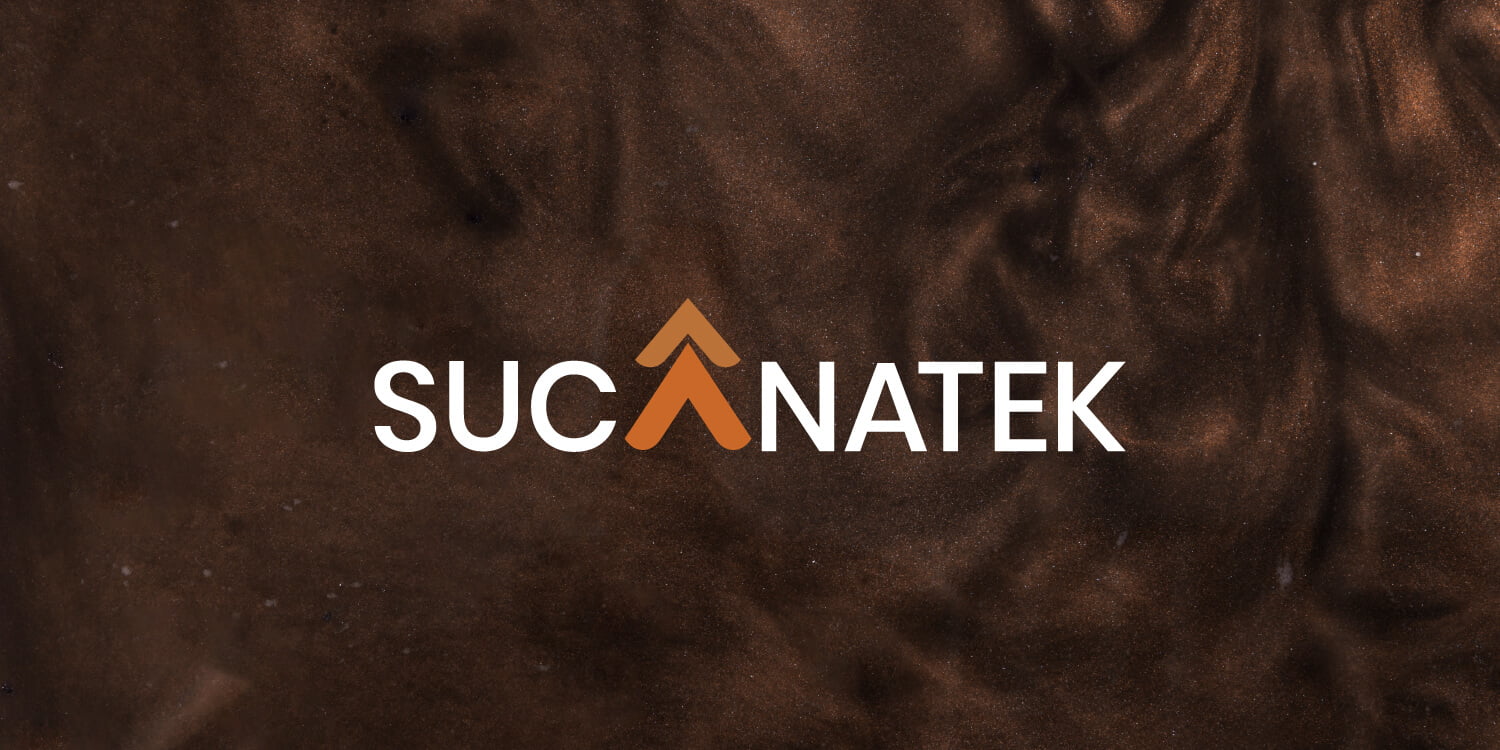
The Palette: Grounded Ambition
To stand out in a sea of corporate blue, we established a highly distinctive color system: Infrastructure Brown: A foundational tone that communicates stability, dependability, and the literal "groundwork" required in project management. Dynamic Orange & Gold: These vibrant accents inject an energetic, forward-thinking ambition, representing innovation and premium service quality.


The Impact
The refined identity instantly elevates Sucanatek from a distant offshore vendor to a premium, US-ready project management partner. The sharp, intentional visual execution instills immediate confidence in overseas stakeholders, proving that geographical distance does not compromise structural excellence or corporate sophistication.