Overview
Wood and Grains stands as a beacon of excellence in the woodworking industry, dedicated to producing top-tier plywood that bridges the gap between raw natural beauty and modern craftsmanship. They approached us to define an identity that communicates their core pillars: uncompromising quality, sustainable innovation, and a deep respect for the material itself.
Client: Wood and Grains Industry: Plywood & Woodworking Scope of Work: Brand Identity, Logo Design,Visual Strategy
The Challenge
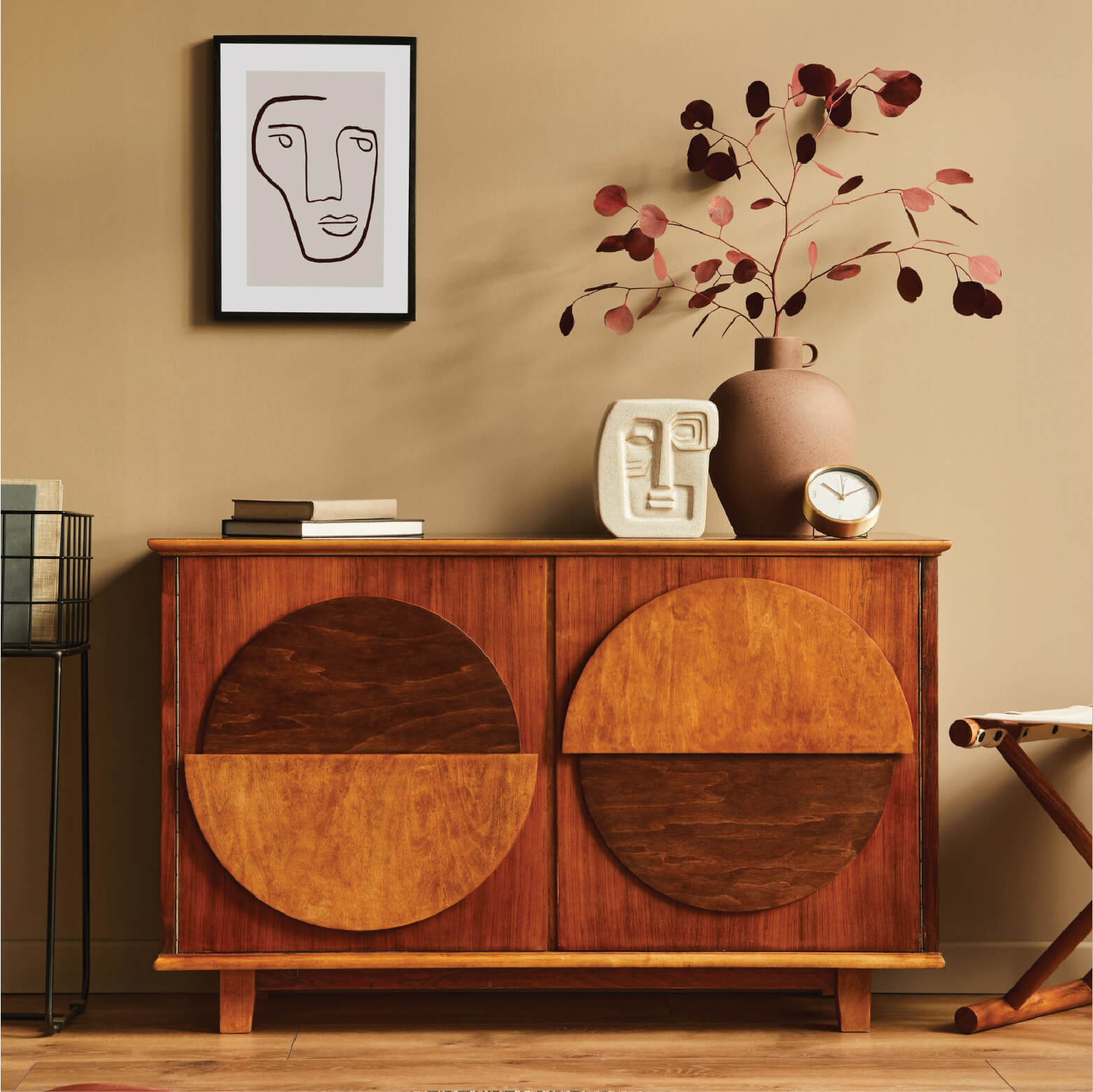
The plywood market is often commoditized, with brands struggling to distinguish themselves from industrial manufacturers. Wood and Grains needed an identity that rose above the transactional nature of the industry. The objective was to position the brand not just as a supplier of wood, but as a partner in design—a company that transforms raw forestry into refined, functional art.
The Strategy
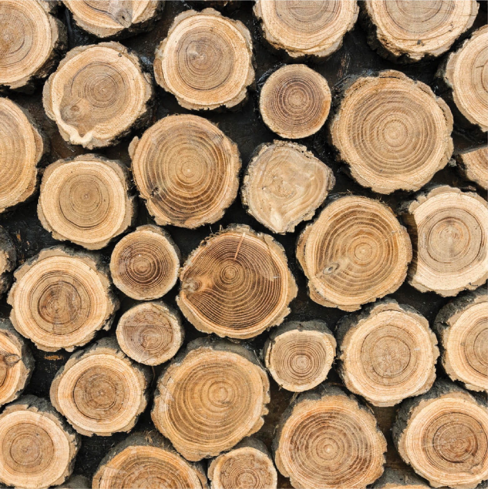
Our strategy was to honor the organic origins of the product while showcasing the precision of the manufacturing process. We moved away from heavy, industrial aesthetics in favor of a clean, sophisticated wordmark that emphasizes structural elegance. The goal was to create a visual shorthand for quality—a brand mark that looks as premium as the products it represents.

The Execution
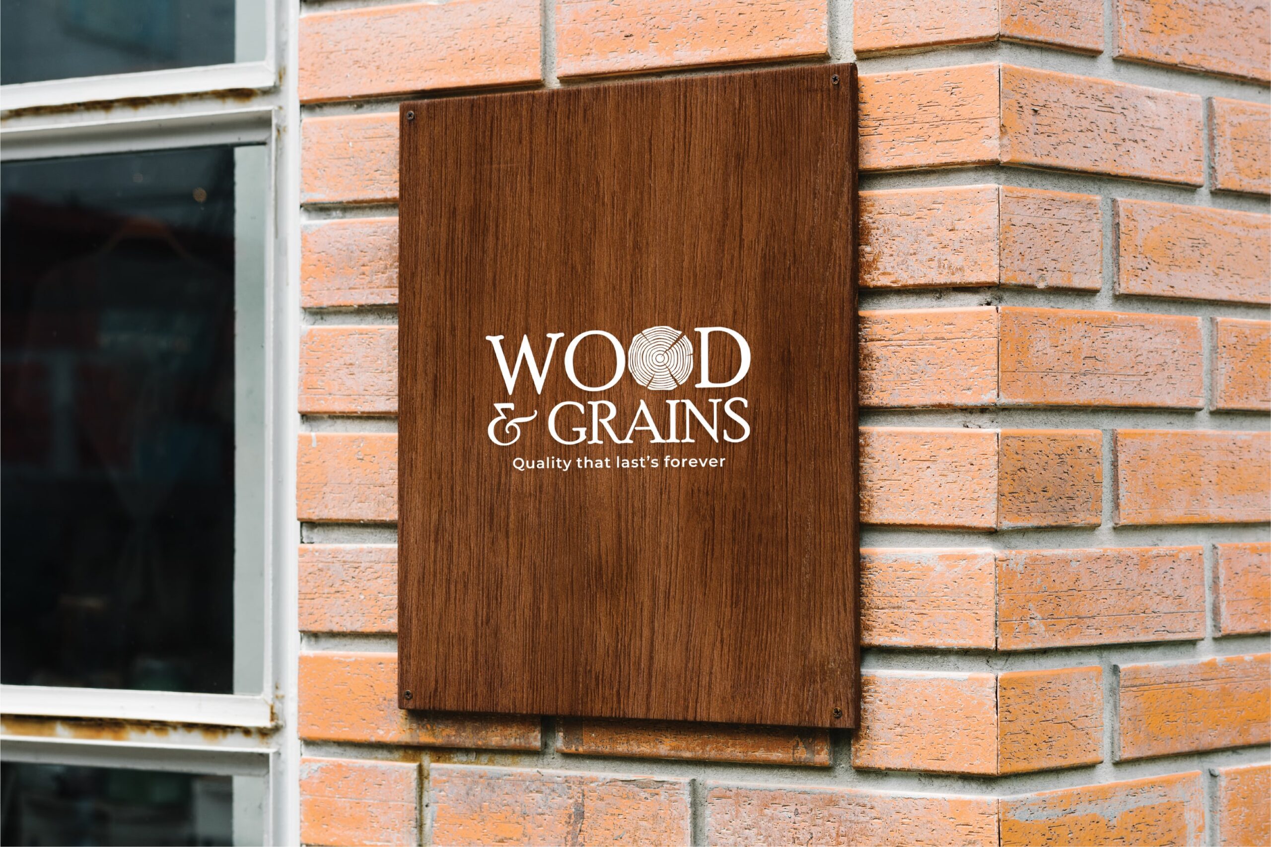
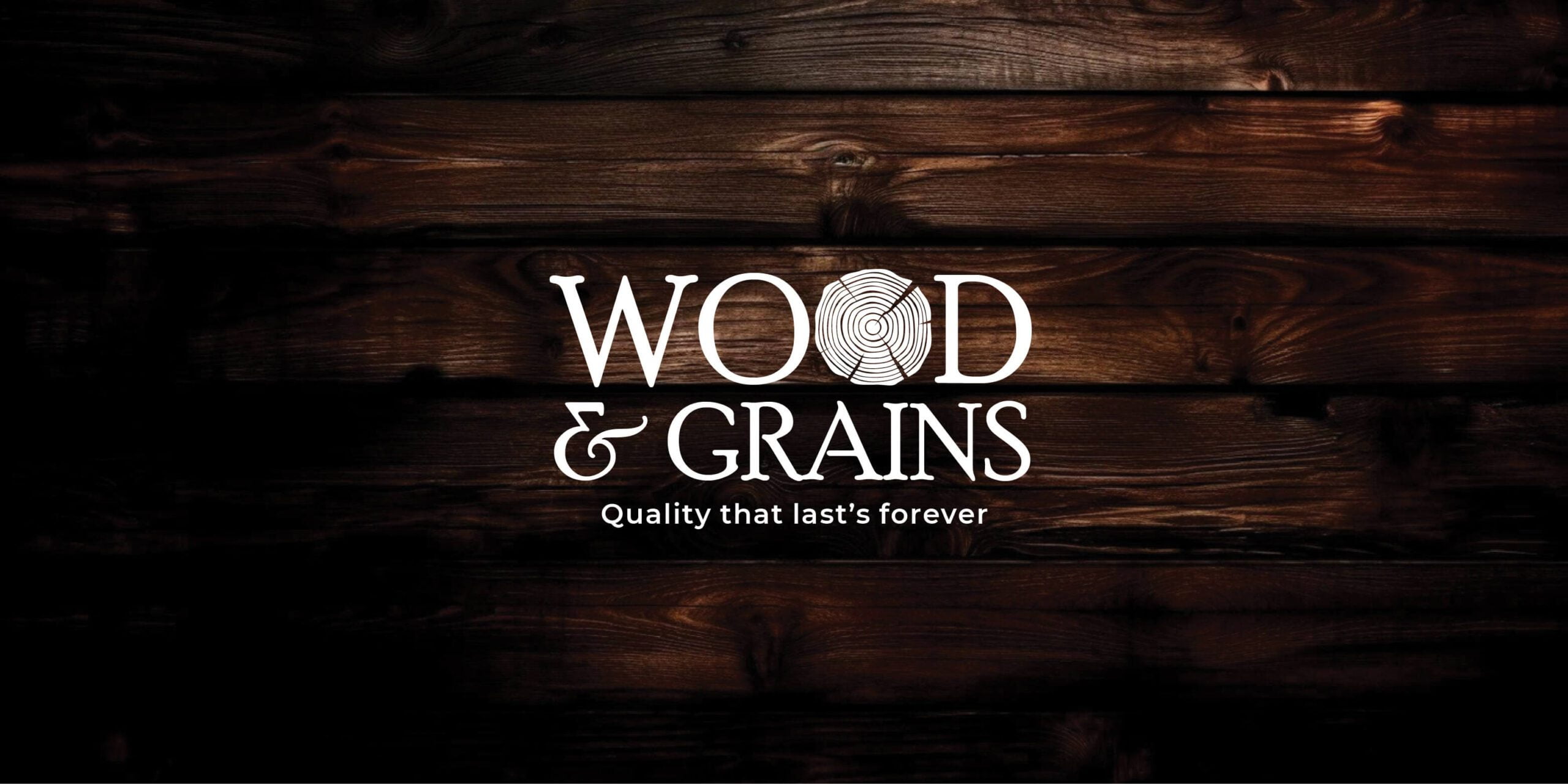
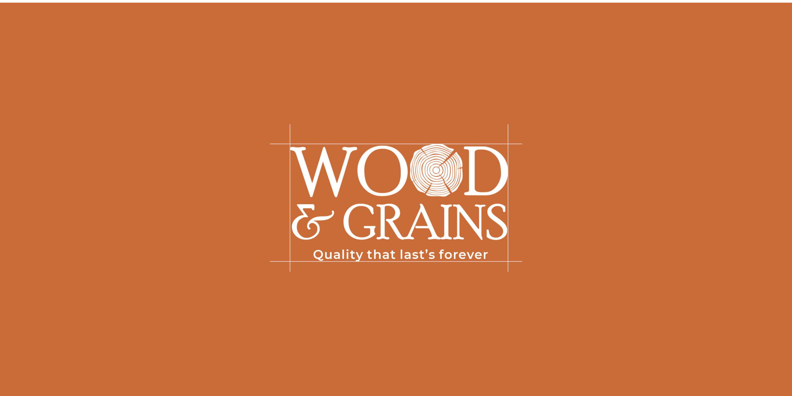
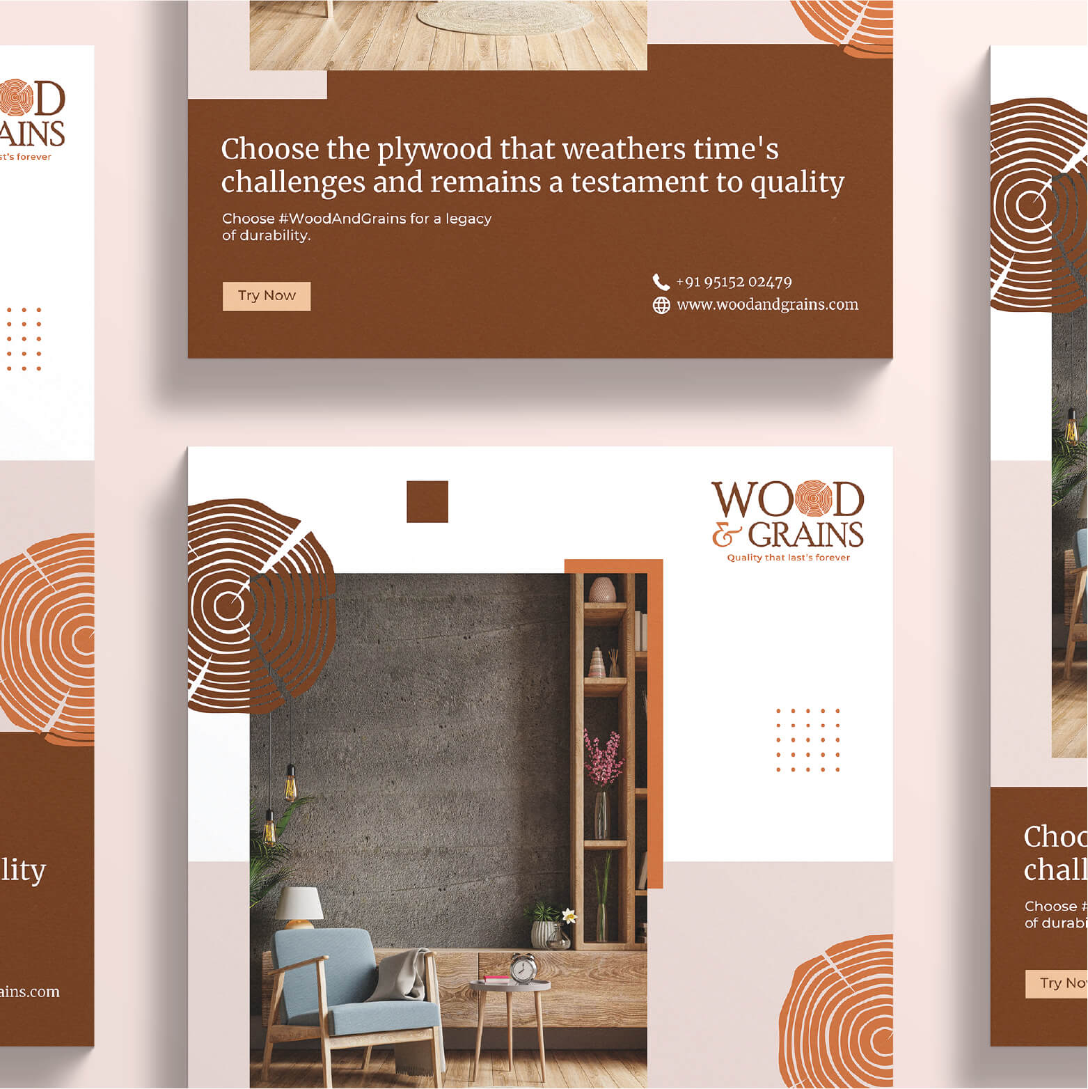
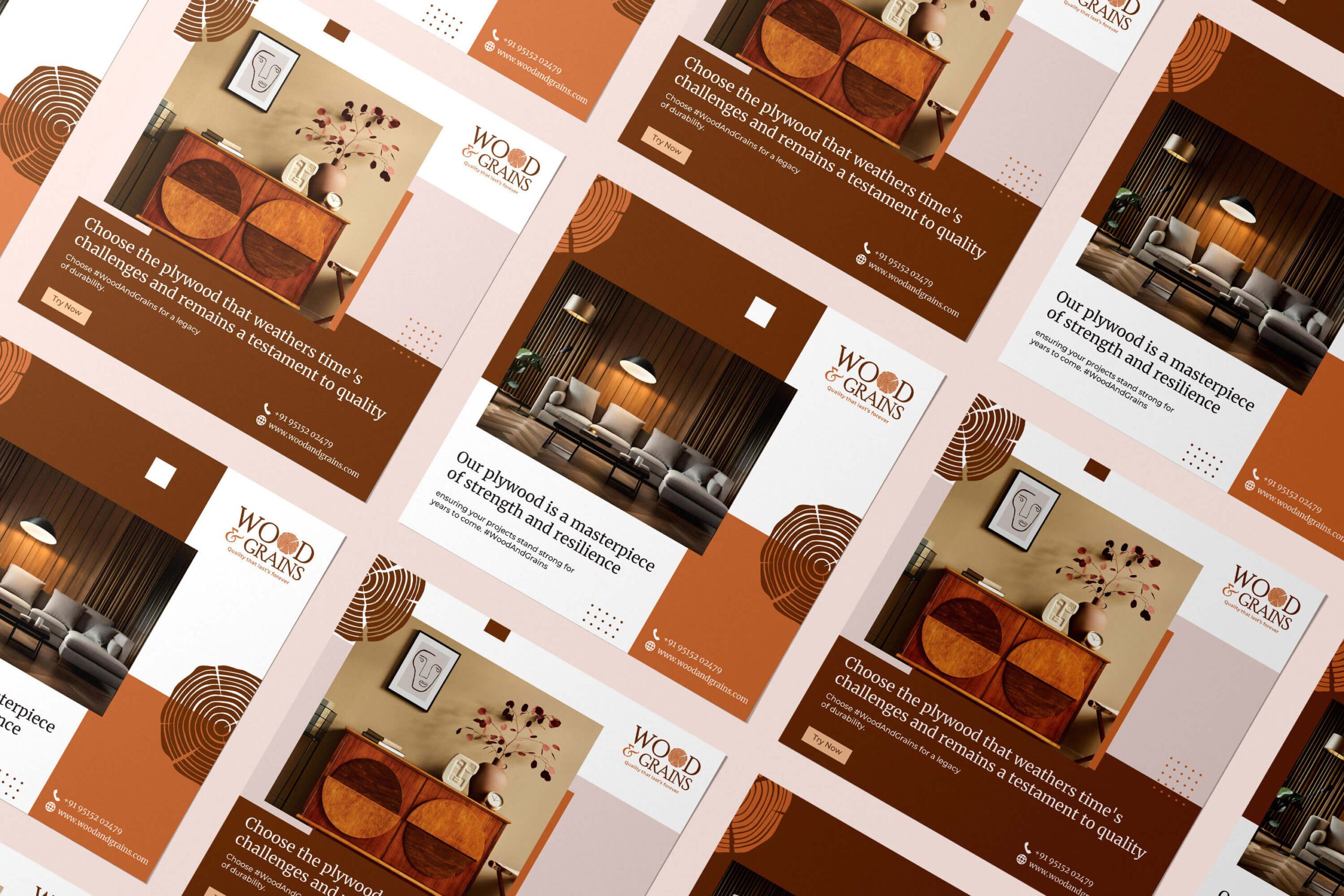
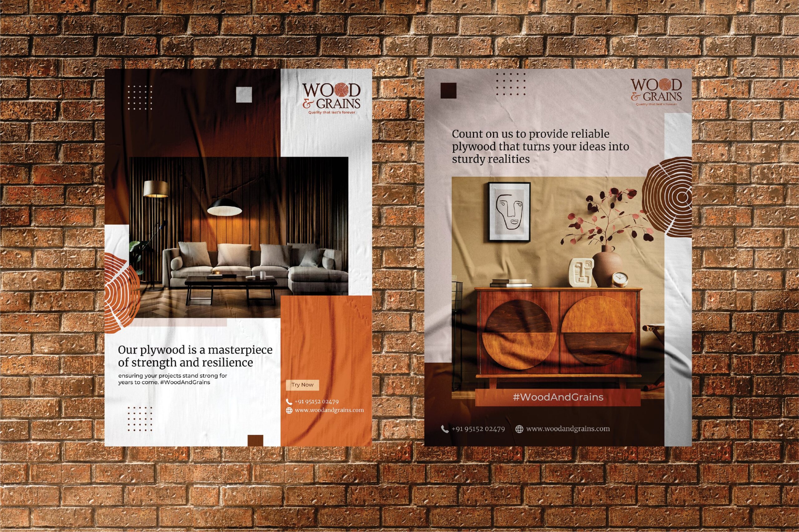
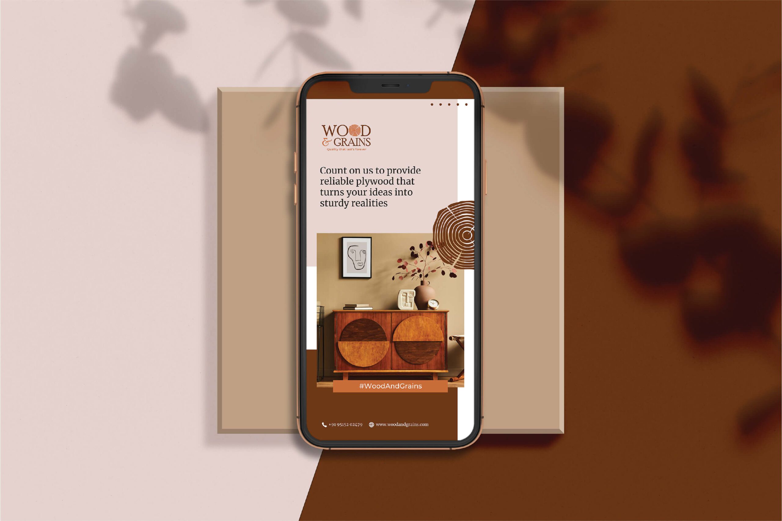
The Mark: The Heart of the Grain
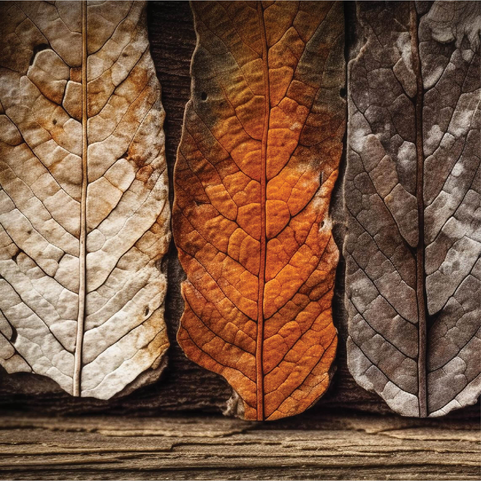
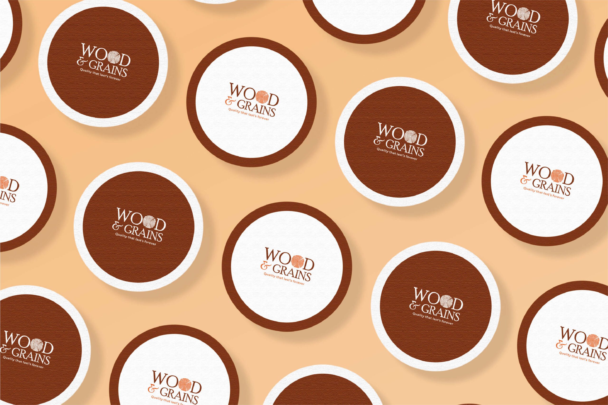
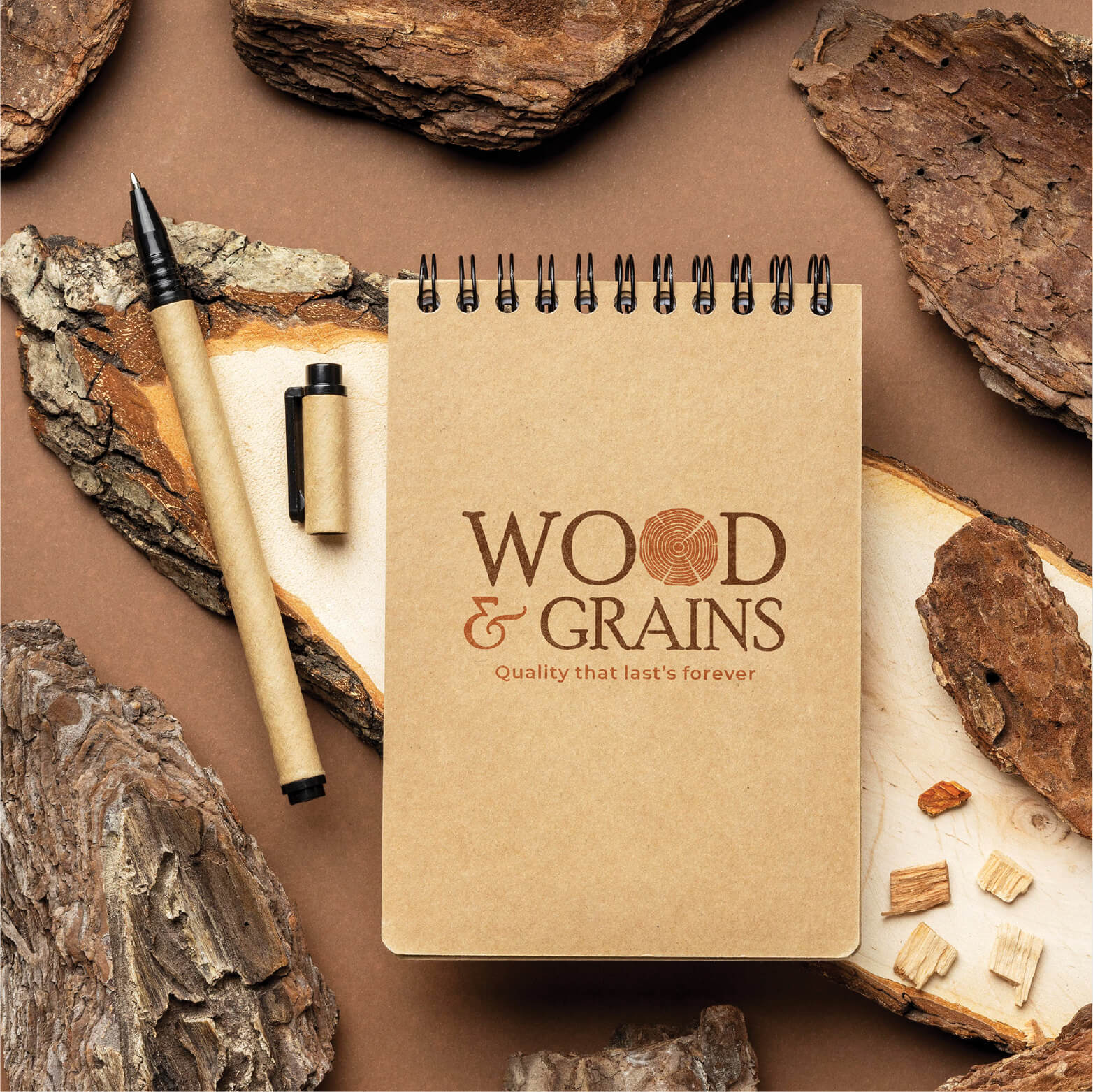
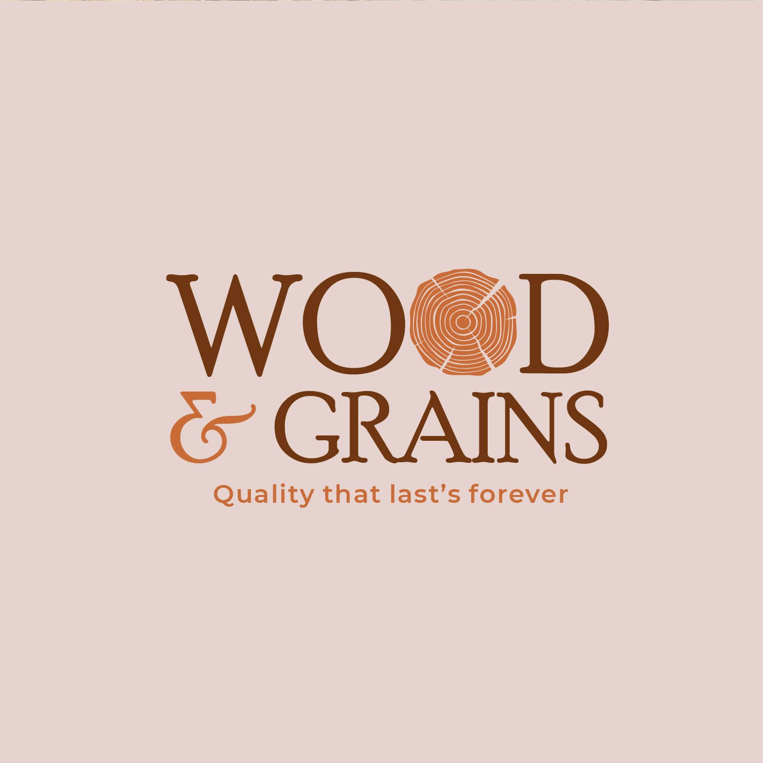
We developed a bespoke wordmark where the letter “o” serves as the brand’s anchor. Specifically, we crafted this character as a stylistic cross-section of a tree trunk, featuring a subtle, intricate wood-grain texture within the circular opening. This design choice serves as a powerful visual metaphor, representing the company’s role in transforming raw nature into finished excellence.
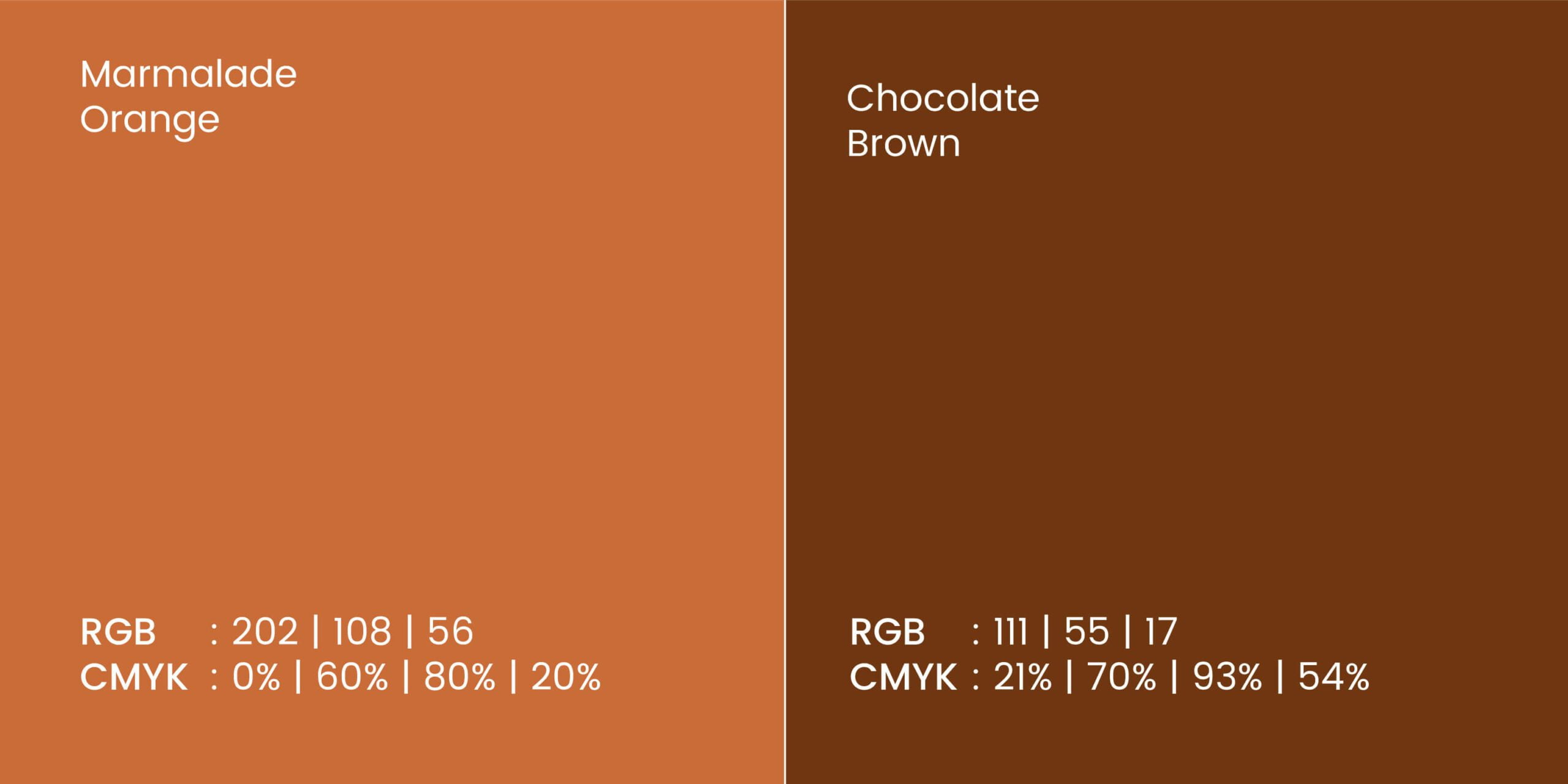
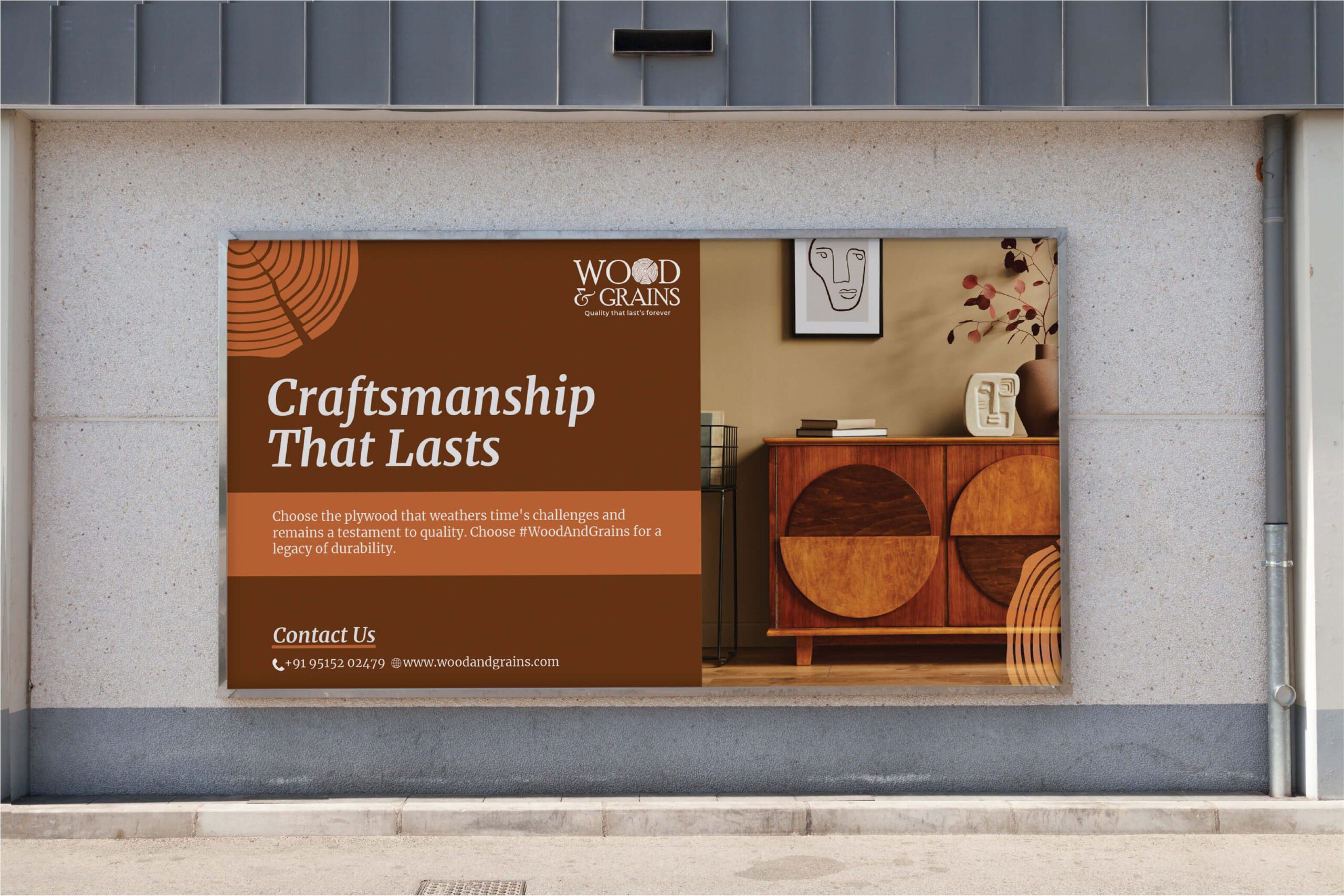
The Palette: Earth & Innovation
To reflect the brand's dual nature of reliable materials and creative potential, we established a precise color system:
Earth Brown: Grounding and reliable, this tone speaks to the authenticity of the material and the company's integrity in the woodworking industry. Innovation Orange: A sophisticated pop of energy that infuses the brand with creativity, passion, and a modern edge.
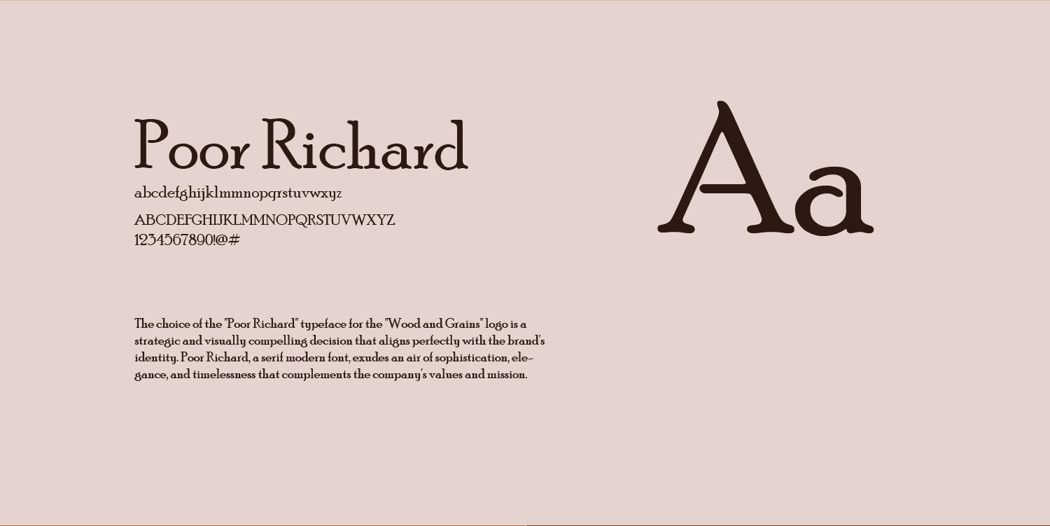
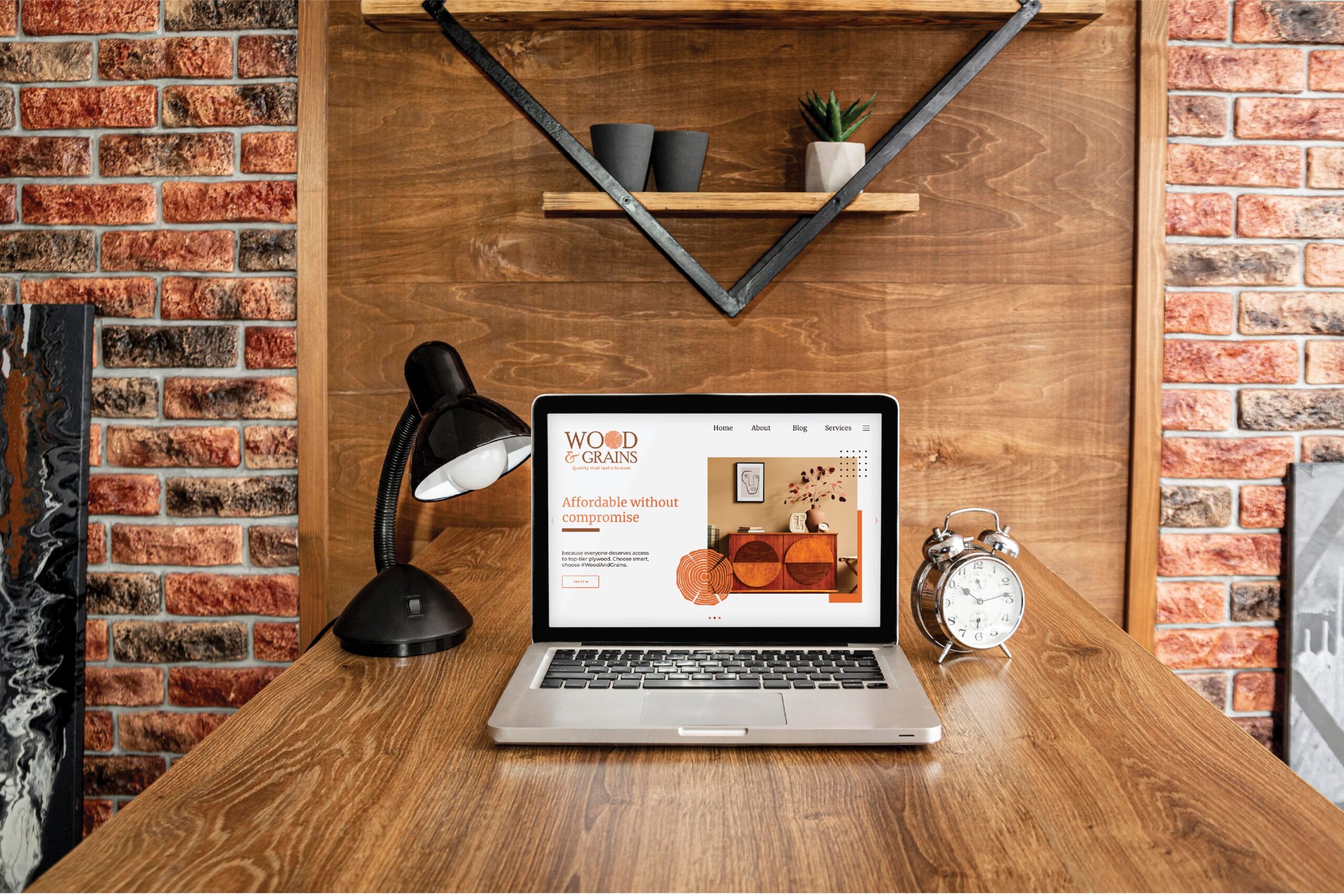
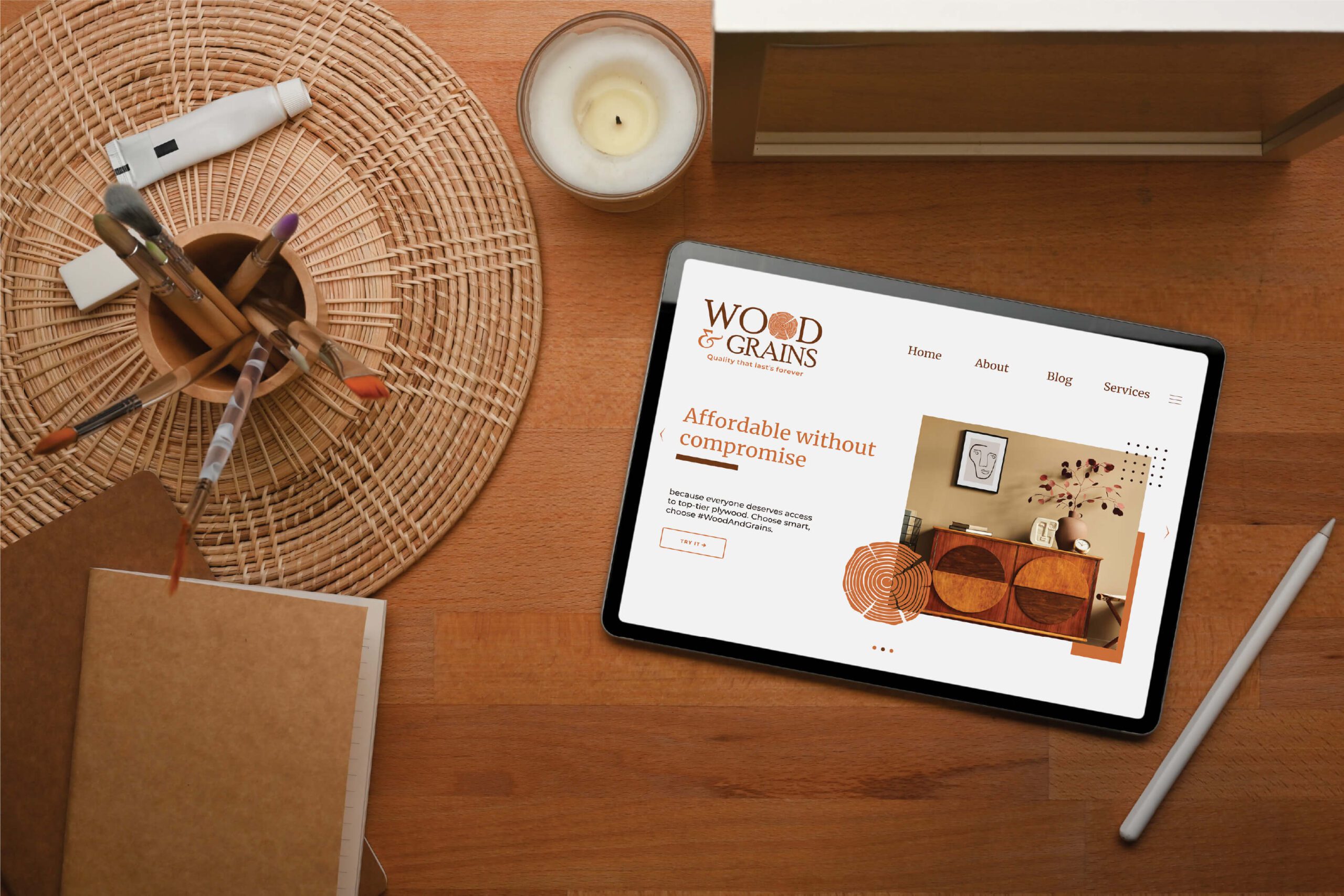
The Typography
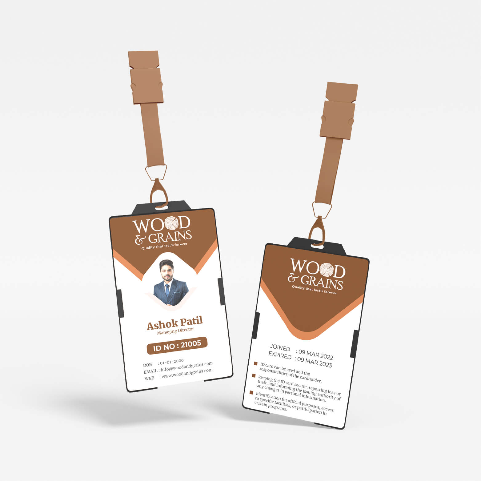
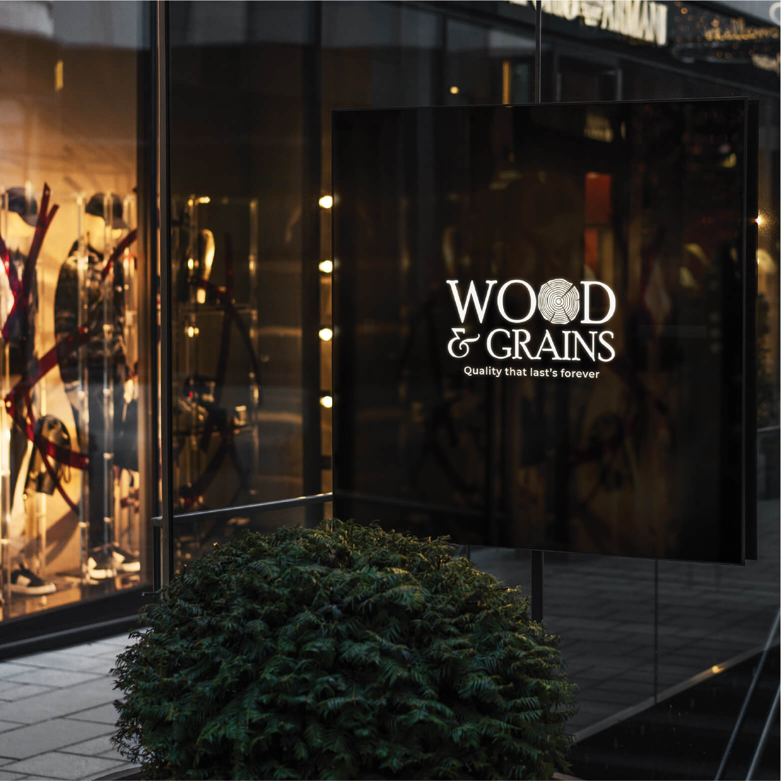
We selected typography that exudes clarity and refinement, ensuring the brand name remains legible and authoritative across every touchpoint—from laser-etched product stamps to large-format warehouse signage.

Strong Brand Identity: The logo establishes a strong and cohesive brand identity that resonates with customers, suppliers, and stakeholders. It encapsulates the company's values and mission in a single visual element.Market Differentiation: In a crowded market, the logo sets the company apart by effectively communicating its unique selling propositions, especially its focus on sustainability and quality.


The Impact
The new identity successfully repositions Wood and Grains as a premier choice in a crowded market. By moving the focus from "commodity" to "craftsmanship," the brand now resonates deeply with architects, interior designers, and discerning builders who prioritize sustainability and aesthetics. The cohesive visual system has elevated the brand's perception, transforming it into a trusted mark of quality in the construction and design sector.