Overview
In a crowded retail landscape, local supermarkets often struggle to differentiate themselves from corporate giants. Indifresh approached us with a vision to redefine neighborhood grocery shopping. They required an identity that didn't just label their storefront, but actively communicated their core values: farm-fresh quality, everyday reliability, and a welcoming atmosphere.
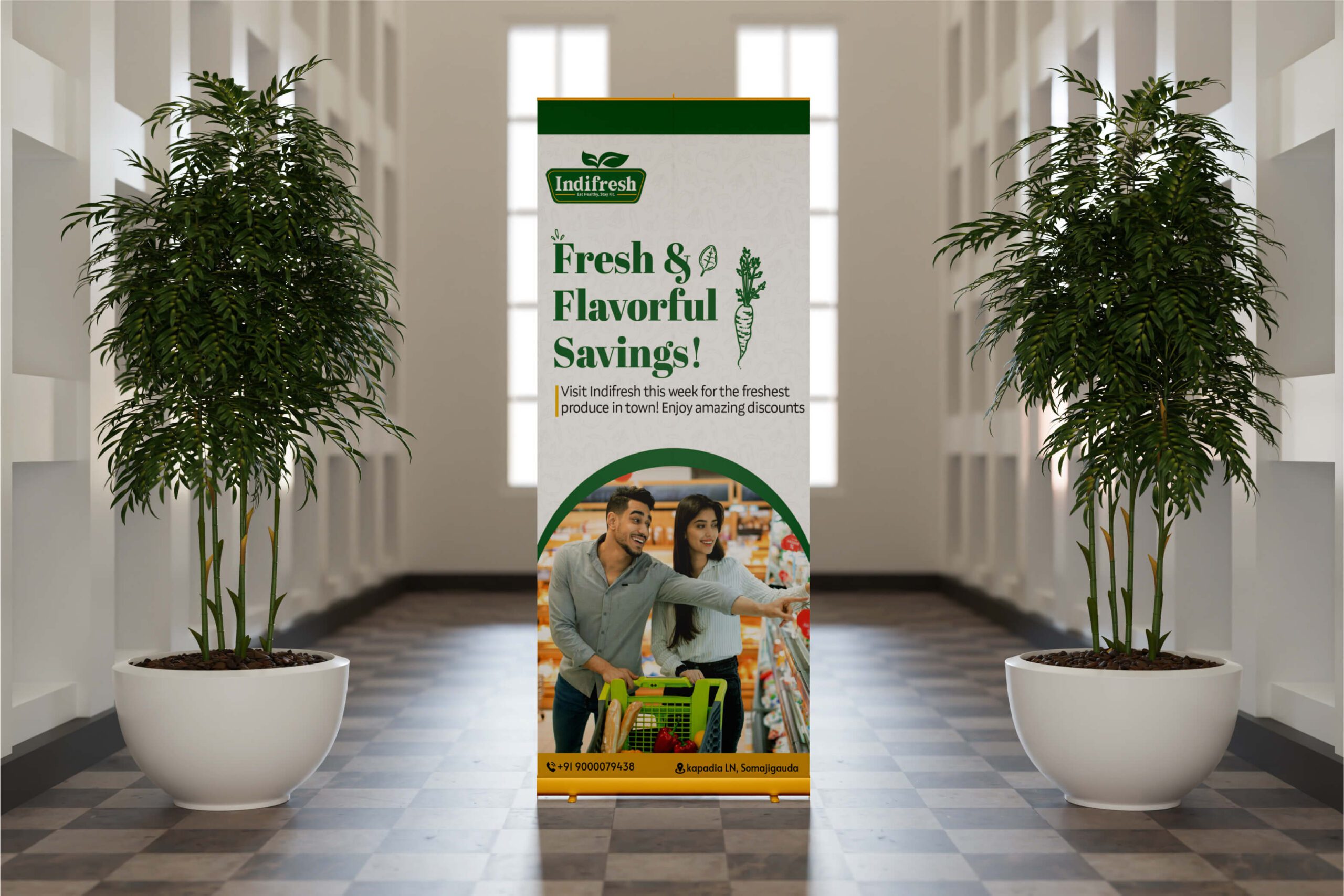
Client: Indifresh Industry: Retail & Supermarket Scope of Work: Brand Identity, Logo Design,Visual Strategy, Color Psychology
The Challenge
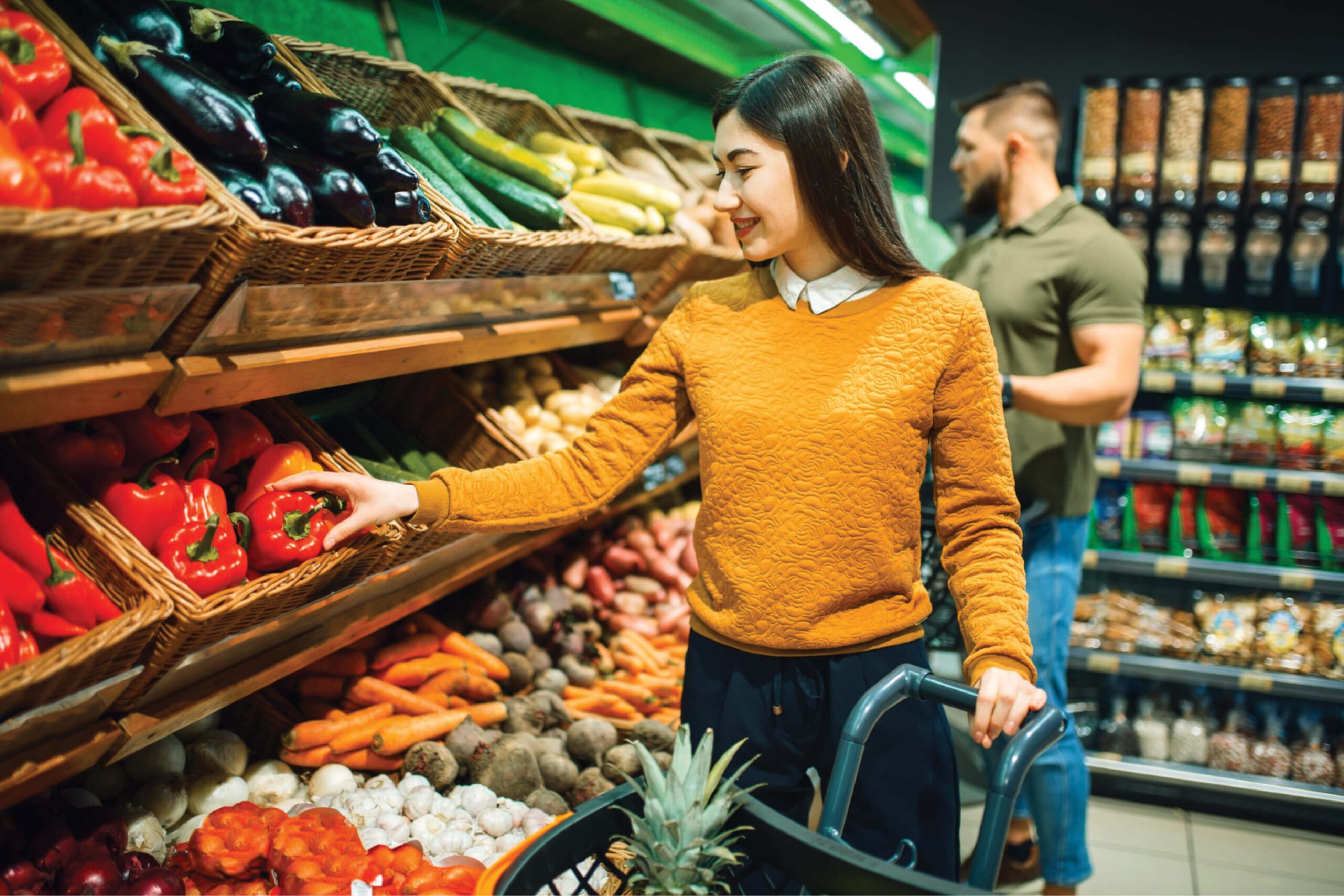
Supermarkets frequently suffer from visual clutter, making the shopping experience feel purely transactional rather than enjoyable. The objective for Indifresh was to strip away the noise. We needed to craft a brand identity that positioned them as a premium yet accessible neighborhood staple—a brand that customers could instinctively trust for their daily needs.
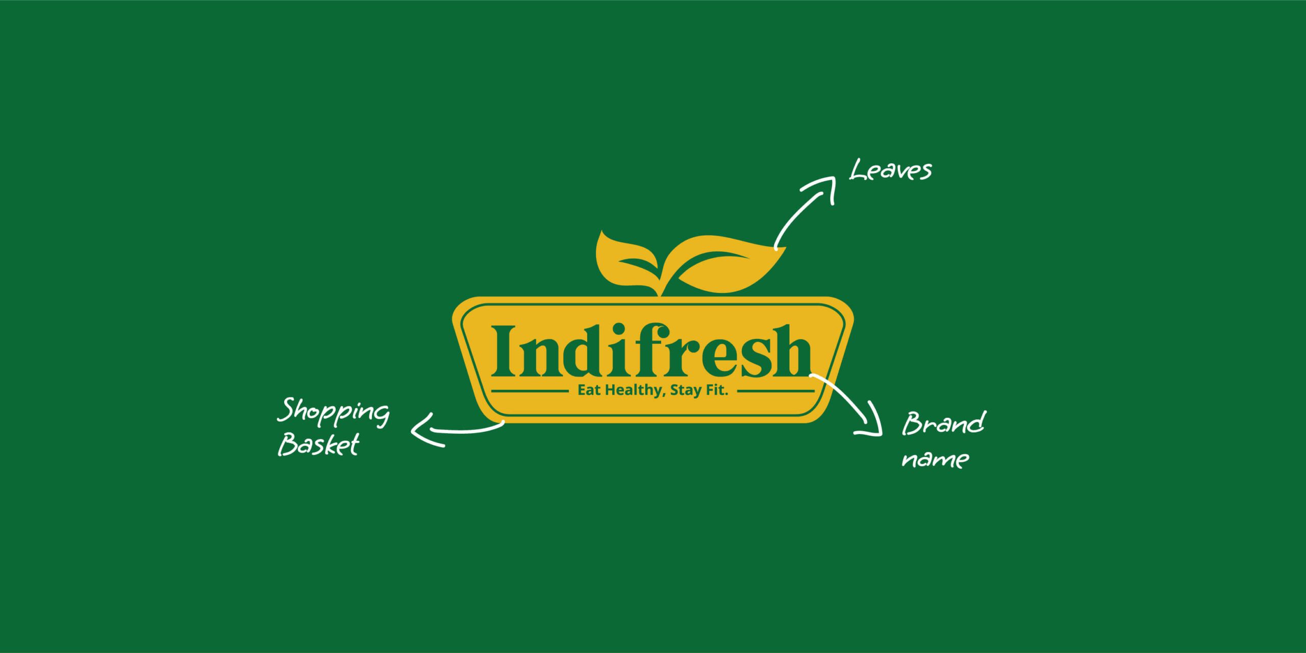
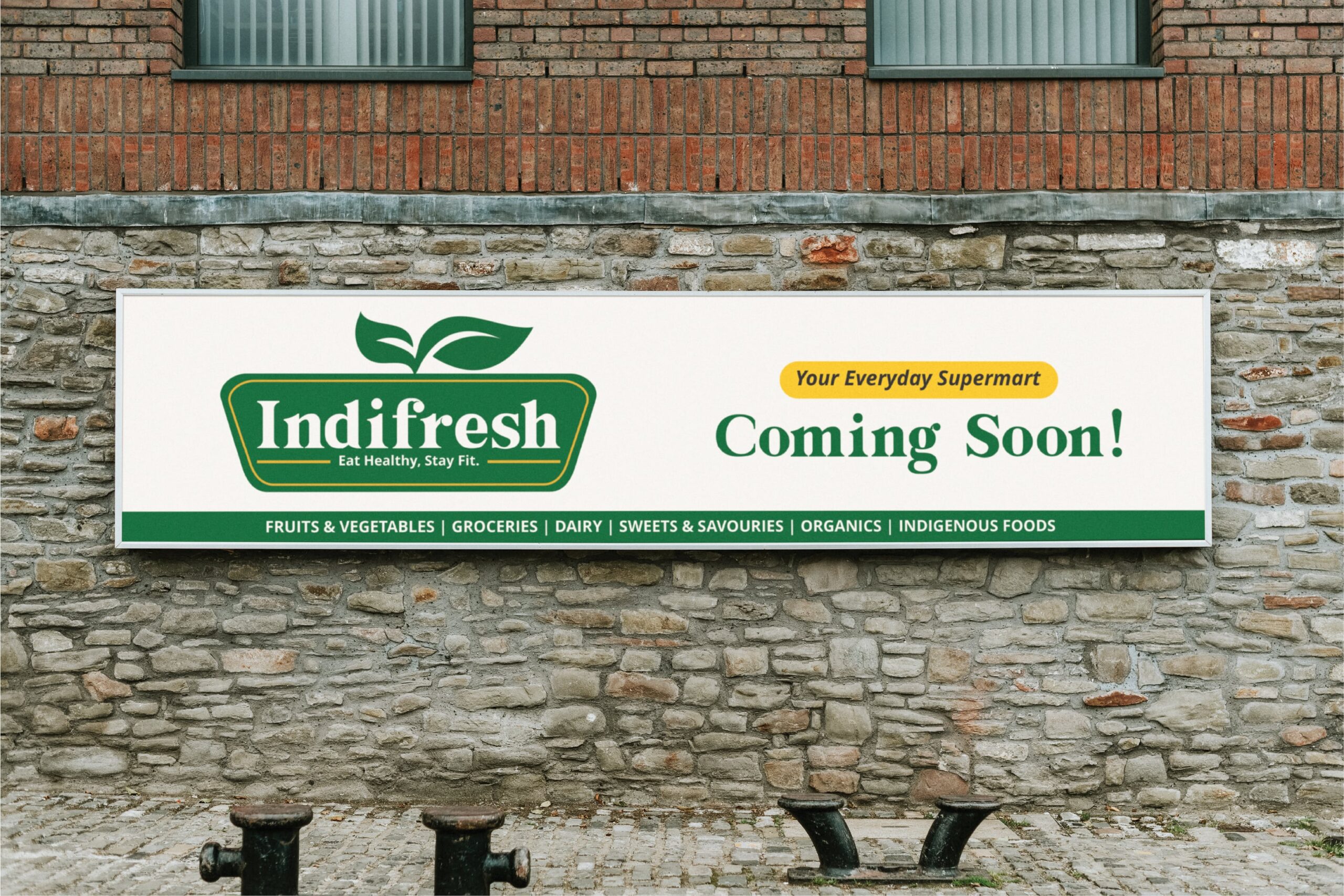
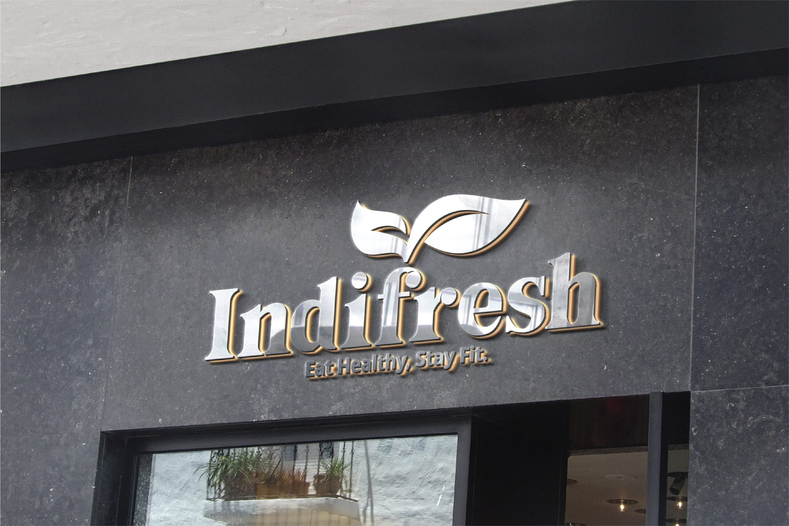
The Mark
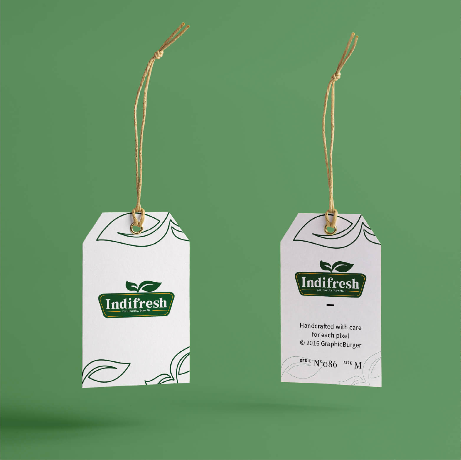
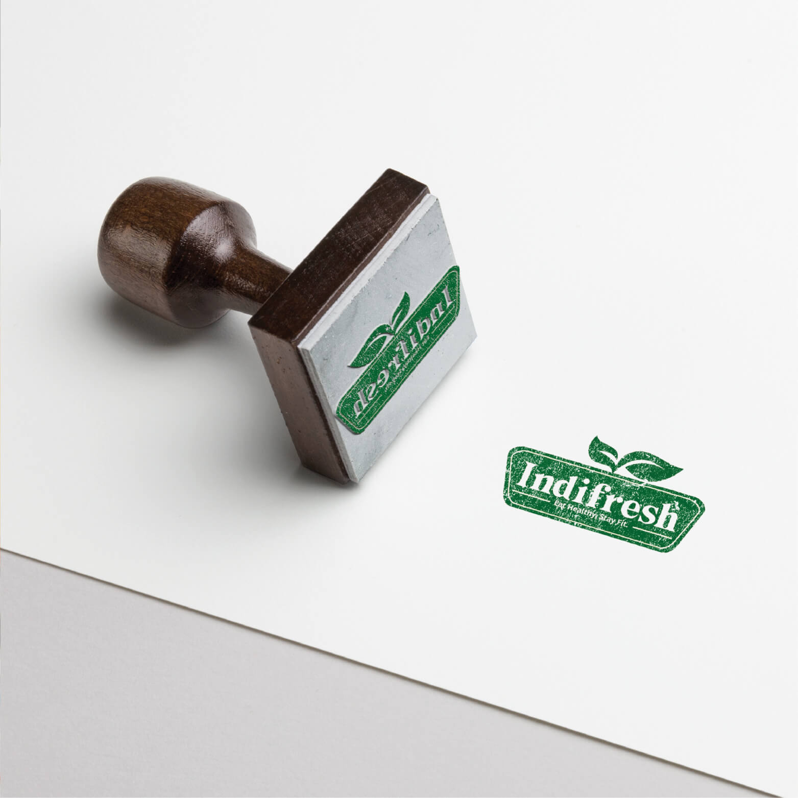
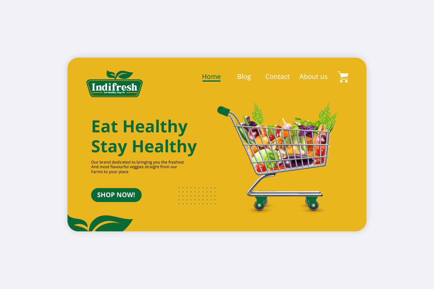
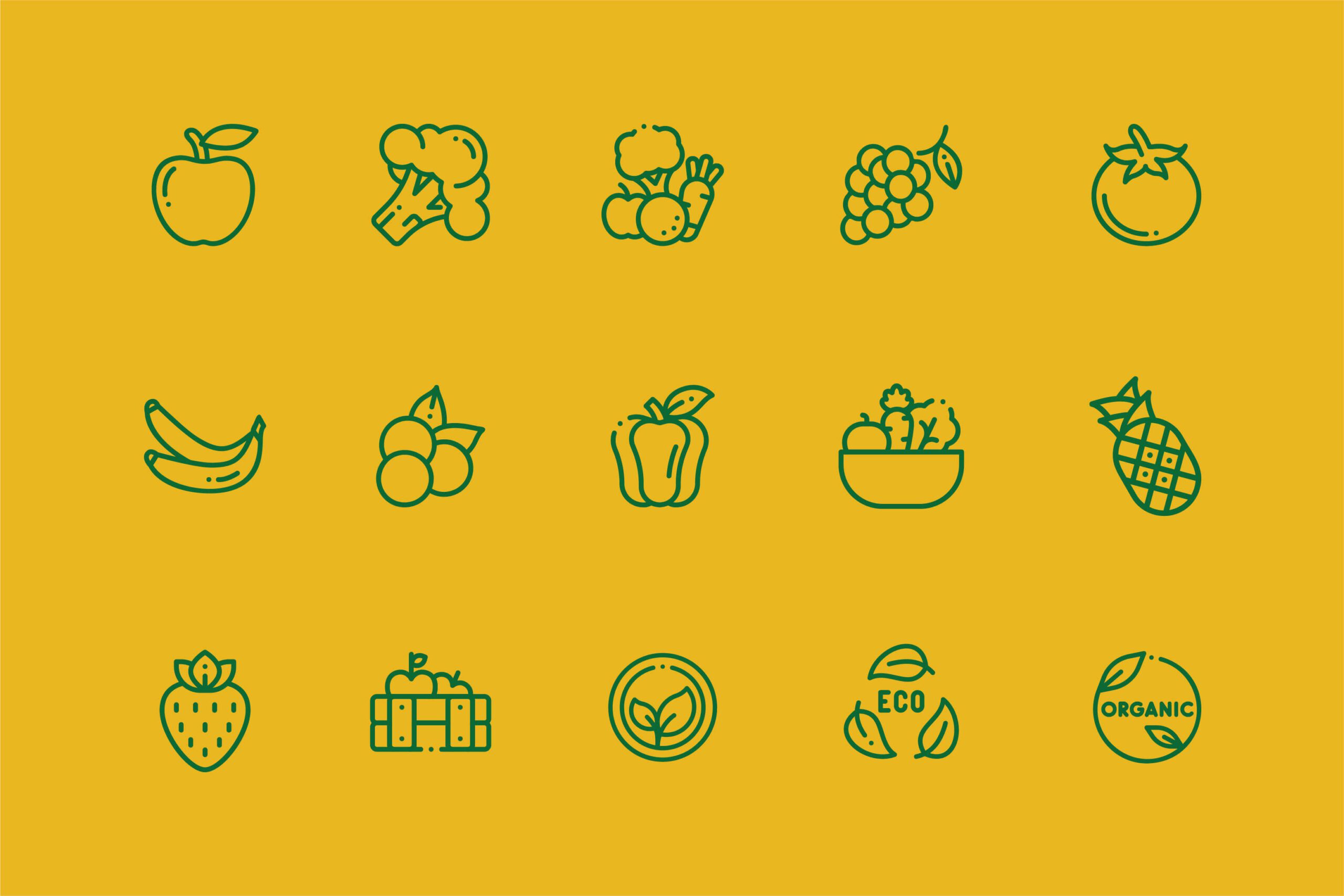
We developed a modern wordmark anchored by a structural box—symbolizing neatly packaged, organized goods. This foundation is crowned with a fluid leaf motif, immediately signaling natural growth, eco-consciousness, and organic quality.

The Typography
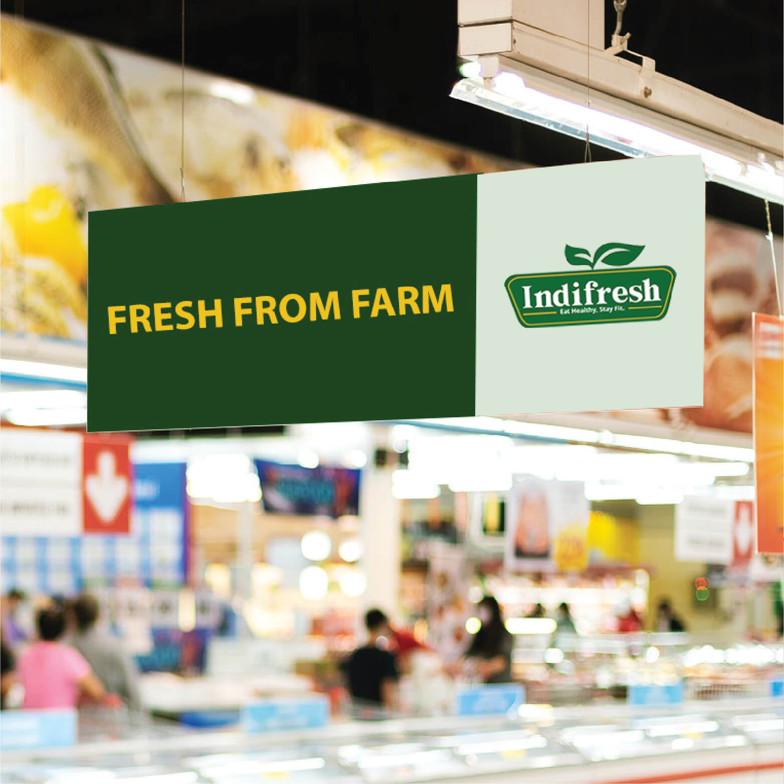
Clean, geometric typography was selected to ensure absolute legibility and a modern editorial feel at any scale—from massive street-facing illuminated signage to intimate, handheld packaging.
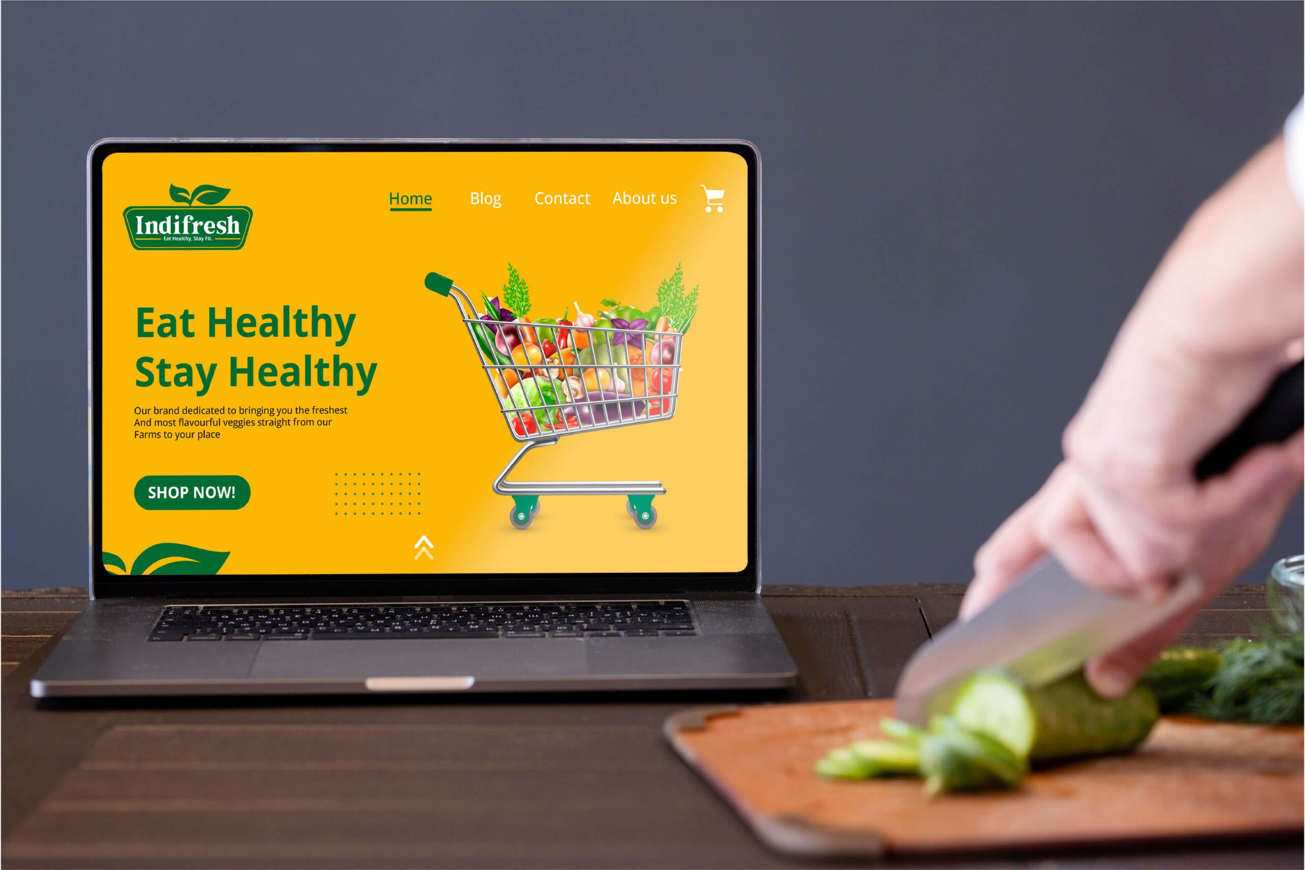
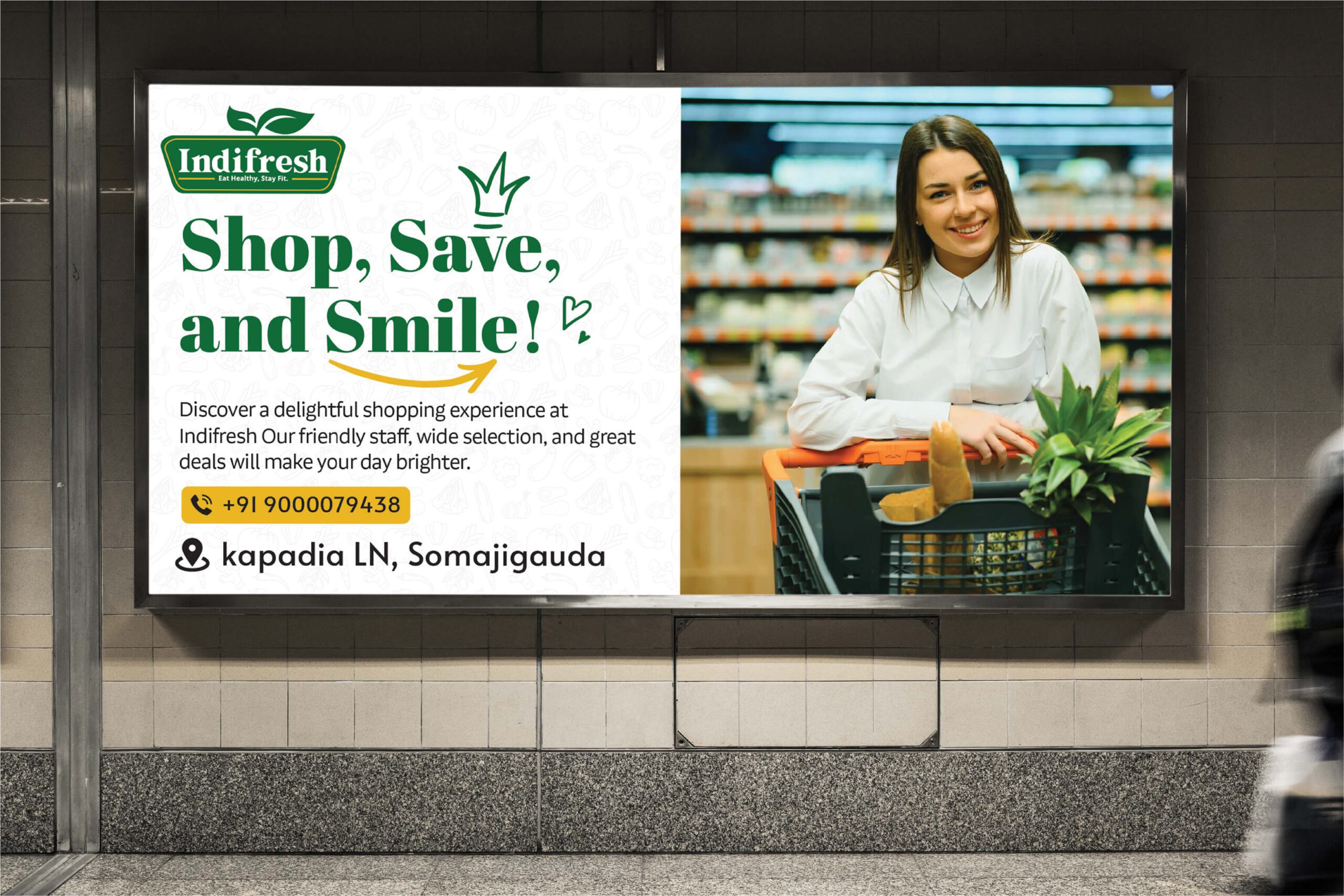
The Palette
Color is the silent ambassador of a brand.We established a deliberate, strategic tri-color palette:
Vitality Green: Signifies health, organic growth, and freshness. Optimism Yellow: Introduces warmth, approachability, and energy to the retail floor. Pure White: Acts as the anchor, providing essential breathing room and a crisp, hygienic aesthetic.


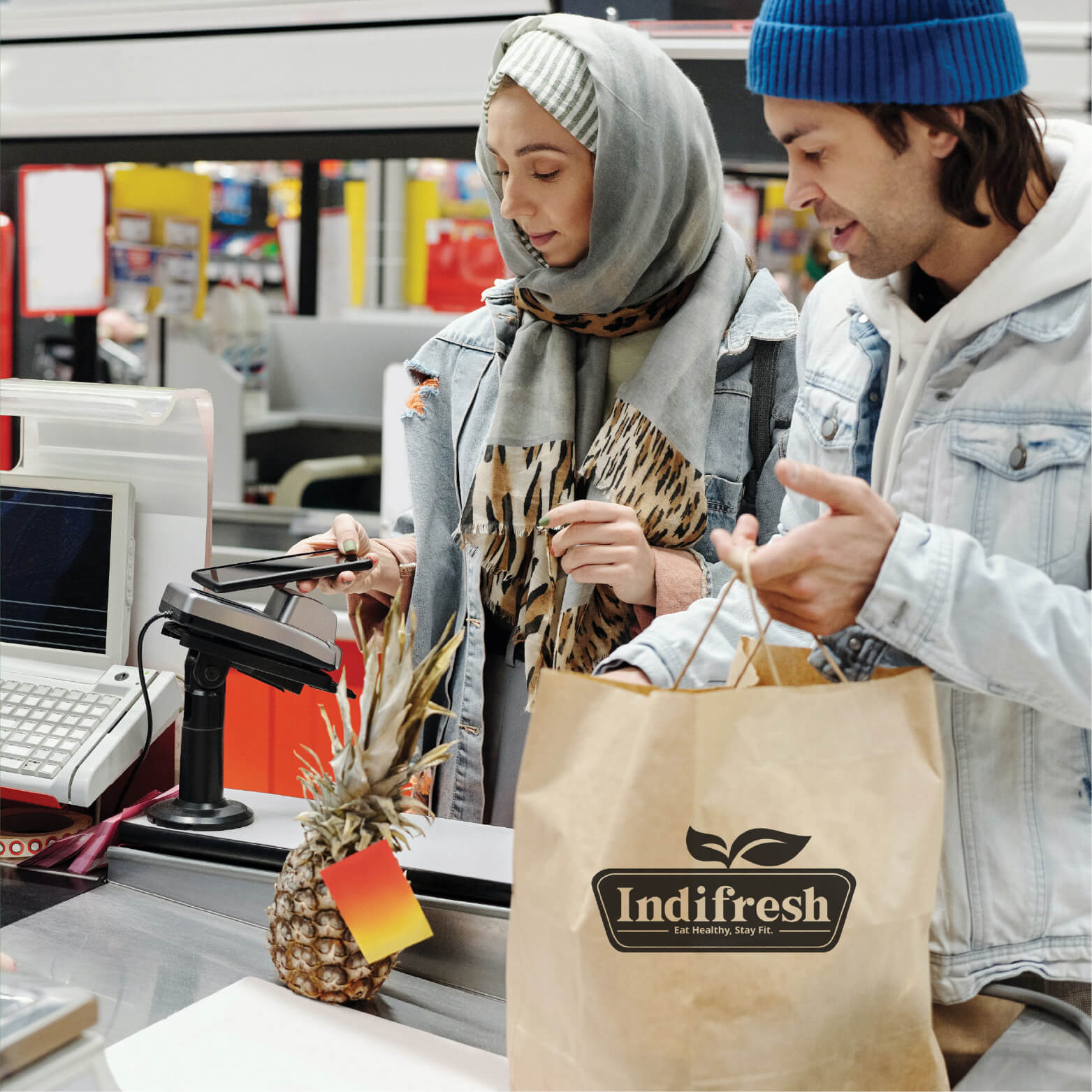
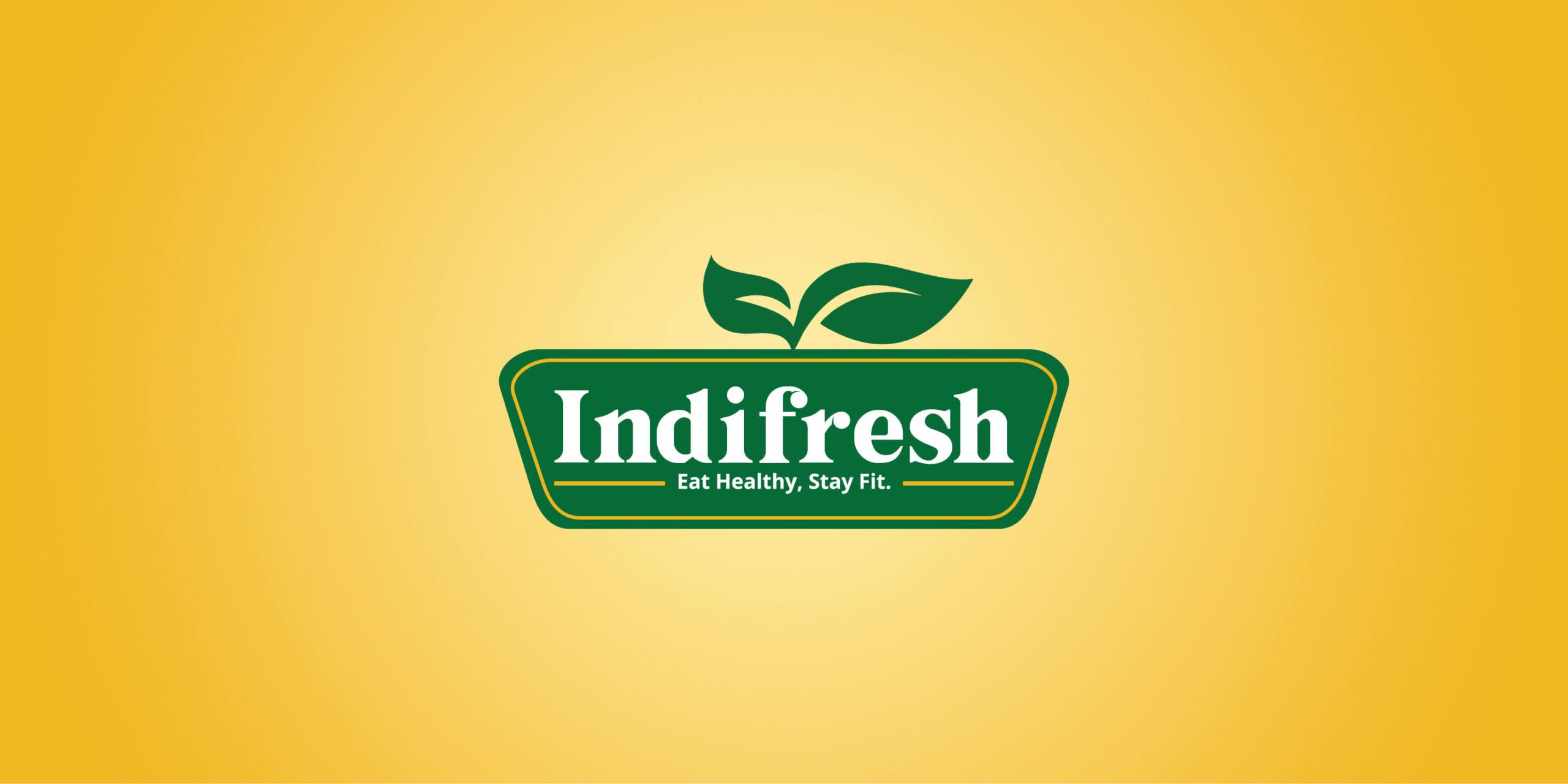
The logo effectively communicates the values and essence of the brand. It instantly conveys the focus on fresh, natural, and high-quality products, enticing customers who prioritize health and well-being. A well-designed logo enhances brand recall. When customers see the "Indifresh" logo on advertisements, packaging, or in-store displays, they will associate it with the positive shopping experience and the freshness of products.


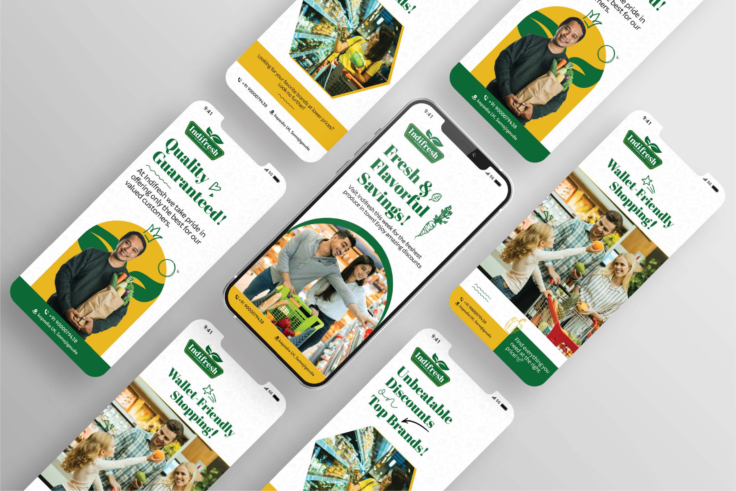
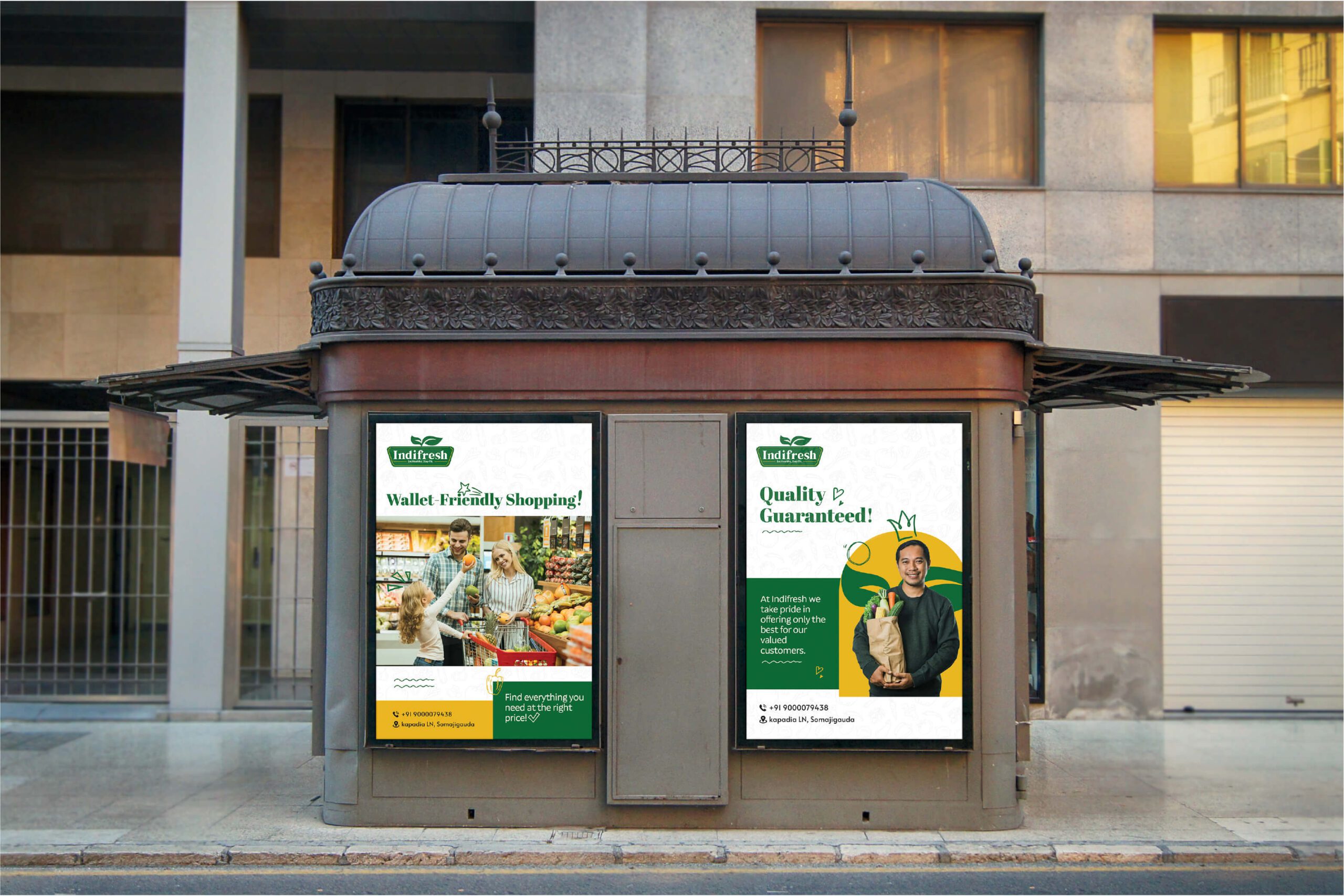
Positive Perception: The logo's association with freshness, health, and nature enhances the company's overall image. It positions "Indifresh" as a reliable and customer-centric supermarket, fostering trust and loyalty among shoppers. Customer Attraction: The visually appealing and unique logo design will capture the attention of potential customers. The use of green, yellow, and white colors can create a sense of curiosity, prompting people to explore the supermarket and its products.