
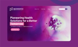
Mediserves is based in Dubai, United Arab Emirates. With a strong commitment to enhancing global healthcare, specialize in the research, development, manufacturing, and distribution of high-quality pharmaceutical products.


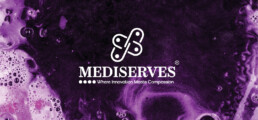
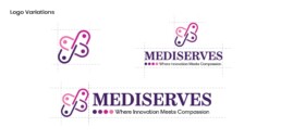
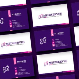
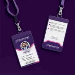
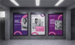
In the dynamic world of pharmaceuticals, a captivating logo can create a lasting impression and effectively represent a company’s brand identity. The logo design for Mediserve, a prominent pharmaceutical company, achieves this by integrating the shapes of capsules, people, a plus sign, and the initial letter of the company. The clever combination of these elements, along with the strategic use of purple color shades, brings forth a logo that embodies the core values and mission of Mediserve while visually appealing to its target audience.
Design Elements
The Mediserve logo incorporates several design elements, carefully selected to convey the essence of the company. The core shapes used include capsules, people, a plus sign, and the initial letter ‘M’ of Mediserve. Each of these elements has unique significance within the pharmaceutical industry.
Capsules symbolize pharmaceutical products and the healthcare field. The capsule shape communicates the company’s dedication to providing effective and innovative medical solutions. By incorporating this shape into the logo, Mediserve expresses its commitment to excellence in pharmaceuticals.
The silhouette of people within the logo represents care, compassion, and the importance of human well-being. It reflects Mediserve’s focus on providing healthcare solutions that improve the lives of individuals and communities. This inclusion demonstrates the company’s commitment to human-centric practices.
The plus sign within the logo symbolizes positivity, growth, and advancement. It represents Mediserve’s aim to enhance the well-being of patients by providing reliable and comprehensive healthcare solutions. Additionally, the plus sign signifies Mediserve’s dedication to collaboration and partnership with medical professionals and other stakeholders in the healthcare industry.
Lastly, the incorporation of the initial letter ‘M’ of Mediserve within the logo establishes a strong brand presence and aids in brand recognition. This element serves as a visual anchor, providing a direct association with the company’s name and identity.
color palette
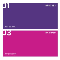
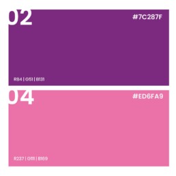
The color scheme plays a crucial role in establishing the emotional impact and visual appeal of the logo. The Mediserve logo predominantly features various shades of purple, which have been strategically chosen for their symbolism and psychological impact.


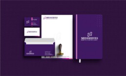
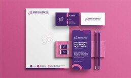
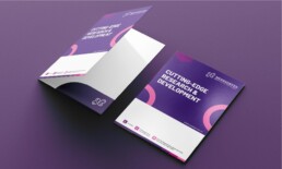
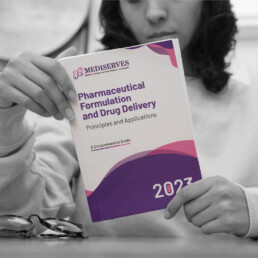
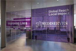
The Mediserve logo design expertly merges symbolism and elegance, creating a versatile branding solution that thrives in both printable and digital environments. It effectively captures Mediserve's core values, vision, and dedication to excellence in the pharmaceutical sector, ensuring consistent brand representation across various channels.


The strategic use of purple shades adds depth, elegance, and symbolism, reflecting trust, reliability, innovation, and diversity. The incorporation of three parallel lines reinforces Mediserve's commitment to the pharmaceutical industry. company's brand identity and dedication to improving healthcare outcomes.